


9 Confluence Best Practices Your Users Should Know

This guest blog was written by Balkis Khouni, an Atlassian certified consultant at Valiantys. Valiantys is a top Atlassian Platinum Solution Partner with proven expertise in DevOps, Agile and ITSM. They have rendered client-tailored services to over 4,000 companies, providing expert guidance on the deployment, adoption and support of Agile tools. To find out more, visit valiantys.com.
Confluence is a content collaboration software that helps teams create, share and discuss their work. One of the tool’s characteristics is it’s simple and user friendly interface, yet also provides all the necessary features to organize and structure your company’s content on one single platform.
Because of the tool’s simplicity, it is easy for users to add content without following good practices or guidelines, resulting in an unstructured wiki which can be counterproductive and hard to browse.
It is highly recommended to define a list of guidelines for your users, so they know how they should structure content within Confluence. Below are some general best practices which will help optimize your company’s use of Confluence and make information sharing a breeze for everyone. While these tips are geared more towards day-to-day usages, for further information on how to make Confluence a fully-fledged Enterprise Content Management solution check out this guide from Atlassian.
1. Identify the list of spaces you need to create
Spaces are like folders, which allow you to organize your content by different categories.
We recommend creating a space per Team (i.e. Finance) or by Project (i.e. Software development).
2. Take the time to define your page structure
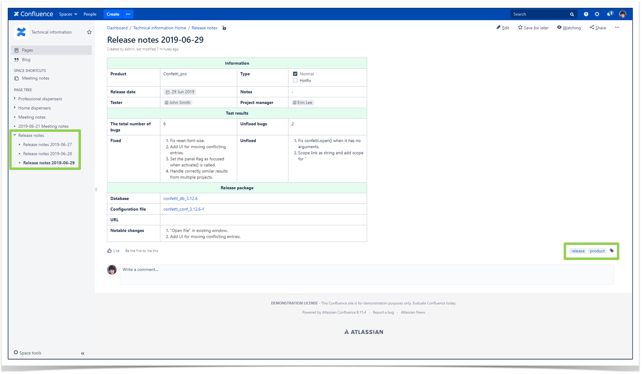
In each space, it is important to set up a clear and organized page structure so content is grouped by subject and relevance. You can use page hierarchy to group several pages under one single parent page. For example:
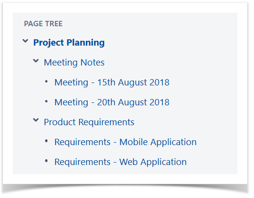
When you have several levels of hierarchy, it might be useful to use the Children Display macro on parent pages. This way, users won’t have to expand the whole tree to find their page.
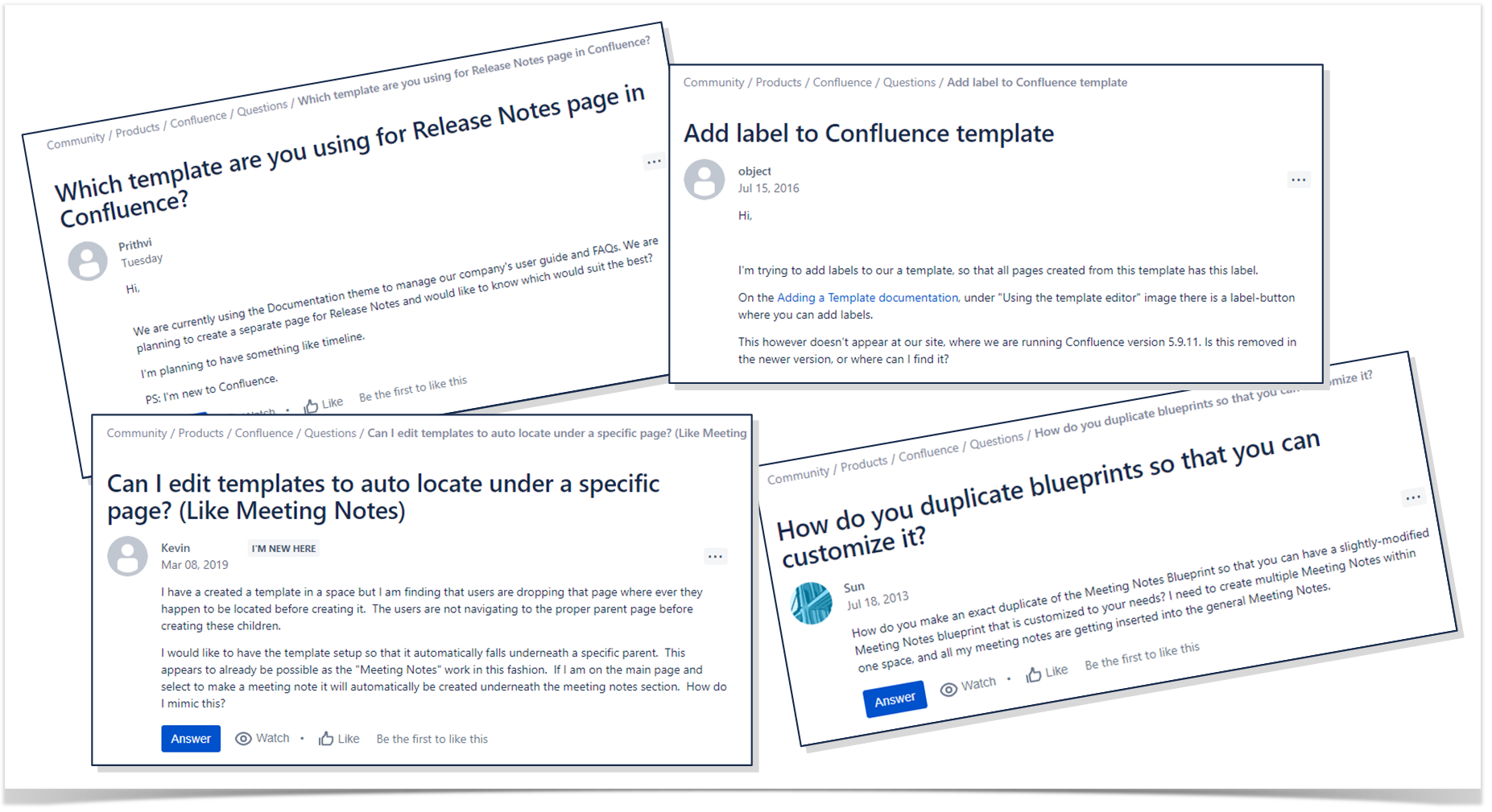
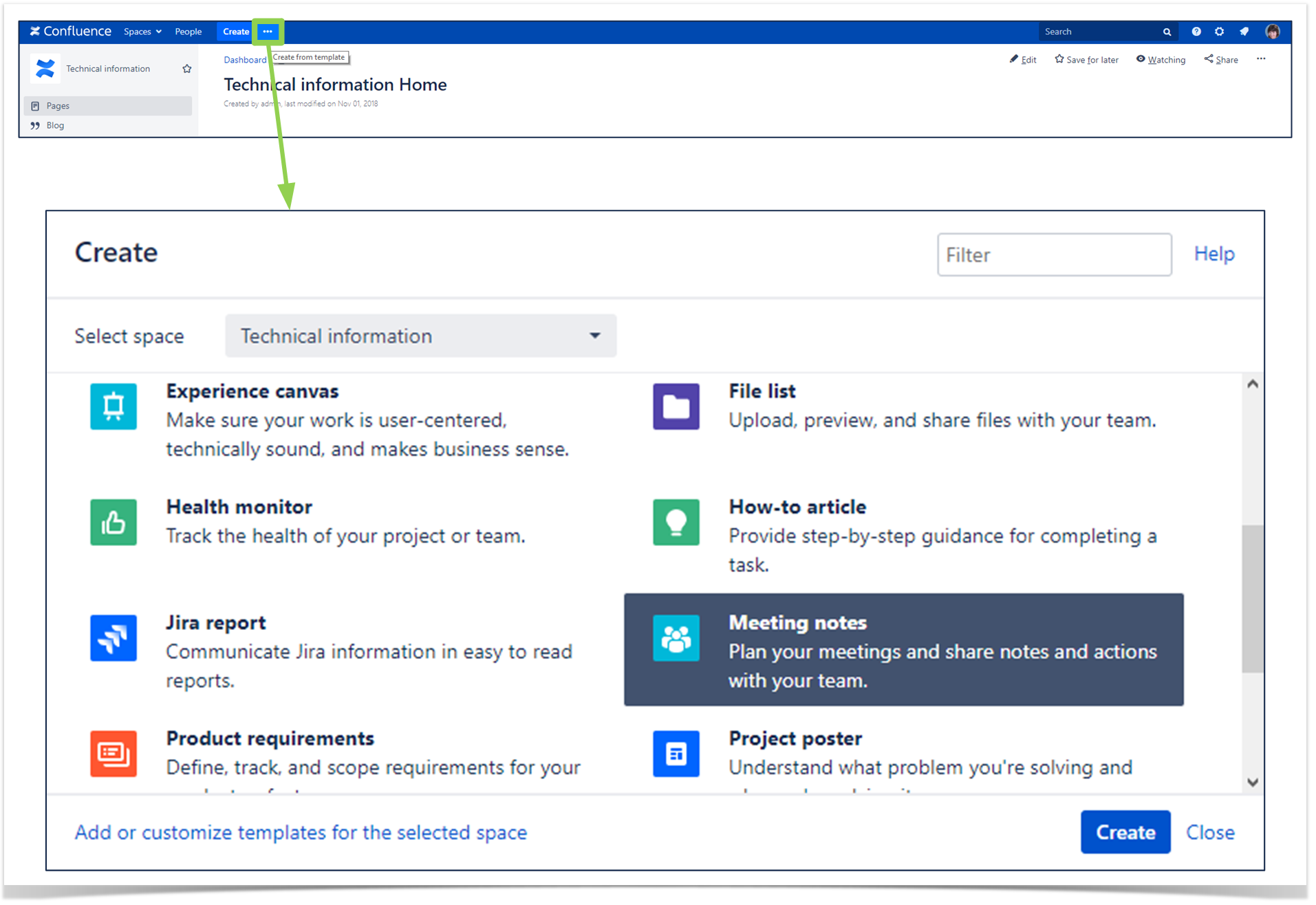
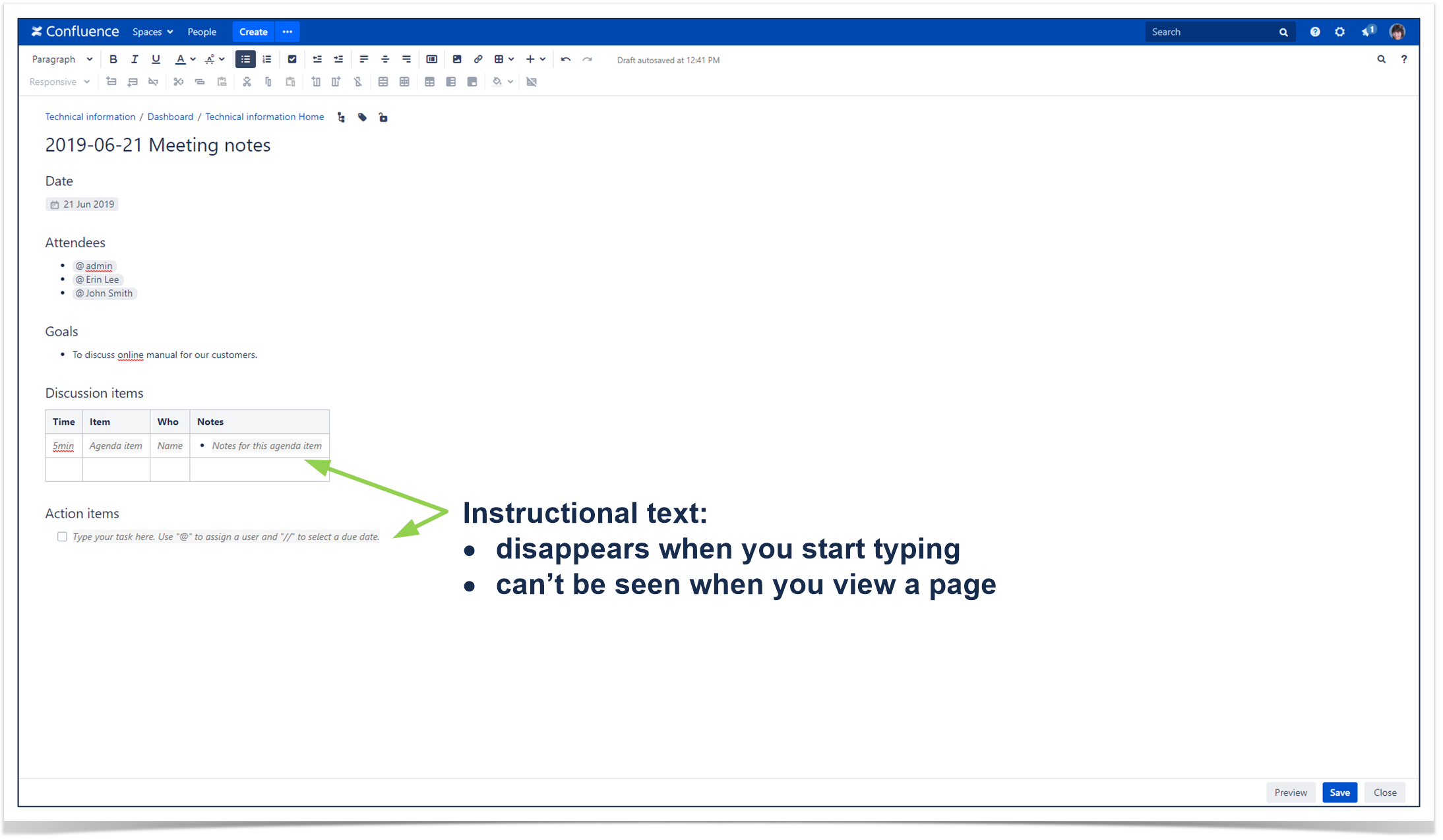
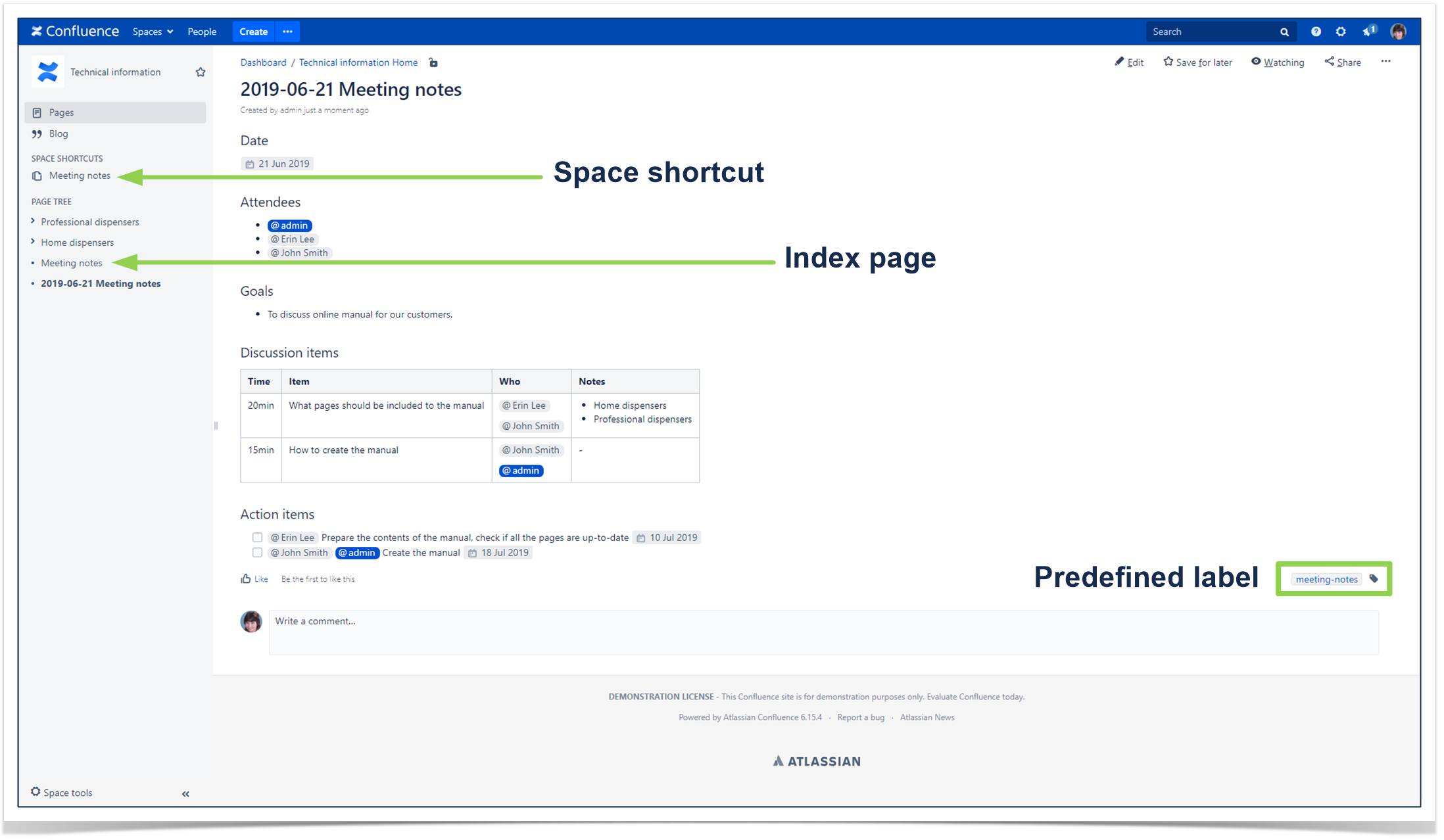
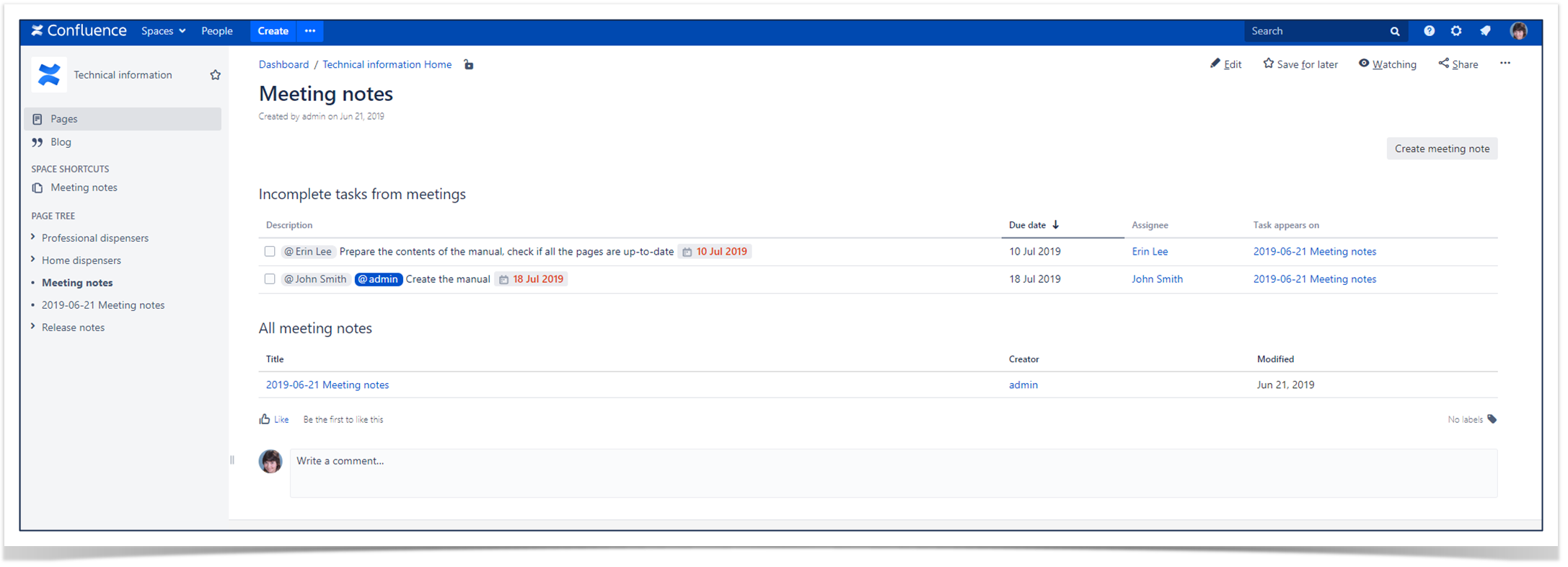
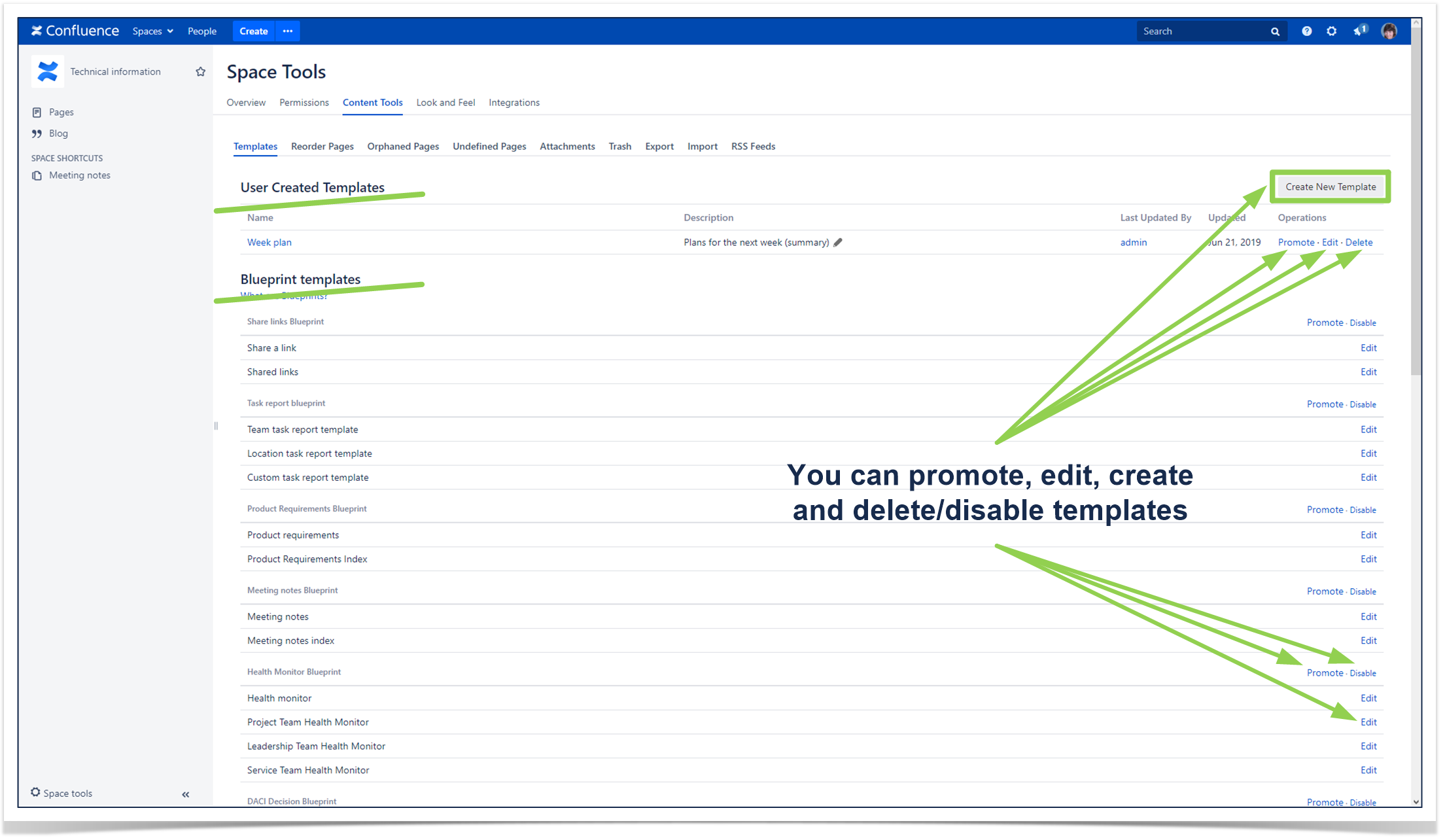
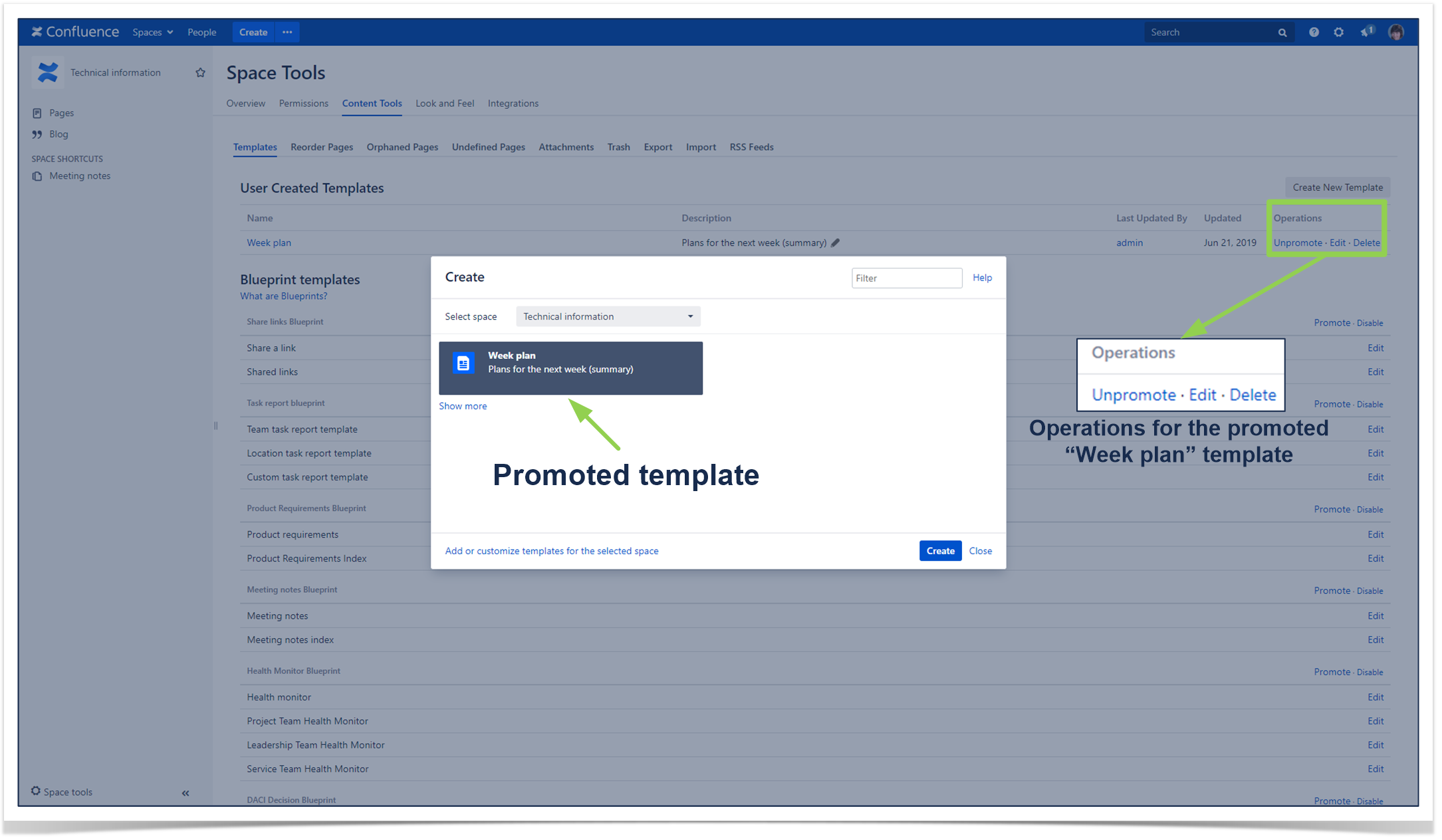
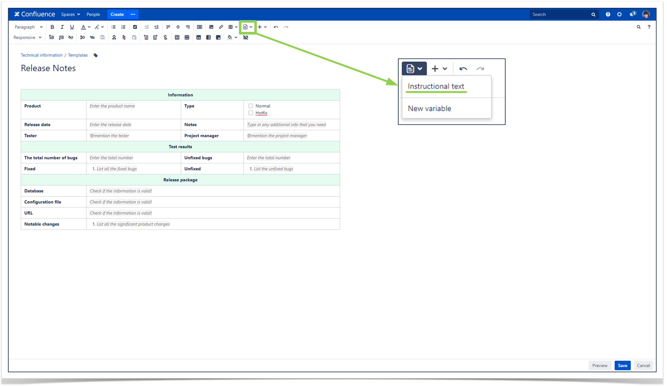
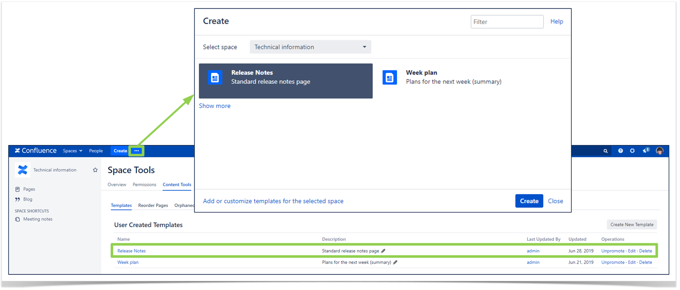
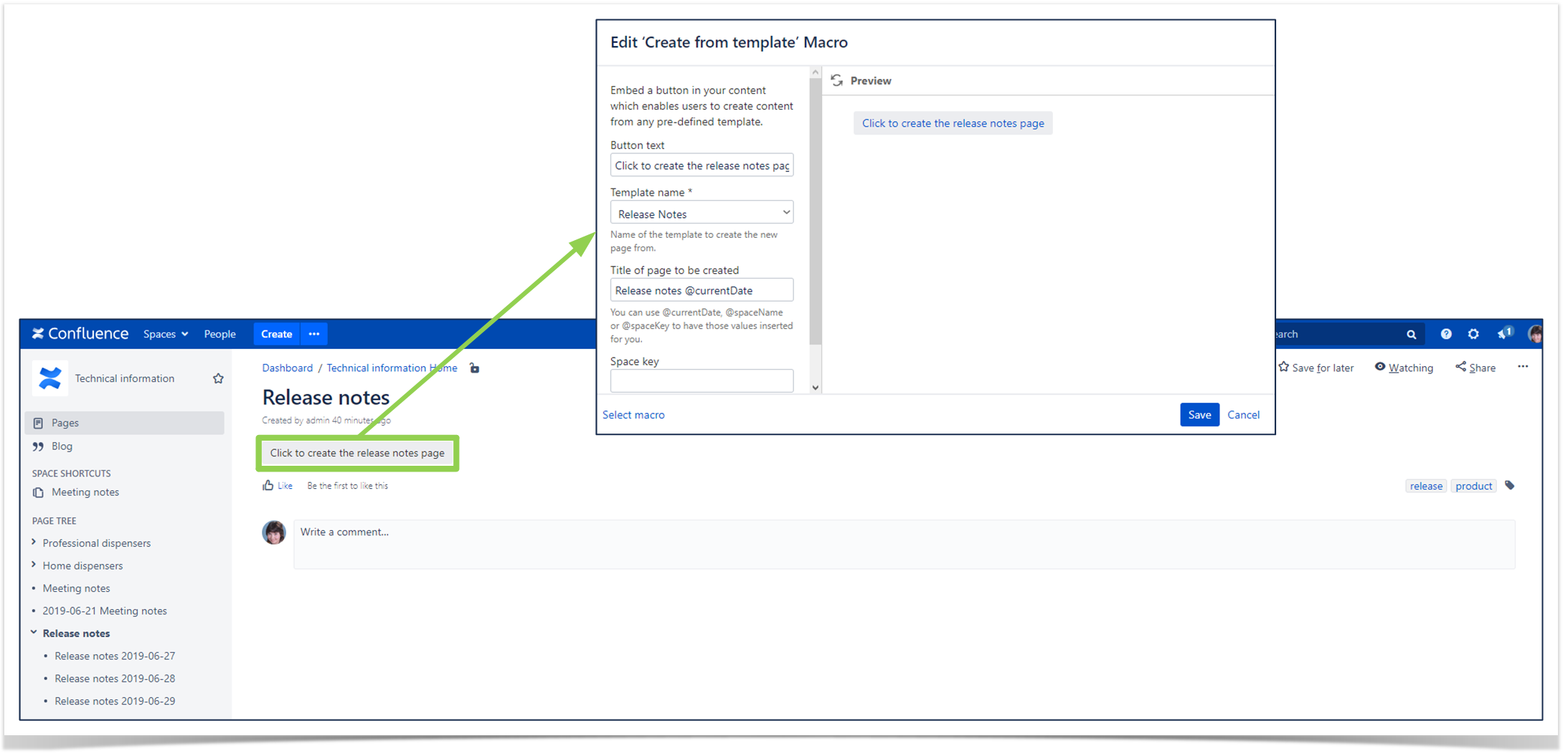
3. Use page templates
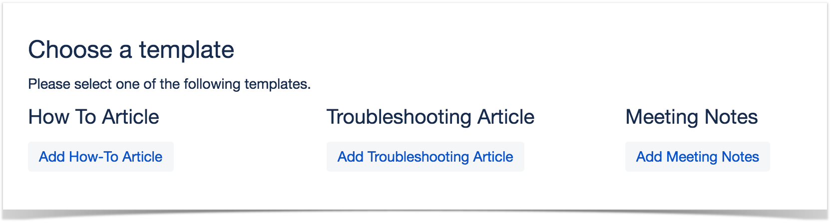
Confluence comes with a set of page templates, also called Blueprints, that allow you to:
- Group pages by category of content (i.e. How To articles, Meeting Notes, etc.).
- Have a standard layout and structure for those pages.
- Save your employees’ time, as they aren’t recreating the wheel with each page.
Confluence gives you the flexibility to set up your own templates and promote them to users, so they’ll have easy access to the pages. We recommend using the Create from Template macro, on your home page space, and also train users on the details for each available template.
 Quick Tip
You can also structure your content as training materials for onboarding or internal education.
Click here to learn how!
4. Increase productivity by using Confluence macros
Confluence comes with a set of useful macros that provide a range of functionalities, which can make your pages more dynamic and customizable. This can enhance the look and feel of your pages while improving the user experience when browsing through content. A full list of macros bundled in Confluence can be found here. Alternatively, the Atlassian Marketplace offers a range of apps which can give you more choices for third party macros.
5. Organize your attachments
Confluence makes it easy to attach files to your pages, however keep in mind the following best practices:
- Make sure to name your attachments in a way that is meaningful to make it easy for users to browse through them.
- When uploading and updating version of an attachment, make sure to not rename it. By using the same name, the attachment is replaced rather than duplicated.
- Optionally, you can organize your attachments in folders so all your files can be viewed in a structured manner. This can be achieved by using the Smart Attachments for Confluence app.
6. Avoid redundant content
Redundant content can be hard to avoid, especially if you need the same content in more than one place within your wiki. However, by duplicating content, it makes it difficult to keep everything updated without it becoming a tedious task.
To avoid this scenario, you can use the Excerpt and Excerpt Include macros and embed sections of your pages into other pages.
7. Label your content
Labels are an easy way to group pages and attachments that are relevant to the same topic, making it easier for users to find what they need.
A good rule of thumb is to make sure to choose labels that are relevant and meaningful. When labels are used consistently, you can make use of handy macros such as Content by Label.
8. Grant permissions wisely
It’s true that too many cooks spoil the broth. If you have too many administrators, chances are they’ll configure Confluence for their own needs rather than taking into consideration a global view, and in effect too many configurations in different directions can lead to performance issues. Make sure to give users the exact permissions they need to perform their work, and minimize the number of system and space administrators to no more than five people.
9. Train Confluence users to adopt best practices
Confluence is very easy to use, which can be a double-edged sword – everyone can use Confluence, but over time everyone can also contribute to creating a disorganized wiki if users are not mindful of their actions.
It is crucial to invest in your Confluence users, and train them on why it is important they use the right page structure, add the right labels, use the right macros, etc. To nail down these basics, Valiantys offers a Confluence in Action User Training to get your entire team on the same page. Likewise it is also important Confluence administrators are trained, as they will be supporting users and making changes that affect the whole system. Valiantys’ Advanced Confluence Training gets your admins ready to manage their own instance in just one day.
For more information on training your team to implement best practices on Confluence – or even the rest of the Atlassian suite – refer to Valiantys’ comprehensive trainings.