5 Tips to Become a Gantt Chart Expert Using monday.com

The Gantt chart is one of the most popular chart types. While it’s often associated with tracking IT projects, its use goes far beyond that. In practice, a Gantt chart is an advanced timeline that can be used to plan almost anything: recruiting and onboarding new team members, designing and executing construction work, organizing financial and legal activities, and much more.
It’s no surprise, then, that monday.com offers both built-in and third-party support for Gantt charts. In this article, we’ll dive in and explore five practical tips to help you become a Gantt chart expert and get the most value from this powerful feature.
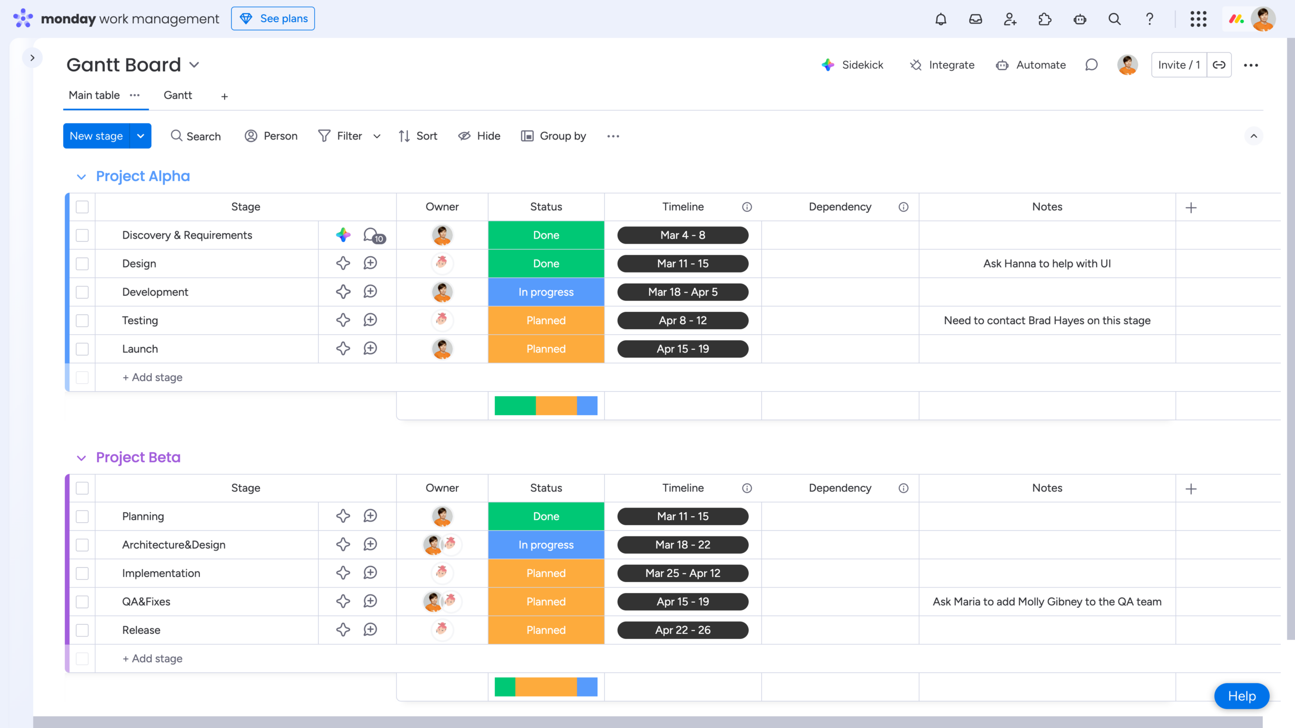
Tip #1: Use Timelines (Not Single Date Columns) for Better Gantt Performance
At a minimum, creating a Gantt chart requires just a few core elements:
-
Items that represent your tasks or project phases
-
A start and end date for each phase
Additional columns – such as Status or Dependency – aren’t mandatory, but they can make your Gantt chart easier to read, manage, and adjust.
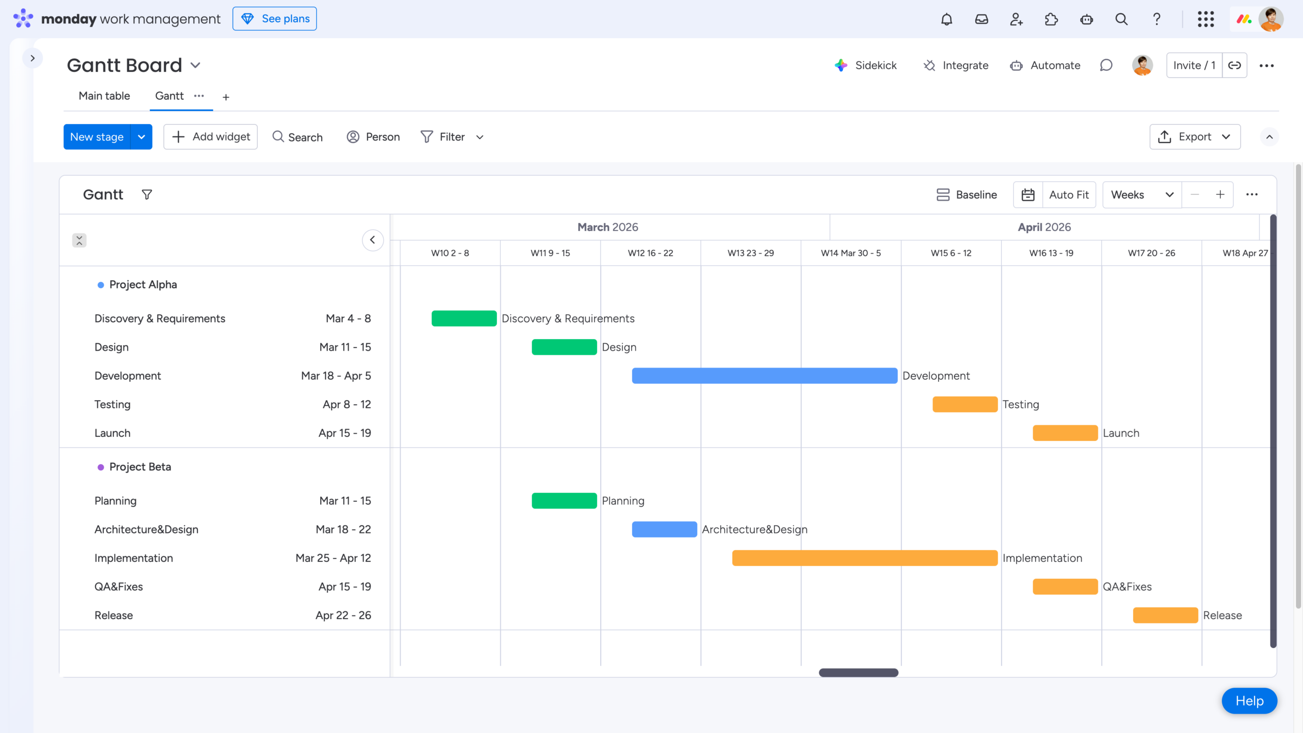
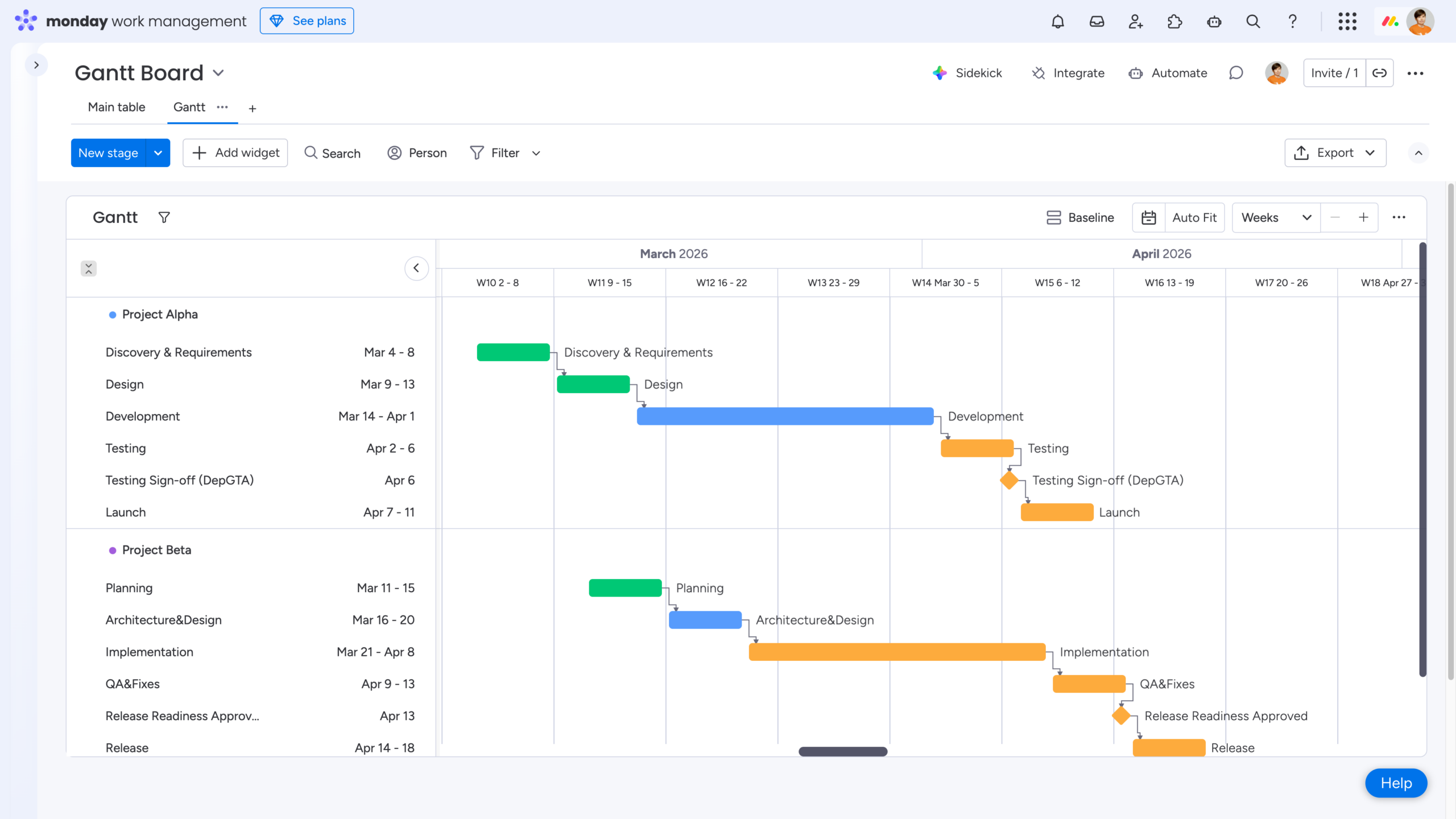
With that in mind, the first – and most important – tip is to use a Timeline column to define the start and end dates for your phases. This approach is considered a best practice compared to using separate single Date columns. Timeline columns are displayed as continuous, color-filled bars on the chart (rather than simple start and end markers) and provide much greater flexibility when working with Dependencies, Duration columns, and Baselines.
Now when you manually adjust bars directly in the Gantt View, all changes are instantly reflected on the board. This keeps everything perfectly in sync and makes ongoing planning far more efficient.
💡 Takeaway: Build your Gantt chart using Timeline columns instead of single Date columns for better performance and flexibility.
Pro Tip: Use Milestones to Highlight Important Dates
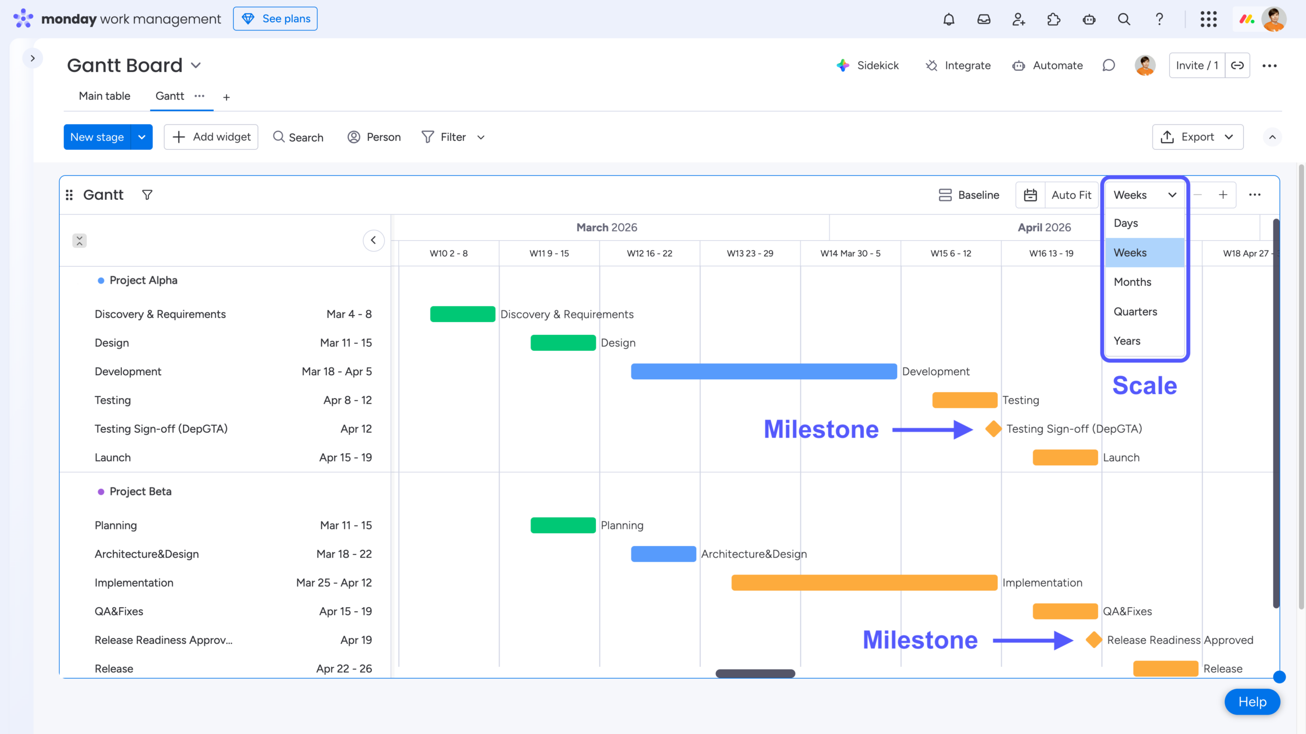
To make your Gantt chart easier to read, you can manually set the appropriate time scale and add milestones to highlight important dates. Milestones represent key turning points in a project or the completion of specific phases. They are zero-duration items and appear as diamond icons on the timeline, making them easy to spot at a glance.
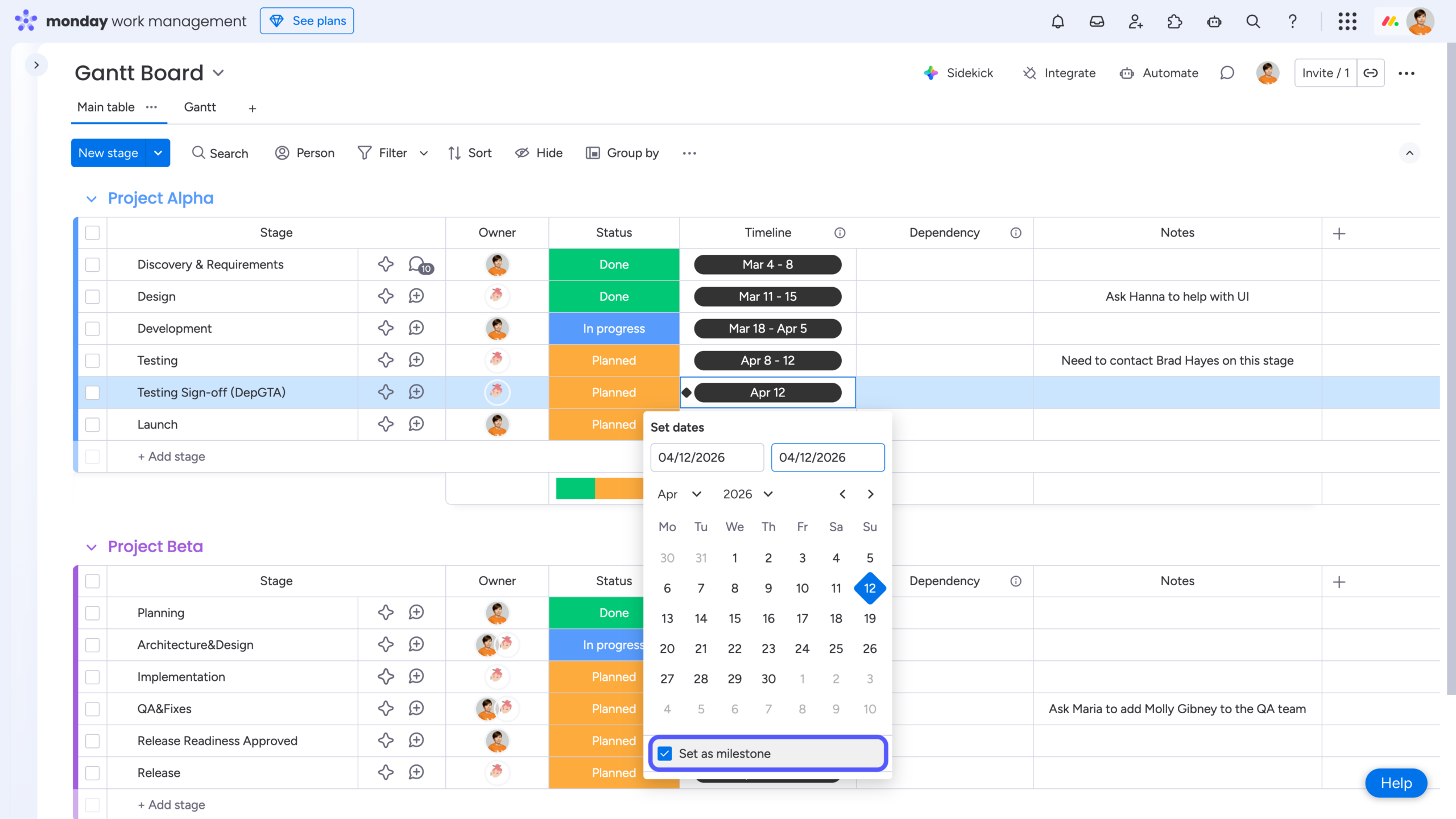
To set up milestones in your Gantt chart, click the three dots to the right of your Timeline column name, then go to Settings → Customize Timeline Column. Enable the checkbox labeled “Show ‘Set as milestone’“.
Once this option is enabled, reopen the date picker for any item and you’ll see “Set as milestone” at the bottom of the Calendar View, allowing you to mark that date as a milestone.
💡Takeaway: Add milestones to clearly highlight important dates and key turning points in your project.
Tip #2: Add Dependencies to Visualize Task Relationships
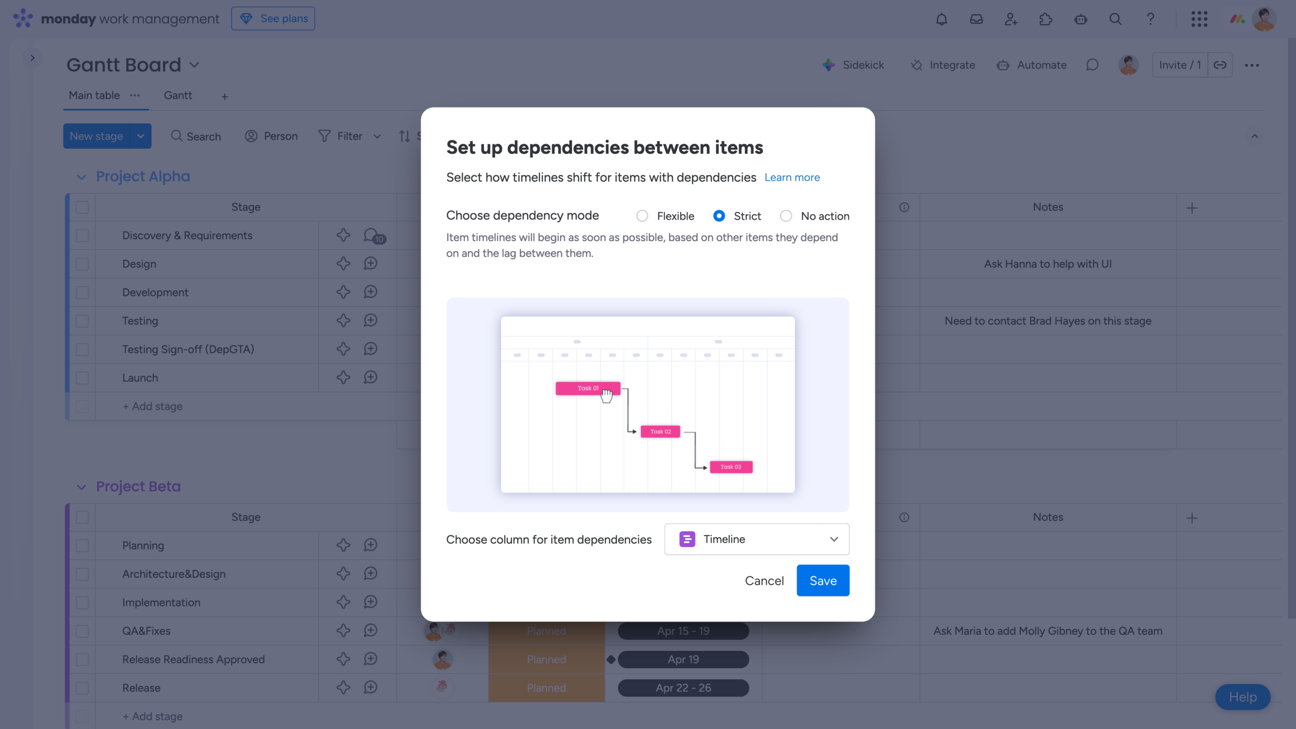
To add dependencies, first insert a Dependency column into your board and then choose the appropriate dependency mode:
-
Flexible – Ensures that dependent items don’t overlap in time. If a conflict occurs, dates are adjusted automatically to maintain a logical sequence.
-
Strict – Automatically shifts an item’s dates to precisely reflect any time changes made to the item it depends on.
-
No action – Displays dependency relationships without adjusting dates. Even if a dependency conflict occurs, item timelines remain unchanged.
As you switch between dependency modes, the preview GIF in the dialog updates to show how each option works in practice, helping you quickly understand the impact before applying it.
In the same window, you’ll also be asked to choose the time column (for example, a Timeline column) that will be used to define and adjust item dependencies.
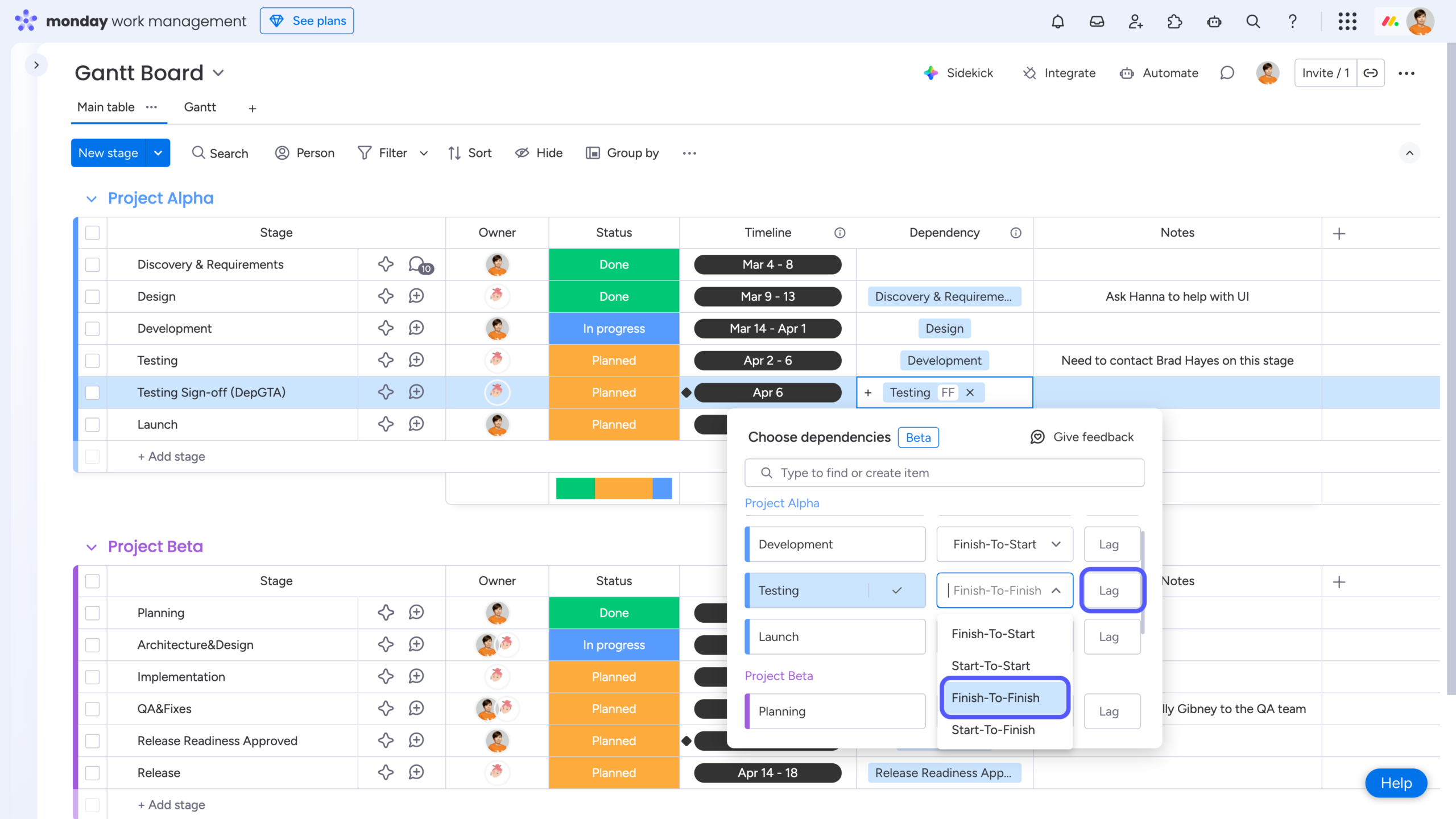
Next, go back to the board and define which items depend on one another. For each dependency, choose the appropriate dependency type and, if needed, specify a lag. The lag option is available only when using the Strict dependency mode.
monday.com supports four dependency types:
-
Finish-to-Start (FS) – Task B can start only after Task A is finished. This is the most commonly used dependency type. Because it’s the default, it does not have a special visual indicator in the Dependency column.
-
Start-to-Start (SS) – Task B can start only after Task A has started.
-
Finish-to-Finish (FF) – Task B can finish only after Task A is finished. This type is commonly used for phase-closing milestones, such as test sign-off or approval points from our example.
-
Start-to-Finish (SF) – Task B can finish only after Task A has started. This is the least common dependency type and is typically used in very specific scenarios.
When managing projects with strict timelines, you may need to account for planned delays or intentional overlaps between phases. This is where the Lag field comes into play:
-
Lag – A delay between the dependent item and the item it depends on. It represents the amount of time that must pass before the next step can begin and is added by entering a positive number of days.
-
Lead – An overlap between dependent items, allowing a task to start before the preceding one has fully completed. This is defined by entering a negative number of days in the same Lag field.
Used correctly, dependency types combined with lag and lead values give you precise control over task sequencing and timing in your Gantt chart.
To see the result in the Gantt View, open View Settings, go to Visual settings, and enable the Show dependencies option.
💡Takeaway: Add Dependencies to clearly define task relationships, automatically adjust timelines, and understand how delays in one phase impact the entire project.
Tip #3: Use Baselines to Track Project Progress Over Time
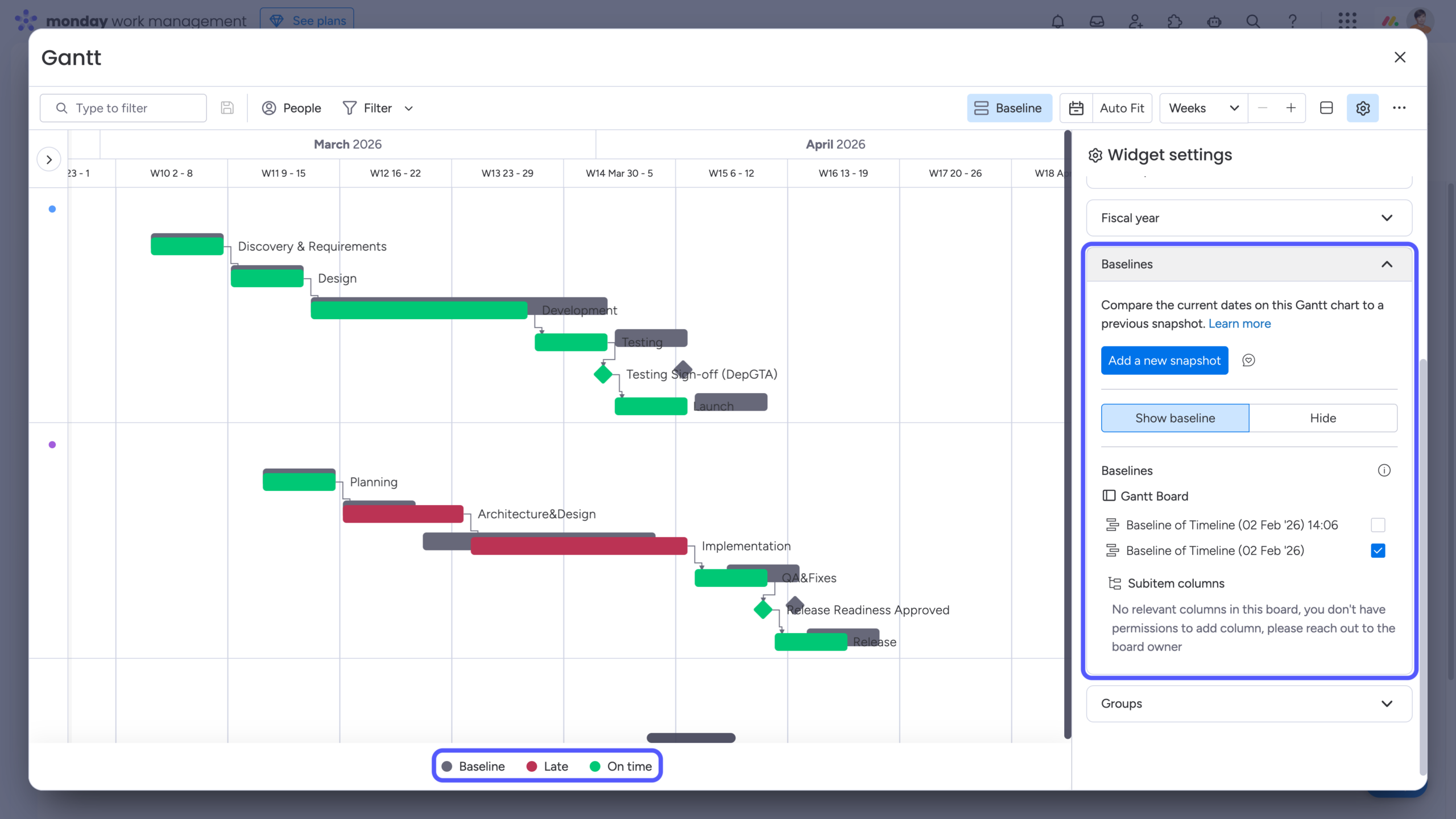
A baseline is a snapshot of your Gantt chart taken at a specific point in time. Once the snapshot is created, you can continue adjusting your plans as the project evolves. By comparing your current schedule with the baseline, you can clearly see how progress and timelines have changed compared to the original plan.
You can create multiple baselines throughout the project lifecycle, allowing you to track how your schedule shifts over time and understand the cumulative impact of changes.
To create a baseline, open View Settings, navigate to Baselines, and click Add a new snapshot. Once created, the baseline will appear in the list, and you can choose whether to display it and which specific baseline(s) to show.
Keep in mind that when a baseline is enabled, the “Color by” setting is automatically disabled. Instead of using board-based coloring (such as Status), items are colored based on their progress relative to the baseline. The baseline itself is always displayed as a gray shadow positioned exactly where the item was at the time the snapshot was taken.
When comparing against a baseline:
-
On-time items appear in green
-
Late items appear in red
This makes it easy to instantly assess schedule performance and understand how your project is tracking against the original plan.
Note that each time a baseline is created, two new columns are automatically added to the board:
-
The Timeline column is duplicated to create a locked snapshot of your schedule at the moment the baseline is taken.
-
A Formula column named Difference is added to calculate the number of days between the original time column and the snapshot column created for the baseline.
Deleting these two columns will delete the baseline on your Gantt chart as well.
💡Takeaway: Use Baselines to capture your original plan, compare it with actual progress, and clearly see how schedule changes impact your project over time.
Tip #4: Add Automations to Make Sure You Keep Up With the Plan
As projects evolve, timelines shift and statuses change. That’s where automations come in handy -they help teams stay aligned with the original schedule and ensure the Gantt chart continues to reflect reality.
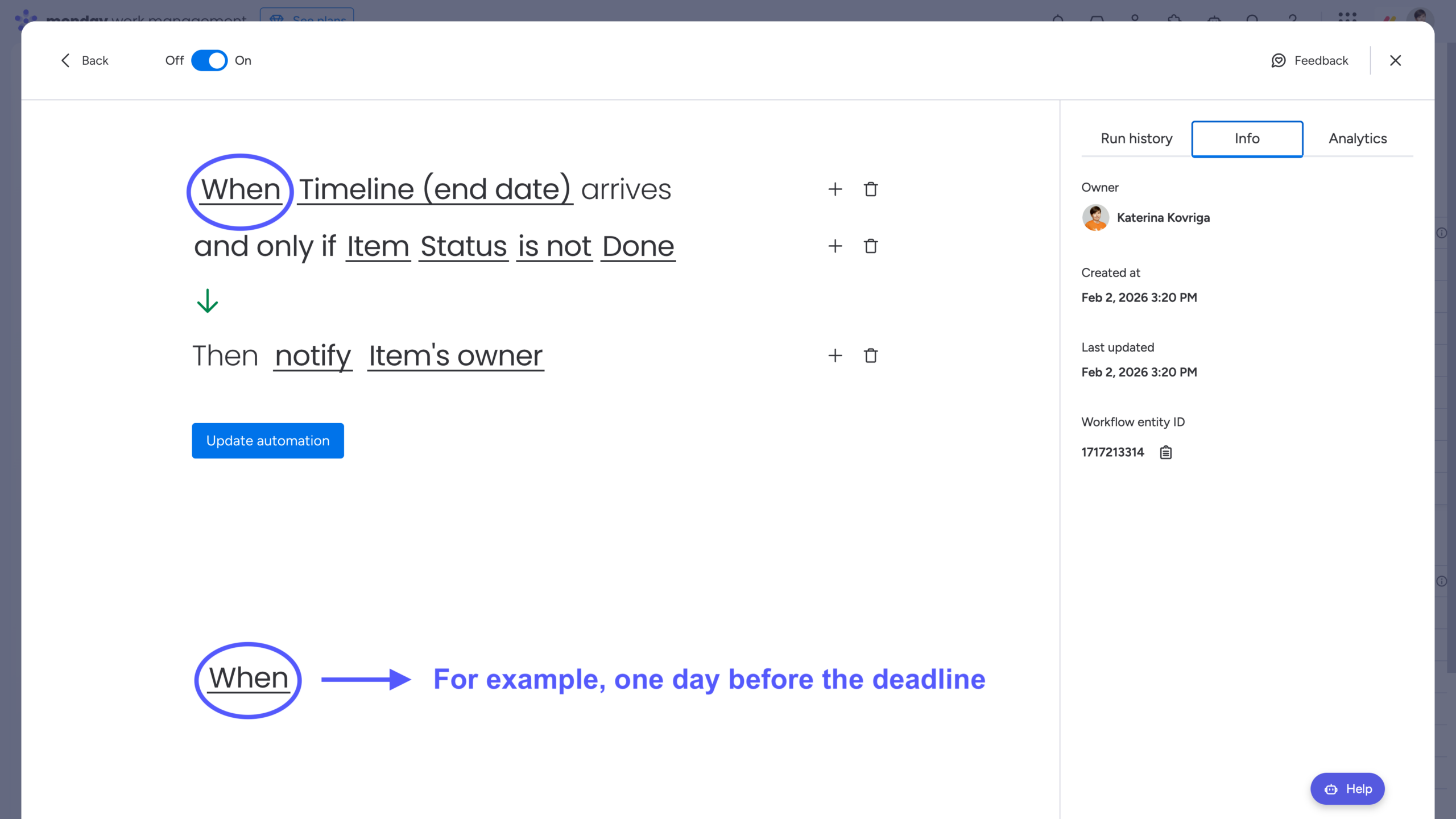
For example, you can set up a simple but effective automation like this:
When the Timeline end date arrives (for example, one day before the deadline) and Status is not Done → notify Owner.
This type of automation helps discipline the process and keeps your Gantt chart a reliable source of truth. Either the status is updated and the timeline remains accurate, or the timeline is adjusted to reflect the current state of development – both outcomes keep the plan honest and up to date.
💡Takeaway: Add Automations to reinforce your planning discipline and keep your Gantt chart accurate, relevant, and aligned with actual project progress.
Tip #5: Discuss the Schedule With Your Customers to Align Expectations
In real life, timelines are often not created solely for internal use. They’re frequently tied to customer projects or need to be reviewed by external stakeholders. As a result, feedback and review edits usually end up scattered across email threads, chat messages, and multiple exported versions of the same Gantt chart in PDF format. This quickly leads to version confusion, longer feedback loops, and extra manual work just to keep the timeline aligned.
That’s why teams need a single, shared version of the schedule that can be reviewed directly with customers – where feedback is left in context, suggested changes are visible, and nothing gets lost in emails or exported PDFs. All without forcing external stakeholders to create accounts or purchase additional monday.com licenses.
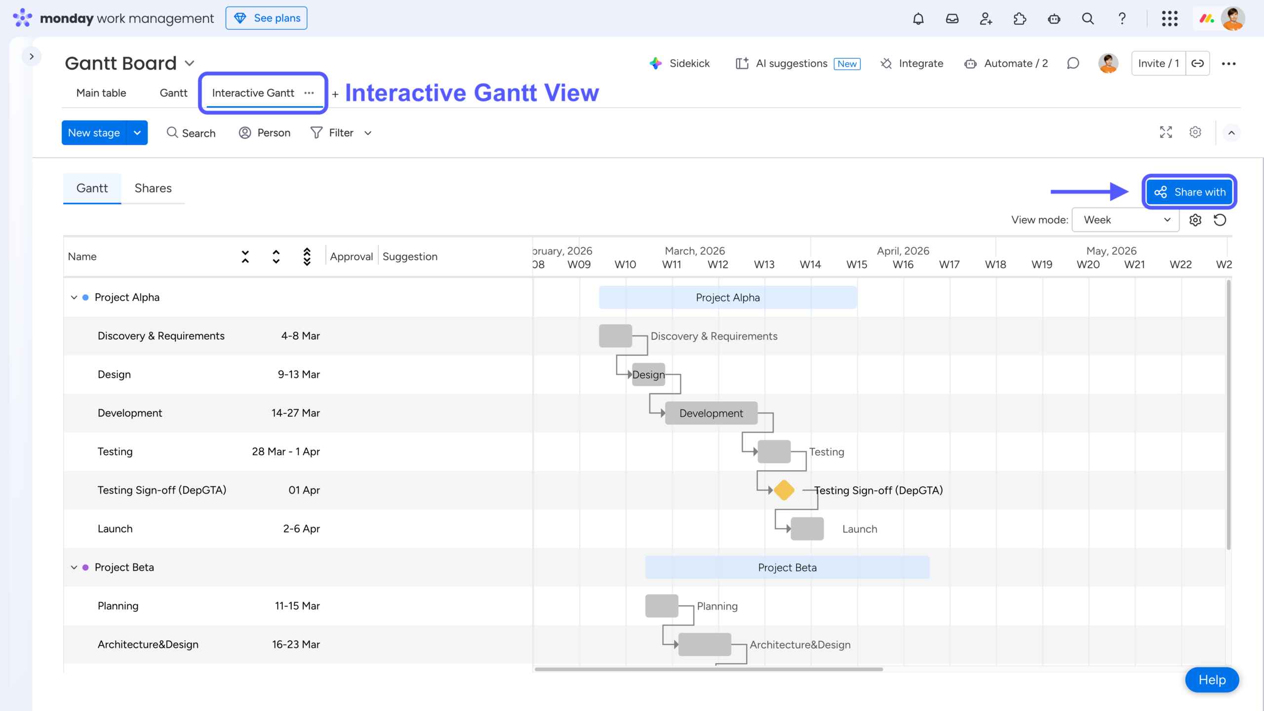
To solve this, we recommend trying Interactive Gantt Timeline, an app developed by our team. It’s not a replacement for monday.com’s native Gantt, but rather an external collaboration layer designed specifically for working with clients and stakeholders outside of monday.com.
You can add it as a Board View, generate a Gantt chart from your existing data, and share it with anyone via email. Recipients receive a guest link that lets them review the Gantt chart directly from the email, or you can copy and share the link manually using any communication tool you prefer.
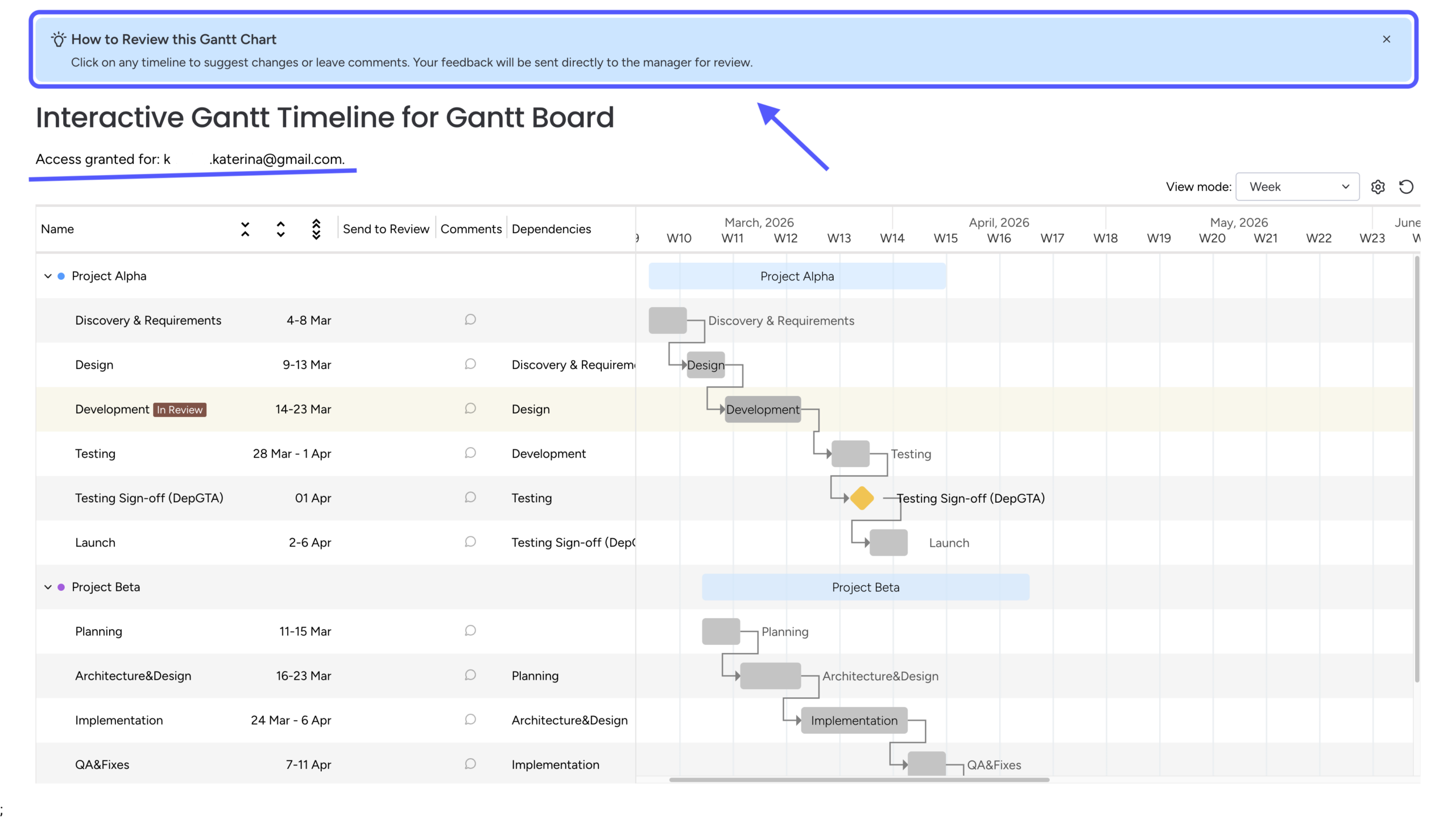
Reviewers don’t need a monday.com account at all – making schedule reviews straightforward, accessible, and friction-free.
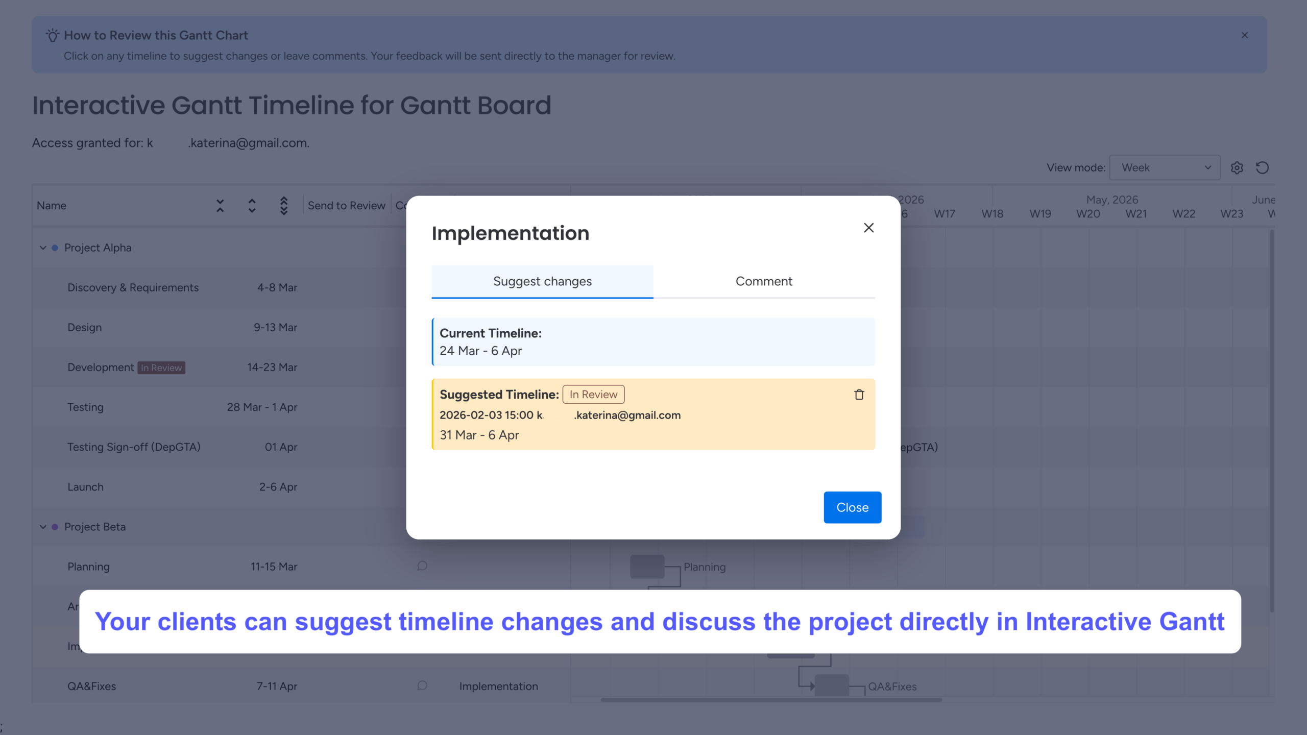
The guest view opens as an interactive Gantt chart, where reviewers can click on any timeline bar and leave suggestions about its duration and/or add explanatory comments.
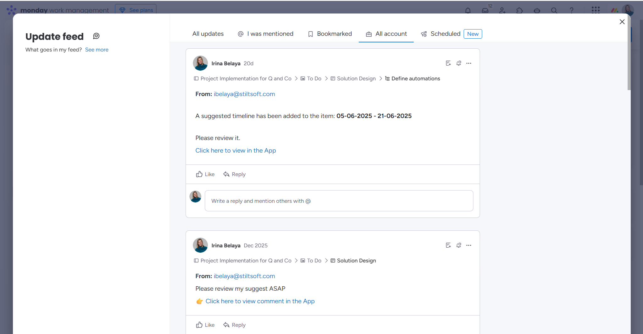
These updates are instantly reflected in the Interactive Gantt Timeline View and in the item updates in monday.com. Project Managers will see the notifications about new suggestions and comments in the Updates feed.
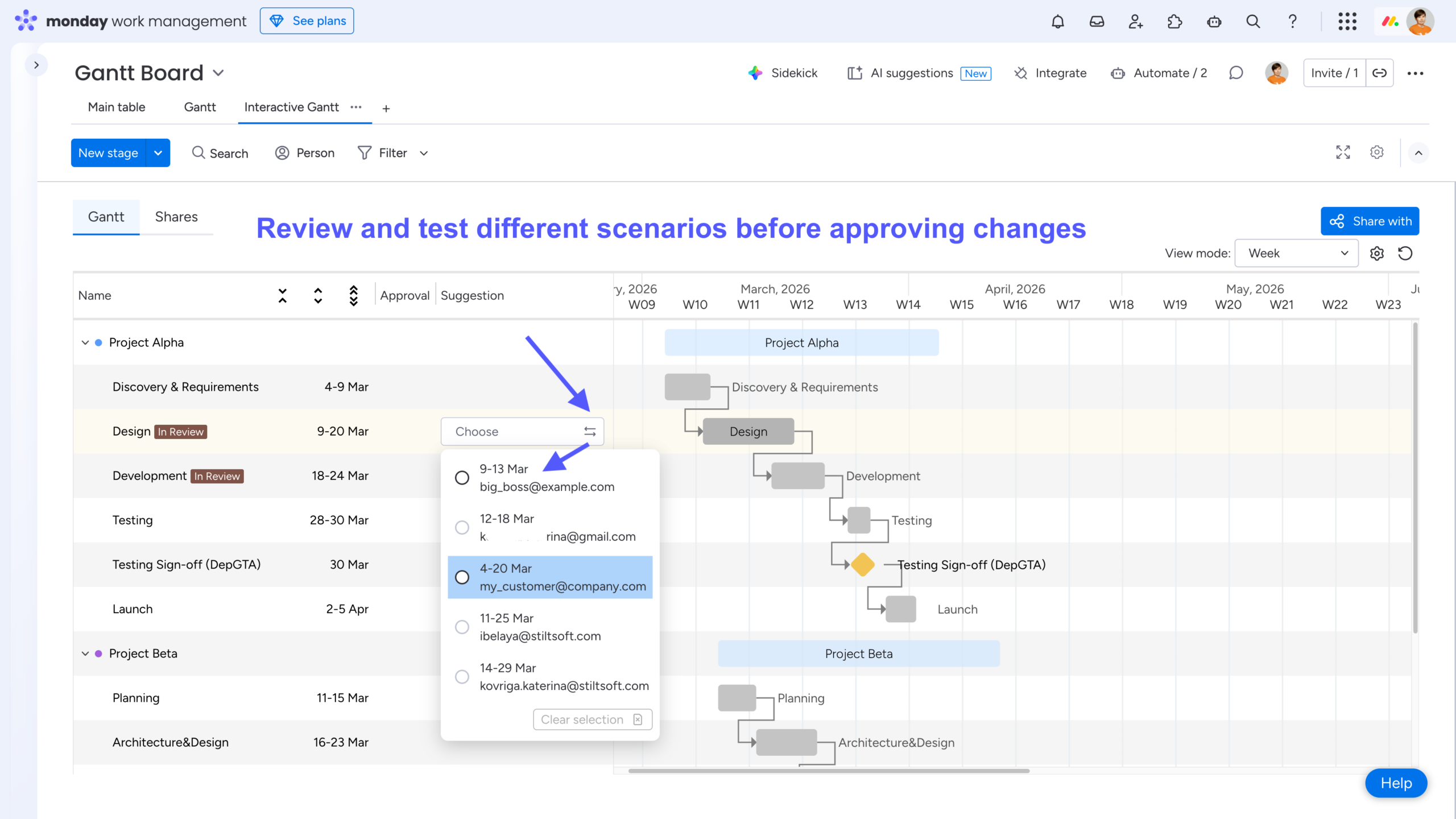
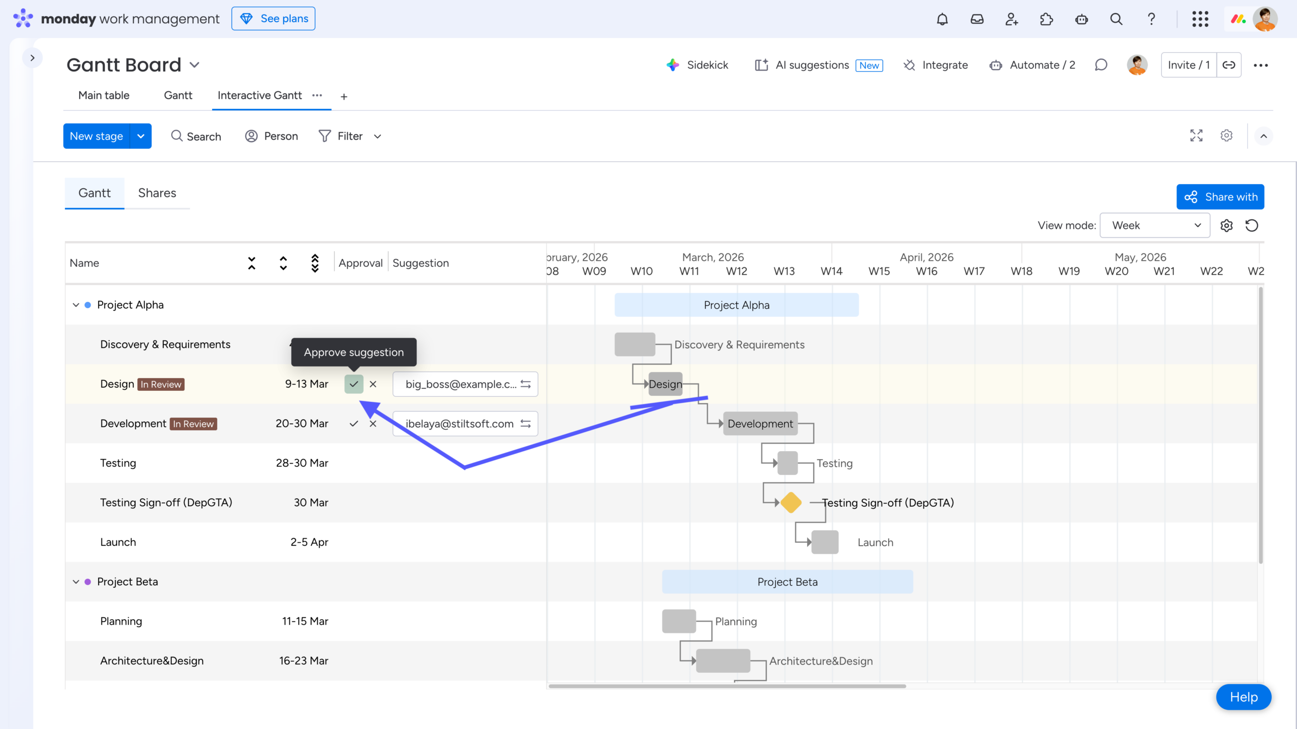
In monday.com, you can review all received suggestions for a timeline bar – even if there are multiple suggestions for the same item – and preview how each one would affect the current schedule. You can then approve the selected suggestion (all others will be automatically marked as rejected) or decline them all. Once approved, the updated timeline is automatically reflected on your board. You can also reply to reviewers’ comments (these replies will appear as item comments on the board).
The corresponding reviewers will be notified about your actions both in their guest view and via email.
💡Takeaway: Use Interactive Gantt Timeline to discuss project changes directly with clients. A single live timeline allows customers to suggest updates while project managers review, test, and approve changes in context, reducing feedback loops and improving collaboration.
Wrap-Up
Gantt charts are far more than a project-management tool for IT teams – they’re a powerful way to plan, communicate, and align work across almost any type of initiative. When used thoughtfully, they become a living timeline that helps teams stay focused, adapt to change, and deliver on time.
To get the most value from Gantt charts in monday.com, remember these five key tips:
-
Use Timeline columns instead of single Date columns to gain flexibility and better performance.
-
Add dependencies to instantly visualize task relationships and understand how changes impact the plan.
-
Use baselines to track progress over time and compare your current schedule against the original plan.
-
Leverage automations to keep timelines and statuses in sync as the project evolves.
-
Discuss the schedule with customers and stakeholders to align expectations before and throughout project execution.
By combining the right structure, visualization, and automation – and by making schedules easy to share and review – you turn your Gantt chart into a true source of truth. Tools like Interactive Gantt Timeline help extend this value beyond your team, enabling clear and effortless collaboration with customers and stakeholders, even outside of monday.com.
Used correctly, a Gantt chart doesn’t just show the plan – it helps you keep it.
FAQ
How to make a Gantt chart in monday.com?
You can add the native Gantt view as a Board View or a Dashboard Widget to visualize your project plan. If you need to collaborate or share timelines externally, you can also use Interactive Gantt Timeline as a Board View and generate a Gantt chart from your existing board data.
How can I group and color my Gantt chart?
Open View Settings and explore the Group by, Label by, Color by, and Visual Settings options. From there, you can customize how your Gantt chart is grouped, labeled, and colored to best fit your needs.
How can I show subitems on a Gantt chart in monday.com?
To display subitems on a Gantt chart, open the View settings of your Gantt view and enable the Show subitems option. Once enabled, subitems will appear as separate timeline bars nested under their parent items, allowing you to visualize detailed task breakdowns and dependencies directly on the Gantt chart.
This is especially useful for tracking complex projects where each phase includes multiple smaller tasks.
Can I apply a fiscal year to the Gantt chart?
Yes. The Gantt chart supports the fiscal year option, which you can enable from the same View Settings menu.
However, this feature is not supported at the board level in monday.com. As a workaround, refer to the How to Use monday.com for Financial Management: Budgets, Tracking, and Reporting blog post – specifically the Custom Columns to Tailor Your Financial Workflows section.
Can I see which tasks must be completed to finish the project on time?
Yes. This is done using the Critical Path feature. You can enable it via View Settings → Critical Path → Show critical path. Once enabled, the tasks that directly impact your project’s end date are highlighted in red.
How can I share my Gantt chart?
You can export your Gantt chart manually as Excel or PDF, or schedule PDF reports to be sent to your colleagues automatically. To do this, use the Export button in the top-right corner of the Gantt View, or select Export from the three-dot menu.
If you need to share your schedule with customers or stakeholders outside of monday.com, you can also use Interactive Gantt Timeline. It lets you share a live Gantt chart via a guest link and collaborate without requiring additional monday.com licenses. See Tip #5 for more details.


