Best Practices for Сreating External Documentation Site in Confluence

We all love Confluence so much for the ability to have the information at hand, open and well-organized. It makes cooperation easy as a pie and saves us a lot of time. But when it comes to creating external documentation in Confluence for our products, we can get stuck.
The good news is that all we need is already in Confluence, and documentation for our products can be ready in a few hours. However, it can be challenging to quickly find the required information since it can be scattered across multiple Confluence pages and spaces. External users need to have limited access to all these pages and see only the relevant information. Moreover, an inexperienced user can easily be lost in Confluence. The interface we all love and find so convenient can appear not so intuitive for those who see a Confluence page for the first time.
You can be a little bit overwhelmed with all that given, however, the solution is simple yet powerful. Keep reading for the best practices for creating an external documentation site in Confluence Cloud.
Create a separate space for your documentation
For security and common sense reasons, we can’t let external users browse our whole Confluence instance. So let’s create a separate space for our product documentation and collect the information for our users there.
Confluence allows flexibility in access restrictions for separate spaces. You easily define what particular users or user groups can do across Confluence pages within a space.
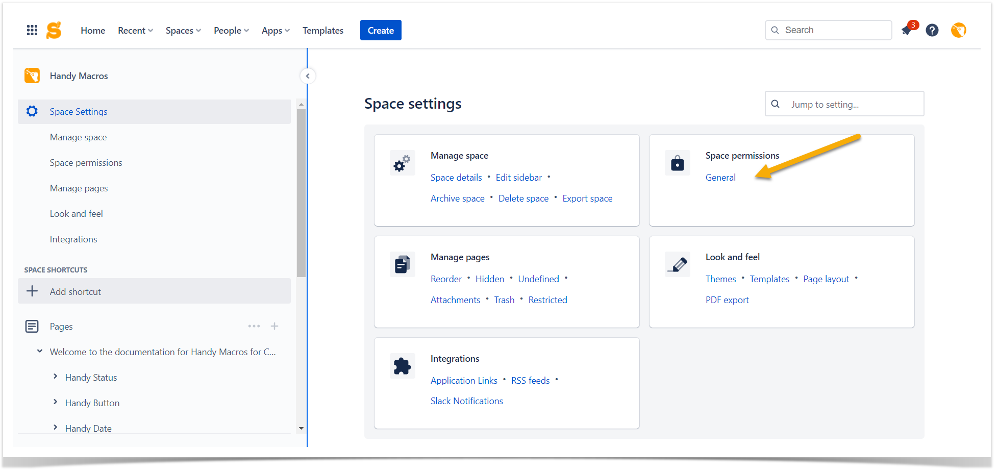
As we create product documentation, we need all users worldwide to access it. Anonymous access works great for that. Navigate to the Confluence sidebar, locate Space settings > Space permissions, and click General.
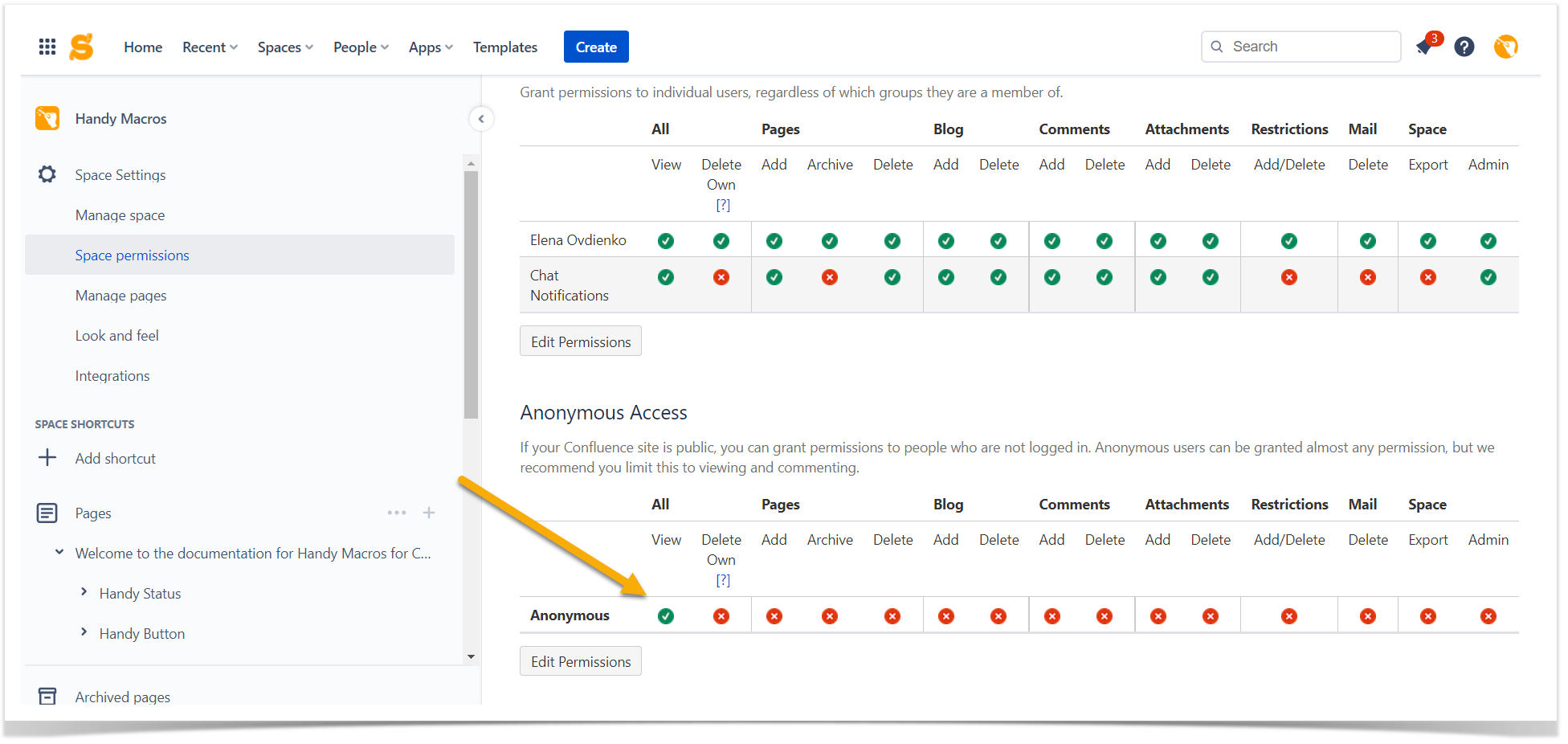
Scroll down to Anonymous Access. Here you can choose the permissions for all external users of your Confluence Cloud documentation site. Be mindful that you can grant broad permissions to anyone outside your organization. Limiting anonymous access to viewing and commenting is reasonable to ensure information consistency and quality. You can read more about space permissions in the Atlassian Support documentation. We suggest enabling only viewing permission for a documentation site.
In this case, you can be sure that your product documentation pages remain clean and concise. Commenting is a great thing, but it can be distracting on informational pages. There are other better ways to communicate with your users, and we’ll cover them later in this article.
Organize the information in your Confluence documentation space
Once you’ve created a separate space for your documentation site in Confluence and given access to anonymous users to it, you need to think about the page structure. Even the most valuable information can become useless when readers can’t reach it effortlessly.
It’s a good idea to start your documentation site with the page tree in mind. Spend some time thinking about the logical structure of your space. You can go even further and create a quick draft on a sheet of paper to consult it while creating Confluence pages.
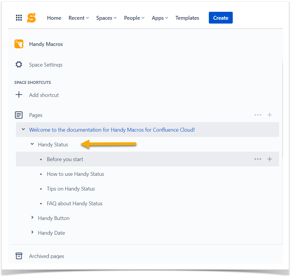
An apparent solution here is to create a home page with general information, parent pages for the main features of your product, and child pages for minor functions or details. You may also want to create separate sections for FAQs, releases, and other technical information. As a result, you’ll get a well-organized documentation site in Confluence that is easy to browse even for inexperienced users.
Other things to keep in mind
The devil is in the detail. All product owners know it for sure. When it comes to your product, you need to always be on top of things. Many great products remained unnoticed because of nuances like an irrelevant logo, title, or bad documentation.
Have you already created a product documentation space in Confluence? Presumably, you were even accurate enough in a space structure. It’s time to leverage your product documentation site with our tips.
Keep your page tree neat and skimmable
Create Confluence pages according to the chosen structure. Don’t make a complex structure where users can get lost. Believe it or not, 2-3 levels of child pages can be complicated enough for your readers. Don’t go overboard.
Keep page names simple
Don’t give readers a reason to quit. Create Confluence pages with short names. The ugly truth is that people are lazy by nature. Who would love to open the page with an academic name like “A technical documentation covering the engineering implementation, functionality, and out of scope issues of a Confluence inline macro for status tracking”? And what if you place the same information under the “Handy Status” title? It looks like this option has a much higher chance of getting read.
Be consistent
Choose the principle of page naming and follow it throughout your documentation. We love to see something known and traditional. No need to vary your page names from section to section. For example, you have a page “How to use Handy Status.” Once you create another one about Handy Date, you may write “Using Handy Date.” The idea is the same, but this inconsistency would distract readers. Stick to one model throughout your Confluence space.
Create a beautiful Confluence page for your documentation overview
Documentation sites in Confluence are easy to set up, but they can be plain and look boring for external users. A landing page with the Children display macro for navigation seems intuitive for you, but it can turn out to be unattractive in your readers’ eyes. In the end, the primary purpose of our documentation site is the satisfaction of our end user. They refer to our documentation expecting to get quick answers to their questions. Their customer journey on our public Confluence site depends on us so let’s make it a smooth adventure.
Highlight the key features of your product
You’ll be surprised, but the visitor of your documentation can know little about your fantastic product. Many users start the evaluation of the product with its documentation. They will walk through the functionality you describe deciding whether your product is worth a trial period. Use this insight to your advantage – create a top-notch documentation site demonstrating the best of your product.
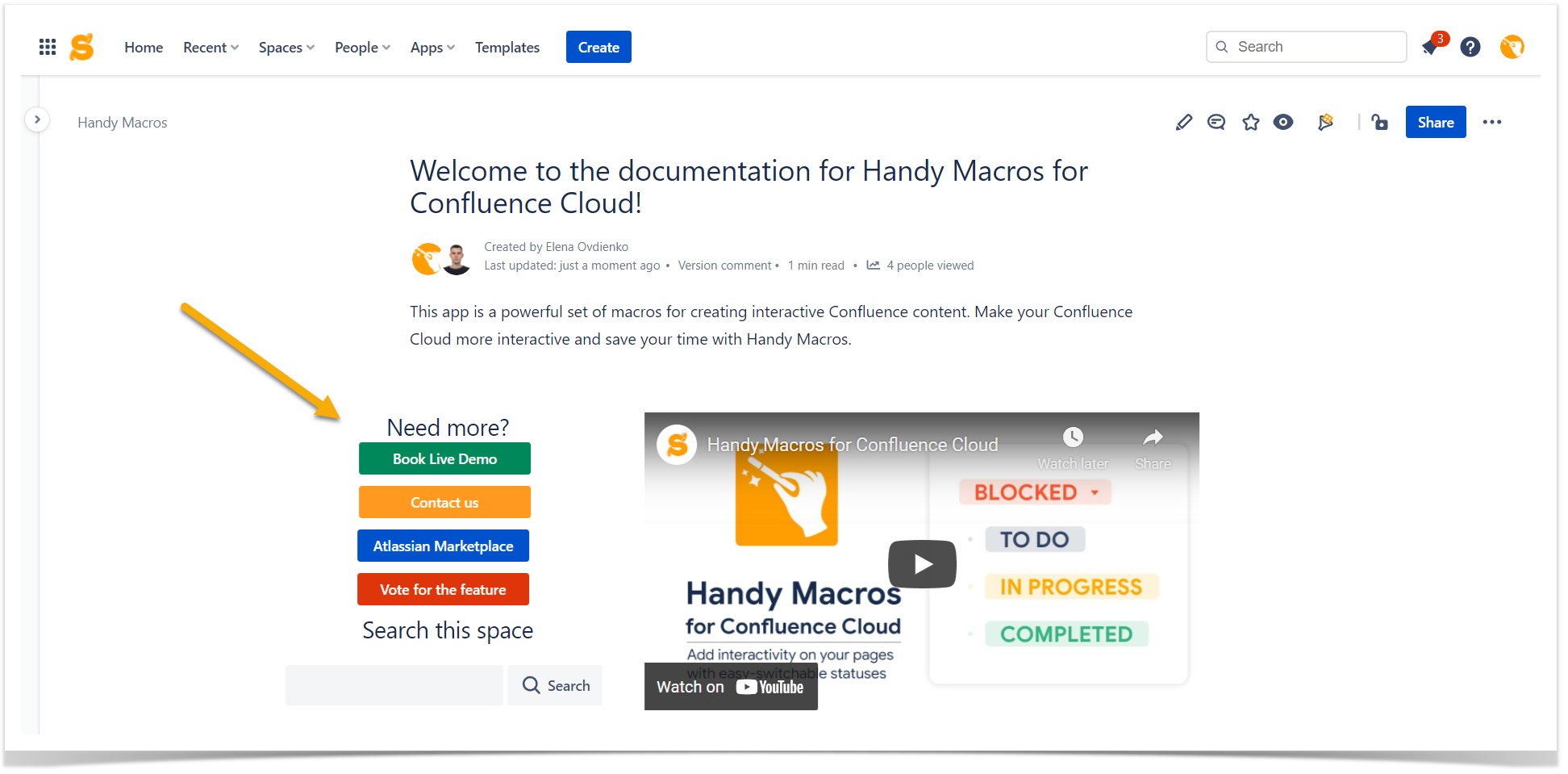
The main page should be concise but informative. Create an attractive page with a brief product description, point out the key features with the bullet list, and add links to the detailed technical description.
Embed video in Confluence
We’re pressed with time and want to proceed with daily tasks as quickly as possible. Add a short demo video to help users learn more about your product.
In Confluence, you can insert links to your Youtube videos in several ways.
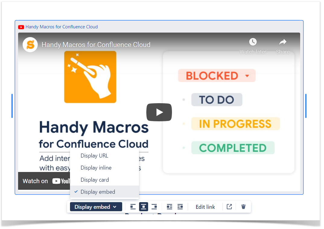
First, you can insert the link to your video directly into the Confluence page. Choose the way the link is shown on a page. For better visibility, we advise the Display embed option.
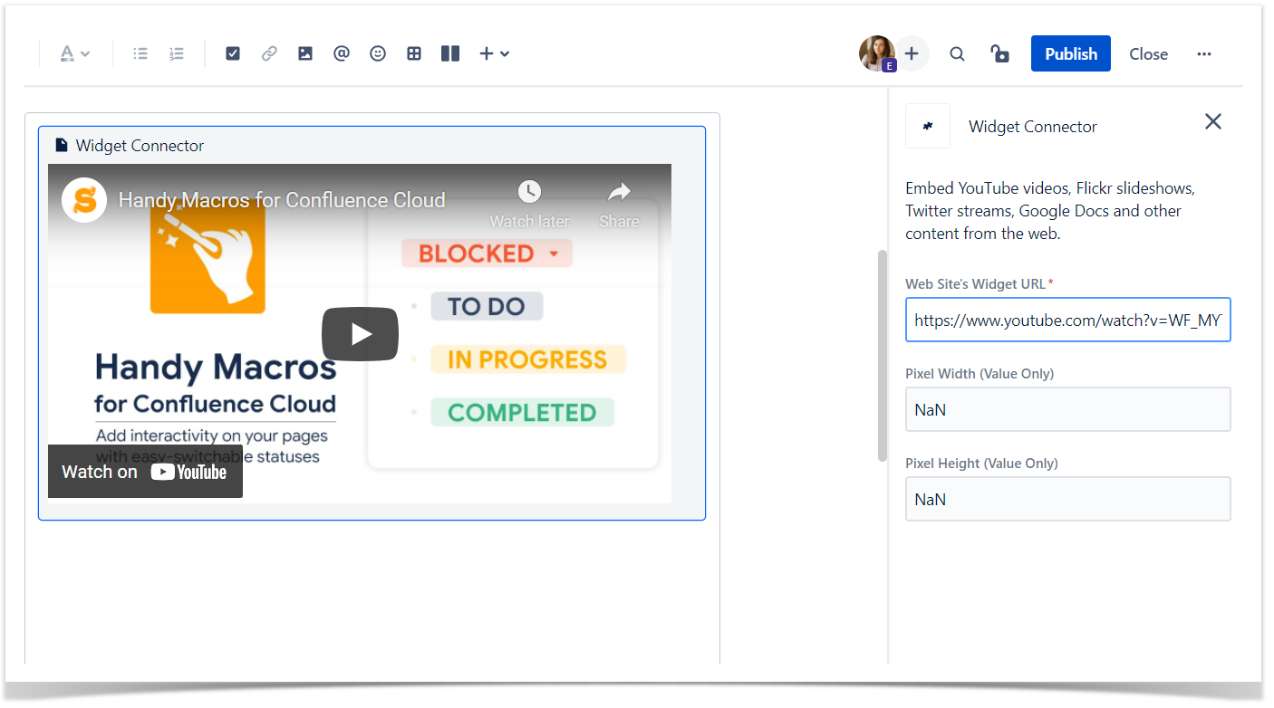
If public links are disabled for your Confluence instance and you want anonymous users to see them, use the Widget Connector macro. It allows you to embed Youtube videos, Flickr slideshows, Twitter streams, Google Docs, and other content from the web into Confluence pages in a few clicks. You can choose the source address and the preferrable size of your media. With this method, you can be sure that even anonymous users will reach the content on your page once you allow the public access to it.
Add a call to action to your Confluence page
Our documentation is another touchpoint with our users. Let’s benefit from it. Add an effective call to action to your main page to trigger additional contacts between you and your site visitors. This could result in long-term relationships in the future. The only thing here is that your call to action needs to be appealing and easy to locate on Confluence pages.
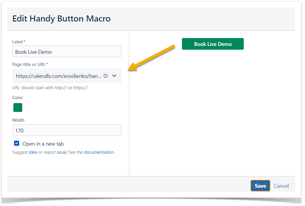
At Stiltsoft, we use the Handy Button macro for that. It’s a part of the Handy Macros for Confluence app. It allows you to create Confluence-like buttons and customize their color and size. Another great thing is that you can easily reuse your Confluence content as Handy Button can lead to an external address or an internal Confluence page.
We suggest creating noticeable links somewhere on top of your documentation page so that users can see them without scrolling the page.
Show the product roadmap
Your customers could be interested in the information about upcoming releases. The features you are working on can become your strength when your users know about them. Don’t go deep here, a short plan overview will be enough.
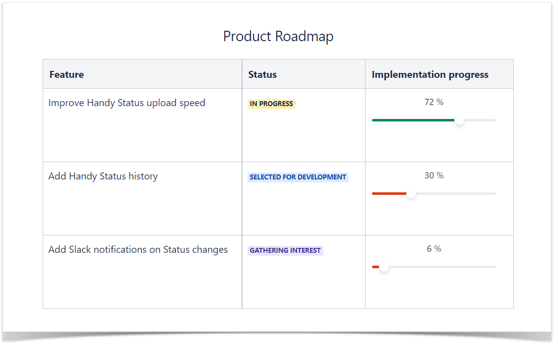
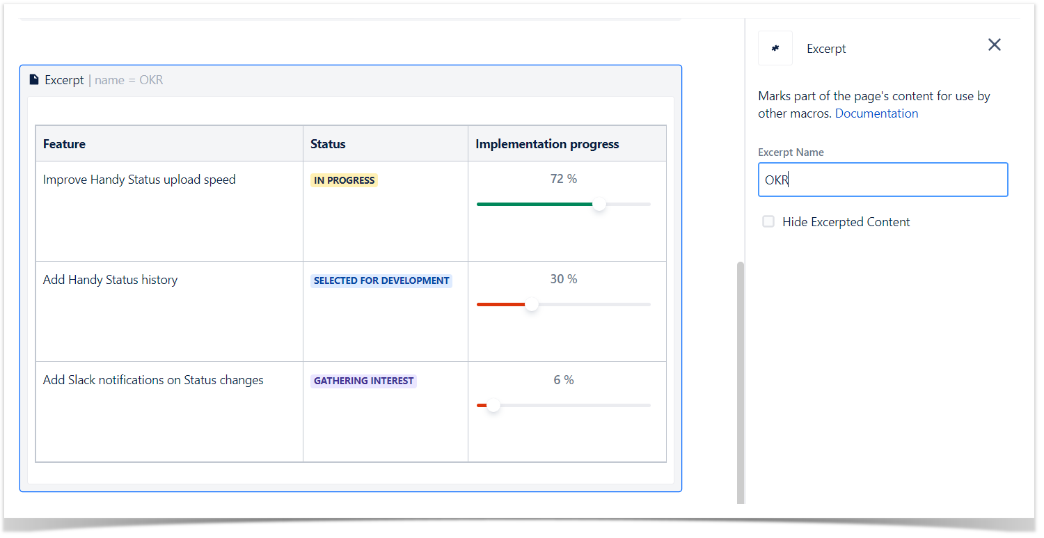
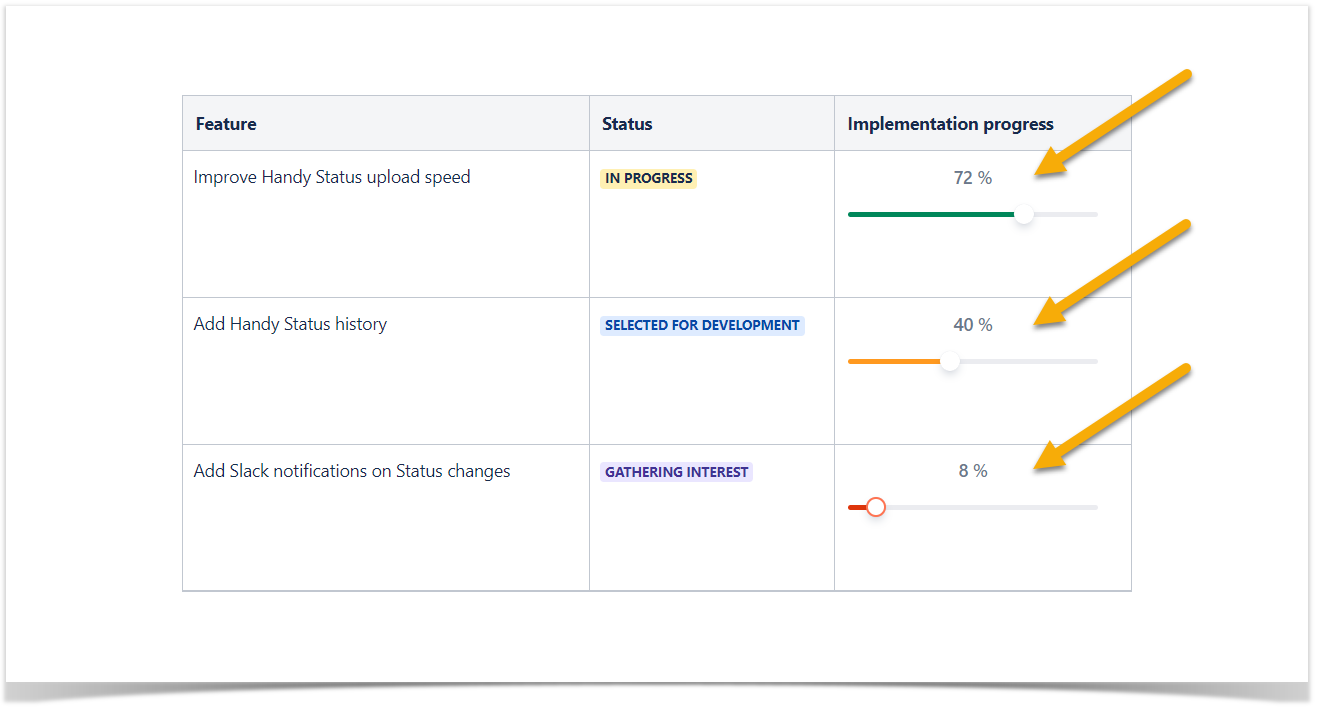
You can show a table with the product development progress from your product dashboard. Here’s an example that we suggest.
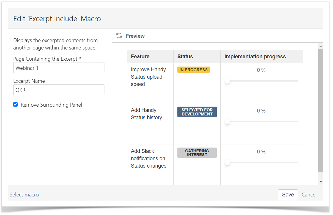
Simple as it is, this table gives an overview of what to expect from the product in the next few months. The user sees the feature itself, its status, and progress. To ensure that the information is always up-to-date, put the content from your product space into the documentation page using a combination of the Excerpt and Excerpt Include macros. This way, you can rapidly reuse the existing table on several Confluence pages. Once the values of the original table change, reused tables will be updated automatically.
You can effortlessly create these dashboards in your space. Your team will benefit a lot from focusing on the essential things. To start with, add the Excerpt macro to your page, create the table with statuses, add sliders for progress management.
You can add the native Confluence Status macro. Type /Status to add it to the page.
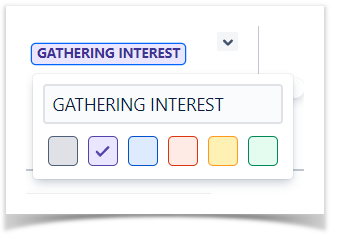
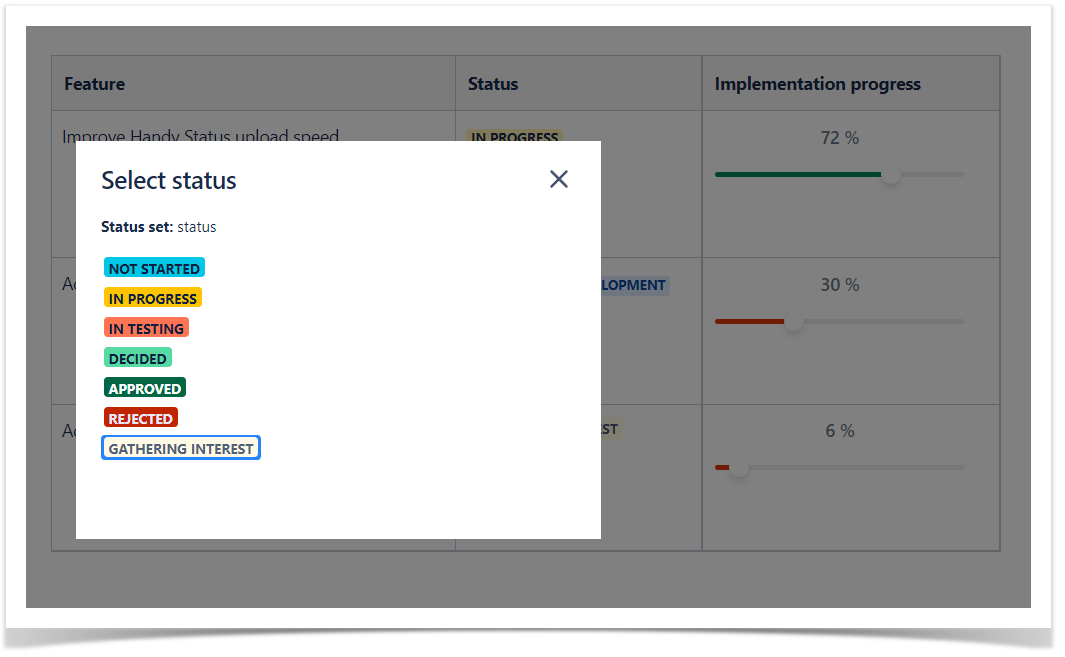
Another solution is Handy Status, a macro allowing you to create a custom set of statuses and easily switch them in the page view mode.
Handy Slider is another macro from the Handy Macros for Confluence app. It can transform your table into an interactive infographic in a second. Just type /Handy Slider, insert it to the page, and set the value. The macro coloring changes based on its value, making progress tracking even more accessible.
You can change Handy Slider in the page view mode. But no worries here. Anonymous users won’t affect your data as they can’t change the Handy Slider value on a page.
Highlight the relevant content
Even though you have created an excellent documentation structure, it’s reasonable to put links to the pages frequently read by your users on the main page.
Keep these bullet lists short. Too many highlights can affect your readers in an opposite way leading to distraction from the key points.
Provide additional navigation
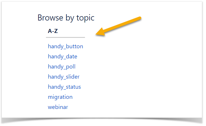
Your readers are newbies to your Confluence site. It’s your role to help them look around. Why not add some more navigational tools? Add the Labels list macro to create a list of labels used in your Confluence documentation space. If you’re accurate enough to update labels for your pages, you’ll get quick navigation by topic, like this one:
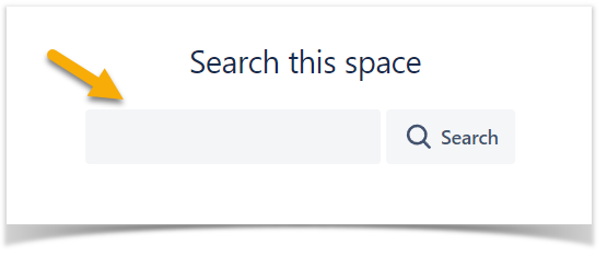
A search bar is a must-have for an external Confluence site. It’s probably the best way to locate the necessary information in a few seconds. Use the Livesearch macro to embed a search box into your Confluence page to show search results as you type.
You can customize its look in the settings to satisfy your needs better.
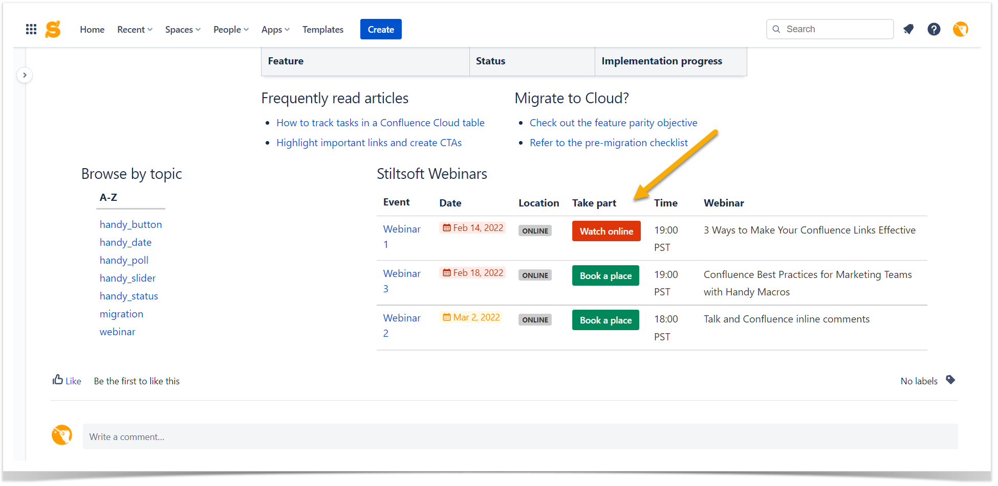
Share the event agenda
If you organize webinars, meetings, or other events related to your product and best practices, you can promote them on your Confluence documentation site. The audience coming to read about your product is presumably interested in your educational content.
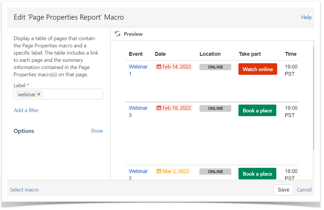
You can put an announcement of upcoming events in a table generated with the help of another Confluence native macro, Page Properties Report. When combined with Page Properties, it collects the tabular data across multiple Confluence pages based on the selected criteria.
As a result, in our example, we get a brief table overview of the webinars described on three different Confluence pages.
With Handy Macros for Confluence, you can go even further and add some dynamic macros to this table.
Handy Date is a great way to highlight the dates of future events for our use case. This macro enriches your experience with date operations in Confluence. You can change the date in the page view mode and choose the date coloring.
Add Handy Buttons to create clickable buttons on your Confluence page. Once you do it and provide the links to your webinar registration or stream record, your users will be able to enroll and take part in your events right from the documentation site.
Move on to your external documentation
Confluence empowers its users with great tools for any need or purpose. Now you see how to organize an external documentation site without any additional development or engineering skills. Just use the native Confluence macros in combination with Handy Macros for Confluence. You can try the app for free on the Atlassian Marketplace to see how you can benefit from it. If you still have questions, don’t hesitate to contact us.


