


Top 5 Reports from Jira and Bitbucket to Get the Most of Your Sprint Retrospective

In the previous post How Project Managers and Scrum Masters Use Confluence for Project Monitoring, we showed how management professionals use Confluence to build a dashboard based on data from Jira and Bitbucket for project monitoring. In the present article, we move on to the second part of the dashboard. It contains reports showing what went well during the sprint and what needs to be worked on. The dashboard provides you with the visualized data for analysis during the sprint retrospective when the team can inspect itself and plan the improvements to be enacted in the following sprints.
Analyze what’s been done: Pull Request Activities charts
The Pull Request Activities chart shows the number of pull requests by state and comes in two variants: pull requests grouped by a repository or by a user.
By looking at these charts, you can identify if there were any problems in teams working in the same repos, see how much each person managed to do, and use these insights in future sprint planning. For example, if you see there were a lot of declined pull requests during the sprint, there could be some problems in the teams’ arrangements, so this is a perfect occasion to discuss and resolve them.
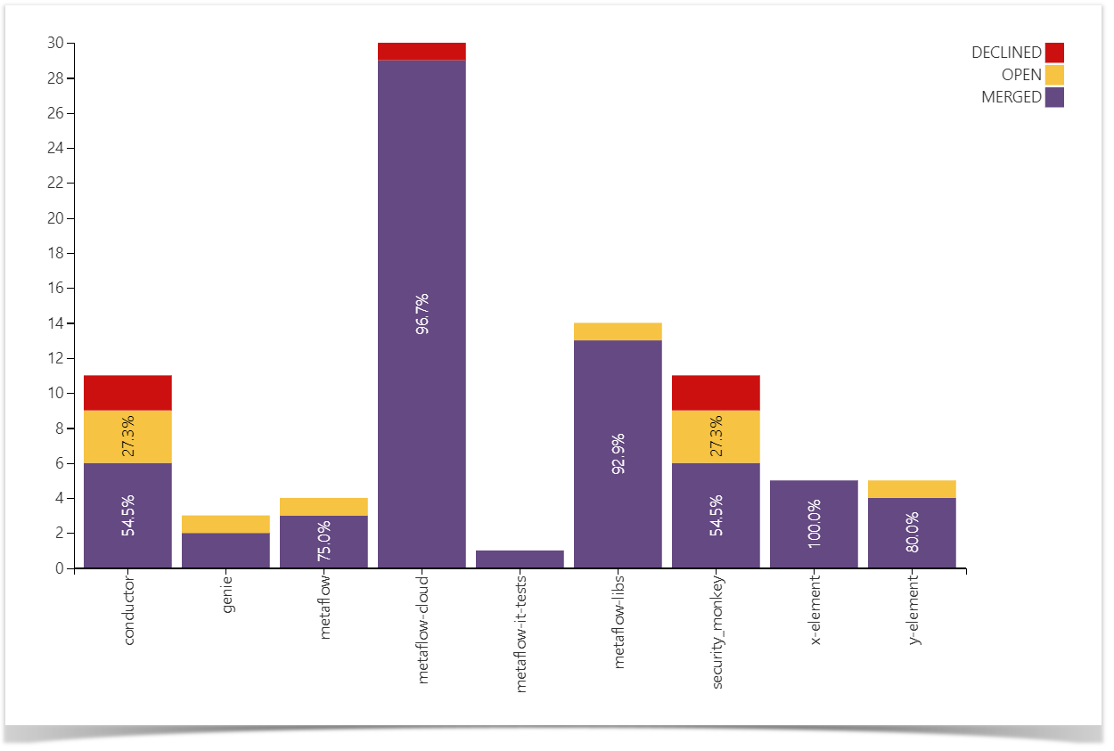
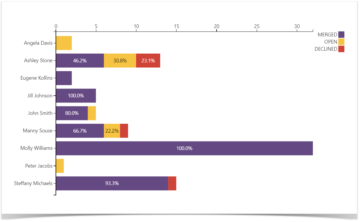
One more point to consider is the number of open pull requests at the end of the sprint — you need to count them in if you want to predict whether you’ll be able to complete work on time in the next sprint.
Follow the instructions to build these charts.
Learn, plan and improve: Pull Requests Gantt chart
The following chart can give your team an understanding of how long the pull requests take to resolve. It can help you predict using historical Git data if your team can finish the tasks by the end of the sprint.
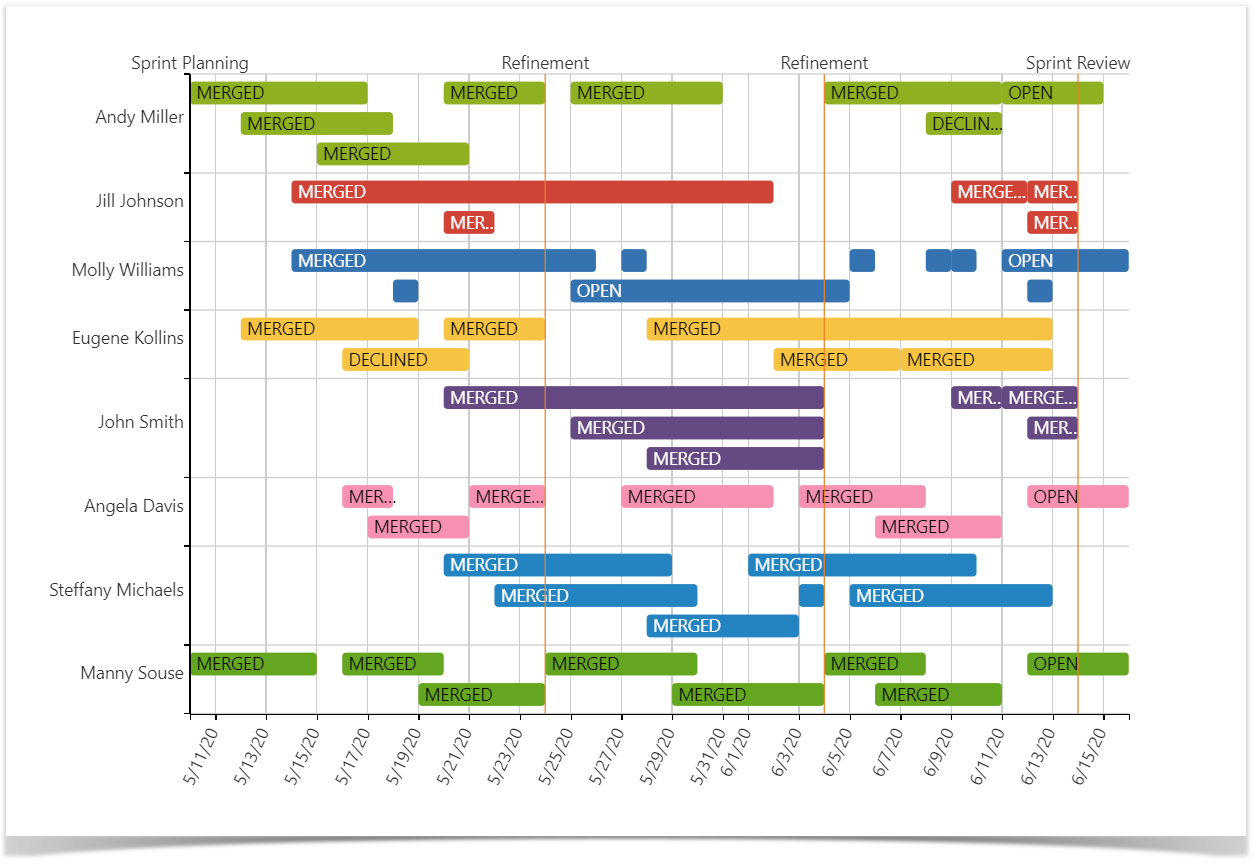
To make realistic predictions, you need to look at the average age of PRs created by the author. If a developer is junior or new to a particular repository or project, they tend to make more mistakes, or they are subjected to more thorough reviews and testing, which potentially delays their PRs, which you need to consider in your planning. Your ideal models will be the users with sets of “colorful bricks” of almost the same size, as they will probably tend to follow the accepted practice.
One more thing that you can pay attention to is the case when a pull request or a few are closed by the very end of the sprint. It could be a sign that the author was hurrying to meet the deadline, which might be the result of review delays or just carelessness, so keep that in mind.
Check out the guide to learn how to build this chart.
Find out who did what: Activity graph
Activity Graph is made to help you know what everybody was doing during the sprint in terms of commits, pull requests, Jira issues, and meetings.
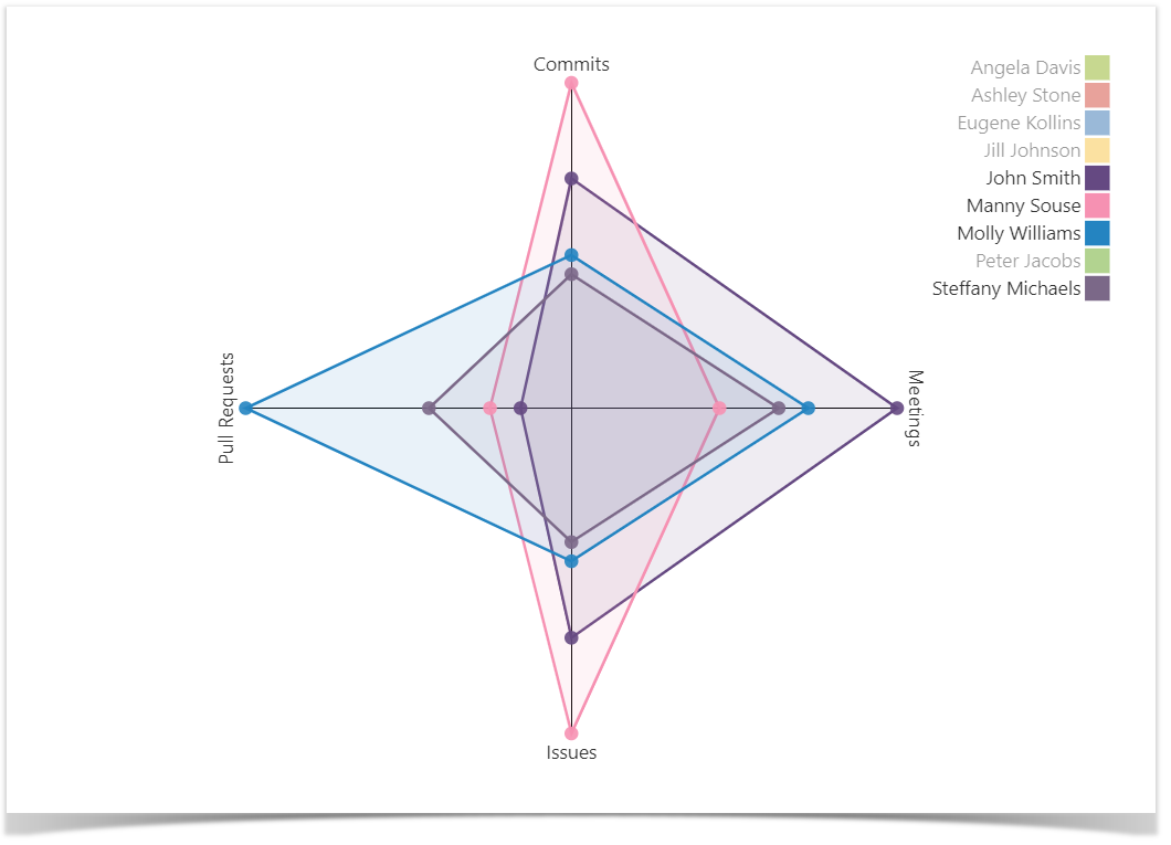
The Activity graph helps you visually compare the distribution of the workload.
The idea behind it is that predictions based on engineering metrics are great, but even a few calls or meetings can slow down the processes. In research by Harvard Business Review, 65% of senior managers said that meetings keep their teams from completing their work. That’s why you need to look at who does what, identify bottlenecks, and manage the processes so that there are no obstacles nor reasons for delays. You can determine who is spreading themselves too thin and find those who are not actively involved. It’s evident that if you expect active development from your engineers and they are stuck in a series of meetings, it won’t work.
Using these metrics, you can understand why the team is moving with such speed and how the changes in the processes affect the team dynamics.
Learn how to build Radar (Spider) chart type.
Count it up: Velocity graph
And the last, but not the least thing when we look back on the finished iteration, is calculating velocity.
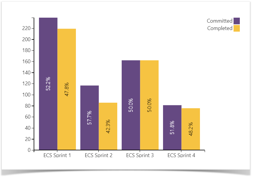 The Velocity graph shows the ratio of story points committed vs. story points completed during the sprint.
When we plan a new sprint, we should consider the information about story points performance in the previous sprints. This way, we can observe the trends, make some conclusions, and change the planning approach if needed. For example, we can calculate the average number of story points completed within one sprint (velocity) and stick to this value in the following sprints. And after that, as more data about finished sprints is accumulated, you can plan much more accurately.
See a full guide on how to work with this graph.
Put it all together
The graphs and charts illustrated in this and the previous article make up the multifunctional dashboard for project management, aimed to give you reporting insights based on data from Jira and Bitbucket, which we presented in the Project Management Dashboards in Confluence webinar.
If you would like to build similar charts and graphs on your own, try the Table Filter and Charts for Confluence and Awesome Graphs for Bitbucket apps for free.