3 Ways to Make Your Confluence Links Effective

Confluence is a powerful collaborative tool for companies of all sizes. Bringing teams together in this new post-COVID-19 reality, Confluence makes it easy to stay tuned, share opinions, and exchange information.
Why Confluence?
When many team members still try to eliminate social contacts, organized Confluence pages become a single source of truth. What’s the key? Simplicity and speed. You can work without switching between messages in Slack or Yammer, documents in Google or Microsoft Office, and tons of emails in your inbox. The Confluence page is a great place to create, edit, and share content. What makes it even more valuable is the ability for inline discussion and collaboration. But is the situation so clear-cut?
What can go wrong?
As with any field of our life, it all differs. Confluence pages are great; some problems can still arise. Have you ever experienced frustration looking at endless pages piled with multiple text fragments from various authors? Trying to find something usually turns out to be pick-and-shovel.
Or remember the last time you worked on some page in a space shared by the whole company? You’ve done a great job performing deep analysis, adding lots of insights, and sharing valuable links with your colleagues. You’ve even shared a Confluence page with this information to make sure it won’t go unnoticed. What happens next? Your team just looks through your work in a minute to never get back to this page again. All your ideas remain overlooked, no links are followed, and no improvements happen. Sounds not so cool, right?
The reason is as easy as pie: we are overwhelmed with information, so it should be well-organized to get noticed. Collecting and analyzing data is not enough. Organizing information and delivering it in small chunks is key.
How to add noticeable links to Confluence pages?
At Stiltsoft, we love to create neat Confluence pages with valuable sources for internal use. Even if initially written as a personal draft with a flow of thoughts, any new page can become a masterpiece as it progresses. So it’s our common practice to structure information on pages in an easy-to-read manner. We often use links to internal and external sources on our pages.
Check out our top three ways to organize links in Confluence. With them, you can be sure your team never misses a thing on a page or skips a vital link.
Highlight your link for better visibility
This advice sounds like a joke, but it works. Use bold type or italics, change the font size or color. It may seem like extra work, but the result makes it different. Which part of the page do you like more?
A few mouse clicks can change how your Confluence links look across pages. Best practices can be easy but effective in creating beautiful Confluence pages.
Add link previews for higher engagement
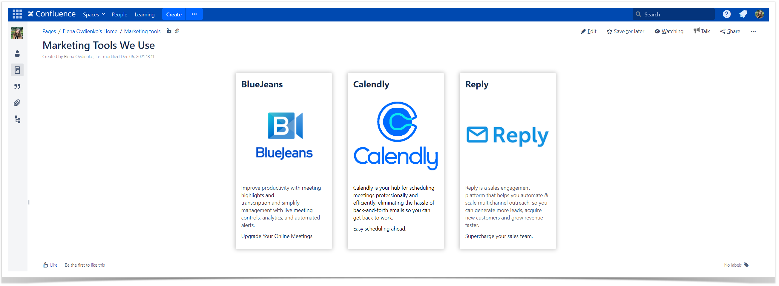
When you need to draw attention to particular links, their content previews work excellently. At Stiltsoft, we use Handy Cards (also available in Cloud) for this purpose. It’s one of many macros available in Handy Macros for Confluence. Using intuitive macro settings, you can create clickable links to Confluence pages or any external URLs.
Handy Cards are highly customizable and allow you to add links with previews for Confluence child pages or pages by labels, choose column or size layout, sort generated cards by creation or update, and many more. The rich functionality of Handy Cards makes it possible to link any web address to it and define its preview.
You can use Handy Cards as an alternative to the native Children Display macro. It’s a quick way to get an organized overview of all pages linked to the parent page. In a few clicks, you get a structured and engaging Confluence page.
Use buttons for CTA
Once you have a link all page readers need to follow, Handy Button is a great idea. It transforms your link to a clickable Confluence button with the text you define. Handy Button is also a part of Handy Macros for Confluence (also available in Cloud), and it works out-of-the-box. All you need to do is to choose the color and name for your URL. After that, you’ll get a Confluence style button on your page that is noticeable even while skimming the page.
What else?
Feel free to share your best practices of working with links in Confluence. Remember, the more we improve, the more effective our processes become.
If you are interested in any other macros from Handy Macros for Confluence, contact us by clicking the button below (and yes, this is a Handy Button ).


