


Table Filter and Charts with dynamic spreadsheets in Confluence

We continue our series of blog posts featuring different use cases of applying Table Filter and Charts add-on in Atlassian Confluence. Our recent posts outlined the ready-to-use recipes of how to work with the Page Properties Report macro, manage dynamic tables created with Scaffolding, analyze team performance with the JIRA Issue macro, and handle data collected with ConfiForms add-on.
In this post we will show you how to work with spreadsheets in Confluence and apply dynamic formulas for data calculation with Spreadsheets add-on from Valiantys. After this you can take advantage of capabilities provided within Table Filter and Charts add-on, such as data filtration, aggregation in pivot tables, and visualization with dynamic charts.
It’s time to start!
Spreadsheets for Confluence
It is not a secret that when you get used to something it is very difficult to live or work without this thing. All users who were actively working in Microsoft Excel know this kind of problem once they have transitioned to Confluence.
Fortunately for them, Valiantys team has designed a solution that can become a replacement of Excel spreadsheets in Confluence.
With this add-on you can create a new spreadsheet from scratch, display the already attached file, or upload a new Excel book on the fly. So you have quite enough ways to create and manage your spreadsheets in Confluence.
Valiantys team did their best to migrate the refined Excel experience to Confluence, so you will not notice any changes while working on your spreadsheets there. You can perform all the basic operations that you get used, as follows:
- manage the format of data in cells;
- style the cells and values in the them;
- add or remove decimal places in numerals;
- insert columns and rows;
- run basic filtration and sorting.
The special thing that we need to point out is support for formulas. Yeah, the good old formulas that made Excel one of the best tools for data evaluation and reporting. Valiantys team has implemented all the most popular formulas, so now you can perform all the key mathematical and analytical operations on your data.
Tracking monthly product orders
Our use case will feature the way how you can manage product orders in Confluence with Spreadsheets and Table Filter and Charts add-ons.
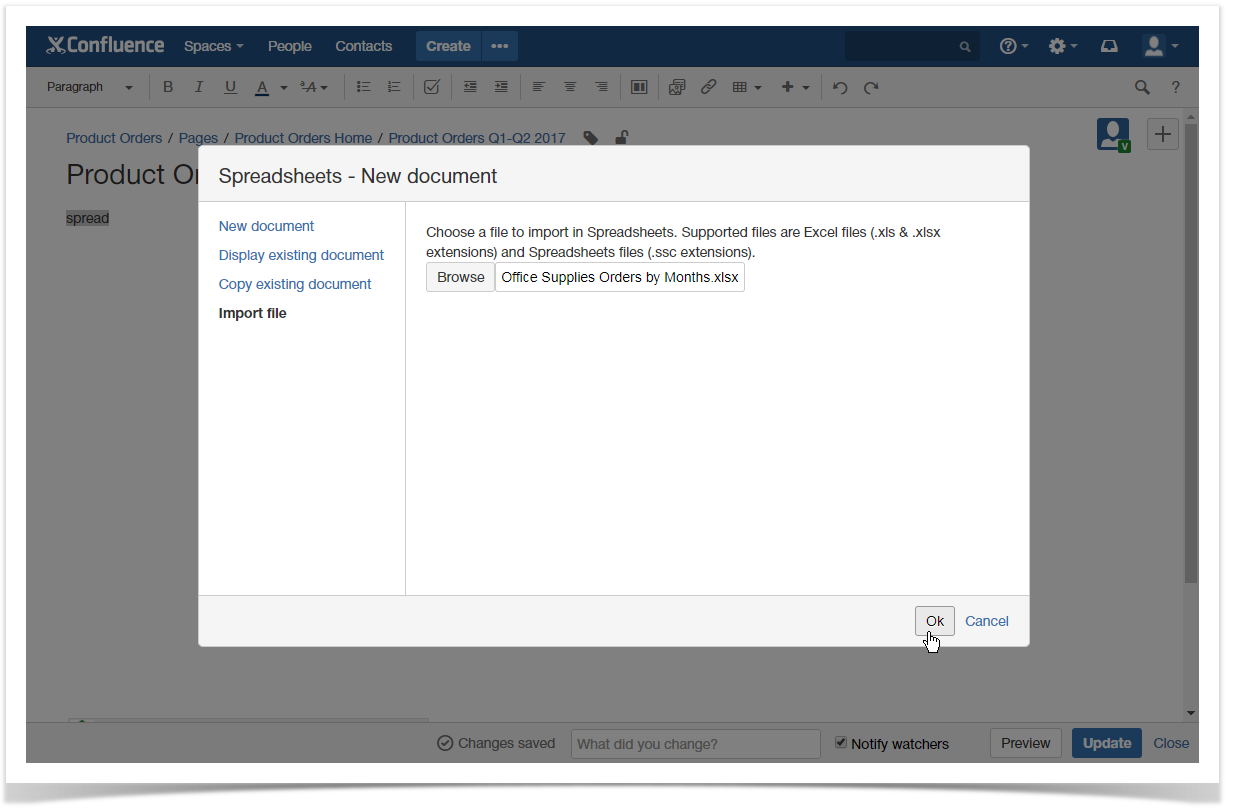
The sales manager tracks orders from different stores in a single Excel spreadsheet. After a month, the collected data is imported into Confluence through Spreadsheets add-on. For doing this, the manager needs to insert the Spreadsheets macro on the page and select the file on his machine for upload. After clicking Ok, the add-on will load the selected spreadsheet and display it to you for further work on it.
Spreadsheets add-on supports the formulas created in the original Excel file, so all the supported formulas will be preserved as is. In our case the sales manager imports the raw data, so all the further calculations are performed through the add-on. The spreadsheet includes six sheets, each one is displayed as a separate tab.
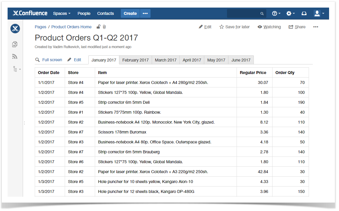
The original table includes the following information:
- Order date – date when product items were ordered.
- Store – store number which the ordered items are supplied to.
- Item – item which is ordered.
- Regular Price – regular price for one piece.
- Order Qty – quantity of ordered items.
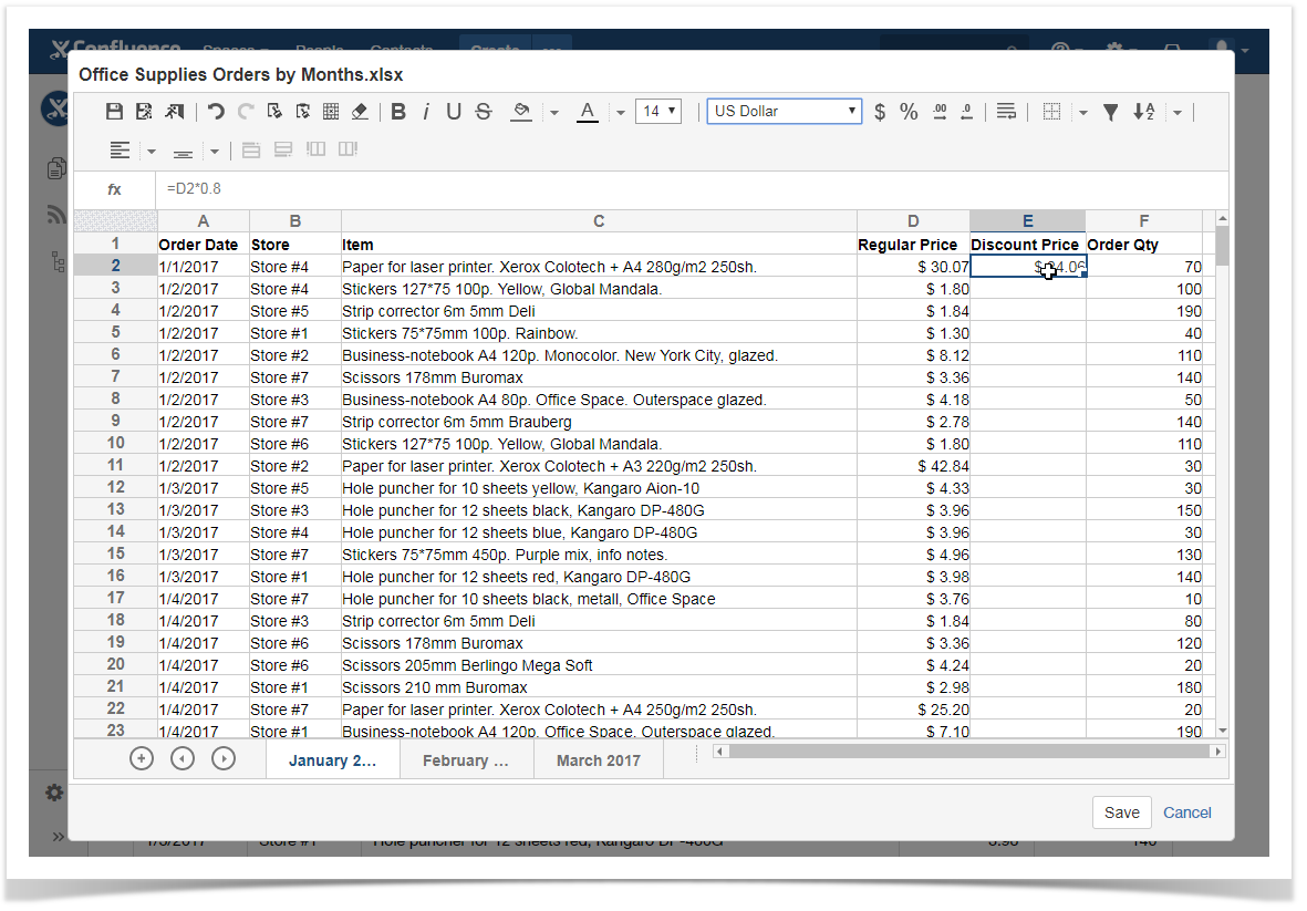
Now the sales manager needs to perform some calculations on this raw data. The initial thing which he does is applying the currency format to the column with regular prices. Then the manager adds the Discount price column which calculates the wholesale price (80 per cent from the regular price) for supplies of 50 or more pieces of the same item. The manager can further choose the cell with the formula and drag it down to propagate to the rest of entries.
Then the manager adds the Subtotal column and uses the formula with the IF condition to calculate the sum for ordered items based on the regular or discount price depending on the ordered quantity:
=IF(F2>=50;F2*E2;F2*D2)
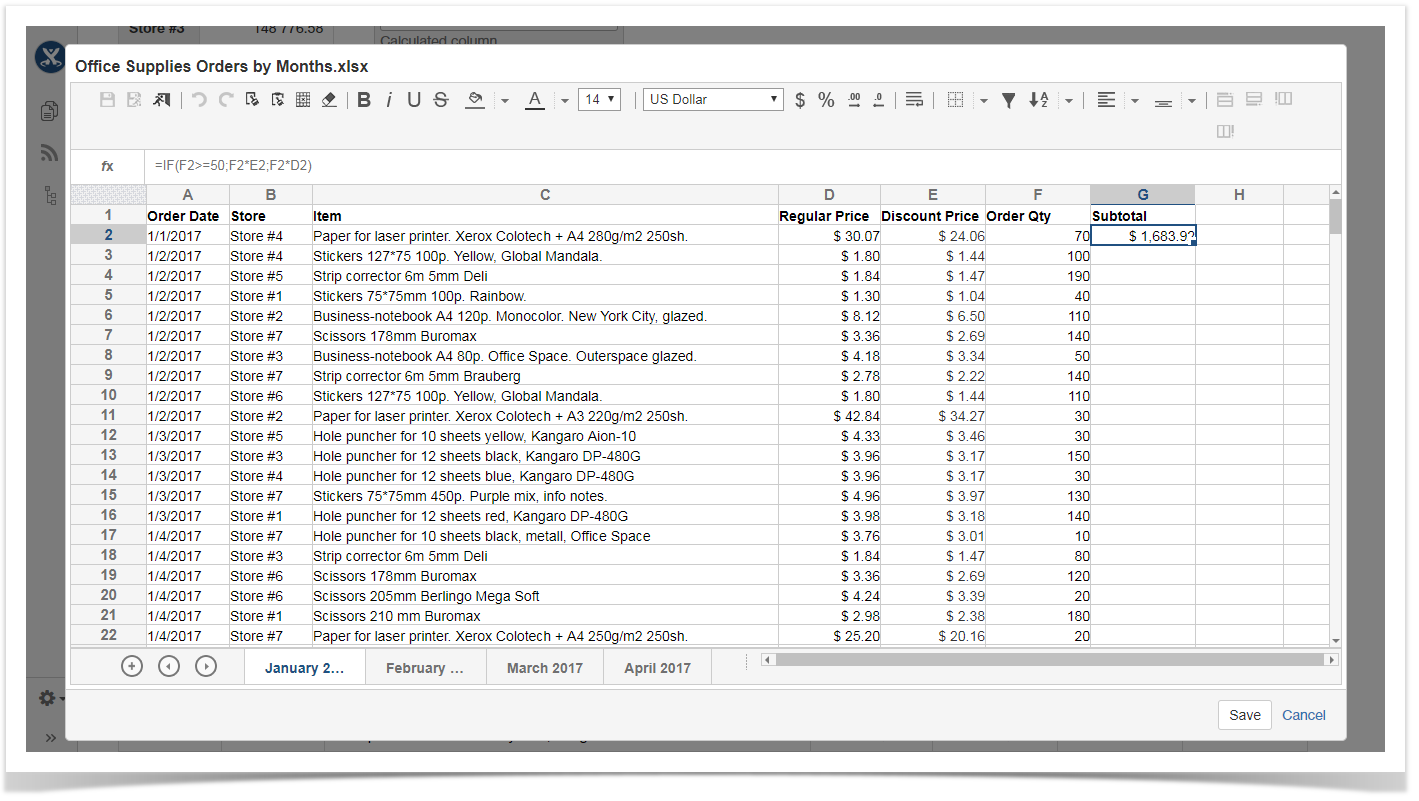
The formula in the cells is automatically updated once you propagate it to the rest of cells. When all the basic calculations are done, it’s time to sum up all the information.
Data Analysis with Table Filter and Charts
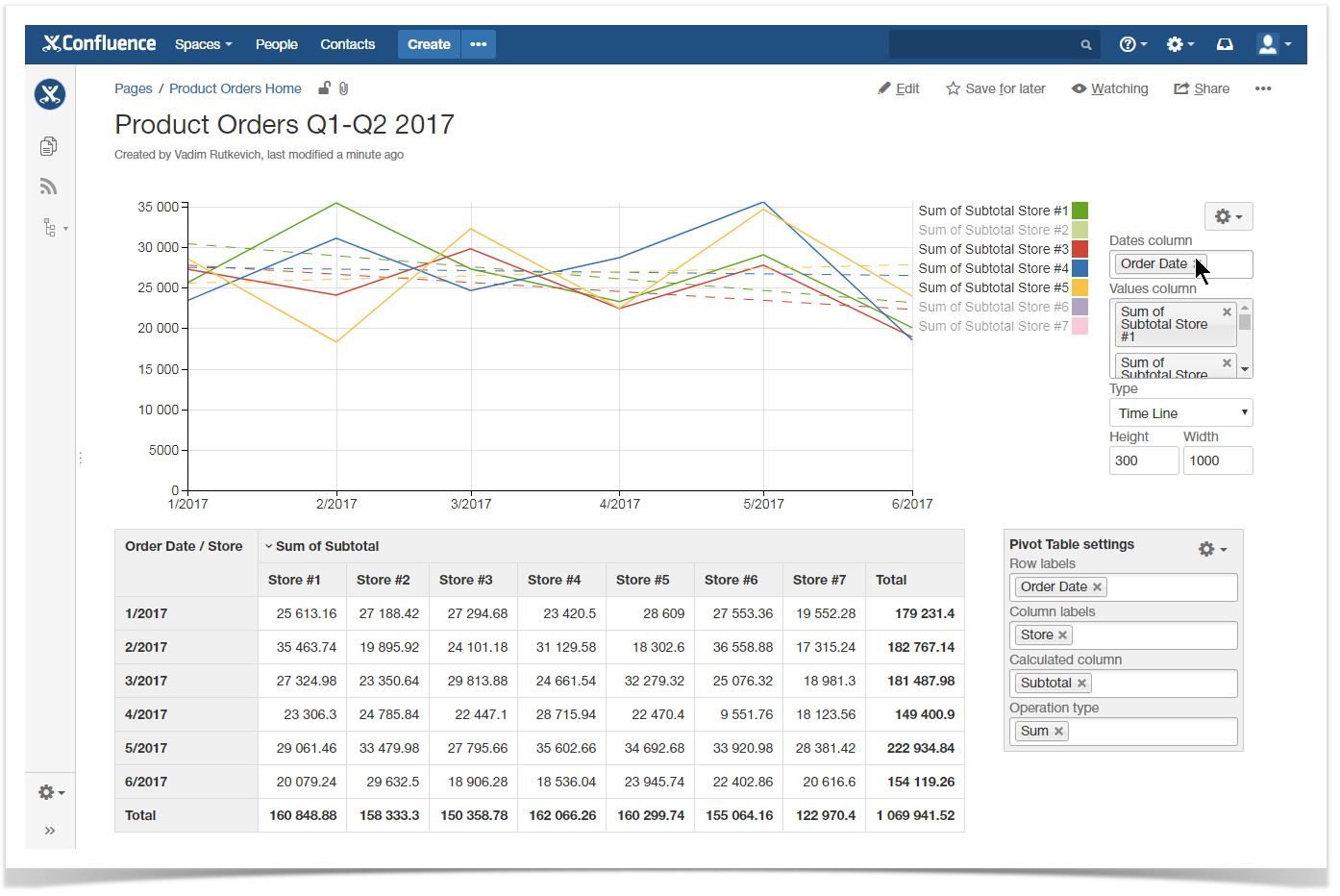
Once the manager has calculated the subtotal for all ordered items it is time to analyze the data and understand how many items were ordered for each store.
Table Filter and Charts add-on is this tool which provides you with sufficient capabilities to analyze table data and transform it into a visually readable format.
So what powers does this solution give you?
First of all, you get a a wide set of filters that you can apply to almost any data format you have in your Confluence, as follows:
Besides filtration, you also get a capability to aggregate data in the form of multidimensional pivot tables, and further visualize it with dynamic charts and graphs.
Watch the following video tutorial and find out how to do this with Table Filter and Charts add-on!
If you have any questions, feel free to drop an email to tech-support@stiltsoft.com or comment below.