Top 5 Confluence Charts According to Our Users

Companies worldwide often hire project management experts to oversee projects and ensure success. For you to internalize project requirements, make plans, monitor deadlines, execute tasks, provide deliverables, you need visualization tools. These visualization tools include charts, Kanban boards, calendars, and other options.
As a product manager, project manager, or team member, you need not worry, as these tools are available on Confluence. To help you execute your job better, we shall discuss five charts most popular among Table Filter and Charts for Confluence users, their benefits, and how to create them in Confluence.
5 Powerful Confluence Charts for Project Managers and their Benefits
1. Column Chart
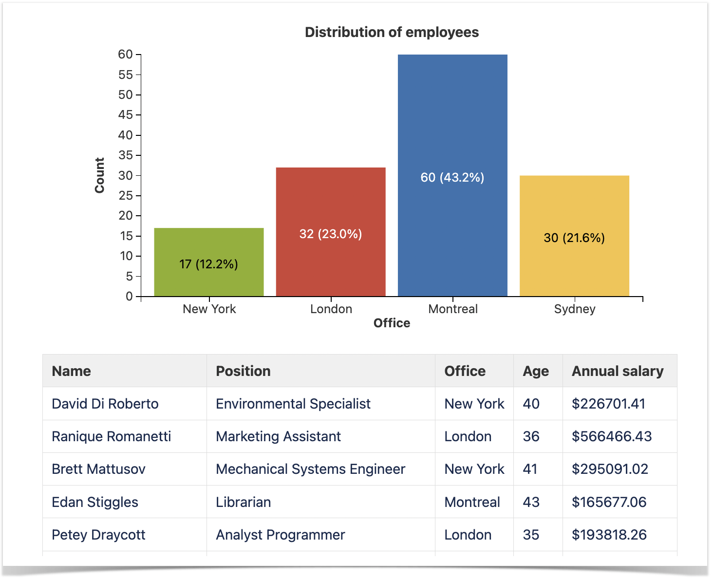
A column chart is a graphical representation tool. It works for visualizing two or more pieces of information about a particular concept.
As a project manager, a column chart helps you to present your not-so-complex data in a concise form. It eliminates the boredom or fatigue associated with reading texts or tables. At a glance, your team members, fellow managers, and clients can make sense of the data presented on the column chart.
2. Bar Chart
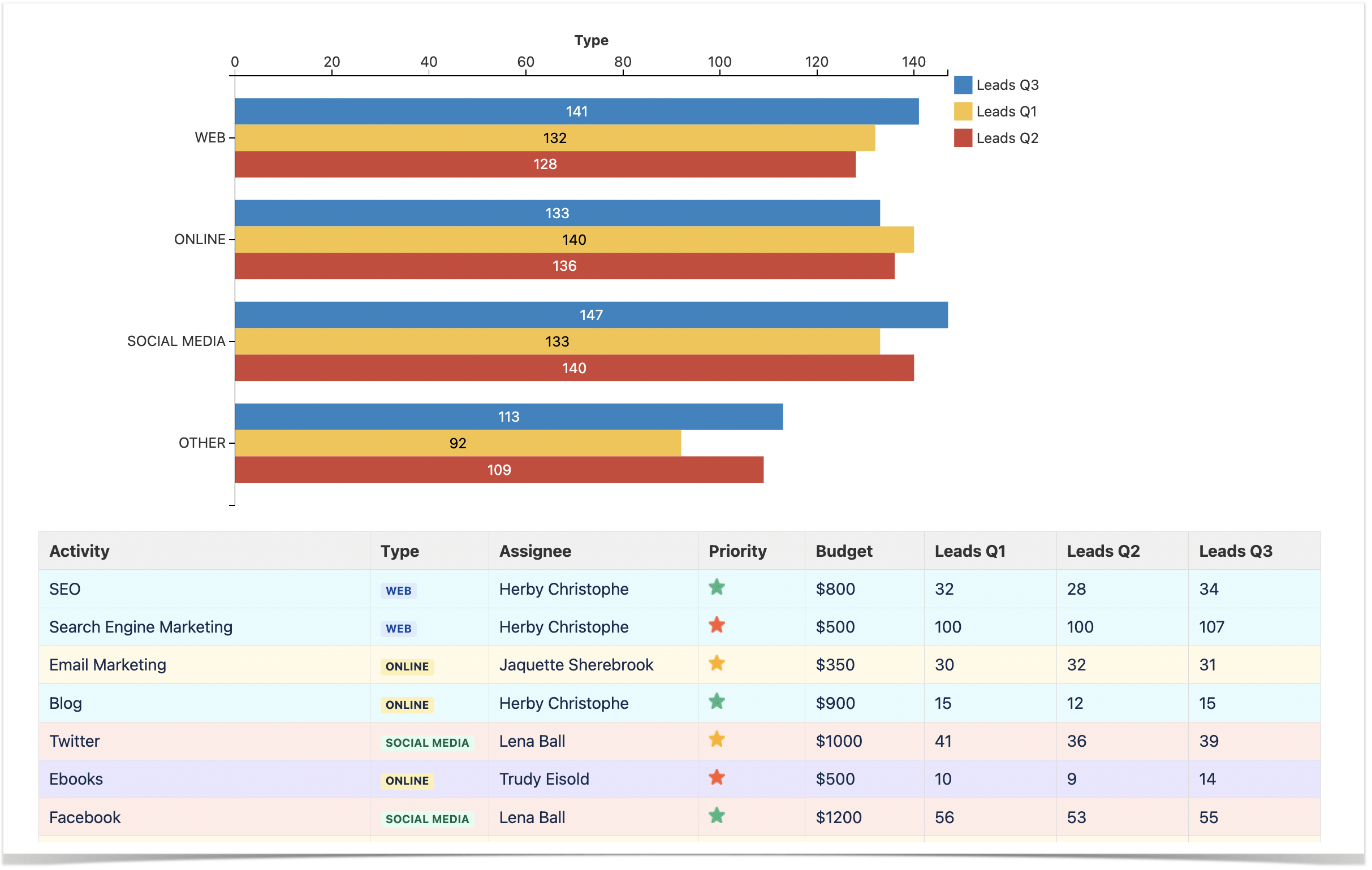
In Confluence, you can create a bar chart to visualize project data for team members, company executives, or external stakeholders. Similar to a column chart, a bar chart presents data in rectangular bars across two axes. It could be in a vertical or horizontal form. The length of the bars is often proportional to the values they represent.
Data presentation and analysis get better with bar charts. It interprets data and clarifies trends or changes. Suppose your team has a task to write a report on ‘May 2023 office supplies.’
Presenting the supplies and their numbers on a bar chart without verbal interpretation will be easy. Also, a bar chart aids data accuracy. In a situation where an error exists in the figures you input in a table chart, you will notice it after plotting the chart.
3. Stacked Column Chart
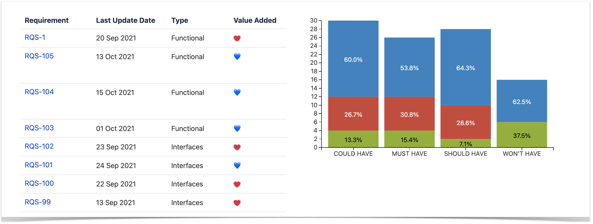
Stacked column charts display data both in vertical or horizontal bars. The data presented often relate to several variants. This chart type works effectively for comparing different variants. In this case, each variant takes a different color for easy analysis and identification.
While your team oversees projects, a stacked column chart is handy for comparing different variables without lengthy texts or crowded tables. You can measure and analyze quantitative data without stress or difficulty.
4. Time Line Chart
Whether you manage projects, work with finances, or plan marketing campaigns, you have to deal with various costs, expenses, and profits. And once in a while, it is essential to see the trends. That’s when a time line chart comes in handy.
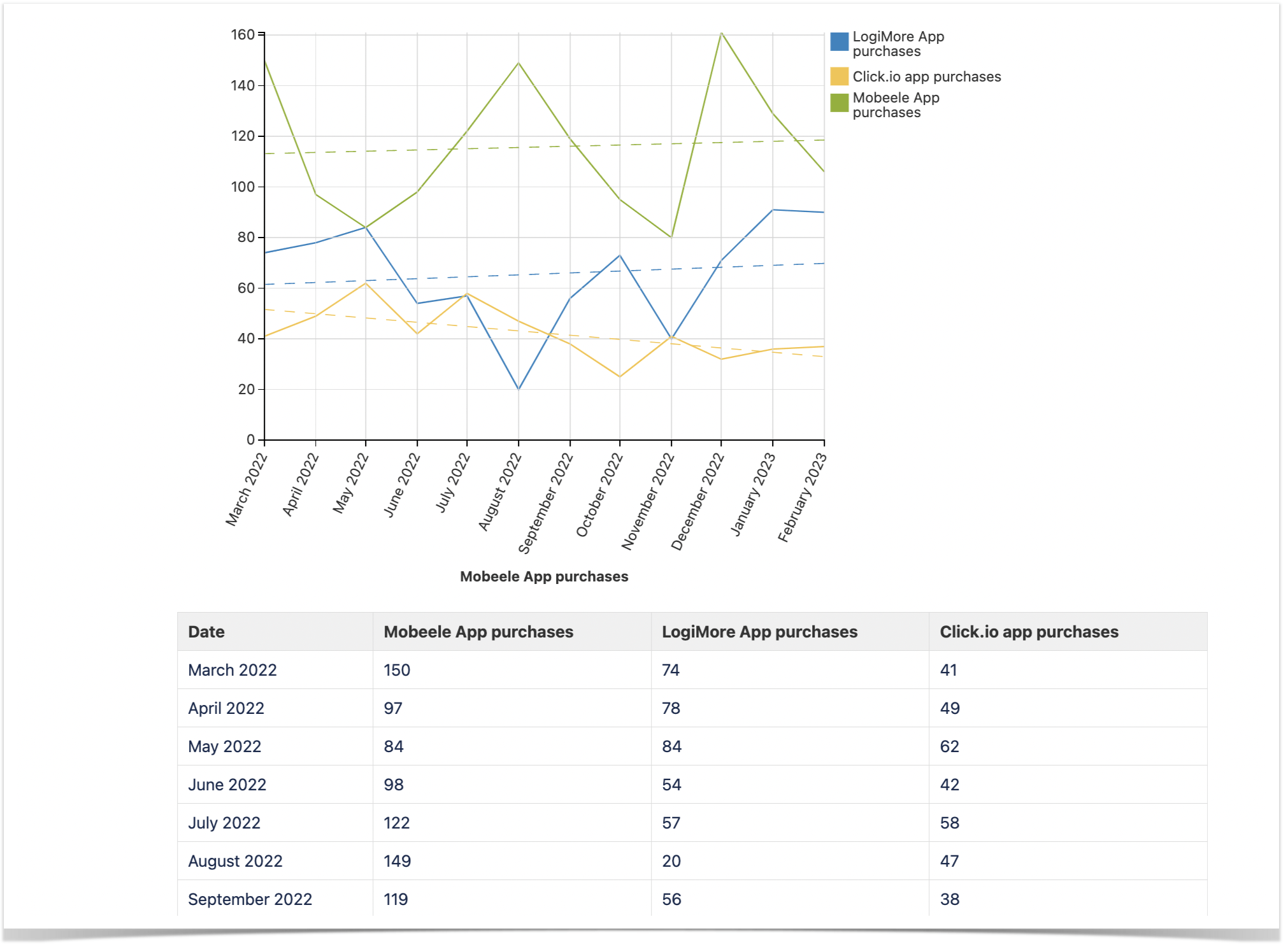
Since a time line chart visually represents how data changes over time, you can also use it to track various product-related things, such as app purchases, the number of leads, and other valuable parameters.
Conveniently, you can use a time line chart for comparison, and if the data changes drastically over time, you can add a trendline to understand the overall tendency. With these capabilities of a time line chart, you can spot even minor changes early on.
5. Gantt Chart
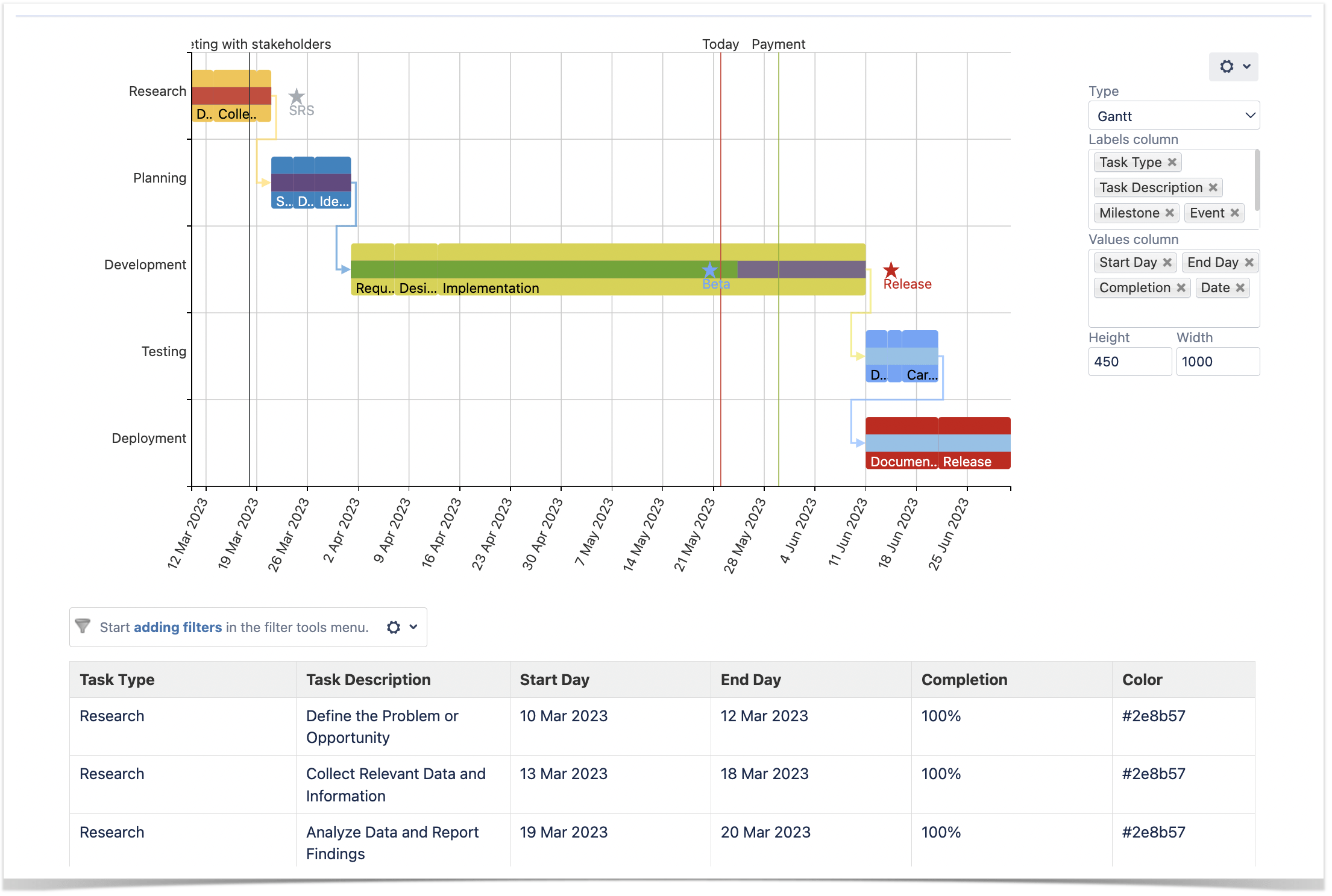
Gantt charts are among all teams’ most popular project management planning and visualization tools. As a project manager, a Gantt chart helps you present a series of project-related processes in a simple diagram. On the Gantt chart, you can enter information such as task type, task description, start date, end date, milestones, and dependencies.
It summarizes complex project information in a simple, colorful diagram for concerned persons. It removes the complexity associated with going through several written pages. Confluence helps you customize your Gantt chart to suit your project plans and goals.
Confluence also supports alterations. As an automated tool, it maximizes time and saves effort, as it does not require making manual designs, creating diagrams, or making changes. With a Gantt chart, your team will view workflow, collaborate & communicate better.
How to Create Charts in Confluence
Now let’s discuss how to create the charts mentioned above with the Chart from Table Macro from the Table Filter and Charts for Confluence app.
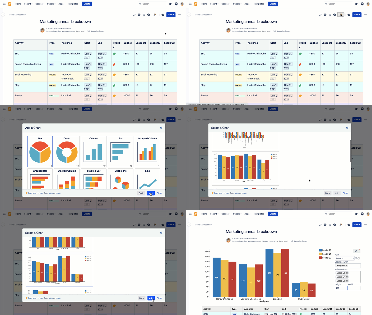
Pick a table you want to turn into a chart. Click the funnel icon at the top of the page. Select the Chart from Table macro. It will automaticaly generate suggestions for chart types available based on your source table. Pick the most suitable one, but keep in mind that you can also adjust the look of the chart afterwards.
In the view mode, you can change chart type, its size and color scheme, add or remove columns used to create a chart.
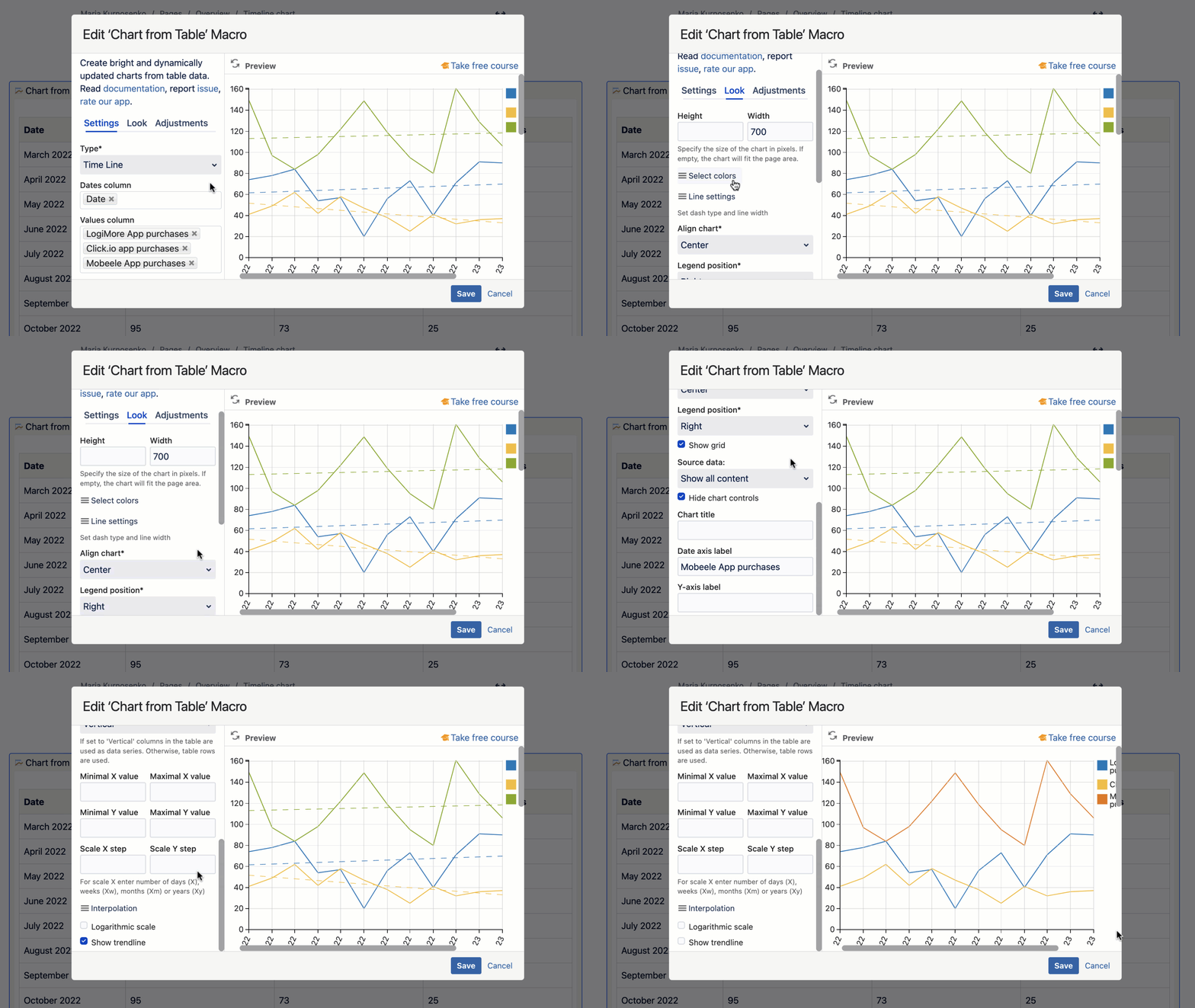
However, if you go to the edit mode, you can find even more settings there. All macro settings are divided into three tabs:
- Settings. Indicate chart type, label, and values. You can also choose to have the chart in 3D.
- Look. Insert chart height, width, color, chart alignment, legend position, title, and row and value axes labels. You can also change the data label and source data options.
- Adjustments. Select the decimal separator, set worklog settings, table data orientation, minimal value, maximum value, maximal value, and scale step. You can also select or deselect ‘Logarithmic scale’ and ‘Show trendline.’ Also, move your mouse to the right side of the preview panel to fill in the needed information. This helps you to visualize changes or edits.
Note that editing options in the ‘Look’ and ‘Adjustments’ tabs differ for all chart types. For example, the Time Line chart requires adding date(s). This option is not available for a bar chart.
If you want to try creating charts in Confluence with the help of the Table Filter and Charts app, follow the instructions below.


