Two-Minute How-to: Adding Charts in Confluence Instantly

Presentation is often a vital part of working on a project. If you want to visualize data and show it to your colleagues, you’ll probably do it with charts and graphs. Such demonstration is both appealing and easy to understand.
Table Filter and Charts for Confluence allows you to produce charts quickly and efficiently. With this app, you can:
- build charts and graphs in a few clicks
- choose ready-made charts based on your table, or customize them yourself
- select the most suitable chart type and convert it to 3D
- aggregate table data before creating a chart
In this blog post, we’ll show you how to add Confluence graphs in a moment.
How to add a chart with a wizard
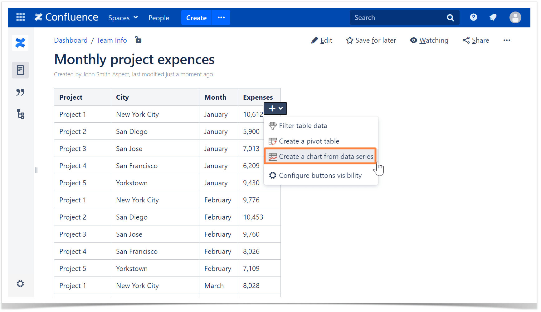
First, open a page with your table and hover over it. Click the button on the right. Choose the Create a chart from data series option.
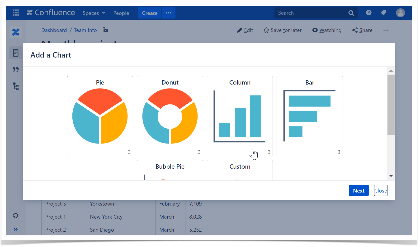
Next, you’ll see the types of charts you can add. Click on the one that appeals to you the most.
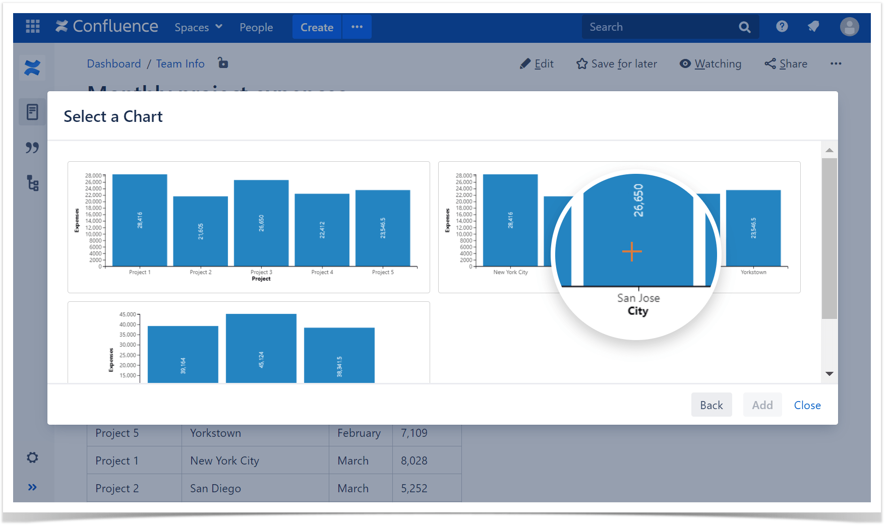
The Table Filter and Charts for Confluence app analyzes your table and suggests you various chart options. For each chart type, you’ll see a few methods of data organization. To insert a chart, choose the preferred option.
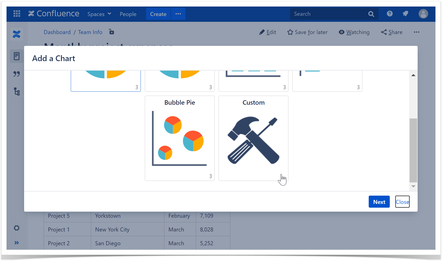
If you want a chart that differs from the app’s suggestion, you can always create a custom graph. Choose the Custom button at the end of the list, then select a chart type as well as labels and values columns.
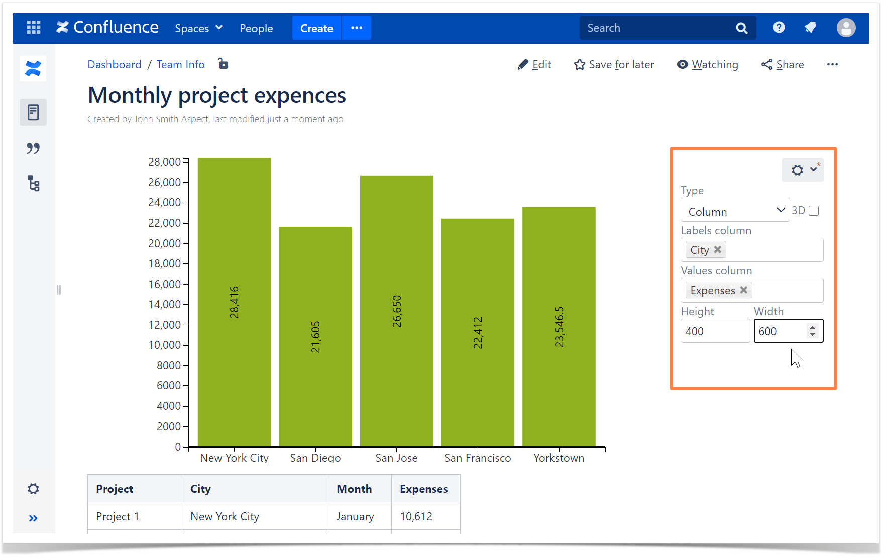
You can adjust Confluence charts of the fly if needed. If you hover over a chart, the settings menu will appear on the right. In this menu, you can change labels and values columns, modify your chart height and width, and switch to a different chart type.
Adding a chart in Cloud
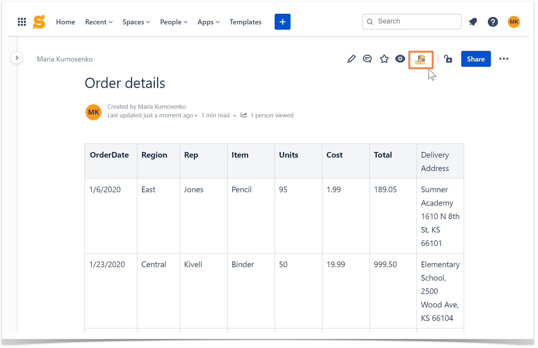
The mechanism is very similar in Cloud too. When you open a page with your table, choose the button in the top right corner.
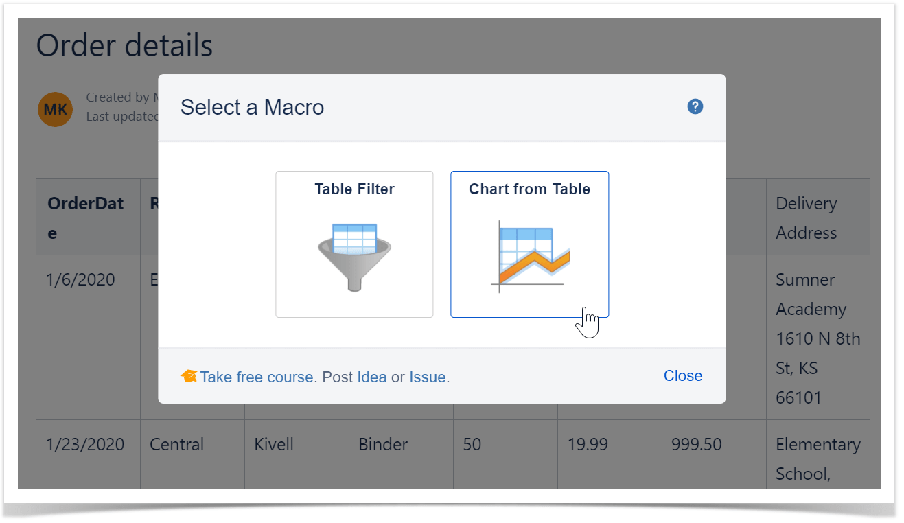
Then select the Chart from Table macro.
All of the following steps are the same as in the Server version. Add one of the suggested charts or customize your own. Depending on your case, you can choose various settings and adjust charts in Confluence to particular needs.
Useful tips
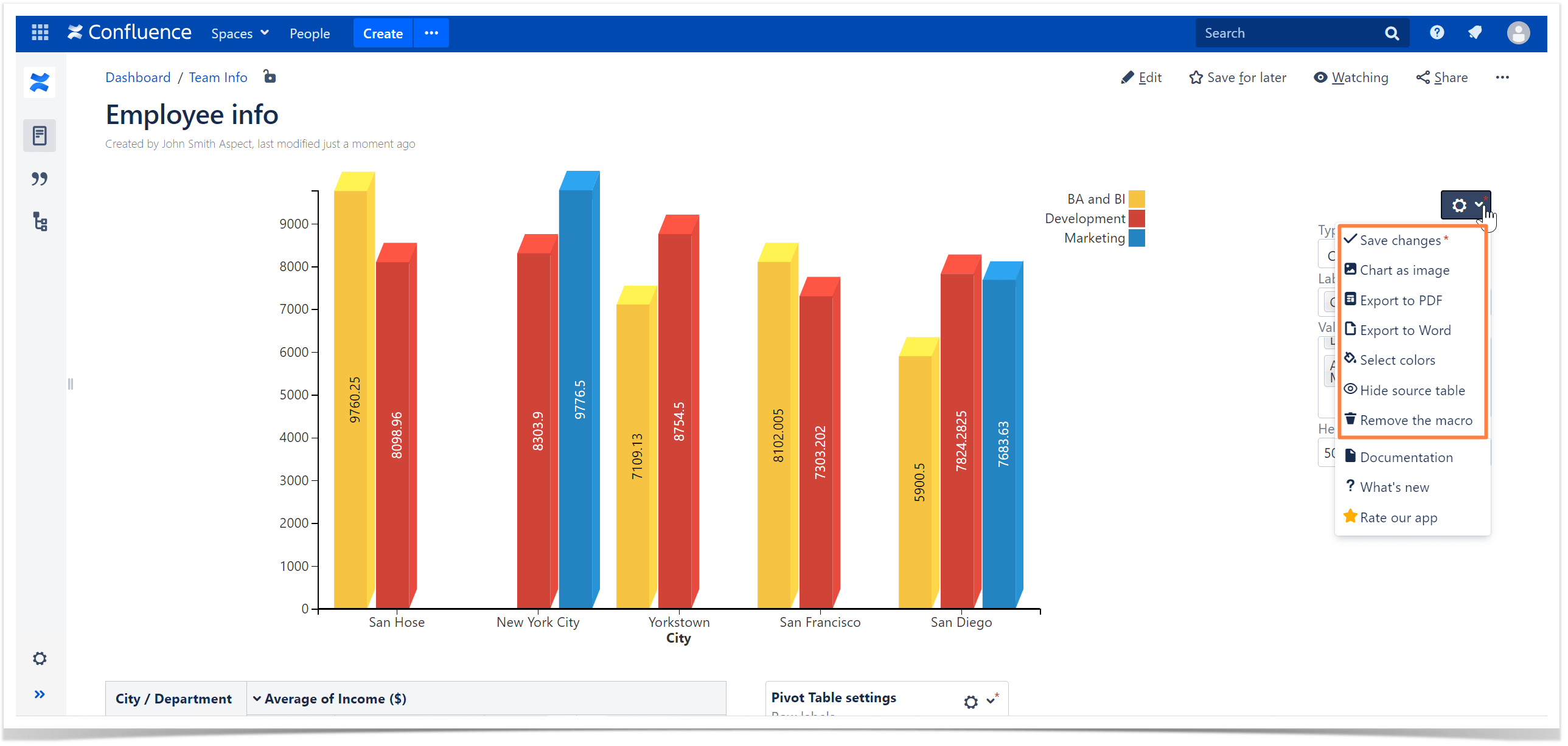
- Chart colors are chosen automatically, but you can always change them to suit your brand book or in case you just like a different color scheme more. Click the cogwheel icon, press the Select colors button, and pick more suitable tones.
- If you need to hide the table your chart is based on, open the settings with the cogwheel icon and press Hide the source table.
- If you need to use your chart outside Confluence, you can export it as an image, PDF, or Word file. Press the cogwheel icon and select the suitable option.
Now that you know how easy and quick inserting tables can be, try it out for your projects and reports. If you have any issues or questions, contact us.


