


Visualized Statistics of Git Repositories in Bitbucket

It’s exciting to see Atlassian taking a new step in developing Bitbucket by engaging Atlassian vendors in the creation of apps for this web-based source code management and collaboration solution. Our team is thrilled to be among the pioneers who will be contributing to enriching the functionality of this platform for the benefit of the Bitbucket community. We are happy to introduce Awesome Graphs for Bitbucket Cloud.
Our goal is to make the functionality of Awesome Graphs available in Bitbucket Cloud. We’ve started with just a couple of graphs, but there’s much more to come.
Install the app on your workspace using this link and try all the features on your repositories.
Contributors
The Contributors graph helps you analyze trends and compare the input from different people in terms of commits and lines of code.
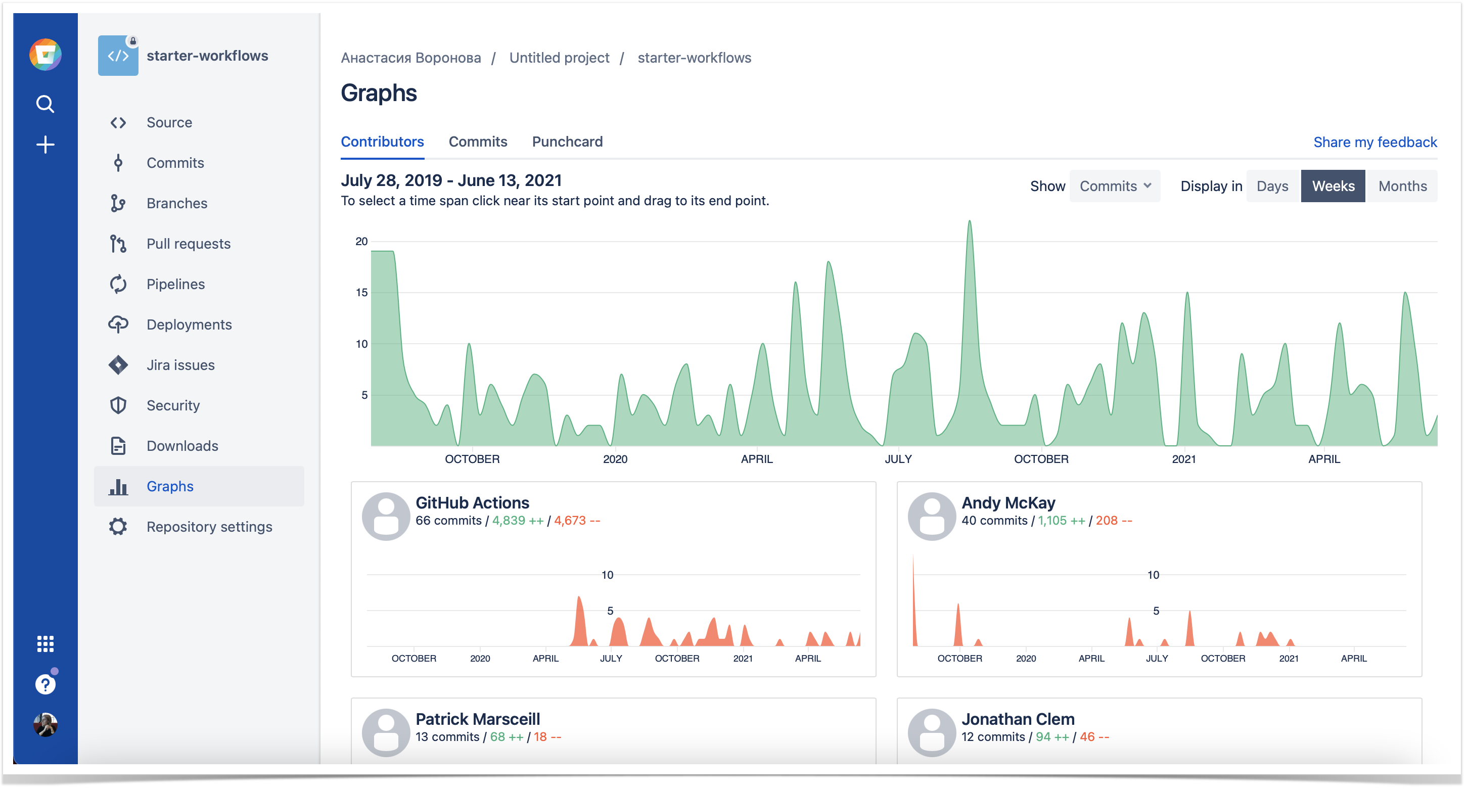
This graph visualizes the number of commits, lines of code added and deleted in the repository. The cards below the graph represent the personal contributions of each developer with the total number of commits and lines of code made during the time span you select.
If you want to analyze a specific period of time, click directly on the graph near its starting point and drag it to the end point.
Commits
In the Commits tab, you can see the number of commits made over the last year grouped by week and detailed daily commit statistics of the selected week.
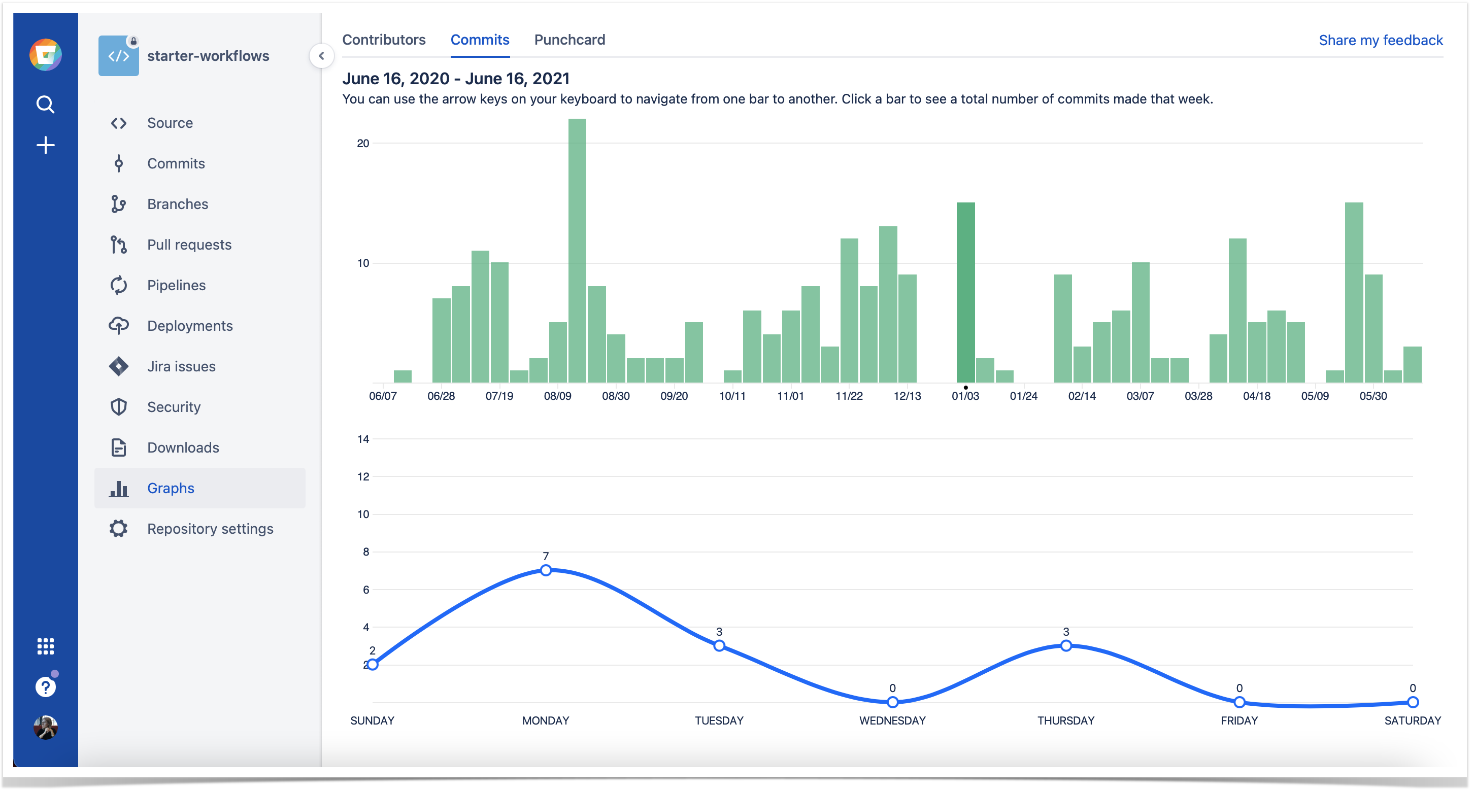
In the upper part, the interactive Commits bar chart displays all commits made over the last year grouped by week. Each bar represents one week. Click a bar to see the total number of commits made that week. You can use arrow keys on your keyboard to navigate from one bar to another. When you click a bar or switch from one bar to another, you see changes on the scatter chart below.
Punchcard
In the Punchcard tab, you can see the commit summary by day of the week and hour over the period starting from the first commit in this repository till now. For example, on the screenshot below, the “Thursday 2 pm” circle represents the total number of commits made on all the Thursdays from July 15, 2010, till May 28, 2015, from 2 pm to 3 pm. When you hover over a circle, you can see the exact number of commits made during that hour on that day.
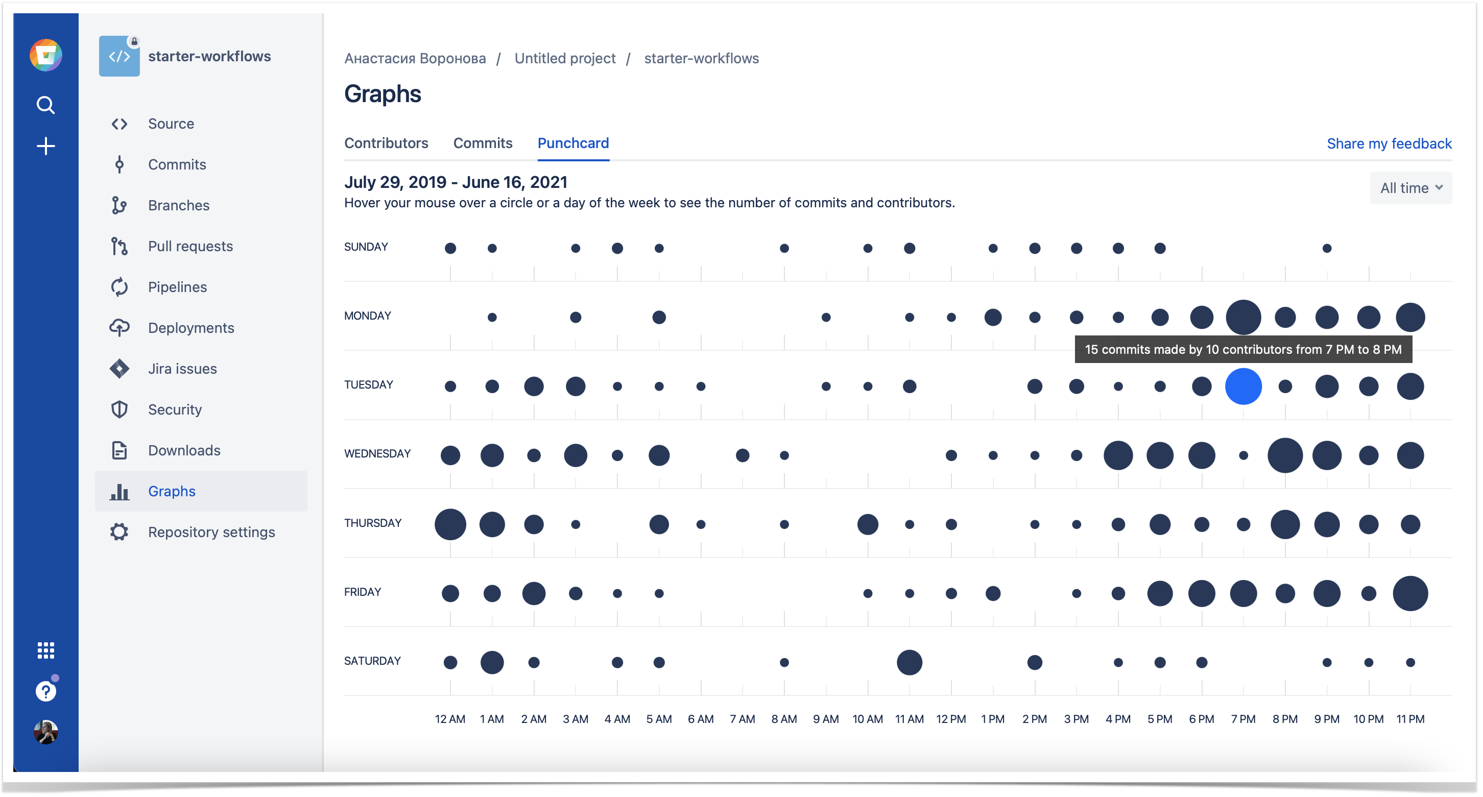
You can use this data to find out what hours of the week have been the most productive for your team. Moreover, your team can take advantage of this information to meet different goals.
As an option, it’s useful when planning work or searching for ways to improve team performance. For example, knowing the most productive hours of your team, you might want not to plan any distracting activities for those hours and let everyone focus on work. Or you can take a closer look at those top hours and try to figure out what conditions and factors could have contributed to that efficiency. These insights can help you learn what improves your team’s performance, using this knowledge to optimize working conditions if needed.
Installing the app
To install Awesome Graphs, navigate to this link and select the workspace of your choice.
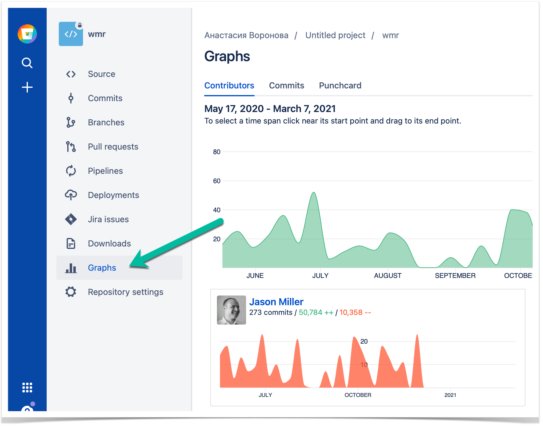
When the installation is completed, you can start using the app. To view the graphs of the current repository, navigate to the Graphs section on the left-hand sidebar.
Roadmap
We’re going to add many more useful graphs to Awesome Graphs for Bitbucket Cloud in the future. For example, graphs on the workspace level and pull requests data.
If you like to share your ideas or let us know which graphs you’d like us to implement next, please, contact us.
You can also read how other teams benefit from using Bitbucket in a bundle with Awesome Graphs: