Confluence Navigation: Optimize Search and Build a Catalog

Confluence is a place where knowledge lives. Here we store guidelines for newcomers, documentation for power users, ideas and plans of various teams, and many more. It will depend on your company’s workflow, but you’ll normally find all the information you need in your Confluence if you use it. Effective Confluence navigation makes the process faster.
The ideal world would be like that… The truth is we live in real life where Confluence spaces are way too many, pages have inconsistent names, and data is hard to find. Things get even worse once you are new to Confluence or your team and have no idea where to look at.
This article covers tips on organizing Confluence navigation. You will learn how to optimize search in Confluence, organize pages, and build a catalog on an overview page for your team. Combine these tips to ensure effective knowledge sharing in your company.
Ensure better searchability in Confluence
What’s your first step in working with data? Find relevant information. We all use Google Search daily when we need to learn something. You can do the same in Confluence to quickly locate the needed page. Remember that your teammates are all unique and may have different levels of Confluence expertise, searching patterns, and navigation preferences. The goal is to ensure better searchability for any user.
Make Confluence navigation effective
Confluence has a search bar, and all teams use it to locate the required page quickly. Right? Wrong
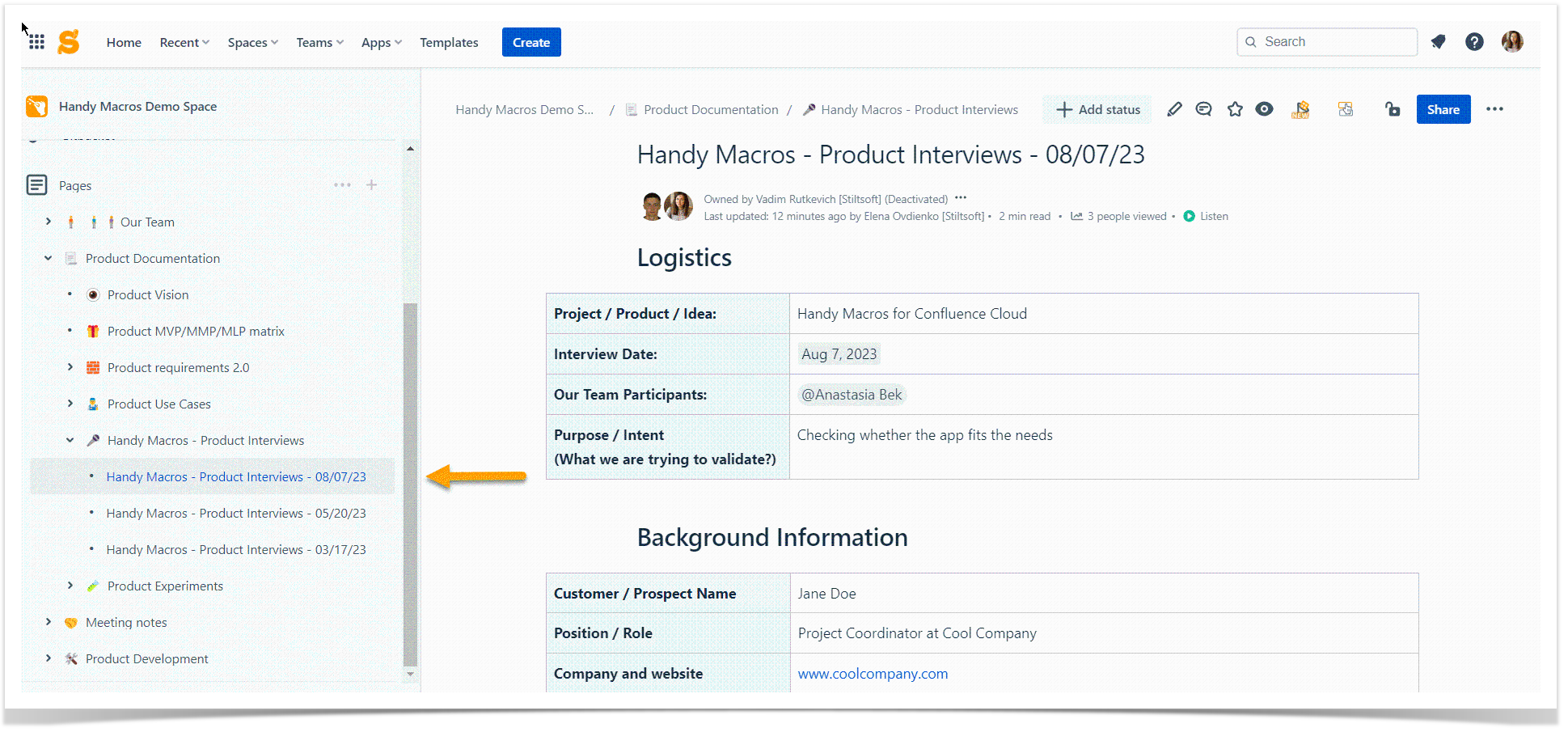
Some users will use it inconsistently. Others will avoid it at all for many reasons. To name a few, they don’t know the page name, get frustrated with many search results, or forget about this search bar. So start with organizing the space page structure, as that’s where many users look at. They navigate through the space structure on the sidebar, deciding where to start their journey. For this reason, think about consistent naming patterns and easy-to-read parent page titles. The quick check is as easy as this: your mom should get the page idea by its title. Keep in mind that you write documentation for new readers. They can see your Confluence space structure for the first time, so keep it simple.
Promote quick and advanced search usage
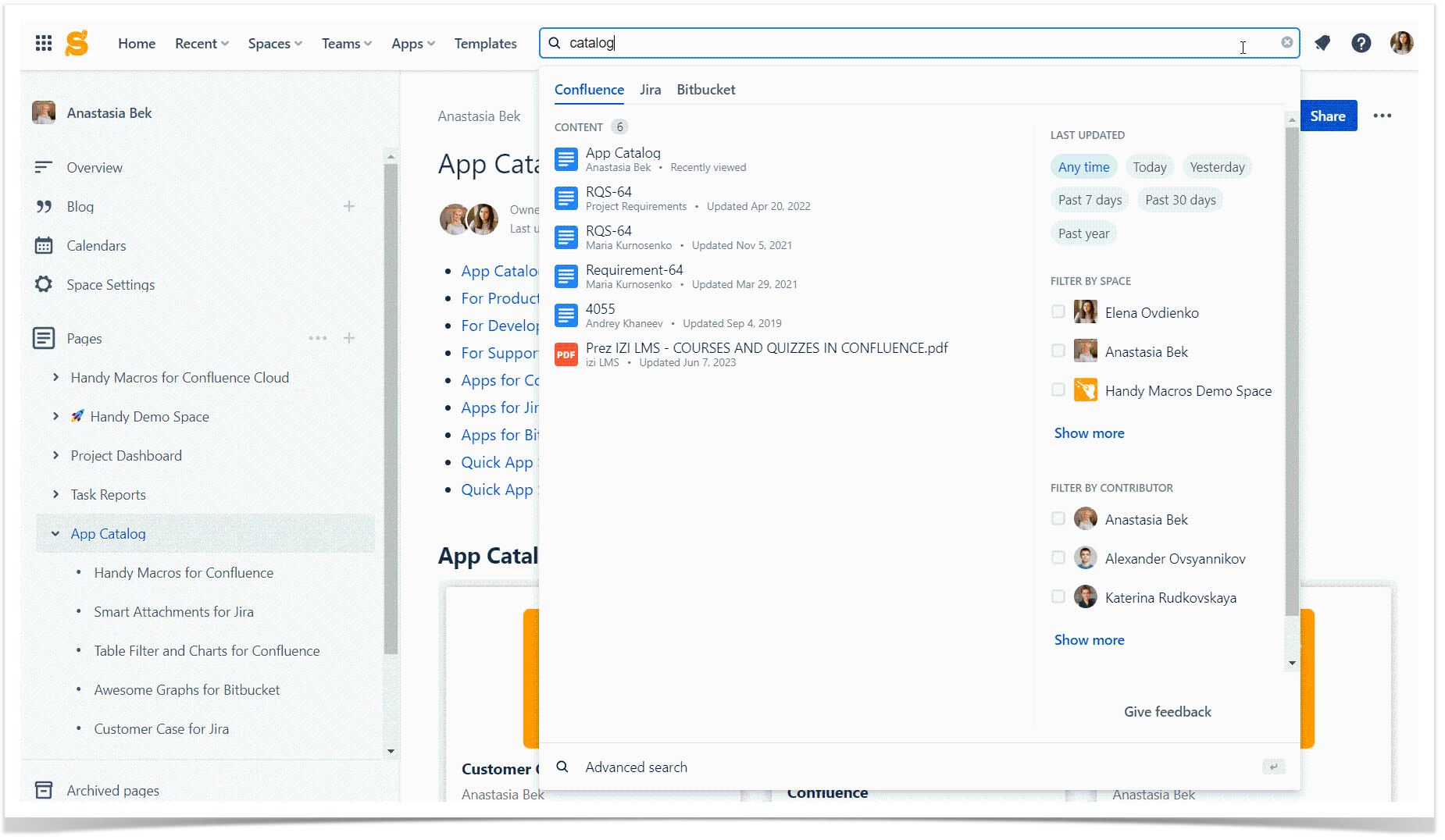
Using search functionality in Confluence empowers your users to easily find what they’re looking for. Think about it as a quick assistant in Confluence navigation. Start typing what you need, and get the results immediately. Confluence allows you to narrow down search results in a second with filters by space, contributor, date, or page label. The question is how to encourage your team to use this functionality.
We have a few suggestions on how to optimize search in Confluence:
- Educate your team. If you are a team lead or a project manager, you must be a Confluence power user. Let your team grow with you. Knowledge sharing can be fun and lead to efficiency growth in your company. Inform your colleagues how they can access Confluence quick search and benefit from advanced search. Demonstrate common Confluence search syntax queries and provide examples.
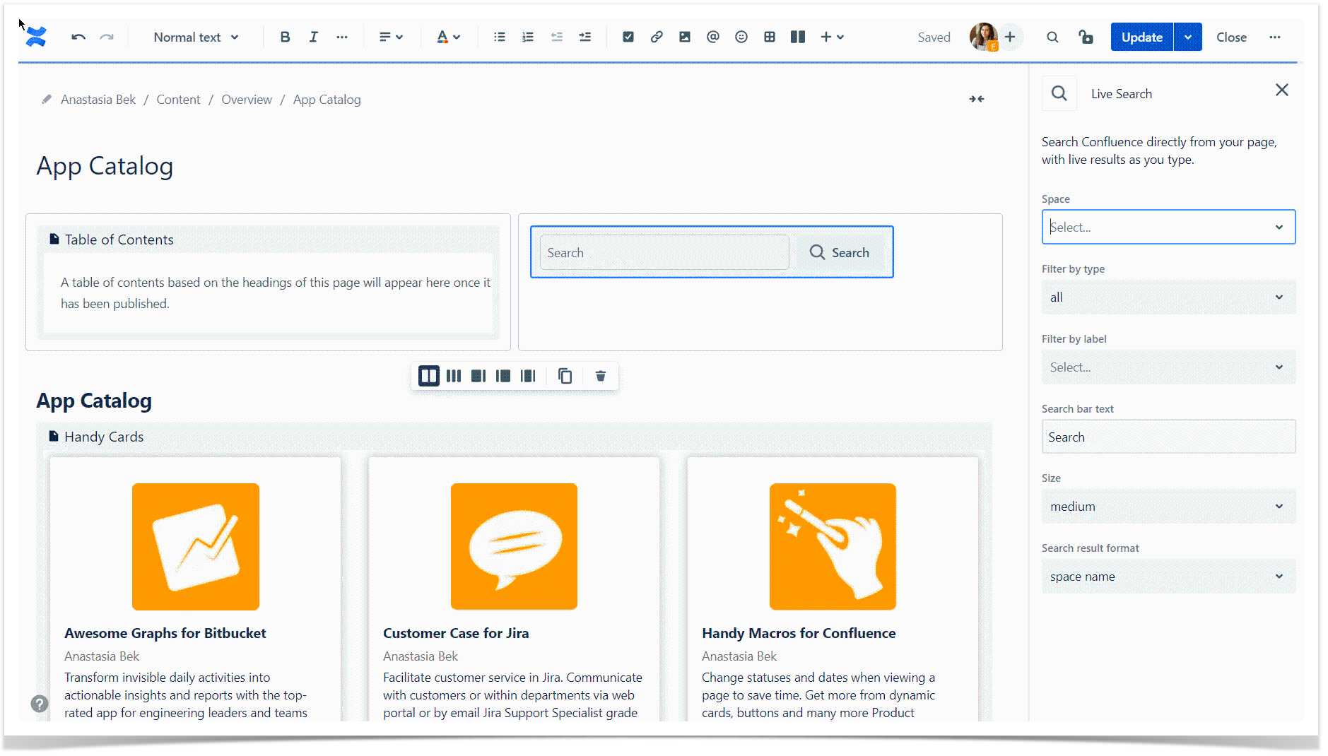
- Add additional search fields. Confluence Cloud has the Livesearch macro. It adds a search box to any place on a Confluence page. To ensure narrower search results of more precision, you can set additional parameters on the macro creation. Customize the look and feel of the search field as well, providing your teammates with an intuitive solution. Once you have the Livesearch macro on a page, Confluence will dynamically display matching results as users type their queries.
Structure content with templates, labels, and macros
You can enhance your Confluence content searchability by sticking to the same page naming, labeling, and structure patterns. We believe your team will find the better recipe for their workflow after some period of experimenting. Still, you can look at the best practices to structure content in Confluence Cloud:
- Stick to consistent page naming patterns across the space. Spend time with your teammates to decide what’s the best way for page naming in your company. You can enhance Confluence navigation by adding keywords, timestamps, or prefixes indicating the department or activity. To ensure you follow the same pattern, create guidelines and Confluence templates where applicable.
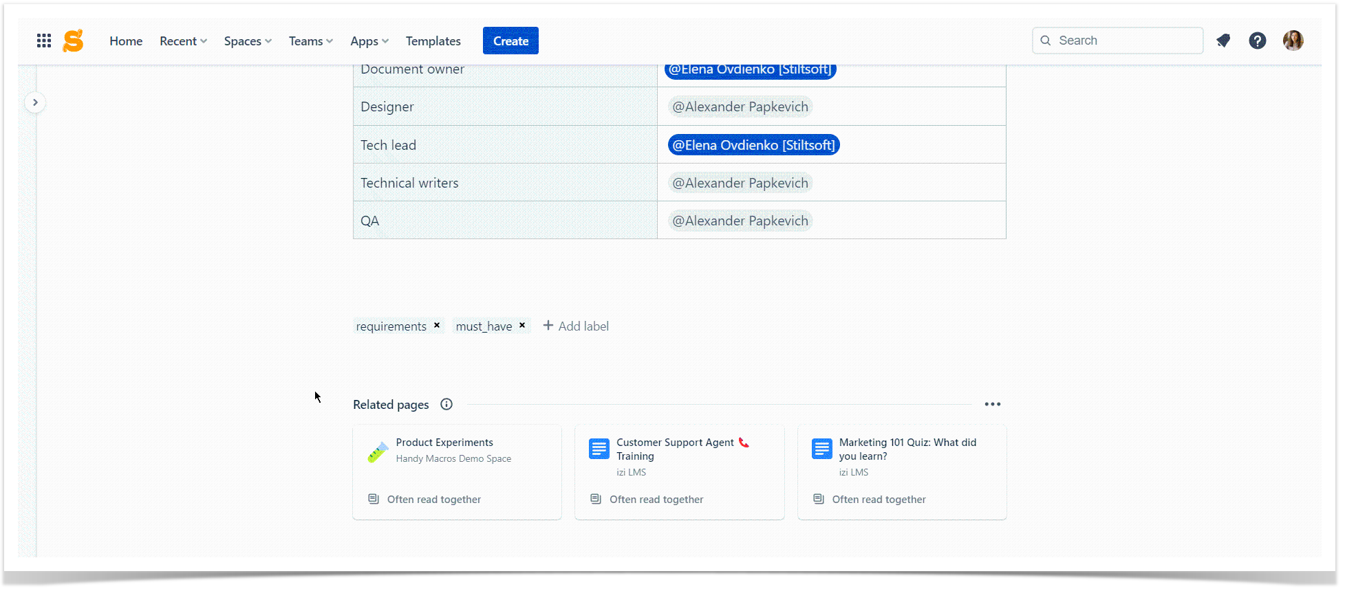
- Add related pages to highlight content that can be beneficial. Related pages in Confluence Cloud automatically generate suggestions for further reading. They are based on the reader’s personal preferences and configured by the space admin.
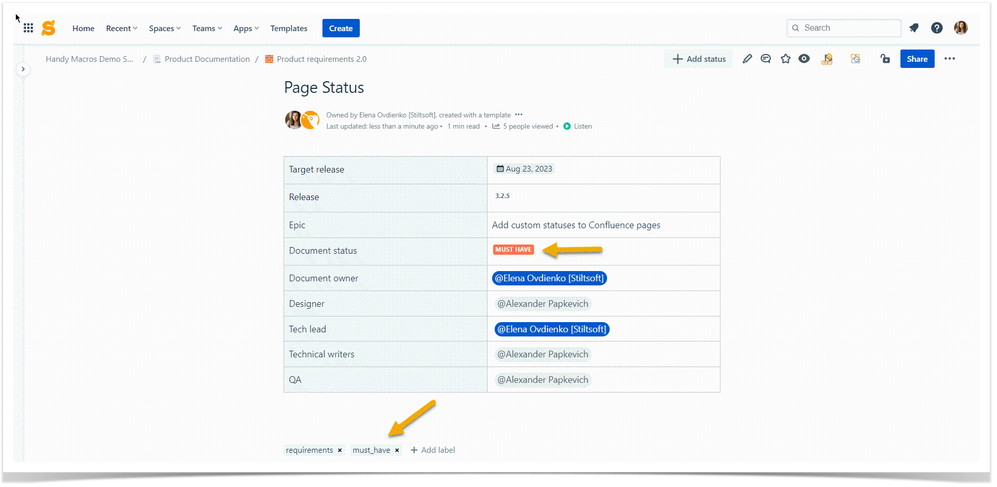
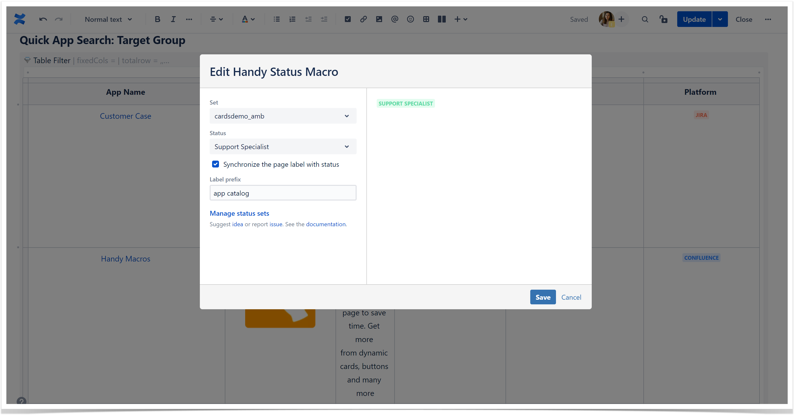
- Assign labels to your pages. Labels are a sort of hashtags in Confluence. They help you build reports, collect data from relevant pages, or search for the required page in seconds. Agree on the label usage in your company, and create a list of labels for their consistency. If you lack a systematic approach here, try the Handy Status feature of page label synchronization. This functionality allows you to assign labels to pages automatically. They will correlate with the Handy Status macro used on a page and update automatically after the status change. You can use Handy Status in a bundle of other features available in Handy Macros for Confluence.
- Use dashboards in Confluence. You can try the Recently Updated Dashboard macro or create a dashboard with other Confluence reporting macros. We love using the Page Properties Report macro. Labels will work as a means of reference perfectly here. Handy Status will automatically assign labels to your pages if you want to base your reports on the status value.
Build a catalog in Confluence
With the tips above, you can boost Confluence navigation in your company. Your team will find pages faster, run advanced searches, and browse through well-organized space trees. You can make content discovery and Confluence navigation easier with our suggestions in this section. Some tips include the usage of our Handy Macros for Confluence and Table Filter and Charts for Confluence apps. They are available on the Atlassian Marketplace for any hosting type – Cloud or Data Center.
Organize Confluence Pages
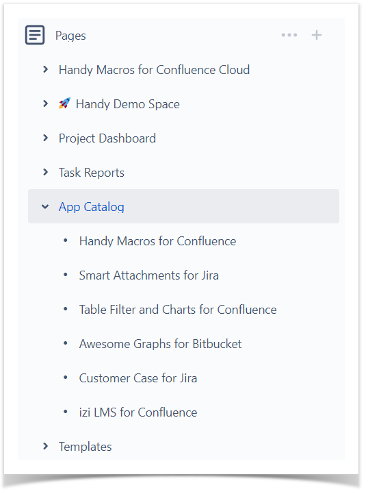
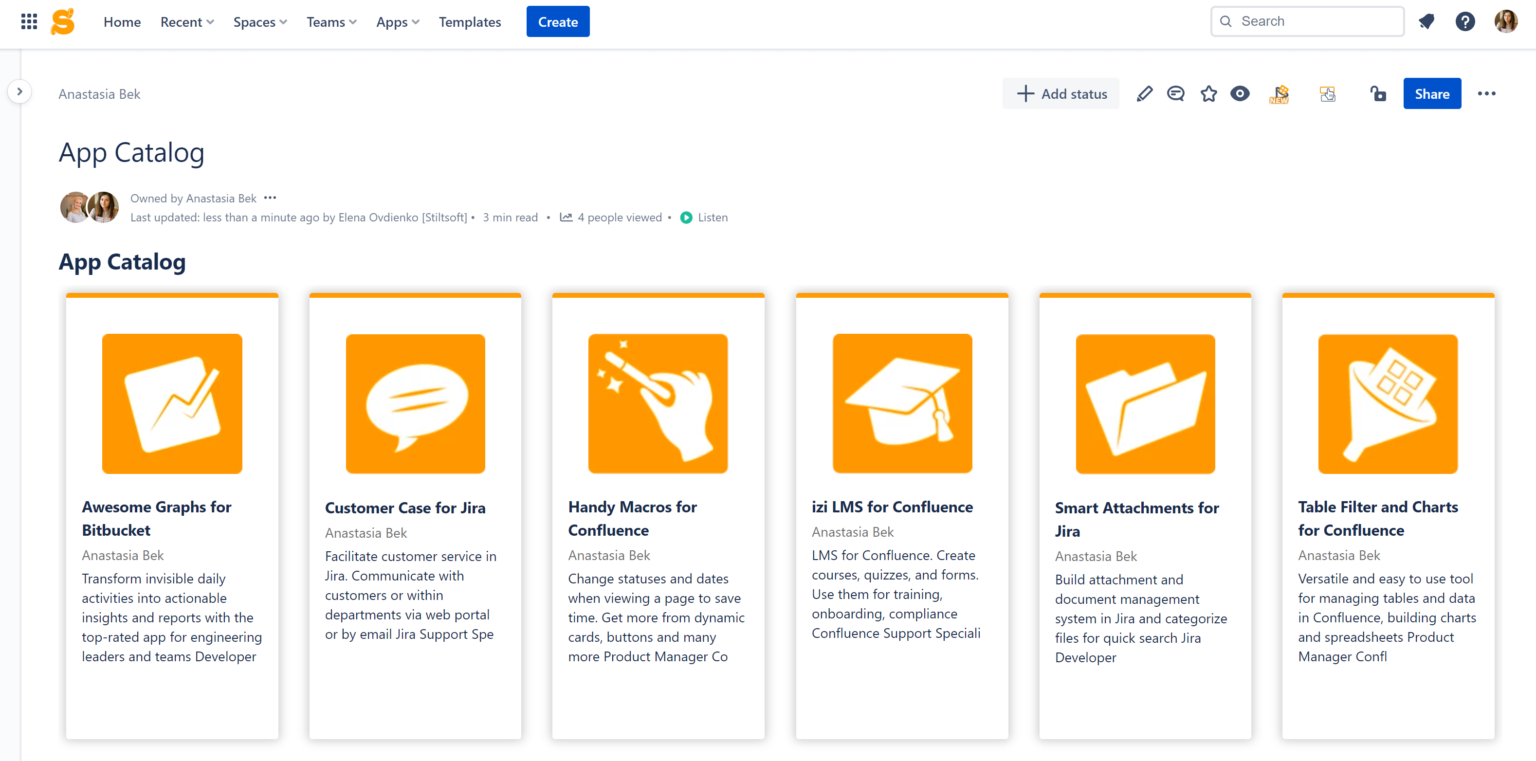
For cases when you create content for new Confluence readers, we advise thinking about creating a one-stop page aggregating the key information. It will guide your users and facilitate their Confluence journey, especially at their first steps in a particular Confluence space, company department, or company at all. Organize Confluence pages to make navigation easier.
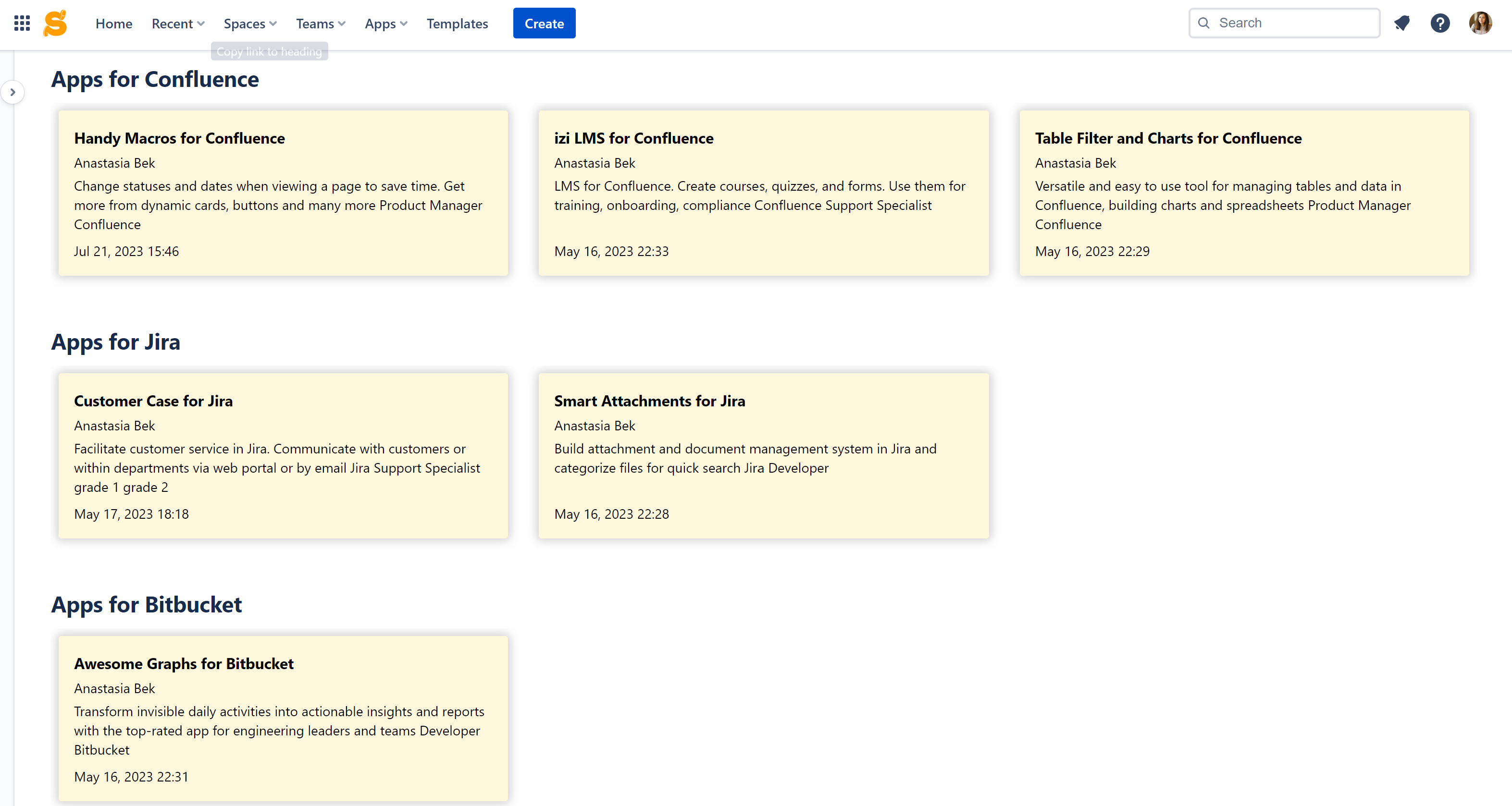
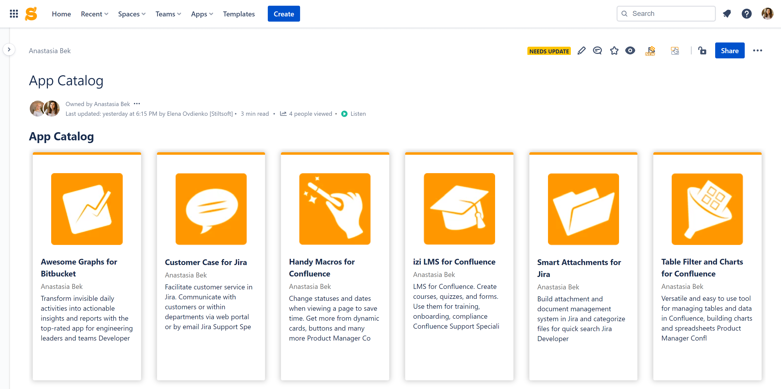
Highlight Confluence content that will help your readers most with Handy Cards. This macro allows you to create cards with Confluence page previews in a minute. All you need to do is to select what pages to highlight, and our app will automatically generate appealing clickable page tiles in Confluence. You can select the card design, including its color, size, or images, to better fit your use case and corporate branding. Handy Cards from the Handy Macros for Confluence app is a good choice to start building a catalog in Confluence as your users will immediately focus on what matters most.
You can add sub-categories to help users navigate through pages faster. This is easily done with Handy Cards based on Confluence page labels. This way, you select the label for each sub-category of your Confluence content. Handy Cards will automatically update the information if you add a new page with this label. So you will keep the Confluence catalog up-to-date automatically.
Add an interactive Confluence table
Confluence navigation on a one-stop page can become even more productive with an interactive table used for quick data selection. You can add categories based on your use case and empower your team with a powerful search.
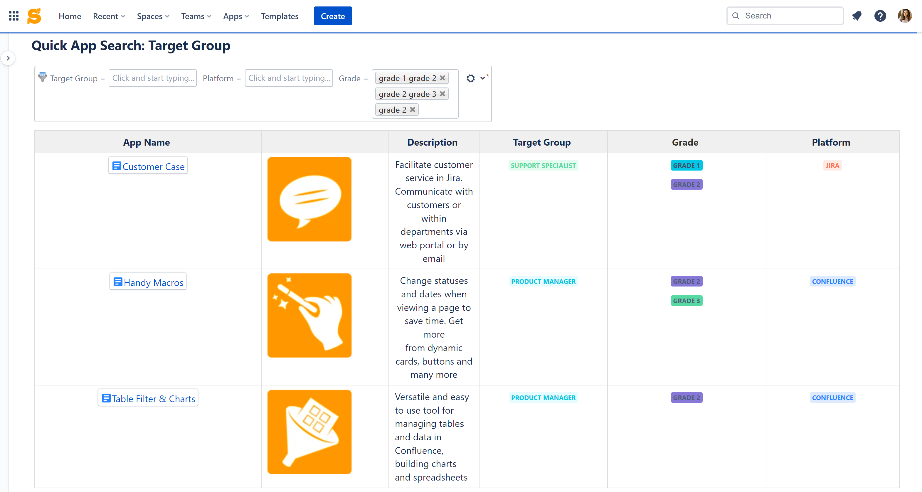
For example, once we build a catalog with Confluence products that the team can use in a company, we can create a table with filtration parameters. You can create columns for the target group, grade, and Atlassian product indication. To make it easier, add dropdowns for repeated values with Handy Status.
Later, you can switch values from the dropdown and reuse statuses on diverse Confluence pages. This way, you get consistent data across all Confluence. The team works with information faster, making quick updates.
Adding Table Filter to an interactive table with a catalog makes Confluence data search a breeze. Just select what you need from the dropdowns of the filtration panel and immediately see the results.
Indicate Confluence page status
All right, now you have organized your overview Confluence page, added search bars, appealing cards with useful content, and an interactive table with filters. It’s high time to tell your users that the page is ready. It allows readers to differentiate between actual and outdated content in a second.
Confluence offers multiple ways to inform users about the page status. You can add a Panel macro, add a comment, or a Status macro. If you want the Confluence page status to stand out, try Handy Page Status. You can assign visible statuses on the top of Confluence pages so that readers will immediately understand if the information is worth reading. Status history makes reporting effective and indicates the page owner responsible for data updates.
Boost your Confluence navigation
You can find Handy Macros for Confluence and Table Filter and Charts for Confluence on the Atlassian Marketplace. Follow the links above to navigate the app listing pages and click Try it free. If you don’t see the button, please, contact your Confluence administrator to help you start with our apps. After the trial start, you will have at least 30 days to evaluate the app functionality in your company and see if it suits you.


