How to Make Your Confluence Pages More Attractive
Make your Confluence pages more attractive and add more interactivity to your content in Confluence Cloud for instant switching of statuses and dates in the view mode. Learn more.
What is a good-looking and well-organized page? It mainly depends on the situation, but in general, you need to do some basic things to create an easy-to-read and content-oriented page in Confluence.
Plan the page layout
Having the relevant information is just one side of creating a high-performing page. The way you present this information to the reader is another thing.
Crowded pages are tough to read. They can distract the reader and result in a bad user experience with your page.
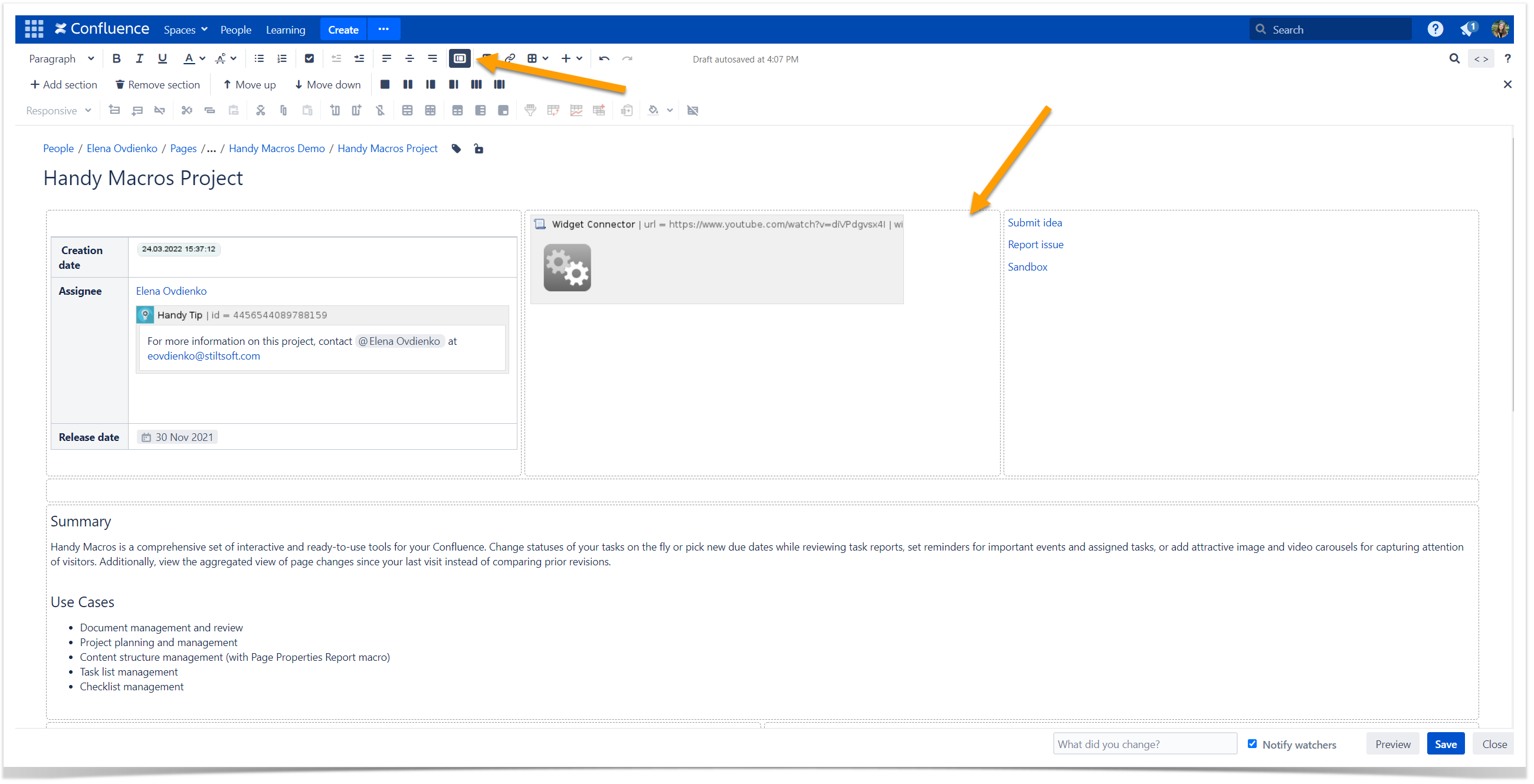
The Confluence page layout is an effective tool for page organization and ensuring the best visual impact. Use this native Confluence feature to add horizontal sections or vertical columns to your page. You can add and move sections up and down, change the number of columns, or remove sections whenever you need it. All your information remains on the page.
Replace default Confluence links with sight-capturing buttons
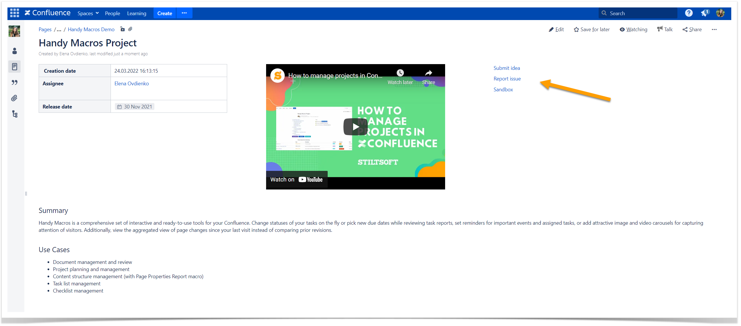
Many Confluence pages require actions from the reader. A native Confluence link is difficult to notice, especially when readers scroll the page. Even with good structure and content organization, this call to action looks quite boring.
Highlight links that need more attention with clickable buttons in Confluence. Any Confluence user can create them on pages without advanced technical skills. As a result, a simple button will appear on a page.
We’ve covered this in detail in our other article, so you can refer to it if you’re interested.
This solution is limited in functionality, though. Buttons can be only grey or blue. Once users click such a button, they always leave the current page and go to a new one.
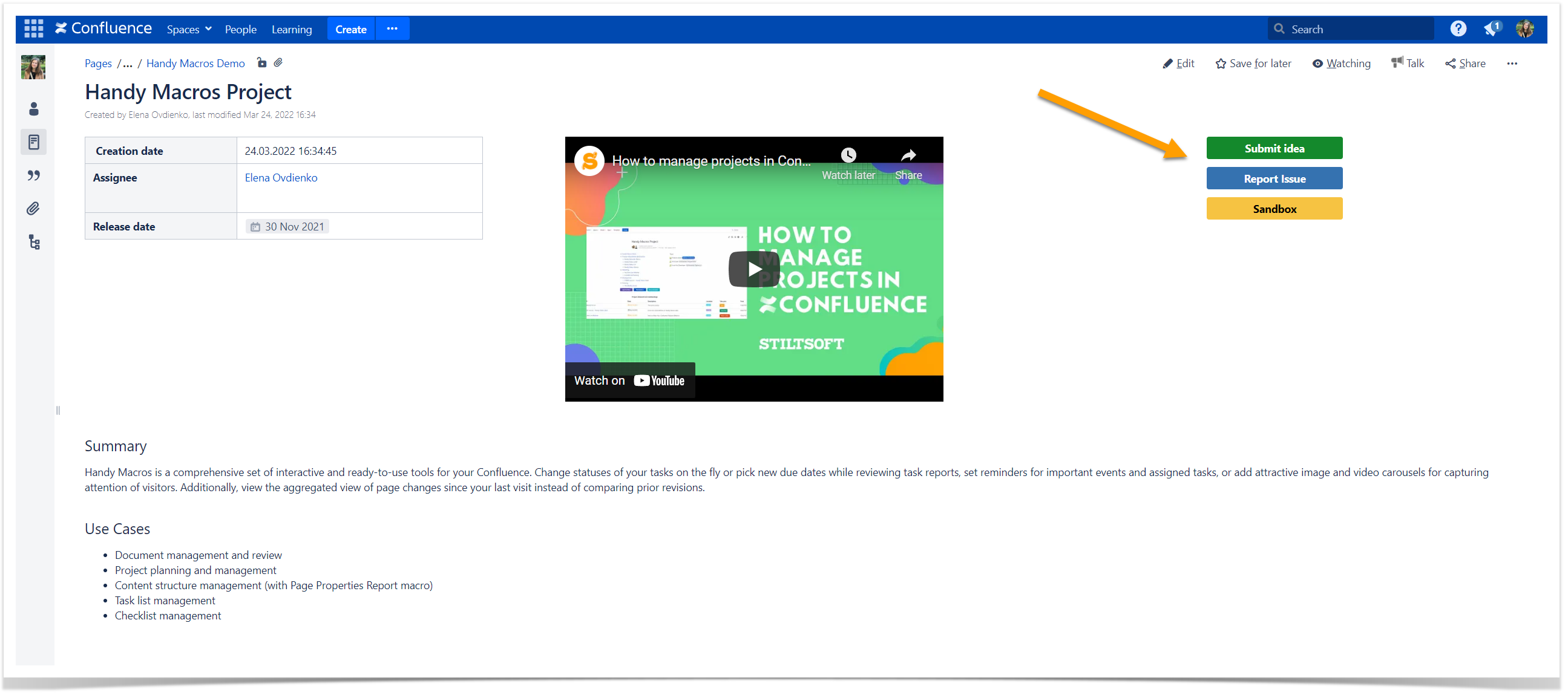
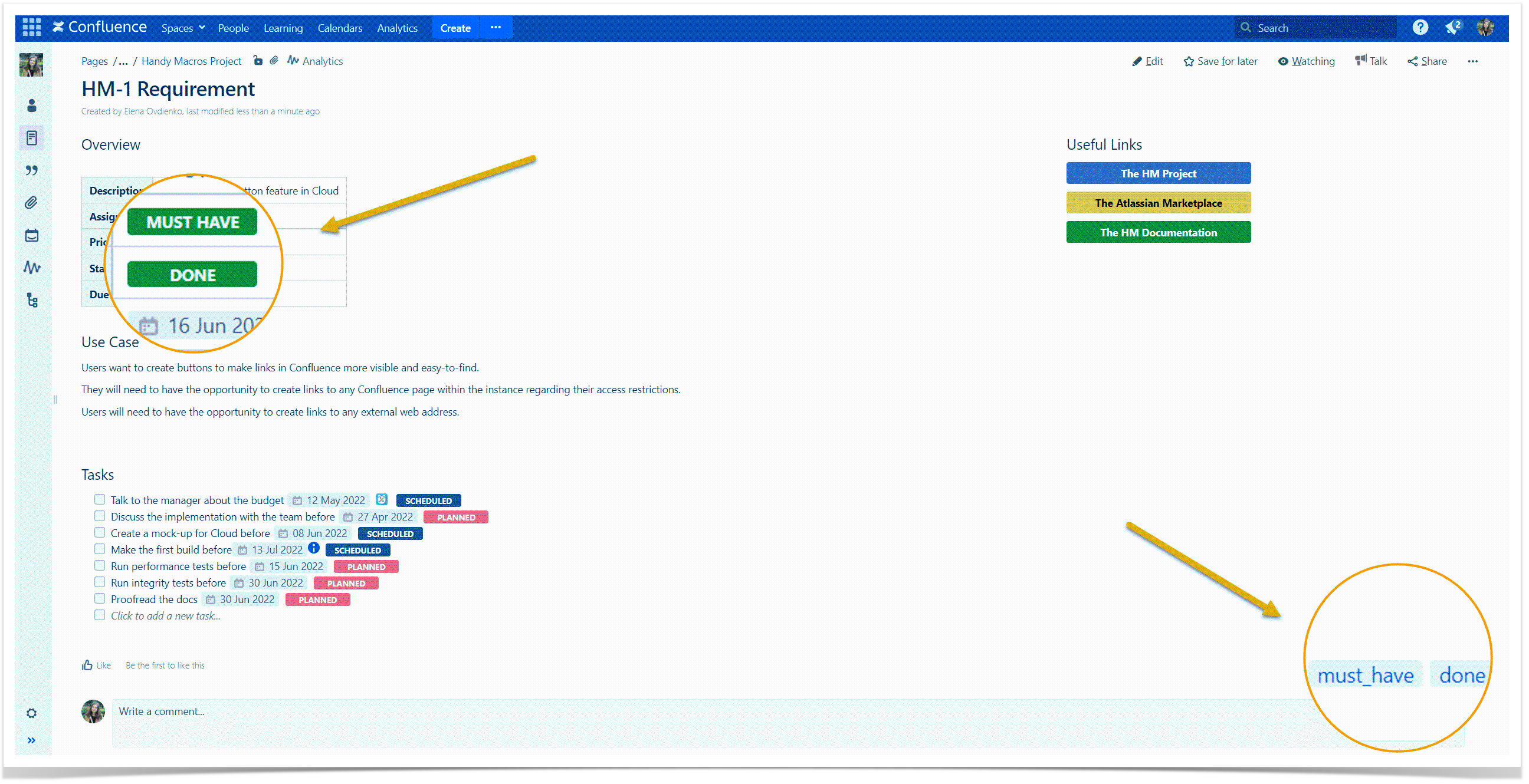
If you need more options for customization, you can try Handy Button from the Handy Macros for Confluence app. The same page looks much better after replacing the set of links with call-to-action buttons.
Organize your pages with panels
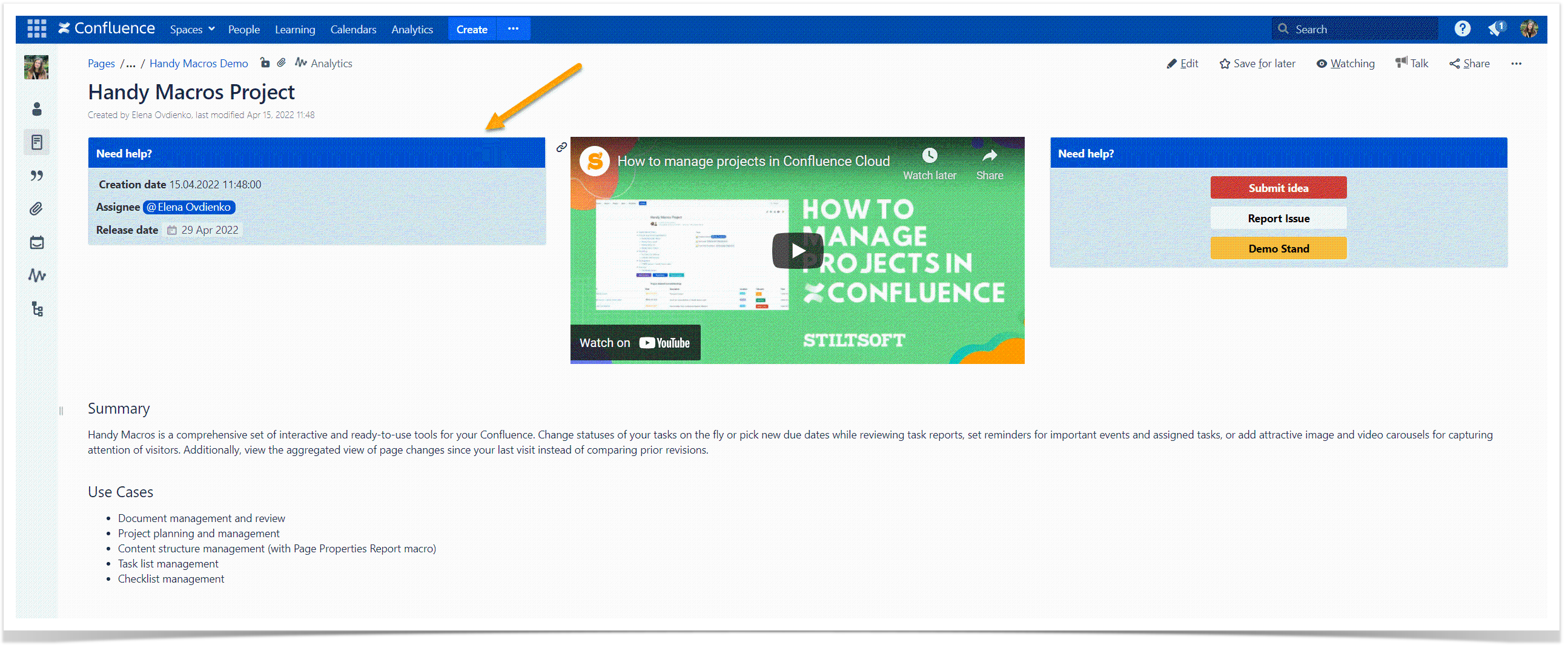
Panels can greatly improve visual perception. They are great for the visual division of content blocks on one page. You can also use panels to make your pages look identical and keep them easy to read.
Use the native Panel macro to create a customizable colored panel on a page. You can put panels anywhere on a page, including table cells and page layout sections. Additionally, select the required border, background, title, and text colors for your panels to correspond to your needs and fit your corporate style.
Create previews for pages
Confluence has the Page Tree and the Children Display macros to list the pages for further reference. They can be a quick solution for creating an overview of the hierarchy of pages in a space.
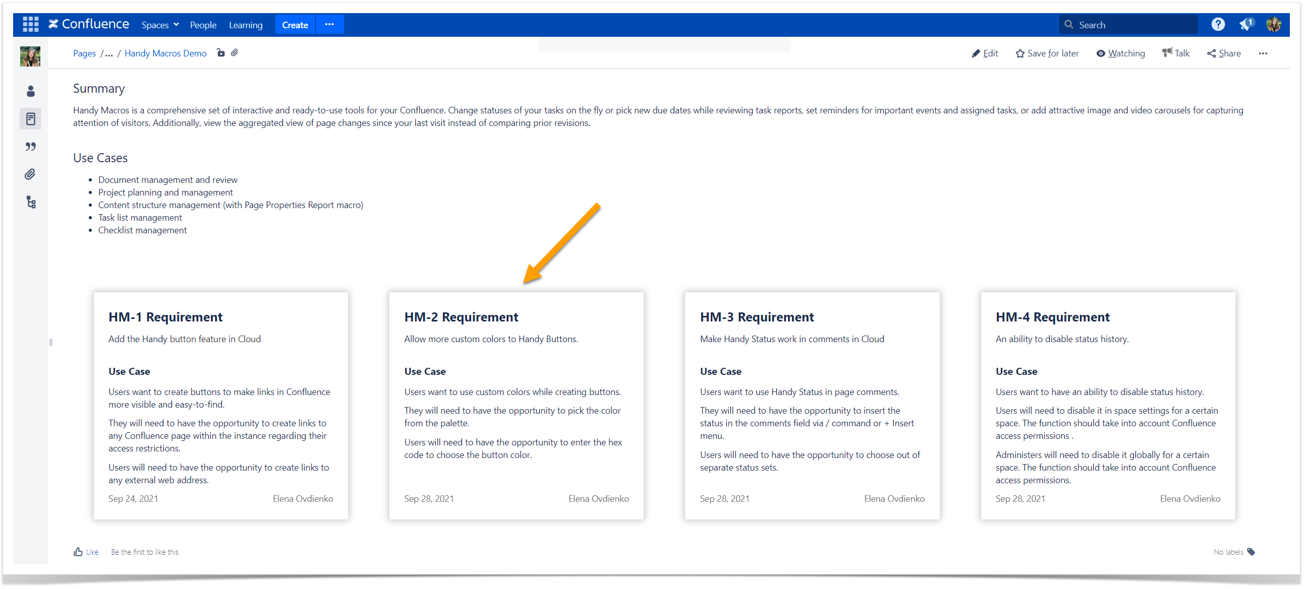
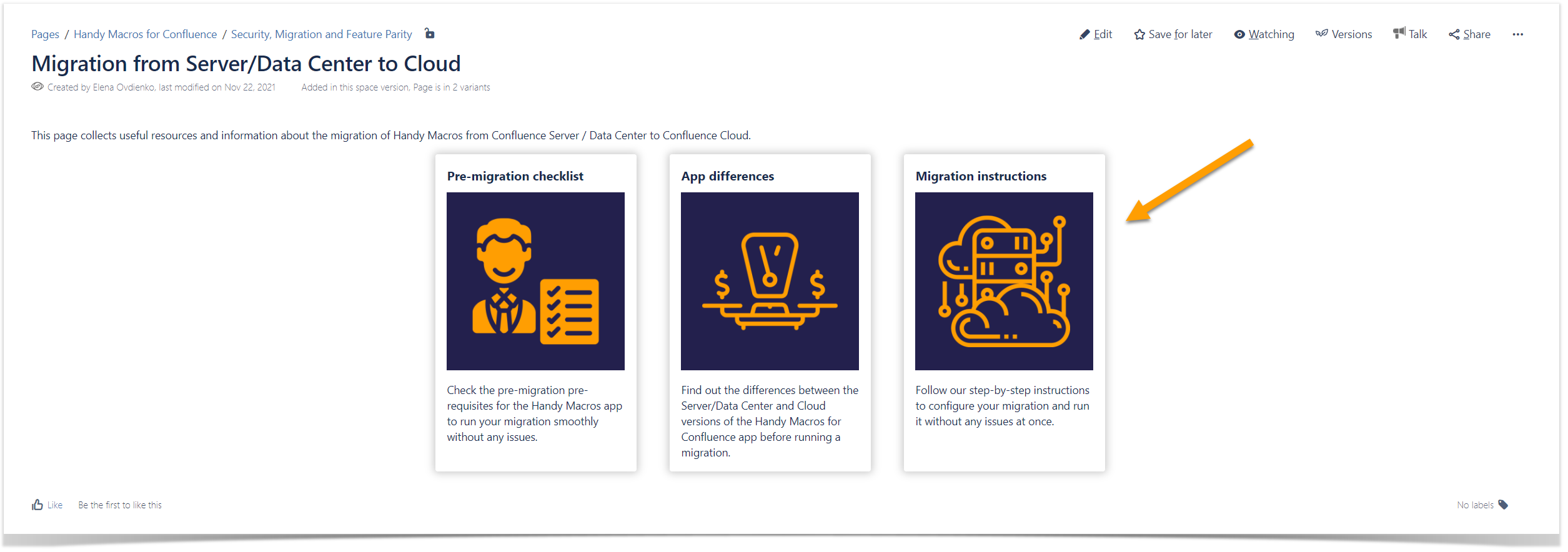
Still, you can encounter many use cases when you need to create a clickable preview for children pages or list pages from different spaces on one Confluence page. Handy Cards can give you this flexibility. Use this macro from Handy Macros for Confluence to generate page previews from child pages, pages by labels, and any external pages.
Adjust Handy Cards to your business needs and team workflow. With diverse setting options available, any user can create clickable cards on Confluence pages in a minute. Handy Cards can fit into any page because you can change their layout, width, number, and content on the fly. Consider adding images to your page previews on Handy Cards to make Confluence pages even more appealing.
Enrich your page functionality with interactive elements
Interactive elements are a good means for capturing attention and improving the user experience. They help you better organize page content and save time you spend on editing and interacting with a Confluence page.
The choice of dynamic elements you may want to include mainly depends on your primary needs and use cases. Let’s look at the most common interactive elements. Most teams use them to enrich Confluence functionality and deliver more with less effort.
Do you use statuses a lot in your Confluence? No big deal! Statuses bring consistency and transparency to all processes and workflows.
Confluence has the Status macro, to add a colored lozenge with a status value on a page. You can choose a solid or light background color for your status and the text that appears inside the lozenge.
If you are still manually typing status values any time you need to add a new status or change the existing one, there’s a macro for that.
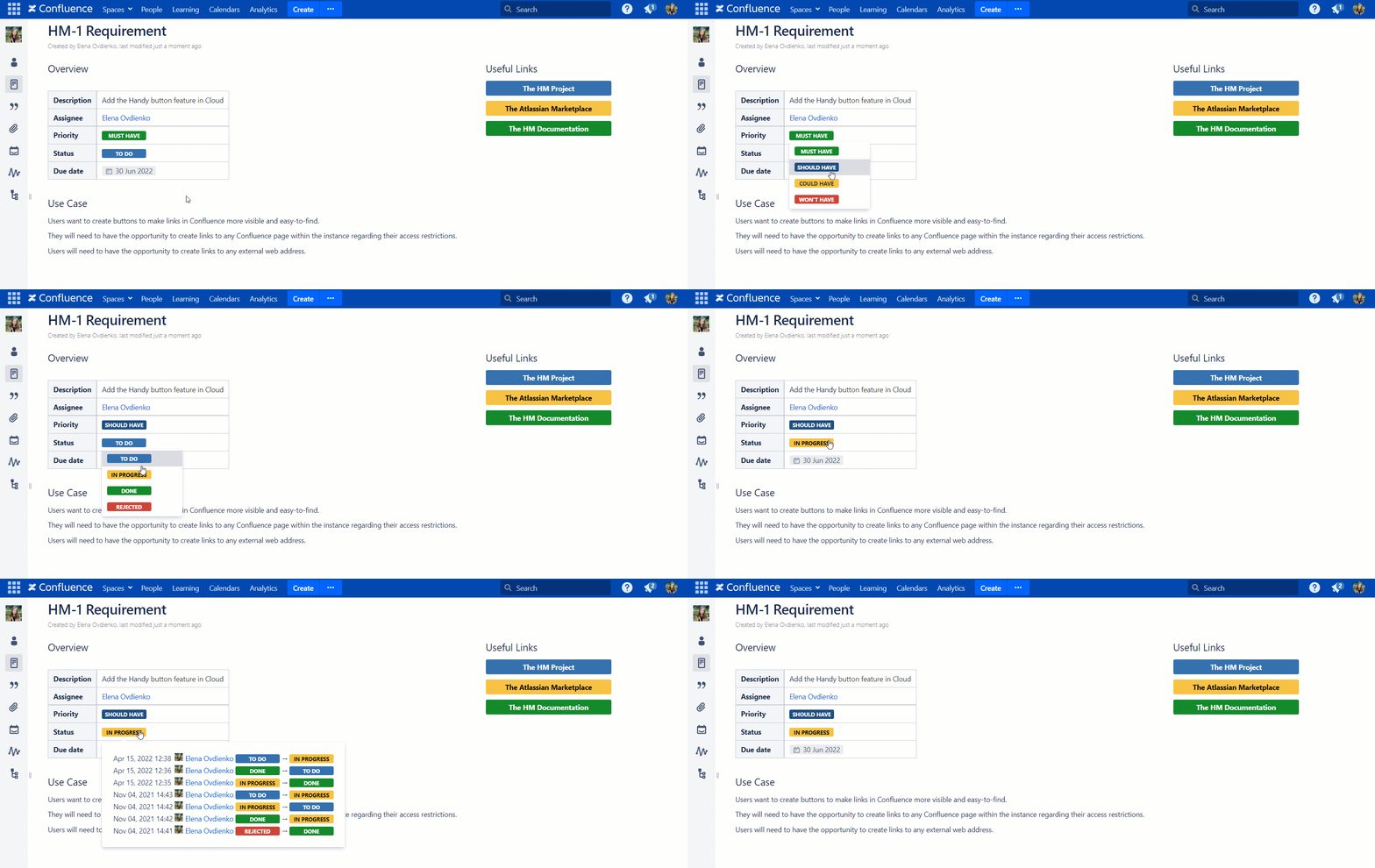
Handy Status will save you up to four hours a week and bring your status management in Confluence to a new level. With Handy Status, you can create dropdowns on Confluence pages and use them without editing. Status switch becomes a breeze and saves your time for other tasks.
Additionally, you can benefit from the Handy Status history. Just hover over the status to see the recent changes, including the time, the user, and the status value. Dynamic statuses can improve your team’s workflow.
If you work with statuses a lot and have them distributed between multiple Confluence pages, it can be time-consuming to get an overview of all your project statuses at once. Browsing through pages one by one to get the information about statuses sounds frustrating. A ready-to-go solution is the ability to synchronize Handy Status with the page label. After doing this, you can create Content by Label reports or quickly locate all the pages with the same status. Labels are automatically updated on each status change, so you always have up-to-date data and can concentrate on other work.
You can include Handy Status in tables for quick bulk updates and filtration and track status progress across several Confluence pages with the Page Properties and the Page Properties Report macros. The Handy Status functionality makes it useful for teams of all sizes and industries.
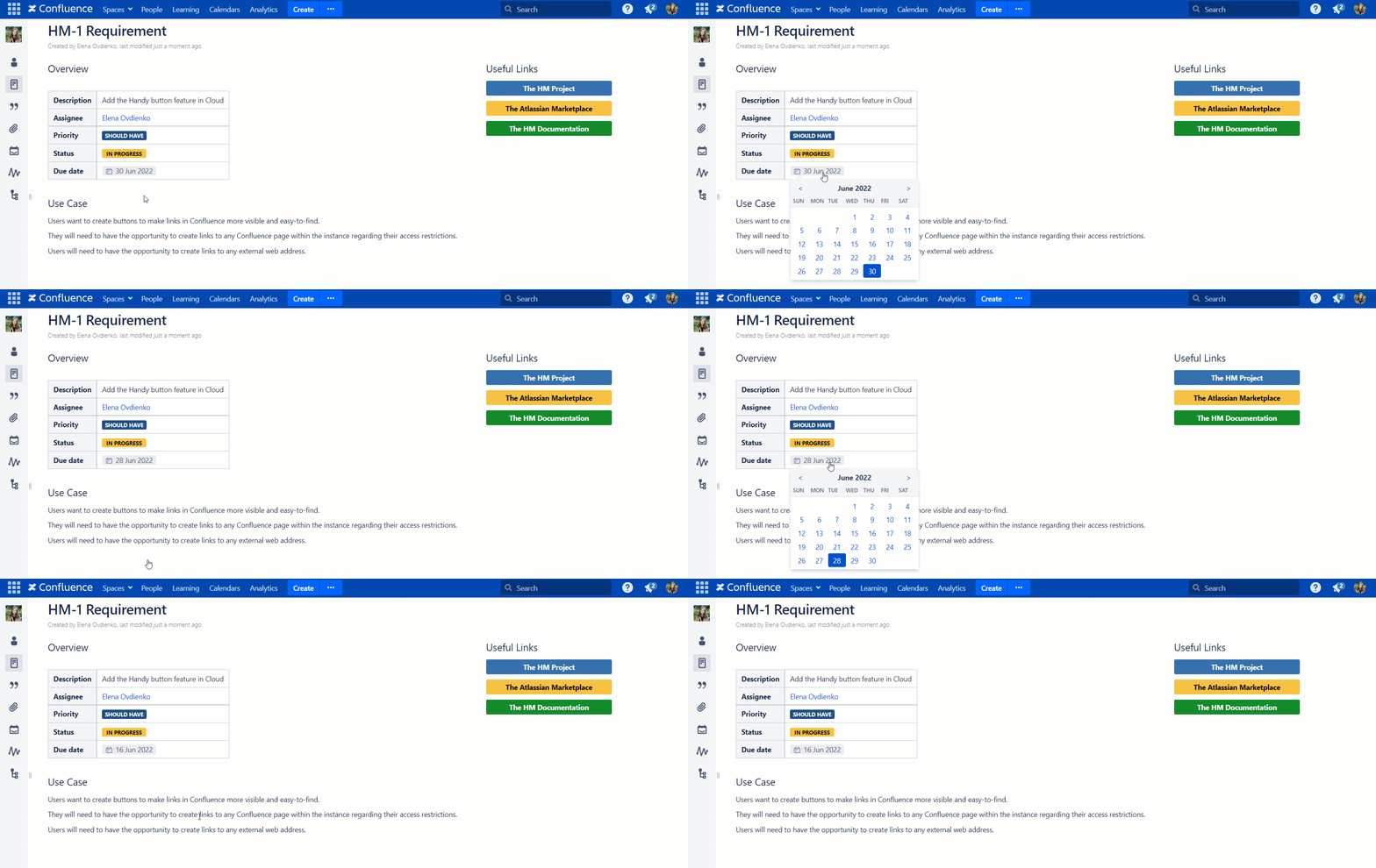
Another common item on a Confluence page is a date. You can insert it by typing // when editing a page. After that, a calendar appears, and you can pick up the desired date.
Changing the date on a Confluence page is a minor update, but it requires additional page editing. With long Confluence pages, switching to the edit mode requires much time.
The solution to the problem is a date-picker that can be used when viewing a page. Handy Date makes it possible for you.
Try Handy Date and Handy Status together to create dynamic Confluence tables. They increase the team speed by two when working with data in Confluence.
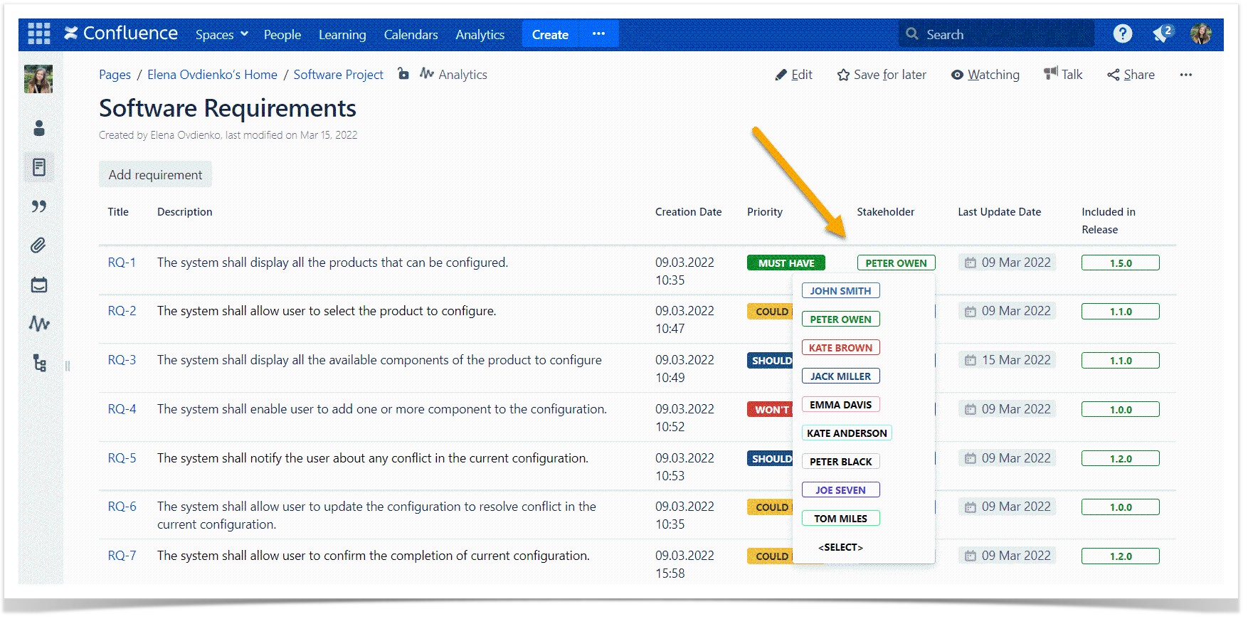
Want a pro tip here? You can create interactive dropdowns with Handy Status for any text content, not only statuses. Use it for company names, employees, locations, or other content and save even more time.
Combine them all and make your Confluence pages more attractive!
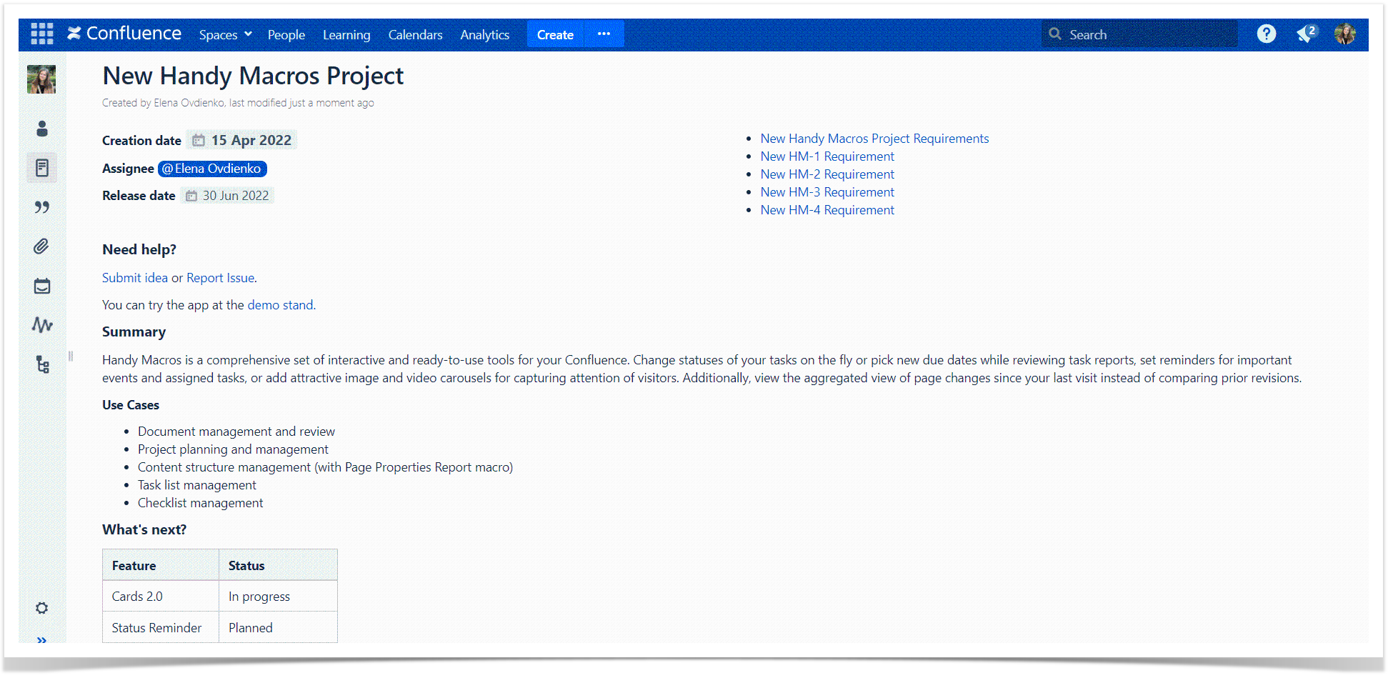
Let’s do some magic on one useful but dull page using the elements described in this blog post:
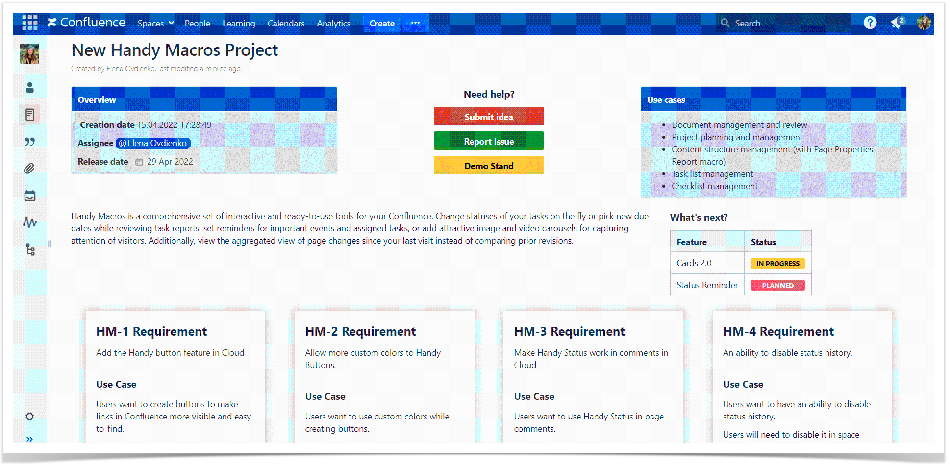
Five minutes later, the page looks completely different:
You can always adjust the look of your Confluence content and get more fun in the collaboration process with the help of Handy Macros for Confluence.
Combine the tools from this post as you want to organize the content structure and tailor page design to company needs in your Confluence. Feel free to perform some experiments. Your readers will appreciate it!


