Pull Request Analytics: How to Visualize Cycle Time / Lead Time and Get Insights for Improvement

Cycle Time / Lead Time is one of the most important metrics for software development. It can tell a lot about the efficiency of the development process and the teams’ speed and capacity. In the previous article, we showed you two ways how to get pull request Cycle Time with Awesome Graphs for Bitbucket:
- using the out-of-the-box Cycle Time report to track this metric directly in Bitbucket UI
- exporting detailed pull request statistics, including Cycle Time / Lead Time and its stages calculated on the global, project, repository, and user levels
Today, we’ll tell you how to use exported data to:
- visualize the pull request Cycle Time in Confluence
- find things to pay attention to in the reports
- get insights to improve performance
Please note that we define Cycle Time / Lead Time as the time between the developer’s first commit and the time it’s merged or declined and will refer to it as Cycle Time throughout the article.
Visualize Cycle Time in Confluence to analyze your codebase
Track average Cycle Time over time
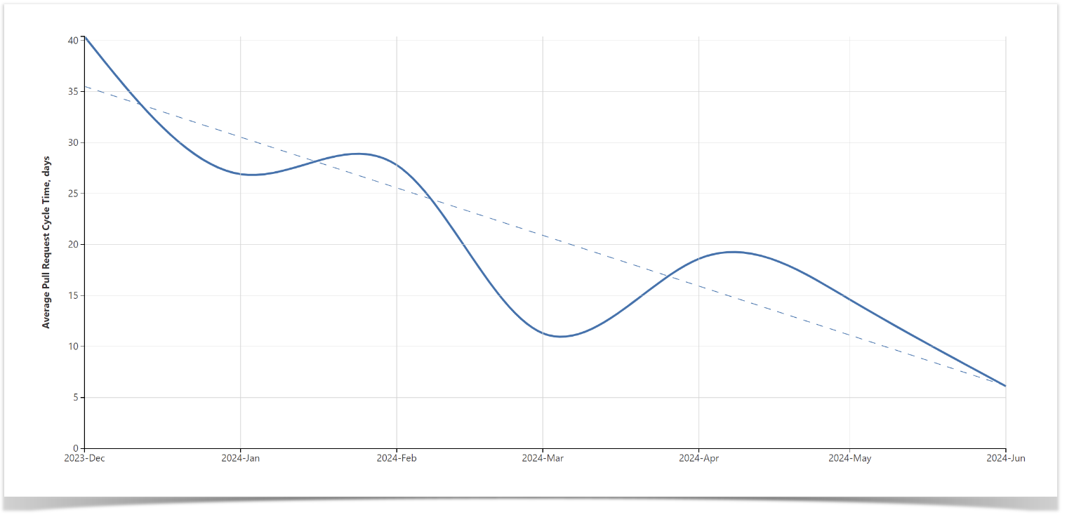
To get a better understanding of the development process, it might be helpful to look at the teams’ dynamics and monitor the changes over time. The following chart shows how the average Cycle Time changes month after month with a trend line so you can see objectively whether the development process is getting faster or slower and check how your rates compare to the industry average.
Follow these instructions to build a Cycle Time chart in Confluence using Table Filter, Charts & Spreadsheets.
See the distribution of Pull Request Cycle Time
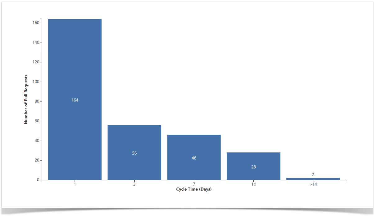
For more precise analysis and evaluation of the current code base, you can also use the Cycle Time distribution chart. This chart provides pull request statistics aggregated by their Cycle time value, making it easy to spot outliers for further investigation. Visit the documentation to see the guidance on how to build the Cycle Time distribution chart in Confluence.
Visualize Cycle Time stages: Time to open, Pickup time, Review time, Time to resolve
While Cycle Time serves as a great indicator of success, and keeping it low can increase the output and efficiency of your teams, it’s not diagnostic by itself and can’t really tell what you are doing right or wrong. To understand why it is high or low, you’ll need to dig deeper into the metrics it consists of: Time to open, Pickup time, Review time, and Time to resolve.
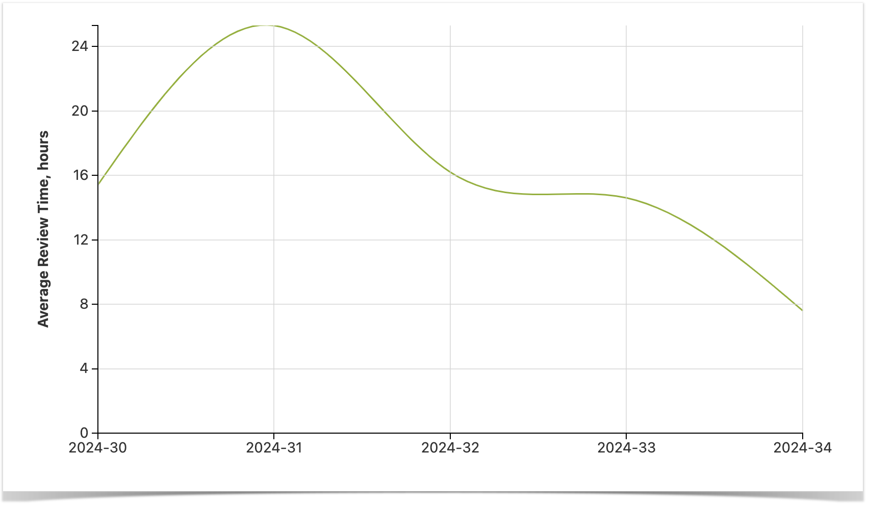
Using Awesome Graphs for Bitbucket as a data provider and Table Filter, Charts & Spreadsheets for data visualization in Confluence you can build reports showing the dynamics of each stage of the cycle. Below is an example of a graph that reflects the dynamics of Review Time. We’ve described in detail how to build a PR Review Time report in one of our articles, feel free to check it. The same guidance can be applied to visualize any stage of the cycle.
Breaking down the Cycle Time
We break down Cycle Time into four stages:
- Time to open (from the first commit to open)
- Pickup time (from open to the first comment)
- Review time (from the first comment to approved)
- Time to resolve (from approved to merge)
Now we’ll go through each of these stages, discussing the things to pay attention to.
Time to Open
This metric is arguably the most important of all, as it influences all the later stages and, according to the research, pull requests that open faster tend to merge faster.
Long Time to Open might indicate that the developer had to switch tasks and/or that code was rewritten, which might also result in large batch sizes. In one of the previous articles, we described how you can check the size of your pull requests in Bitbucket, so you can also use it for a deeper analysis.
One of the things you can do to improve your Time to Open is to decrease the pull request size to be no more than 200 to 400 lines of code. Thus you’ll influence each stage of the cycle, as the smaller pull requests are more likely to be reviewed more thoroughly and be approved sooner.
Pickup Time
Pickup Time is a great metric to understand if your teams adopted Code Review as part of the daily routine. If it’s high, then it might not be part of their habit, and you’ll need to foster this culture. Another reason might be that the pull requests are not review-friendly and the reviewers procrastinate dealing with them. You can change this, once again, by keeping the pull request size small and by writing a reasonable description so it’s easier to get started with them. If the long Pickup time rate is caused by organizational issues, then it might require reprioritization.
Review Time
This is the stage you don’t really want to minimize but rather make it consistent by reducing inefficiencies in the code review process. While there are many strategies for Code Review, there is hardly any industry standard for Code Review metrics, so you’ll need to focus on the organization of the process and try to find a way to get constructive feedback.
Time to Resolve
Long Time to Resolve might be an indicator that there are obstacles in the delivery workflow. To improve it, you need to find out if there are any blockers in the process, including manual deployment, and check if your tooling satisfies your current needs.
Wrapping up
Cycle Time’s importance is difficult to overestimate, as this metric can tell a lot about the way you work, and controlling it, you can optimize the development process and deliver faster. We exported the initial pull request report with the help of the Awesome Graphs for Bitbucket app as a data provider and used the Table Filter, Charts & Spreadsheets for Confluence app to aggregate and visualize Cycle Time data.
These are just a few examples, but you can get much more custom reports. Check out the other guides for charts based on data from Bitbucket. Share your feedback and ideas in the comments, and we’ll try to cover them in future posts.


