How to Create a Pivot Table in Confluence

Confluence doesn’t support pivot tables out of the box. You can either export your table to Excel and paste the pivot back, or create a pivot table directly in Confluence using a third-party macro. Read on to explore both options and set up a pivot in minutes.
Key takeaways
-
Confluence has no built-in pivot table function, so your two main options are to export the table to Excel and build the pivot there, or use a third-party pivot table macro in Confluence.
-
Exporting to Excel works once, but it doesn’t scale for ongoing reporting, especially with large tables, where it quickly turns into manual back-and-forth.
-
A Confluence pivot table macro (such as Pivot Table from Table Filter, Charts & Spreadsheets for Confluence) lets you summarize data directly on the page.
-
With a macro like this, you can pivot data from multiple sources, not just native tables, including Jira work items, Content properties report, and imported tables.
-
Once your pivot is built, you can do a lot more with it: turn the summary into visuals with Chart from Table, and combine multiple sources into an actionable dashboard for stakeholders.
Option 1: Manually export to Excel, then paste the pivot back
Copy the table into Excel, build a pivot table there, and then paste the result back onto the Confluence page. That’s the default option for most users.
The downside is that it turns your report into a one-off snapshot. As soon as the source table in Confluence changes, your Excel pivot is already out of date. To keep it accurate, you have to repeat the whole cycle: export again, rebuild (or refresh) the pivot, and paste the updated version back. With large tables, this quickly turns into a lot of manual back-and-forth.
That manual upkeep is completely avoidable, though. Below, we’ll show you how to create dynamic, always up-to-date pivots without exporting to Excel.
Option 2: Confluence pivot table using a third-party macro, step-by-step setup
This approach to creating pivot tables is ideal for teams that maintain operational data across multiple sources inside and outside of Confluence and need a quick, Excel-like way to summarize and break down that data without exporting.
-
Insert the Pivot Table macro into your page (it’s included in Table Filter, Charts & Spreadsheets for Confluence and must be enabled by your admin).
-
Place your source table inside the macro body. This can be a native Confluence table or a macro-generated table (for example, Jira work items or Content properties report output).
-
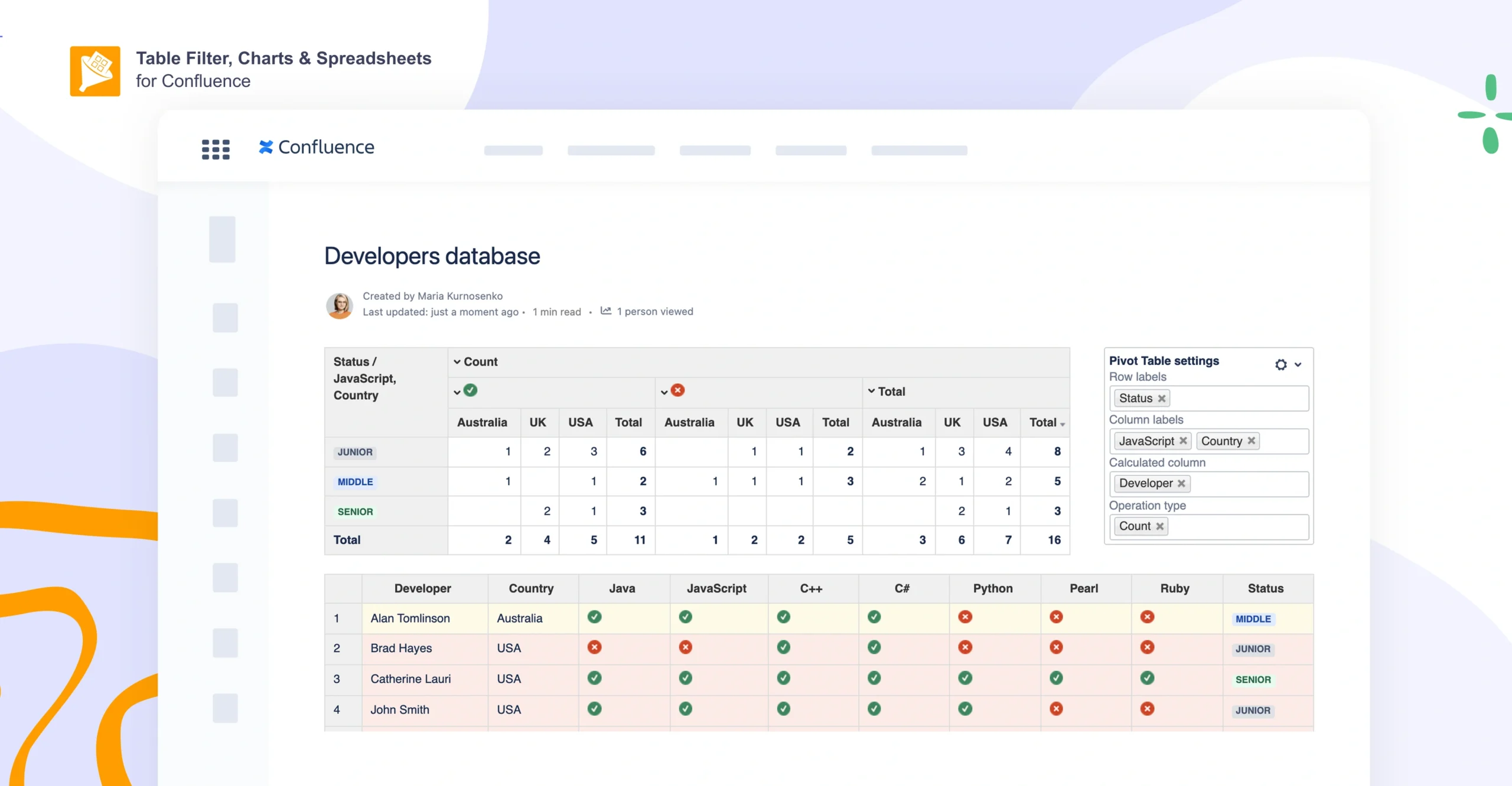
Configure the pivot in the macro settings: pick the columns to use as row labels and column labels, and choose what to calculate in values (e.g., Count, Sum, Average, Min, Max)
-
Publish the page and use the pivot as your summary table. You can later tweak formatting and calculation/display options in the Pivot Table settings.
A pivot table macro like this lets you turn a large table into a readable snapshot that’s easy to share with stakeholders, all within the Confluence page.
How teams use pivot tables in Confluence
Here are several examples of how teams using the Table Filter, Charts & Spreadsheets for Confluence app turn large, hard-to-scan tables into actionable summaries.
Security and compliance reporting
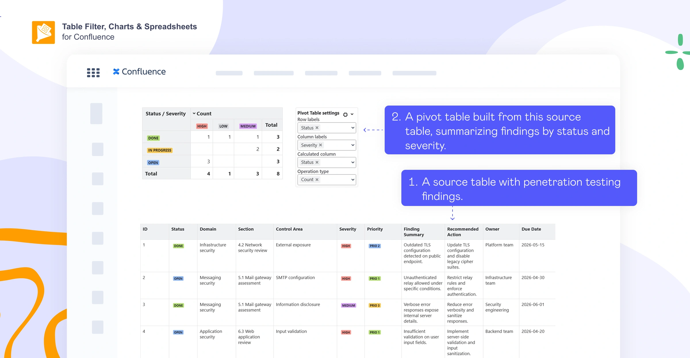
Scenario: Pen test findings are tracked in Confluence as a table (status, severity, priority, remediation notes, owner, due date) that’s too large and detailed to scan quickly during reviews.
How pivot tables help: A pivot table turns the raw list into an instant summary (open vs. closed findings, counts by severity, and ownership breakdowns) so stakeholders can see risk at a glance.
Who uses it: Appsec, IT security, Devsecops, platform security, and compliance-focused teams.
Software testing and QA summaries
Scenario: Test execution results for a release are tracked in Confluence, but the raw table doesn’t give a clear readiness snapshot.
How pivot tables help: Pivot tables aggregate the test results into a release summary (totals by outcome, completion rate, failure rate, and breakdowns by module, component, or location).
Who uses it: QA leads, test managers, release managers, and delivery leads.
Sprint analytics from Jira work items
Scenario: Jira work items data is displayed in Confluence for sprint or project reporting, but a flat list of issues isn’t enough to spot trends or bottlenecks.
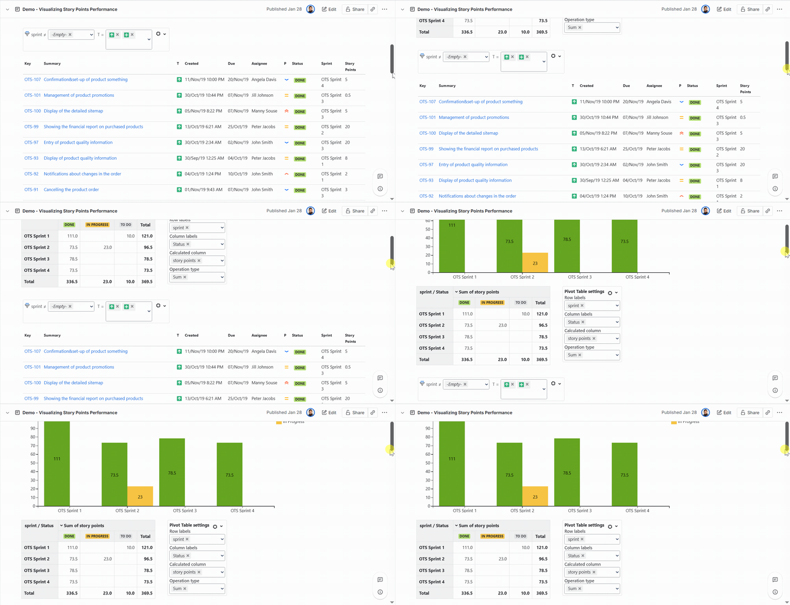
How pivot tables help: Pivot tables group and summarize Jira work items by fields like status, assignee, epic, or story points, making it easy to track workload distribution and progress on a single Confluence page.
Who uses it: Scrum masters, project managers, delivery managers, engineering managers, and product ops teams who report on sprint health.
Example reports:
How to build a report: Pull Jira items into Confluence and turn them into a pivot-style summary. Start with the Jira work items macro to display the items as a table, then use Table Filter, Charts & Spreadsheets for Confluence to slice the data with Table Filter and summarize it with Pivot Table.
Take your Confluence pivot table even further
Creating a pivot from a table is one thing, but with a few extra macros from Table Filter, Charts & Spreadsheets for Confluence, you can take your reporting much further.
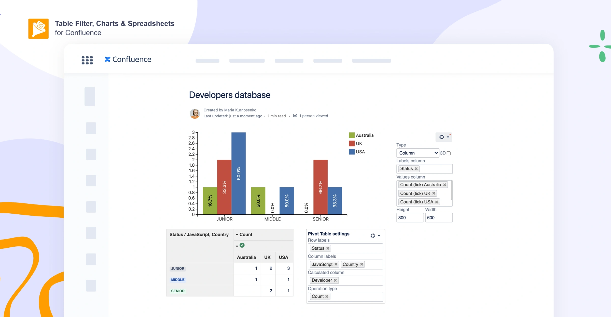
Turn the pivot into a chart
You can also turn a pivot table into an engaging chart. Check out our blog post to learn more about creating charts in Confluence.
Reuse or export your pivot results
There are two ways to share your summary with someone else: reuse it inside Confluence (great for dashboards and templates), or export it (great for sharing outside Confluence or sending a snapshot).
To reuse your pivot table without duplicating the same data across multiple Confluence pages, wrap the Pivot Table output in Table Excerpt, then pull it elsewhere with Table Excerpt Include. In this Atlassian Community thread, for example, a user aggregates pivot tables from multiple pages into a single master page with automatic updates.
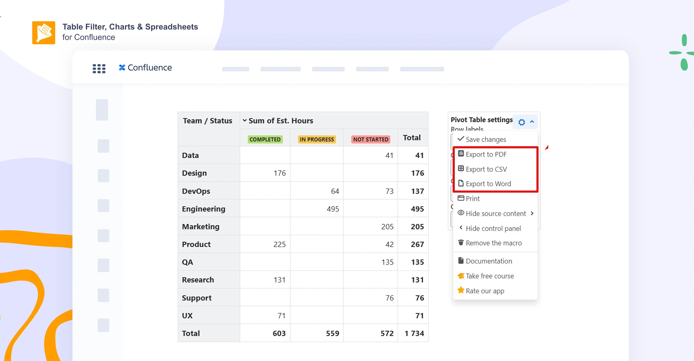
To export your pivot for sharing, open the pivot’s control panel → click the cogwheel → export to PDF, Word, or CSV (see more detailed instructions on how to export macros and results).
Summarize multiple Confluence pages
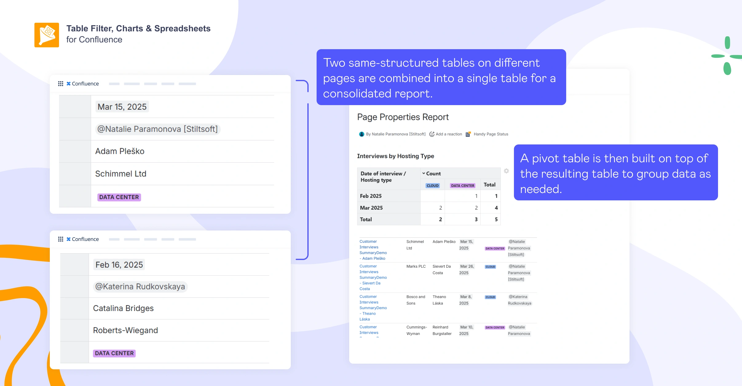
When your data is spread across multiple pages, you can roll it up with Content properties and the Content properties report (previously known as Page Properties and Page Properties Report), then summarize it in a pivot table on a single dashboard page. Take the following steps:
-
Standardize the fields on each item page: On every “unit” page (e.g., bug, backlog item), add Content properties and fill in the same value fields you’ll want to analyze later (e.g., Status, Priority, Owner, Component).
-
Create the roll-up table: On a dashboard page, insert the Content properties report and configure it to pull those pages (most commonly via a shared label, optionally with a parent filter).
-
Add the pivot on top of the report: Add the Pivot Table macro from Table Filter, Charts & Spreadsheets for Confluence, then insert the Content properties report macro inside it so the pivot uses the report table as its source.
-
Configure the pivot: Set Row labels (e.g., Status), Column labels (e.g., Priority, Component), and Values to Count (or Sum, if you’re aggregating numeric fields like Story Points).
-
Publish and reuse: Your pivot updates automatically whenever the underlying pages change, so it stays live without rebuilding the report.
Based on our internal research, teams use this setup for training and project rollups, defect tracking, resource planning, release readiness, and much more.
Try Table Filter, Charts & Spreadsheets for Confluence for free
FAQs
Does Confluence support pivot tables natively?
No, Confluence doesn’t include a native pivot table feature for turning tables into grouped summaries. If you need pivot-style aggregation on a Confluence page, you typically use a macro like Pivot Table, which comes as part of the Table Filter, Charts & Spreadsheets for Confluence bundle.
Can I create a pivot table from Jira issues in Confluence?
Yes. First, use Confluence’s built-in Jira work items macro to pull issues onto the page as a table. Then wrap that table in the Pivot Table macro from Table Filter, Charts & Spreadsheets for Confluence to use it as the source. This lets you group and summarize issues by fields like Status, Assignee, Priority, or Story Points without leaving Confluence.
How do I filter the data that feeds my pivot table?
In Confluence, you usually filter upstream (filter the source table first, then pivot the remaining rows). When combining multiple macros, use a wrapper such as Table Toolbox to control nesting and ordering.
Can I build a chart from a pivot table in Confluence?
Yes, after you create a pivot table, you can turn that summary into a visual chart. Add the Chart from Table macro from the Table Filter, Charts & Spreadsheets for Confluence app (available on the Atlassian Marketplace) and use your pivot table as the chart’s data source.
Can I reuse one pivot table on multiple pages without duplicating it?
Yes, you can “package” the pivot output and reuse it elsewhere. Wrap the Pivot Table result in Table Excerpt, then insert it on other pages with Table Excerpt Include. This is useful for building a master dashboard page that automatically pulls multiple pivot summaries from different pages.
Can I roll up data from multiple Confluence pages into one pivot summary?
Yes, you can do this by using Content properties and Content properties report to generate the roll-up table, then wrapping that output in the Pivot Table macro to create counts/breakdowns on a single dashboard page.


