How to Make Charts and Graphs in Confluence

Every human receives almost 90% of information through the eyes, which is why the visualizations can improve the cognition of your information by the target audience. If you use Confluence for data storage and processing, graphs and diagrams will become real helpers in this. They also make a page look good and help you communicate important points clearly and effectively.
Many in-built and third-party tools allow you to build diagrams, charts, and graphs in Confluence. In this article, you’ll find more information on different apps for building charts and graphs. You’ll learn how to use the native Confluence Chart macro and see one of the apps in action.
Top five apps for charts and diagrams
The Atlassian Marketplace suggests a wide range of apps in the Charts & Diagramming category. You can find a suitable tool depending on your needs and budget. See top five charts and diagrams apps in this category and their specifications in the table below:
| App | Confluence Server/Cloud/Data Center | Price, 500 Users, 1 Year | ||
|---|---|---|---|---|
| Server | Cloud | Data Center | ||
| Draw.io Diagrams for Confluence | $3200 | $200 | $6000 | |
| Gliffy Diagrams for Confluence | $6250 | $1025 | $6250 | |
| Table Filter, Charts & Spreadsheets for Confluence | $1000 | $185 | $1000 | |
| PlantUML Diagrams for Confluence | $10 | $65 | $1000 | |
| Multivote&Enterprise Survey for Confluence | $890 | $1000 | ||
Even though Multivote&Enterprise Survey for Confluence does not create diagrams, it is still at the top of the category. You can combine it with other macros and apps, for example, use Table Filter, Charts & Spreadsheets for Confluence to build a chart based on the results of your survey.
As you can see, these solutions differ to suit various needs. In this blog post, we will tell you more about apps and features for transformation of table data into charts. You’ll learn more about the Table Filter, Charts & Spreadsheets for Confluence app and the free inbuilt Confluence Chart macro.
Table data can be generated by some macros (for example, SQL for Confluence), copy-pasted from Excel, or created from scratch in Confluence. When you have a set of data in your tables, you can generate a visually appealing graph using various tools.
Chart Macro
It is the native macro bundled within Confluence. It offers you the following capabilities:
- supports Pie Chart, Bar Chart, 3D Bar Chart, Time Series Chart, XY Line Chart, XY Area Chart, Area Charts, Gantt Chart
- has a large number of settings to adjust and customize your graphs
- requires edit mode to configure the macro settings
- covers all simple cases when you need to draw a graph
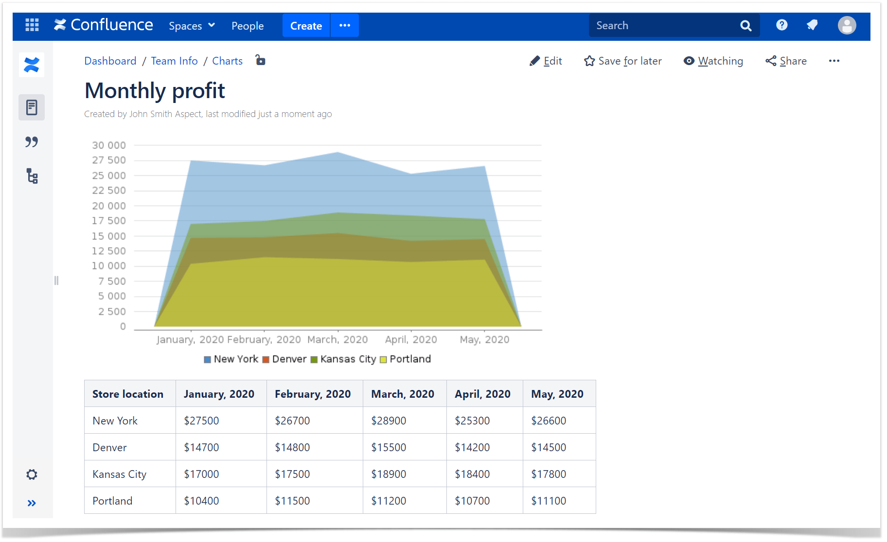
For example, you can create an Area chart as follows:
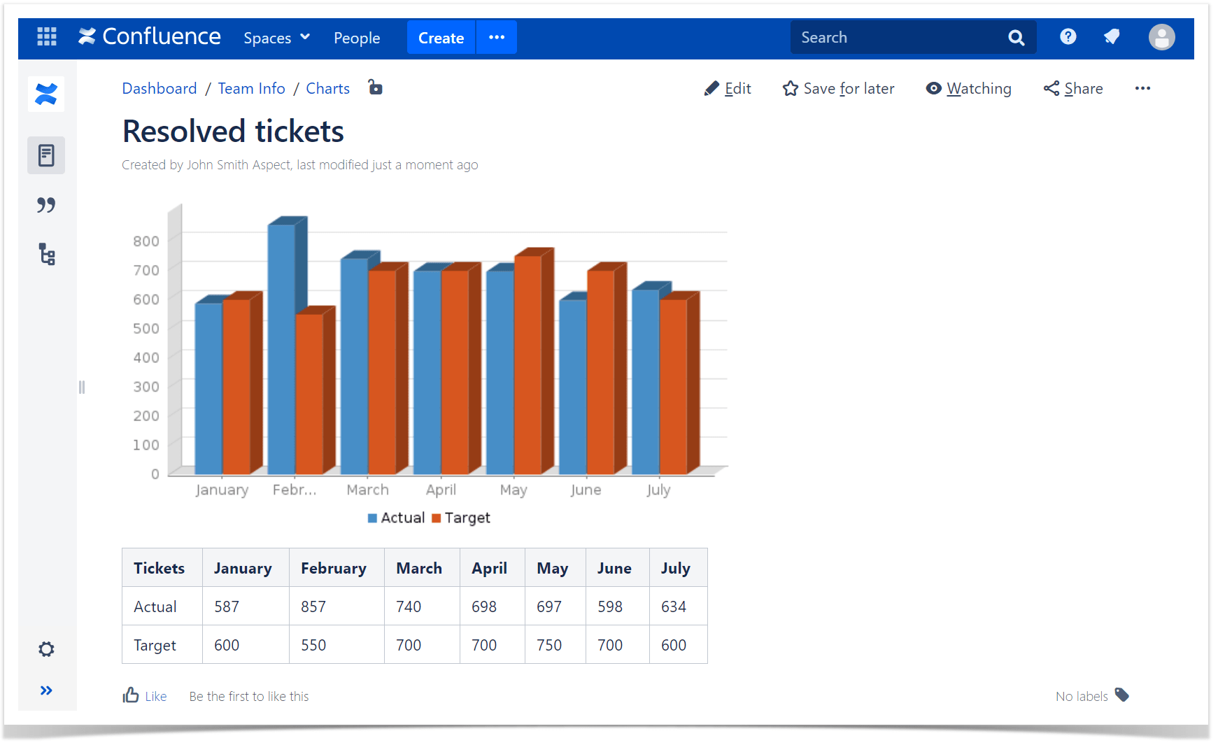
Or render a 3D Bar chart:
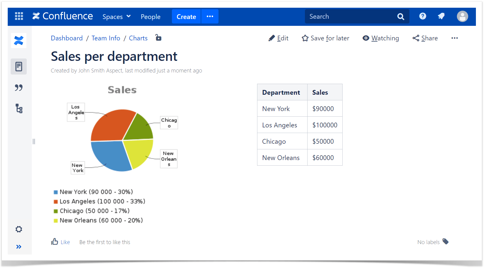
Or see the ratio between different entities with a Pie chart, like the following one:
Table Filter, Charts & Spreadsheets
The app is being continuously developed and improved by Stiltsoft, an Atlassian Gold Marketplace Partner and Silver Solution Partner. Graphs are a part of the functionality that the Table Filter, Charts & Spreadsheets app offers. The app is a pretty useful and flexible solution that includes several macros for various purposes. These are three of its most popular features:
- Table Filter helps you filter complex and large tables on the fly right when viewing or editing a Confluence page.
- Pivot Table allows you to create a pivot table with aggregated and summarized values from big and complex tables.
- Chart from Table can draw graphs using data from the tables (macro-generated tables also supported).
Table Filter, Charts & Spreadsheets is available for Server, Cloud, and Data Center Confluence versions, so you can use all of the macros regardless of your hosting type.
You can choose among the following chart types:
- Gantt chart
- Pie and Donut chart
- Bubble Pie chart
- Column, Stacked Column, Bar, Stacked Bar chart
- Line, Area, Stacked Area chart
- Time Line, Time Area, Stacked Time – Area chart
- Radar (Spider) chart
- Contiguity / Barcode chart
- Scatter plot
- Punchcard
Graph samples with Chart from Table
You can build charts instantly in the view mode from a regular or pivot table.
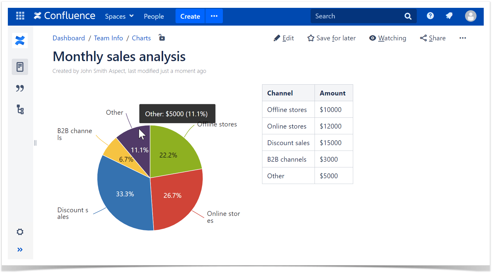
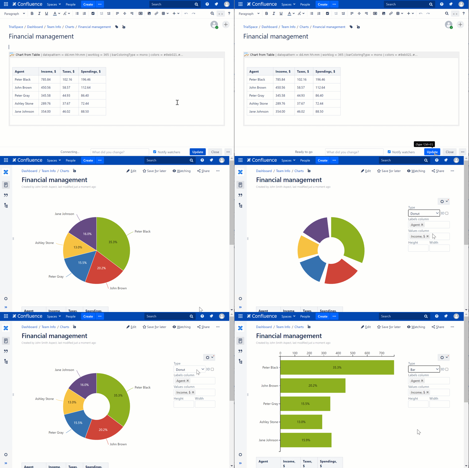
Create pie charts with the monthly sales analysis, as follows:
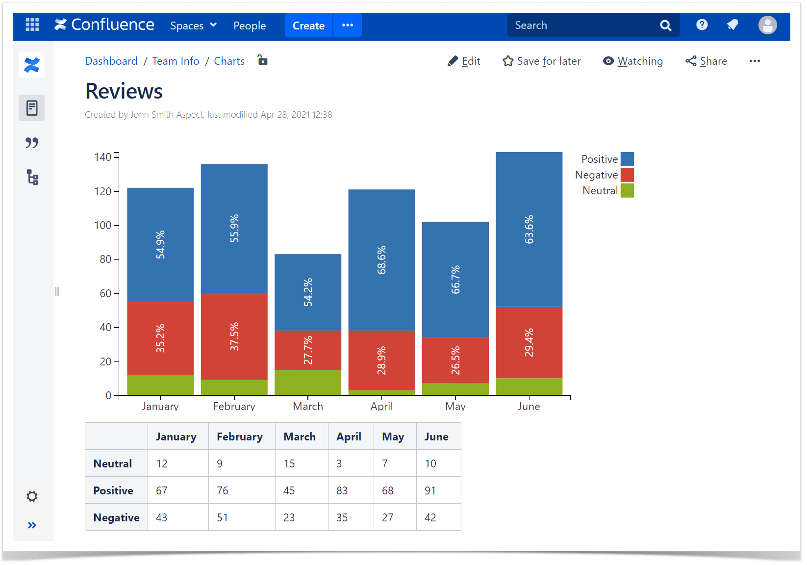
Create a stacked column chart to see the overall picture against multiple indicators, like this:
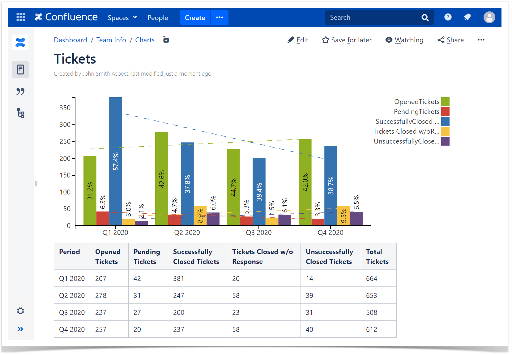
Create a multi-column chart to see the progress and trend over some time period, as follows:
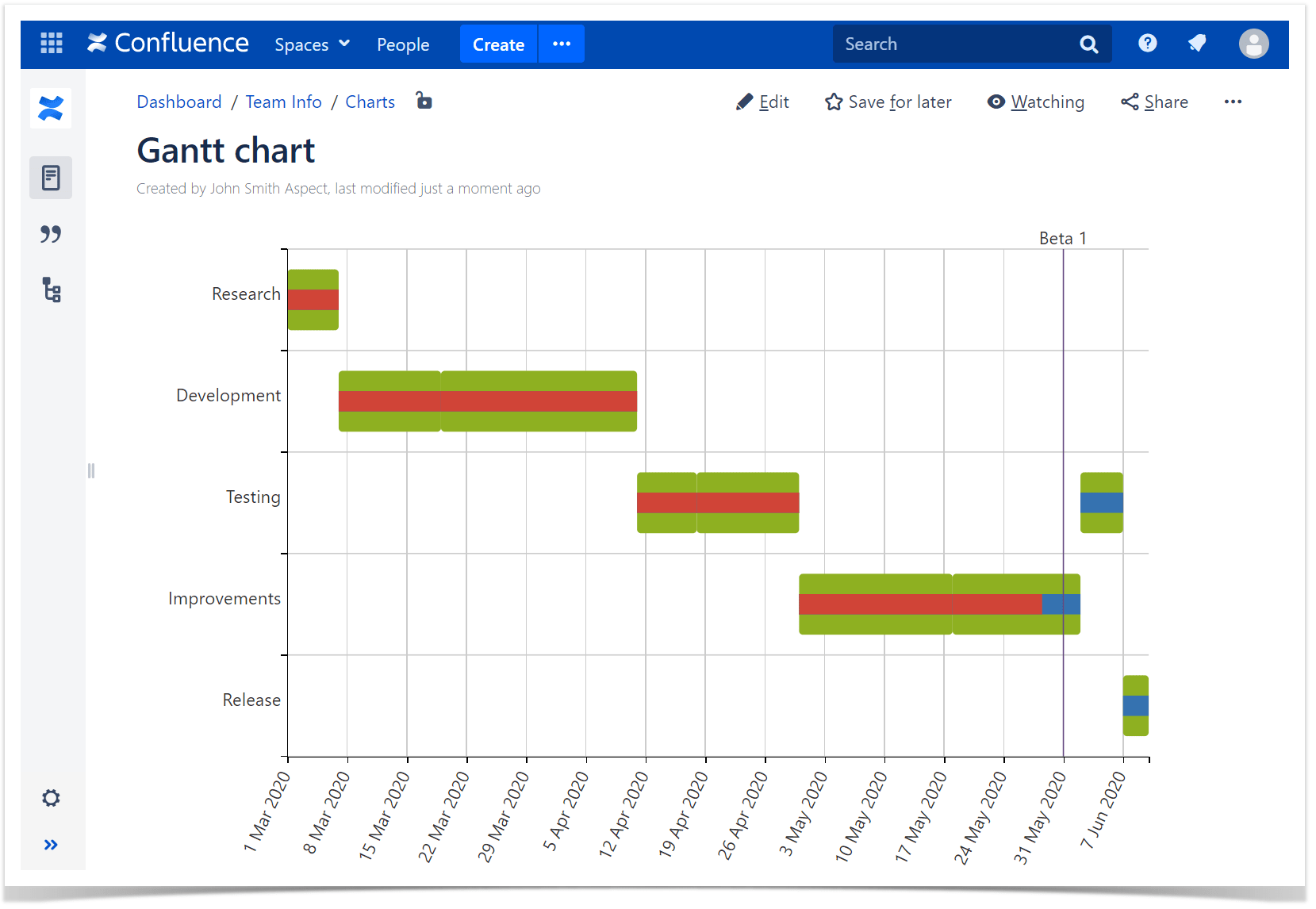
Or build a Gantt chart to see the workflow of a project:
You can download the chart as a picture, export it into a PDF or Word file. Also, you can instantly modify the chart settings while viewing the page by using the management panel, which can be hidden, as well as filter the source table:
Pro tip:
Learn more about using Spreadsheets in Confluence
Table filtering capabilities
The Table Filter macro allows you to filter any table right in the page view or edit modes (the table will be immediately redrawn depending on the specified filter values). The rich set of filters helps you easily handle multi-format data turning large and complex tables into smaller, simpler ones.
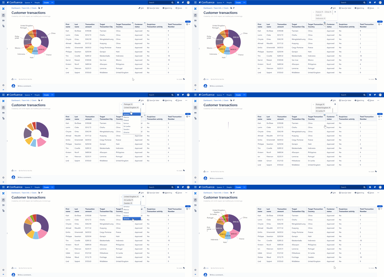
If you have a dashboard with a table and a chart, filtering the table automatically influences the graph, depicting only the sorted information.
Filtering can be temporarily disabled or saved if needed.
Pivot Table
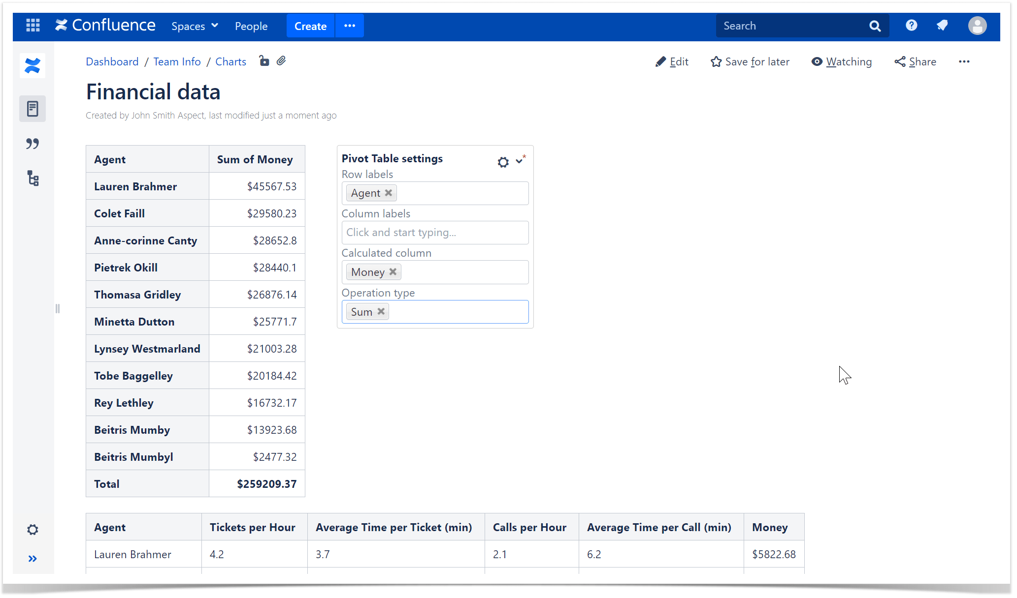
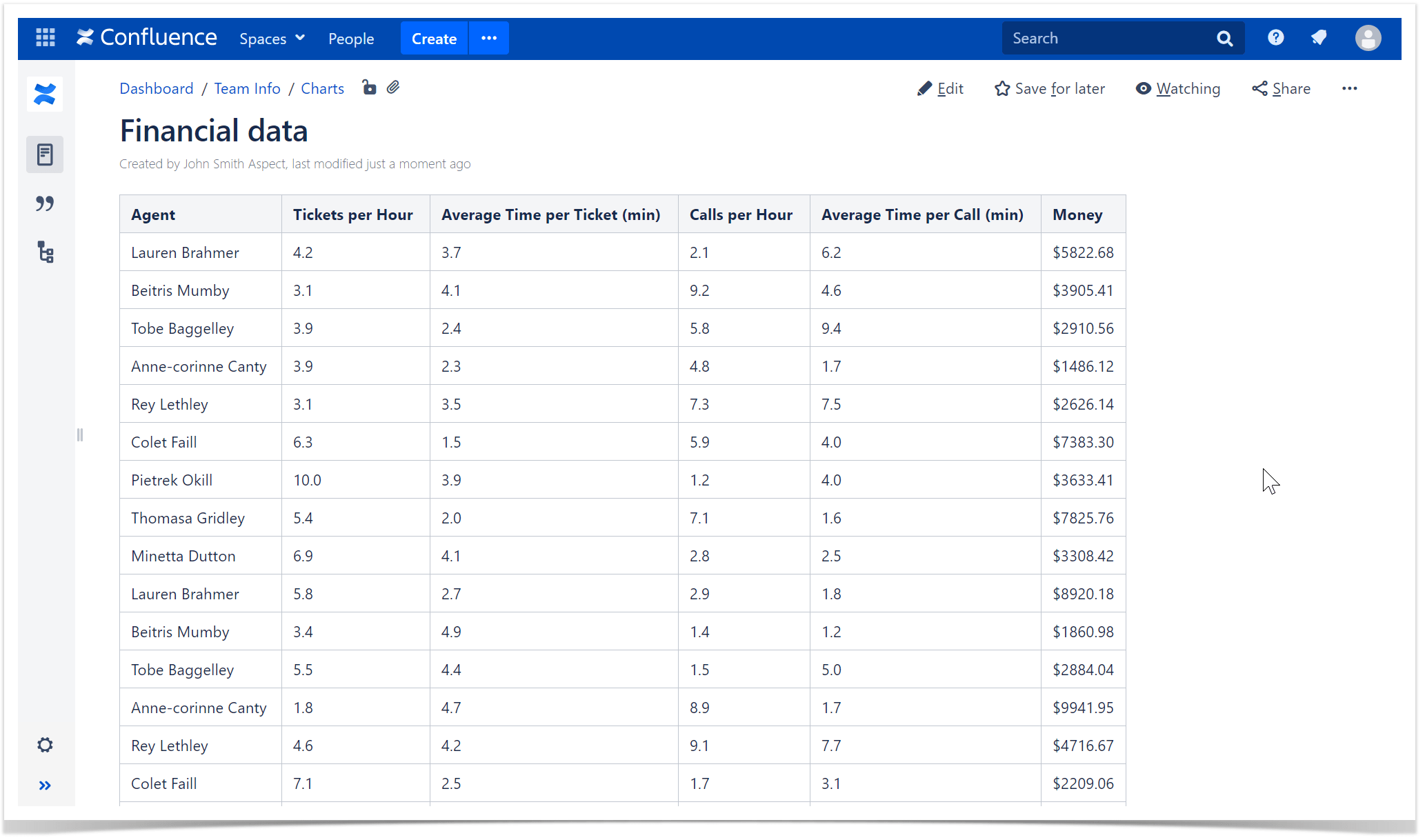
This macro allows you to get a pivot table based on some ‘heavy’ table with repeated values by applying different types of aggregation. Pivot tables help you simplify the information in a table before turning it into a chart.
Combo!
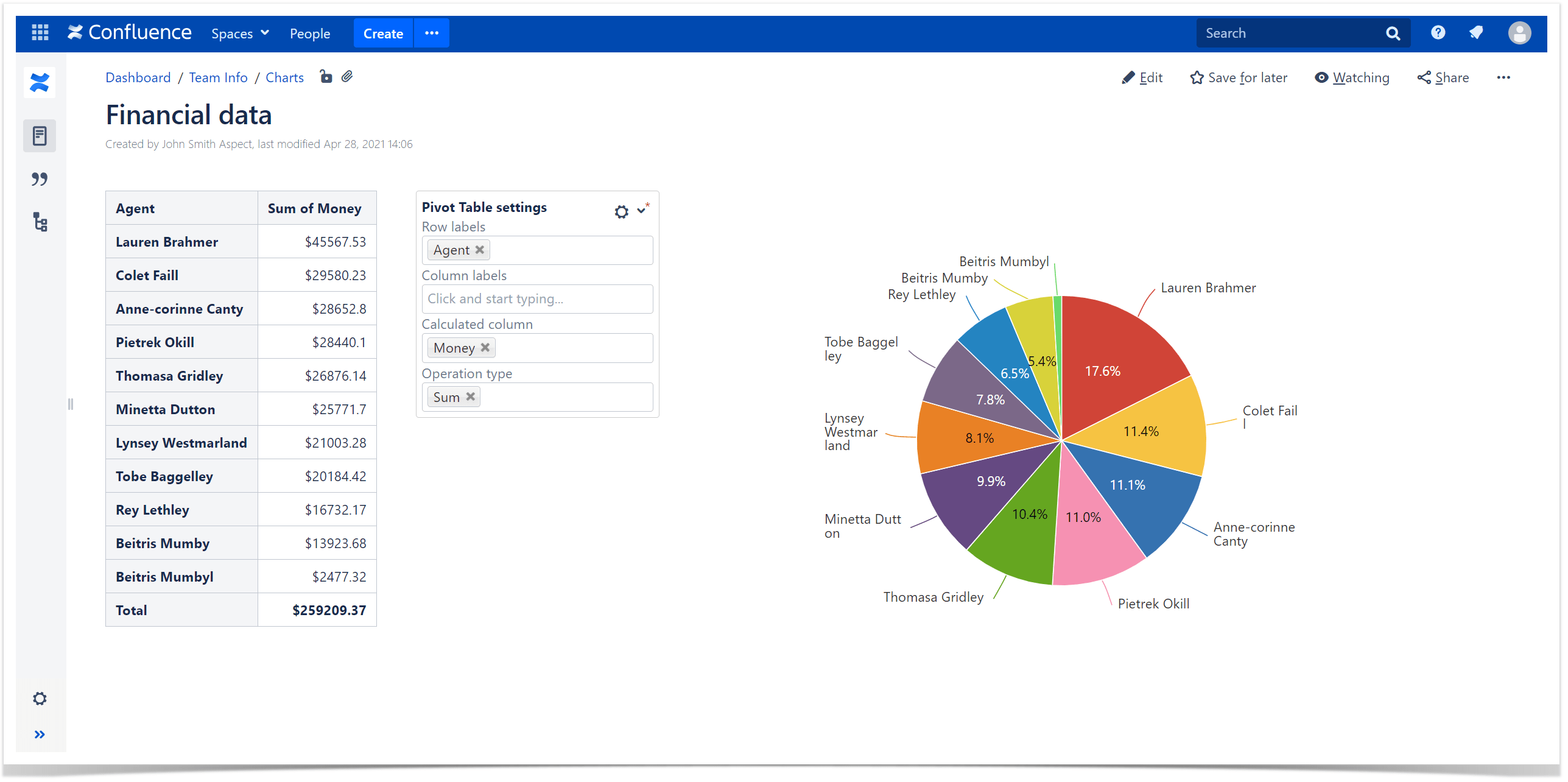
You may combine all these three macros from the Table Filter and Charts app into a single data processing mechanism. In such a way, you can even draw graphs from the filtered pivot table. And, of course, if you make some changes in filtration or graphs settings, the dashboard will be automatically updated according to your changes.
How to get and visualize data from Jira in Confluence
Of course, Atlassian supplies you with the out-of-the-box Jira integration in Confluence. If you use Confluence Server or Data Center, you need to set up an application link to your Jira instance. In Confluence Cloud, you can simply paste a URL to Jira into the page, and it will convert into the Jira Issues macro. Then you’ll be able to receive and handle your Jira data. You can visualize it with the Jira Chart macro (Jira filters and JQL queries are supported). Three types of charts are available:
- Pie Chart from Jira
- Created vs. Resolved Chart from Jira
- Jira Two Dimensional Chart
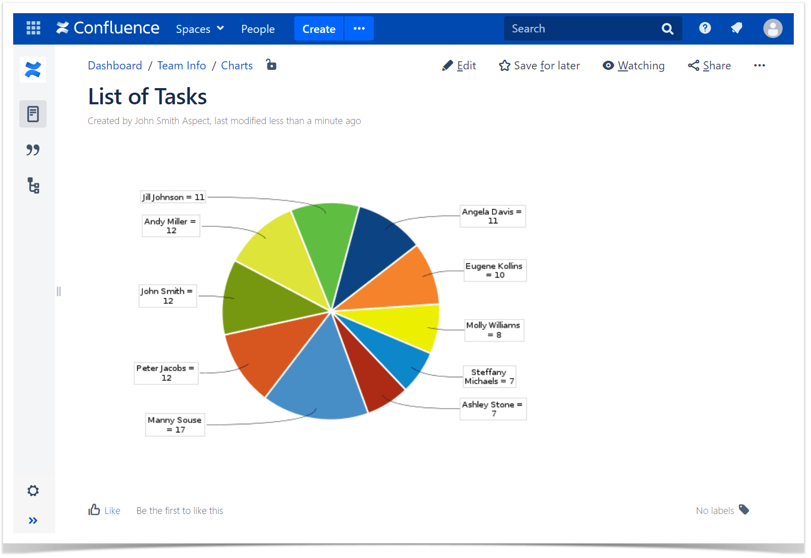
An example of a pie chart with the number of issues per assignee will look like this:
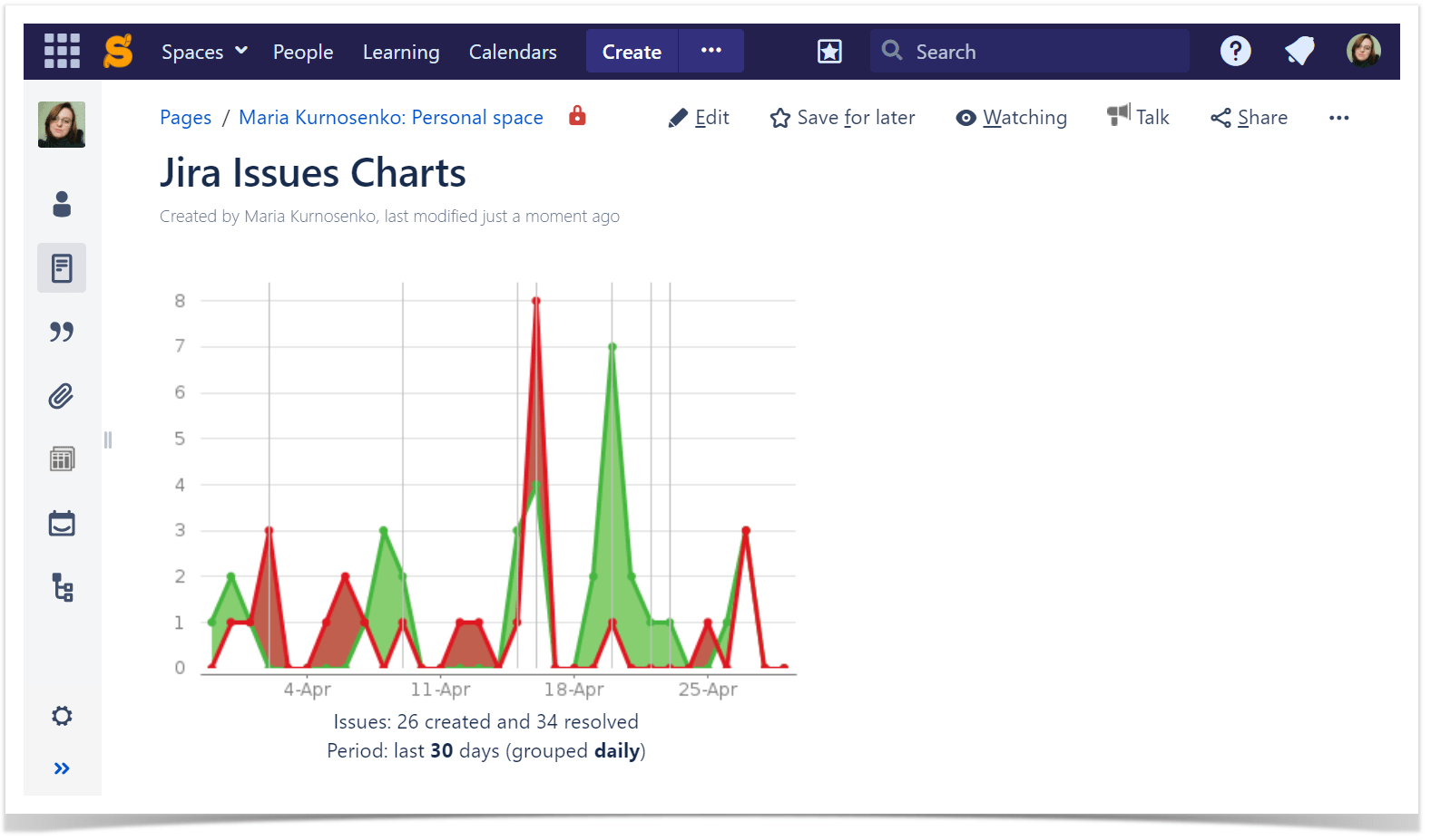
The comparison of created against resolved issues looks like this:
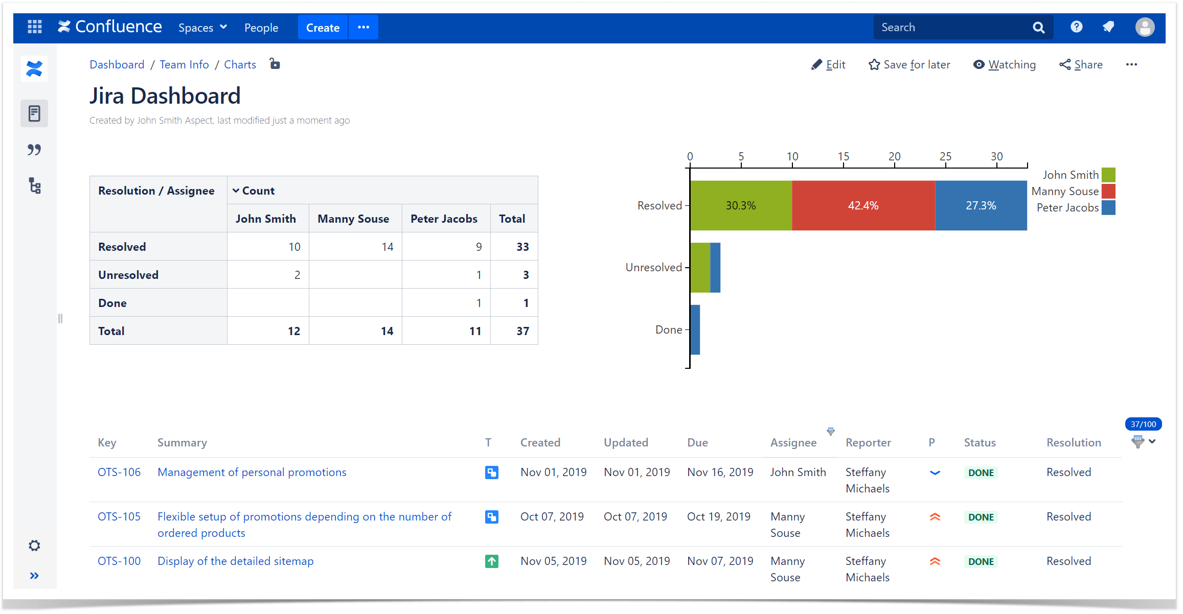
The sample two-dimensional chart looks like this:
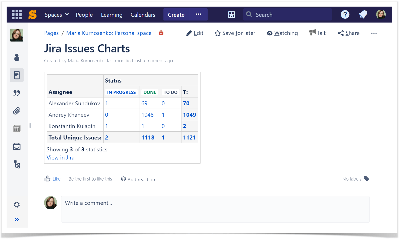
Alternatively, you can process the incoming Jira data with the Table Filter, Charts & Spreadsheets for Confluence app. With its help, you can build a chart from the table containing Jira issues or apply the Pivot Table macro and then create a chart from the calculated pivot table. You can also filter the issues if the list is too big. Of course, you can use the Jira macro filtration, but it is much more flexible and convenient to use the Table Filter macro. In this case, you can make changes on the fly, and graphs will be redrawn automatically. Combo!
Interested in trying our app?
You can see it in action on our demo server. And, of course, find out details in the documentation or watch the tutorials on YouTube to reveal all the capabilities of the Table Filter, Charts & Spreadsheets app. Also, check out a comparison table for the Chart and Chart from Table macros which can help you select a suitable macro for your needs.


