Handy Jira Dashboards for Project Management in Confluence

Learn how to enhance your reports even further by adding engineering metrics from Atlassian Bitbucket in our blog post Bitbucket Statistics Dashboards for Project Management in Confluence
Project management usually associates with Jira because this solution gives teams an easy way to track tasks and activities. However, project managers also use Confluence for team collaboration, reporting and planning. Project teams can share pages, comment on content, or create a customized dashboard with the help of flexible tools and export it to Word and PDF.
Confluence allows you to effectively address complex challenges at work because you can easily combine its native macros with third-party solutions. Table Filter and Charts for Confluence is one of such apps. This app includes the Table Filter, Pivot Table, Chart from Table, and Table Transformer macros that allow you to interpret table data according to your needs.
In this blog post, we will show you how to build a fully-fledged dynamic Jira project report in Confluence. We will build this report with the help of the Jira Issues macro and the five most popular charts for project planning.
Open vs. resolved issues graph
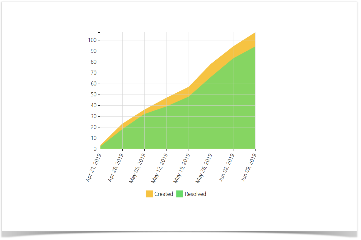
During project implementation, project teams constantly add new tasks, features, and bugs. That’s why they need to visualize the dynamics of project backlog and find bottlenecks (when the amount of work to do is several times as high as the amount of work a team can perform).
The Created vs. Resolved Issues report is a difference chart. This graph helps users choose the required time period and get information about the number of created issues vs. resolved issues. It allows teams to understand whether the overall backlog is moving towards resolution or not.
Check out a full guide on how to build the graph.
Velocity and committed vs. completed story points chart
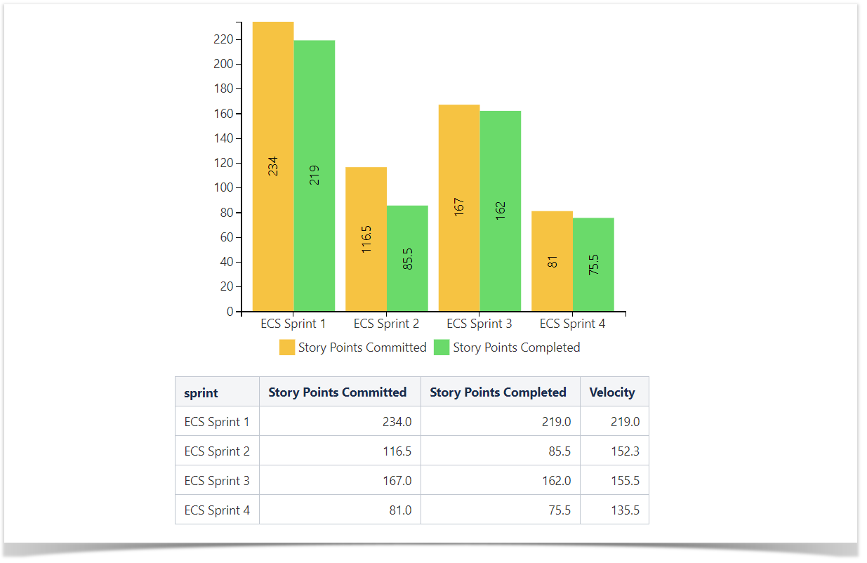
One of the most popular methods to evaluate story points performance in Agile is calculating and visualizing team’s velocity per sprint. Velocity helps to define the amount of work a team can tackle during a single sprint. This knowledge is essential for effective sprint planning and delivery time prediction.
For a deeper dive into calculating velocity, see a full guide on how to work with this graph.
Pro tip:
Learn more about using Spreadsheets in Confluence
Burnup and burndown charts
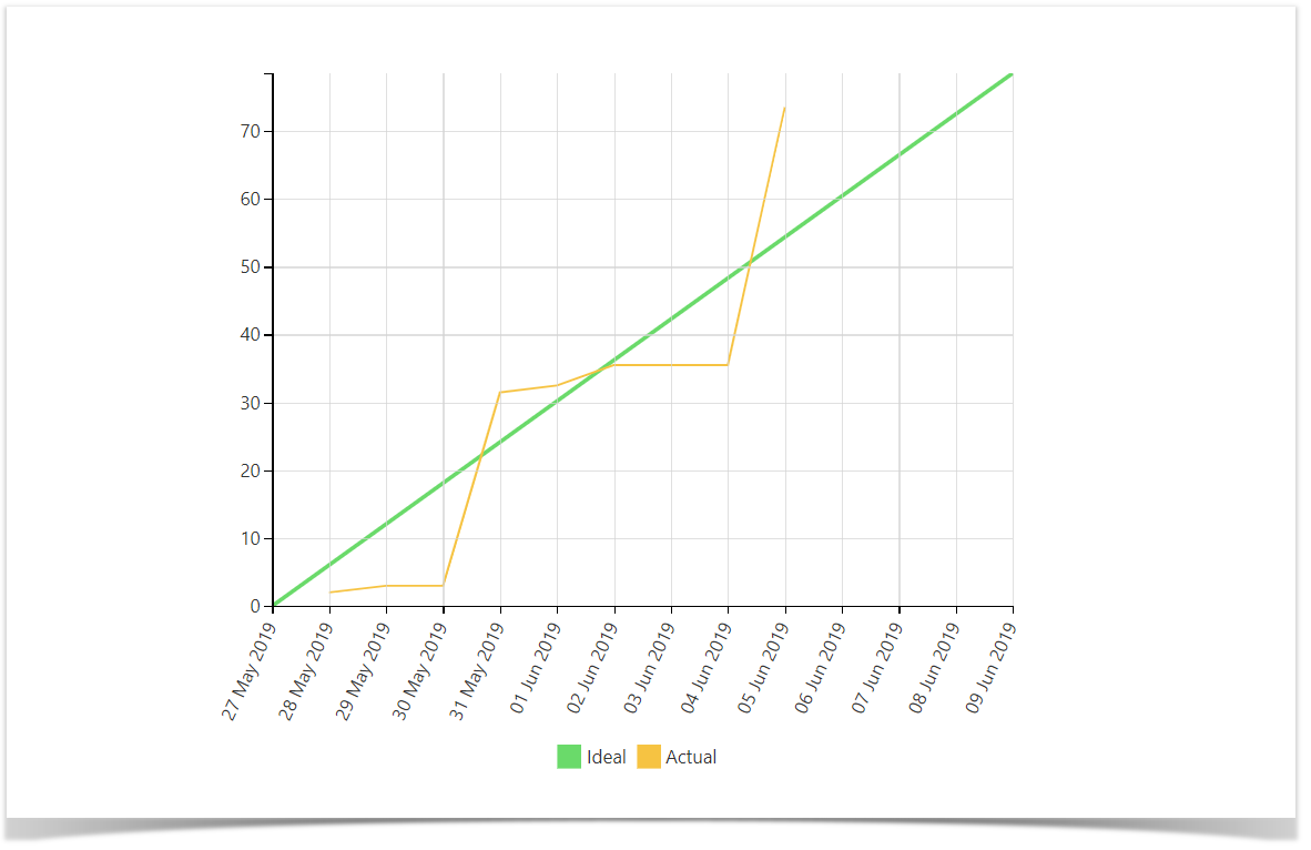
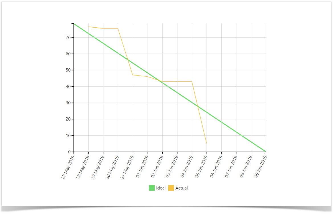
Another widely used method for tracking progress towards sprint completion is building burnup and burndown charts. These charts also give a rough picture of how much time will it take to complete the work.
A burnup chart displays the amount of work that has already been completed and the total amount of work that should be completed during a sprint.
For more on tracking progress with a burnup chart, read a full guide created by our team.
A burndown chart displays how much work remains on a project.
For more, check out a full guide, featuring additional tips for building a burndown chart.
Gantt chart
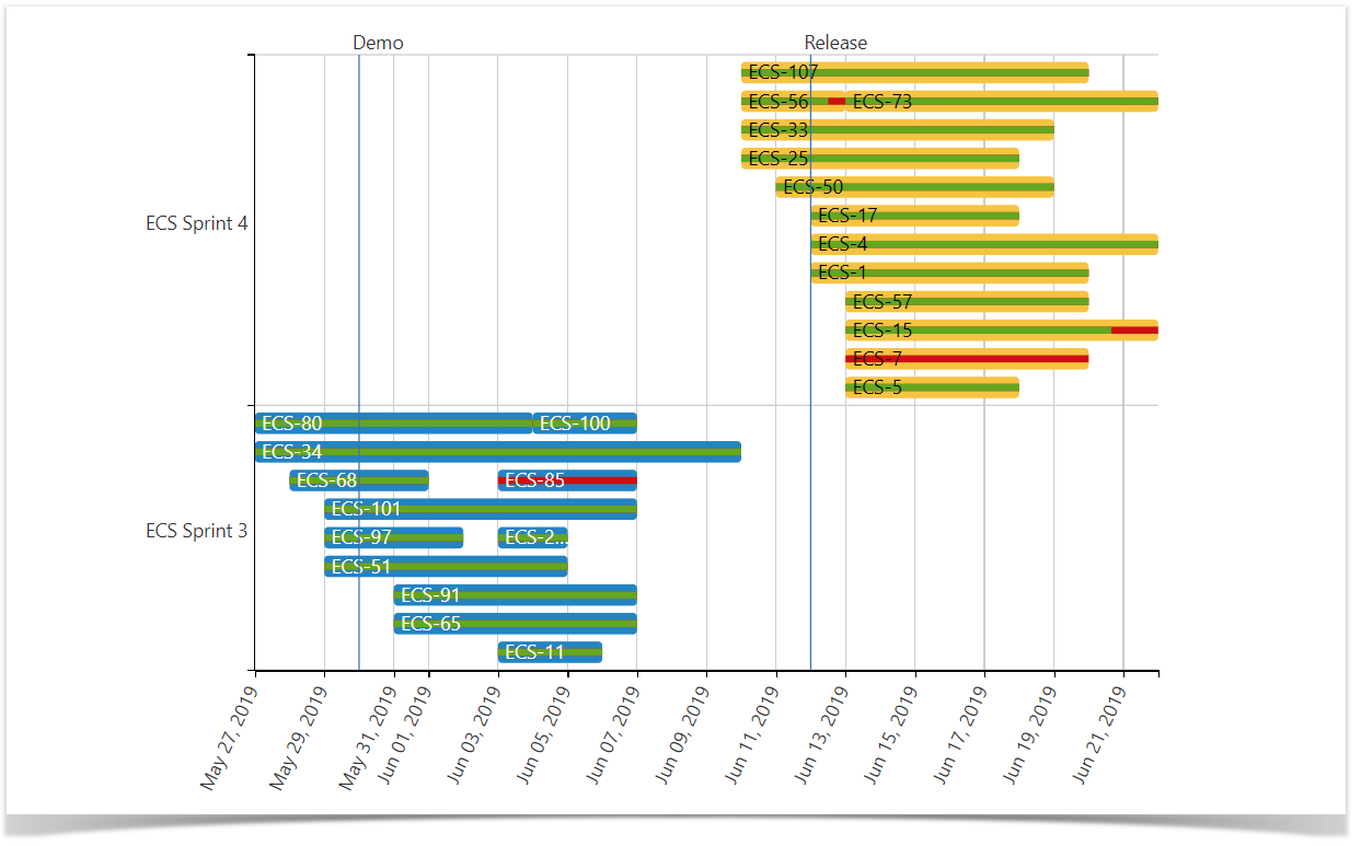
A Gantt chart is one of the best tools that helps you get a quick overview of the whole project or its stages. This chart is a timeline that illustrates how the project will run. You can view individual tasks and their duration and group them by different criteria: sprint, type, component, assignee, and more. Moreover, you can easily add the column with percentage values to display the completion ratio.
If you want to learn more about how to build a powerful Gantt chart, follow our guide or check out five tips to become a Gannt chart expert.
Creating your report
You can use these five charts to build a report that will help you always track project progress. Moreover, you can build all these charts (and, by the way, lots of other charts and graphs) using only one Jira Issues macro. Furthermore, you can save your dashboard as a template and use it for multiple projects. The only thing you need to do is to change the JQL query in the source Jira Issues macro.
You can find the details on our documentation site: How to use Table Excerpt and Table Excerpt Include macros. If you would like to build similar charts and graphs on your own, try the Table Filter and Charts for Confluence app for free.
We created this blog post to show you how our customers benefit from using our app in agile project management and described the most popular use cases they encounter.
Feel free to contact our friendly support team, we’re always happy to help you put your ideas into life.


