How to Get Bitbucket Reports on Developer Activity

One of the best ways to track developer activity is by using reports that visualize engineering metrics relevant to your team. However, as built-in reports are not available natively in Bitbucket, this can be tricky and time-consuming. Fortunately, with the help of simple tools, it is possible to visualize Bitbucket metrics in just a couple of clicks! In this article, we will share how to set up Bitbucket reports on developer activity using Awesome Graphs in your Bitbucket Cloud instance.
Awesome Graphs for Bitbucket is a tool for engineering managers and teams that transforms invisible developer activities into easy-to-understand graphs and reports. It helps over 1,6K engineering teams, including Apple, Oracle, and MasterCard, manage productivity, remove blockers, and streamline delivery.
Choosing developer activity metrics
The first step on the path to getting the right reports on developer activity is understanding what metrics are important to your team. A good candidate here is a metric that can provide insight into the process you are looking to evaluate or improve. For example, for teams looking to streamline their code review process, metrics like pull request resolution time and number of pull request comments will likely be helpful. Similarly, if a team is looking to understand the activity patterns of individual engineers, metrics like commit frequency or the number of added lines of code might be of interest.
Here is a list of some of the metrics that can be easily tracked in Bitbucket reports available with the Awesome Graphs app:
- pull request resolution time
- number of pull request comments
- commit frequency
- number of added and deleted lines of code
How to get pull requests and commit reports
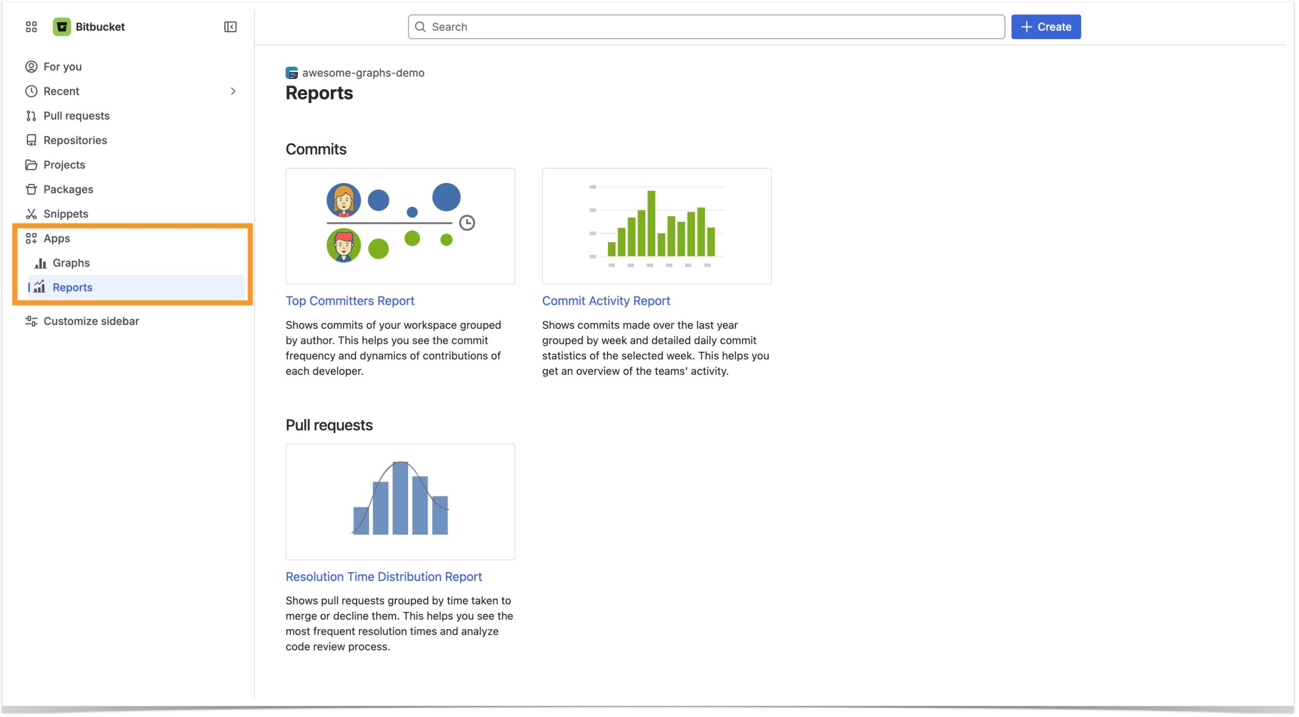
To set up Bitbucket reports, install the Awesome Graphs app and navigate to the Graphs/Reports in the Apps section of the left sidebar.
The next step is to simply select a report and configure what data you would like to be included in the visualization.
Pull request metrics
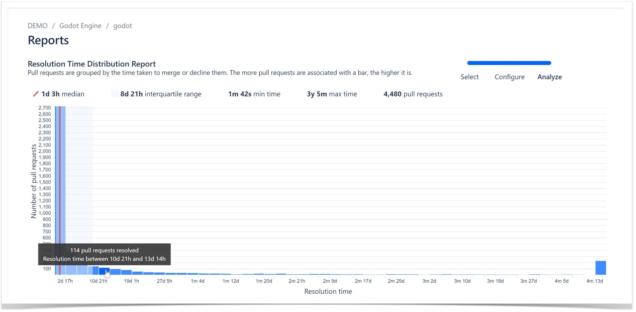
As an example, let’s take a look at the Resolution Time Distribution Report that can help you analyze resolution time for pull requests in just one click:
Hovering over any bar helps you see the exact number of PRs that were resolved within a certain time interval, and above the graph, you can find useful statistics.
For teams looking to track even more PR metrics, like the number of pull request comments or state distribution, we recommend taking a closer look at our Pull Request REST API.
Commit metrics
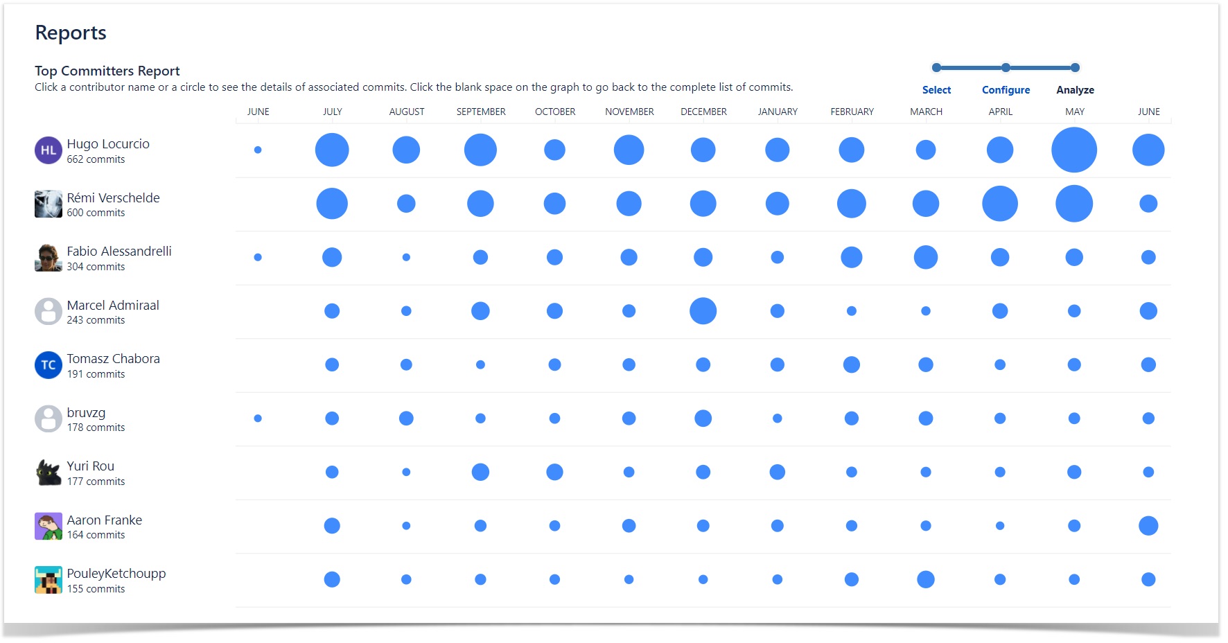
Using Awesome Graphs, it is also possible to analyze individual commit patterns. For example, Top Commiters Report shown below will show you individual activity dynamics for the time period you selected.
For more insight on commits analytics, see our article on all graphs and reports available in Awesome Graphs Cloud.
How to get custom Bitbucket reports
We have now explored various out-of-the-box reports on pull request and commit metrics. But if you are looking to set up custom reporting with engineering data outside of Bitbucket, our REST API can be very useful. Our blog offers resources that can help you learn how to easily retrieve engineering data from your Bitbucket.
To sum up, the Awesome Graphs app makes it possible to create Bitbucket reports in just a couple of clicks and export commit and pull request data for automated custom reporting. If you would like to see Awesome Graphs in action, make sure to activate your free 14-day trial and enjoy the app’s benefits in your instance.


