Two-Minute How-To: Using Pivot Tables in Confluence

Many of us have worked with Excel to store and process tabular data. While Confluence offers a variety of tools for tables, there might be one feature you miss in Confluence if you previously used Excel. We are talking about pivot tables that allow you to aggregate and calculate data, turning a bigger table into a neat and clear report.
Follow our step-by-step guide and learn how to create a pivot table in Confluence with the help of the Table Filter, Charts & Spreadsheets app.
How to create a pivot table in Confluence
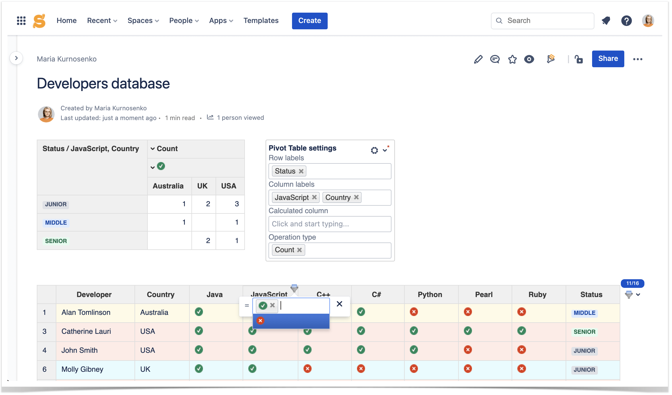
Imagine you keep an eye on a significant development project. You have a table that shows you information about developers in your company: their location, skills, and level of expertise. You need to know exactly how many developers of each tier know how to work with JavaScript.
Start by opening the page with the table. Here, click the funnel icon located in the top right corner.
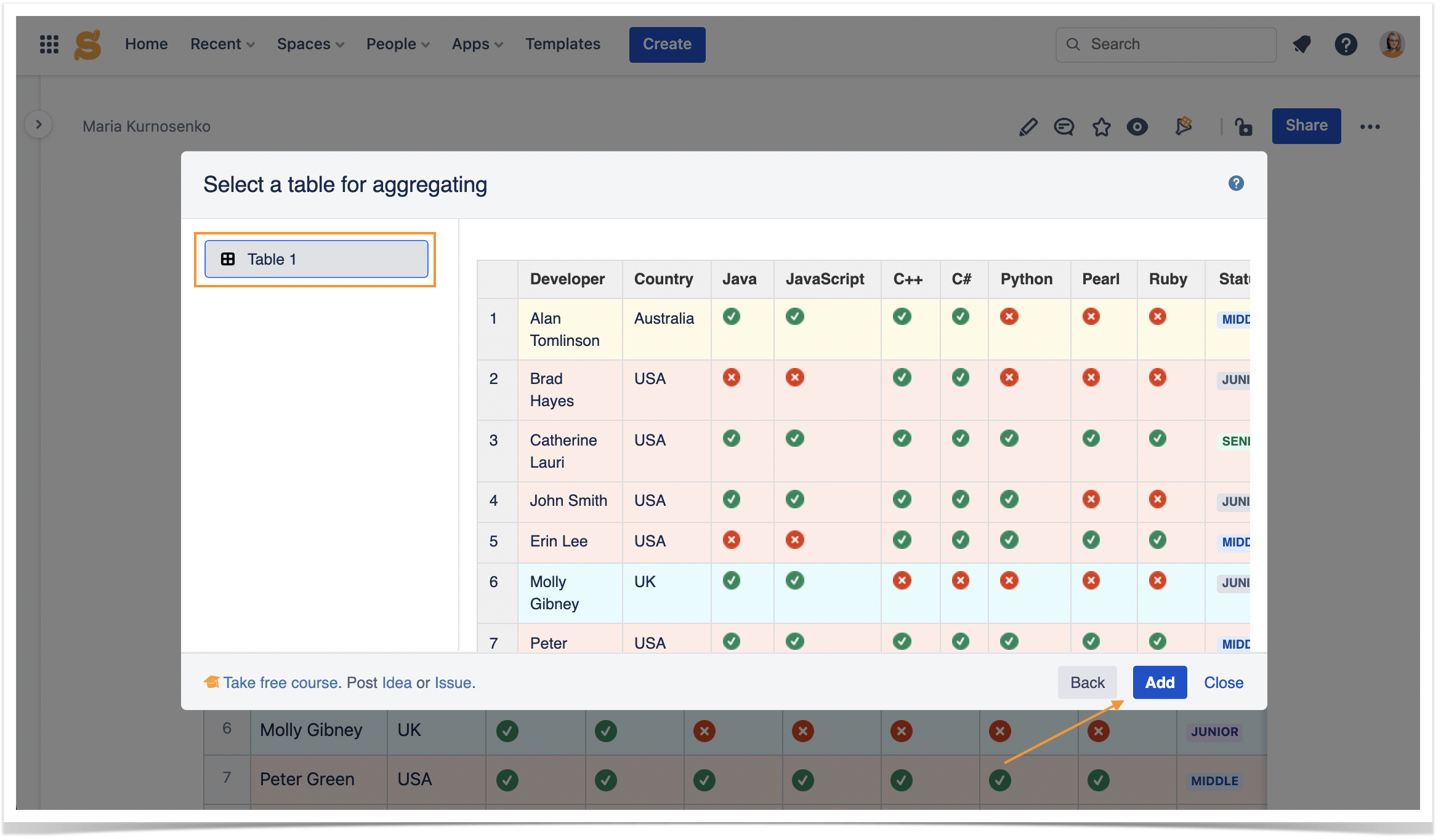
Pick the pivot table macro, select the table, and click Add.
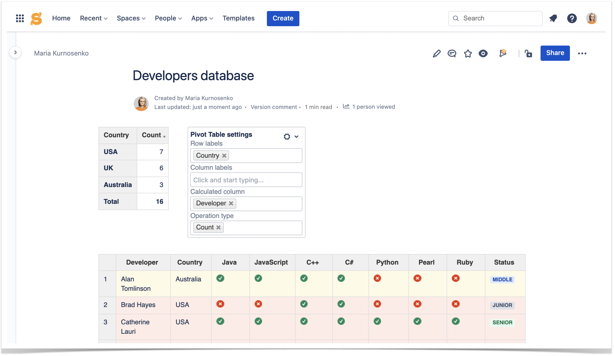
The macro adds a sample pivot table, which already groups a few rows and columns.
You can customize it exactly as you want. Go through the following steps:
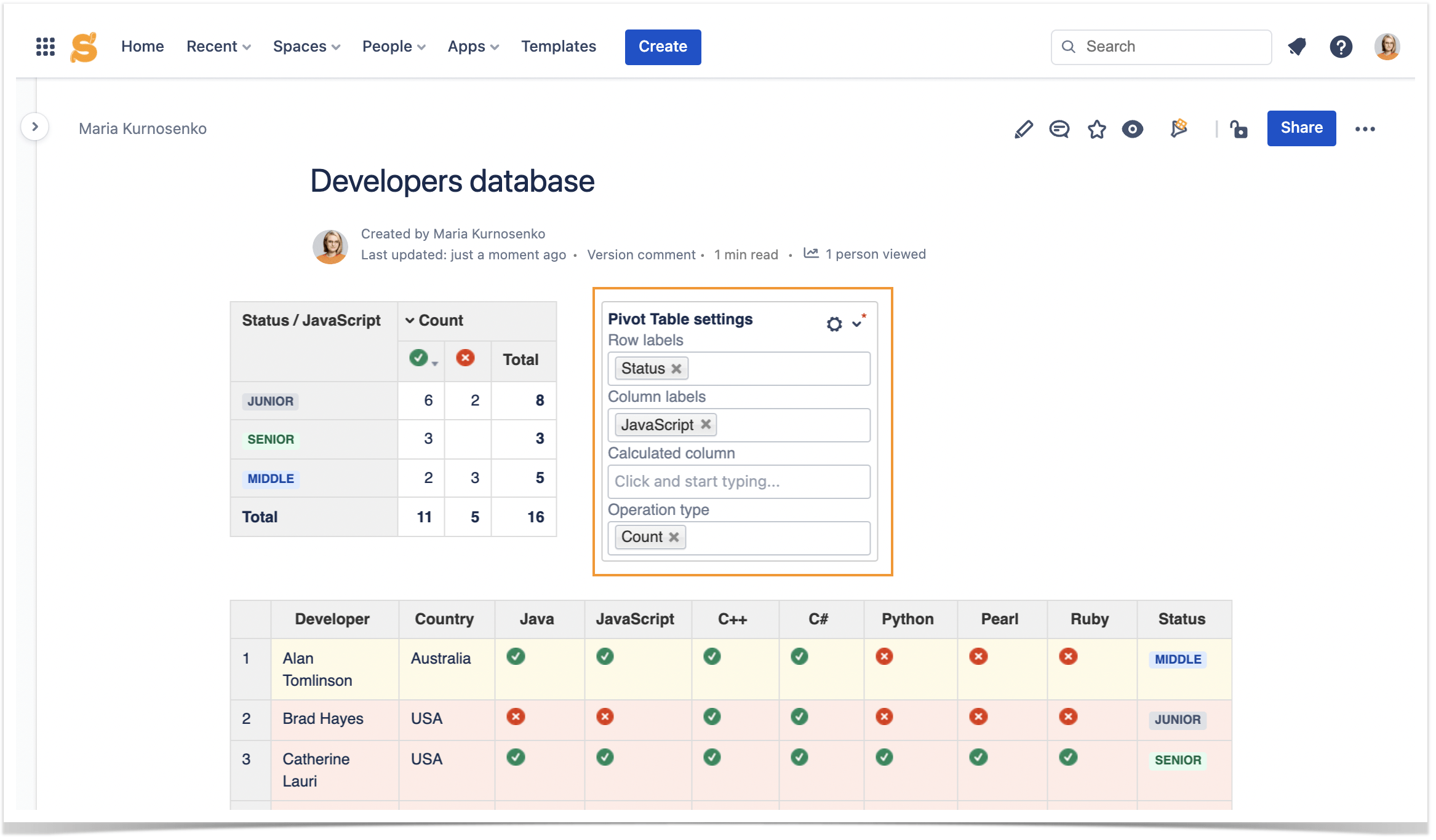
- Choose the Status column for the Row labels. This column contains information about developers’ levels.
- Choose the JavaScript column for the Column labels.

Now you can see exactly how many developers of each level can or can’t use JavaScript.
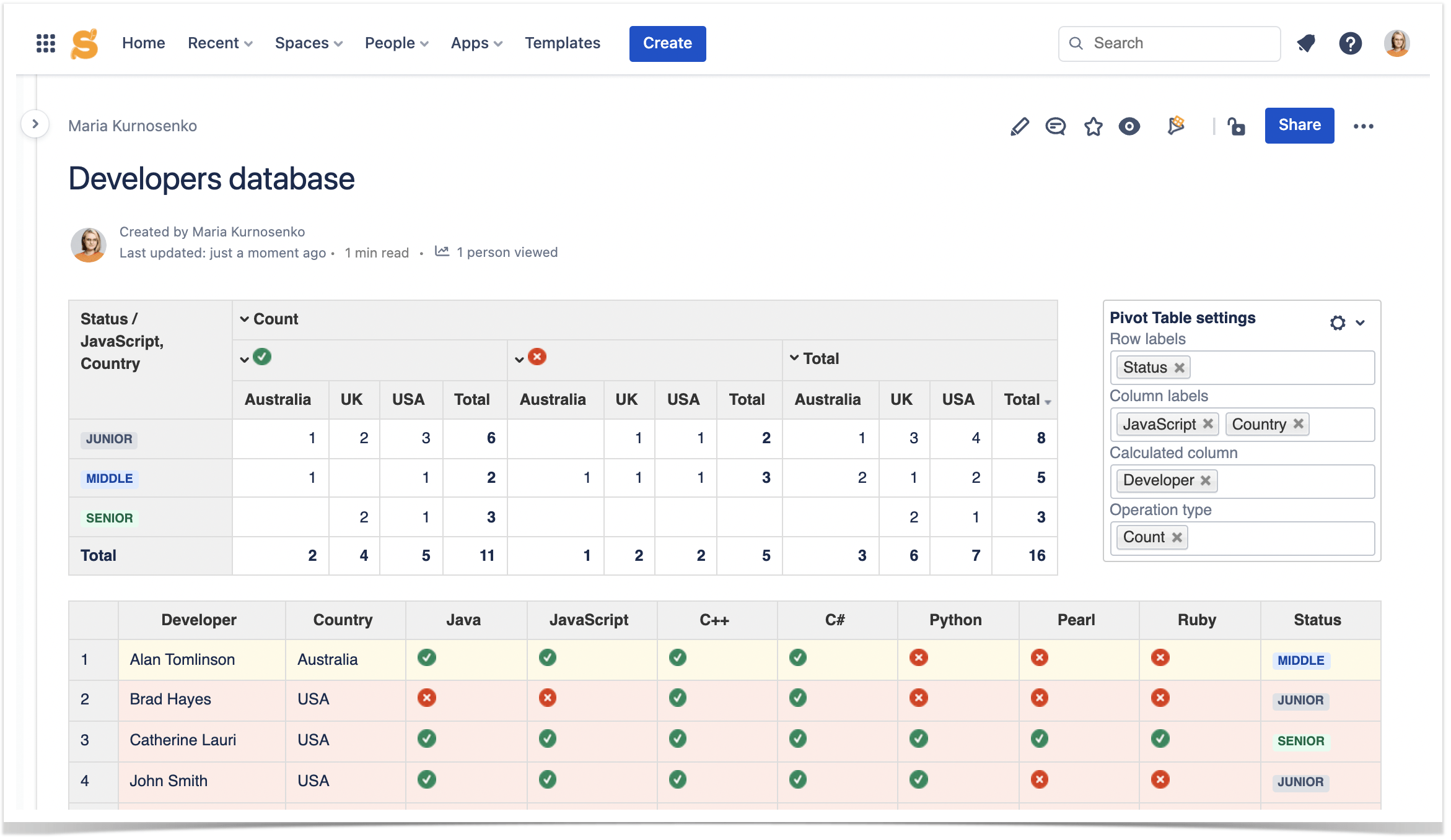
You can add a secondary dimension to your Confluence pivot table as well. For example, if you want to break down the data into countries. For that, add the Country column to the Column labels as well. Now you can see how many JavaScript developers work from each particular location.
Don’t want to stop here?
Apart from building a pivot table, you can use other macros from Table Filter, Charts & Spreadsheets for Confluence.
Filter the source table to get more precise results. You can do this before or after creating a pivot table. Once you add the filters, the pivot table will adjust accordingly.
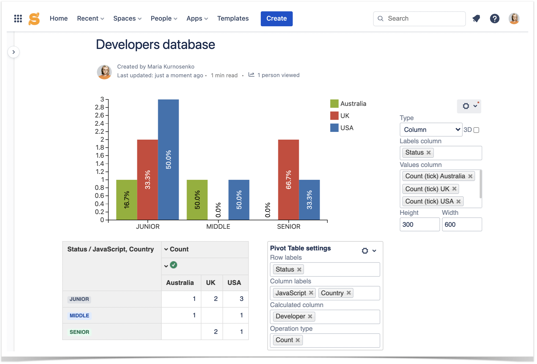
You can also turn a pivot table into an engaging chart. Check out our blog post if you want to learn more about creating charts in Confluence.
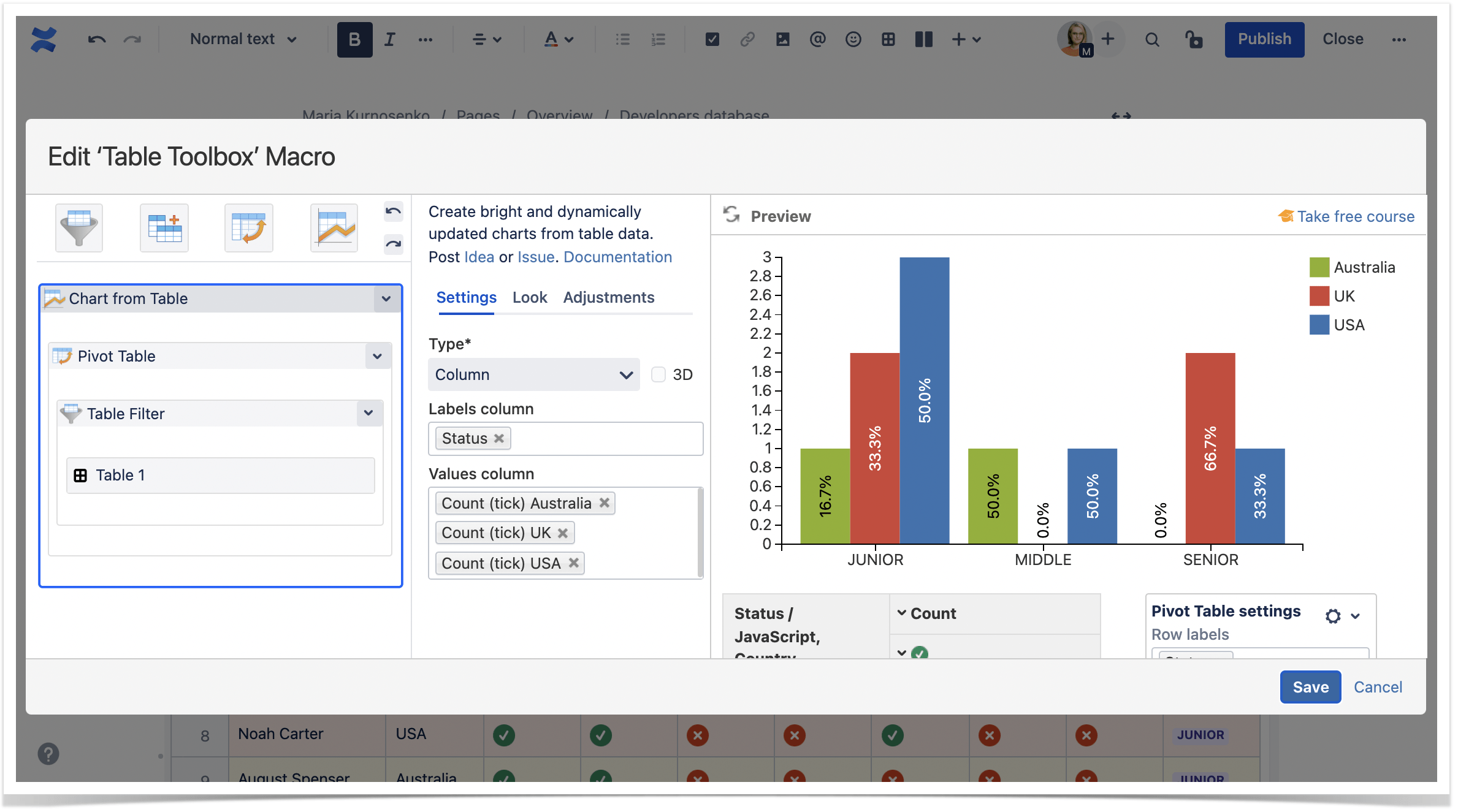
If you add macros after creating a pivot table, go to the edit mode. Use Table Toolbox to nest macros in the correct order.
And that is it! Try building your own pivot tables in Confluence with Table Filter, Charts & Spreadsheets. For any questions and requirements, don’t hesitate to contact us.


