


Visualizing Jira Data in Confluence

Using Atlassian Confluence in junction with Jira has become a norm that more and more companies follow while doing their business every day. The integration capabilities between Jira and Confluence make it easy to reuse data and manage projects.
Jira is equipped with a robust reporting engine that allows you to generate different charts and graphs visualizing the project’s overall progress, the performance of individual developers, and the team as a whole. But is it possible to do it in Confluence? What will you do when you need to share the information with your boss?
Showing Jira Data in Confluence
If you work in Confluence Data Center, configure an application link to output data in Confluence from Jira. In Confluence Cloud, the macro doesn’t require any additional configuration inside the workspace.
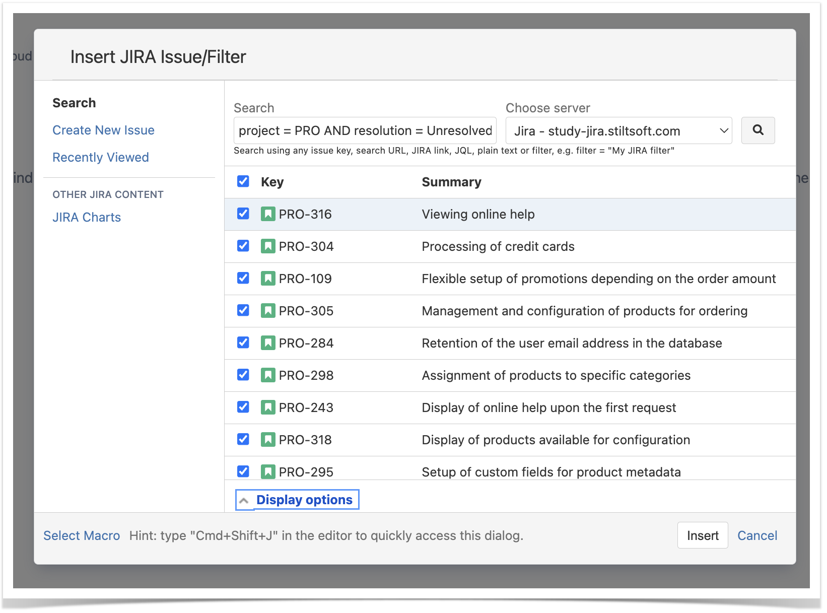
When complete, you only need to create a page and insert the Jira macro. Within the Jira Issues macro, you can insert the appropriate JQL query to fetch issues from the Jira instance or enter the pre-defined filter name into the corresponding field. You can also define the additional information for issues in the table.
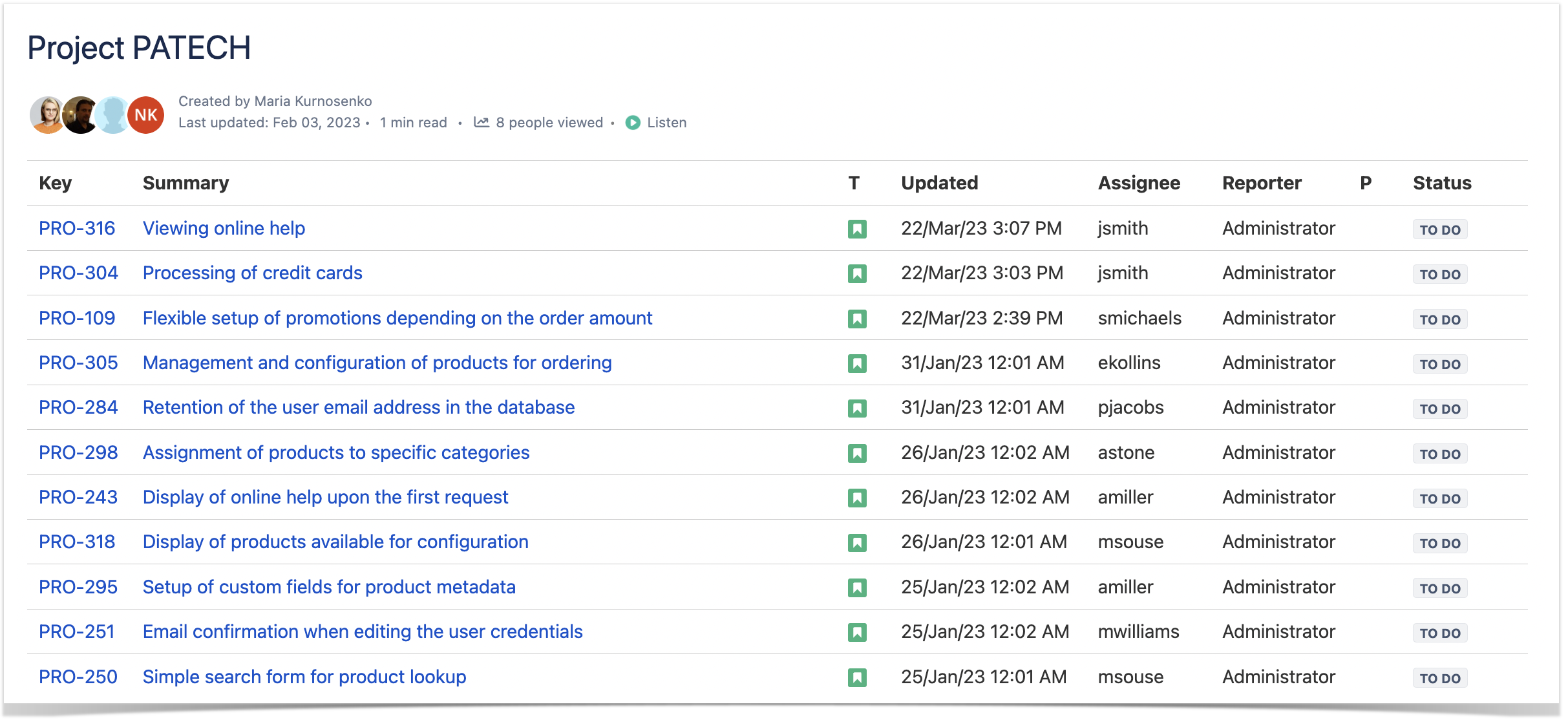
As a result, you will get a table with Jira issues when you save the page. But if you decide to filter these issues in Confluence, you will find that there are no tools for data filtration.
Getting Insights into Your Jira Data
To analyze Jira data in Confluence, you can use a few macros from the Table Filter and Charts app:
- Table Filter – you can use it to filter table data. It applies to tables created manually or outputted by other macros or apps. It supports the Jira Issues macro, so you can filter Jira issues without continuously editing the macro body.
- Pivot Table – this macro will help you summarize issues or aggregate them against some parameter. With its help, you can calculate issues and get table data for further visualization.
Further in the blog post, we’ll show you how to benefit from analyzing Jira data while building charts and graphs.

Charts and Graphs from Jira Data: Two Approaches
If you need to visualize data from Jira issues in Confluence, you may choose one of the two solutions:
- By default, Jira is bundled with the Jira Charts macro. It allows you to output charts and graphs from Jira issues onto Confluence pages. It is simple and works on the basis of JQL queries or saved filters.
- The other solution is the Chart from Table macro from the Table Filter and Charts for Confluence app. It works with the Jira Issues macro and allows you to generate a chart based on this data.
Let’s have a closer look at these two options.
Mastering Jira Chart Macro
Your first step is to insert the Jira Charts on the page. You can do this by entering the /Jira Charts query in the appropriate place on the page or manually inserting it through the Insert menu. Alternatively, if you already have the Jira macro on your page, you can switch to the Jira Charts in the edit mode.
Once it’s done, select the chart type you want to display. You can choose one of the three options:
1. Pie Chart allows you to view the correlation of Jira issues. You can view the ratio of issues by assignee, project, component, reporter, resolution, sprint, priority, and a set of other parameters. As for the chart’s look, you can set the width, enable the border, or display the chart information.

2. Created vs. Resolved chart allows you to trace the correlation between created and resolved issues during a specific period. Additionally, you can enable cumulative data reporting to see the entire project evolution or view individual tasks by period. You can also see the trend of unresolved issues, include all or only major versions.

3. Two Dimensional chart provides you with the table data grouped by two parameters. You can set the appropriate parameter for X and Y axes.

Once you save the page with the macros, you will get the charts that are automatically updated upon each reload of the page.

Management of the Jira Charts macro is simple and requires no special skills. Meanwhile, this macro lacks flexibility and provides limited capabilities that may not be enough for efficient work.
Manipulating Table Filter and Charts App
Our second option is the Chart from Table macro from the Table Filter and Charts app. But to reveal the full potential of working with Jira data in Confluence, you may combine the other macros available in this app’s bundle.
First of all, you need to add the Jira issues macro and place it it within the Table Toolbox macro. It allows you to nest various macros from the Table Filter and Charts app over one another. If you use Confluence Data Center, you need to add each of the macros individually. Next, choose the settings for each of the macros. For example, one of the most common combinations is aggregating the filtered table, and then using the pivot table for further visualization.
If you don’t want to combine all of the macros at once, you can add the necessary one right in the view mode.

After you save the page, you can keep editing the macros. Let’s have a look at a few examples.

Say, you want to view the distribution of created tasks that were resolved within the specific time.
Pick correct creation and resolution dates with a date range filter. Now, for the pivot table, switch to the Created column for Row labels. Next, pick the Time Area chart type. And it’s done!

Now, let’s find out how many tasks of each status are assigned to each person on the team. Change filtration settings accordingly and pick the Assignee column as your pivot table’s Row labels. Select the Stacked Bar chart type.

Optionally, you can change the look of the outputted chart, set the range of values shown in the chart, add the labels and make other alterations.
This combination of macros allows you to manipulate your Jira issues however you like. You can quickly apply filtration, switch to the required data set and perform all these actions in the page view mode. You can also save all the changes without switching the page to the edit mode.
This significantly reduces the time you spend on routine tasks and allows you to increase efficiency.
Which Solution to Choose?
The native Jira Issues macro may be enough if you have a basic approach to data analysis. But if you want more flexibility and deeper insights while switching between a variety of data types, the Table Filter and Charts app can offer you the tools for that.
Follow the instructions below to try the app for free, and don’t hesitate to contact us with any questions and ideas!

![]()