5 Tips to Become a Gantt Chart Expert Using Atlassian Confluence

Imagine you have to visualize a long-term project in the simplest way possible. What is the first solution that comes to your mind? Most project managers would say that a Gantt chart can be a lifesaver. This powerful tool for project planning helps you display the sequence of the main project stages and tasks and their duration within one chart. For this purpose, this is the most illustrative method so far.
Consider the following situation: you are in charge of a new project. Unexpectedly, the vice president of your company has requested a detailed one-page project timeline to look through as soon as possible.
Let’s look at what you have now:
- all deadlines written in separate sticky notes
- the project tasks placed on several Confluence pages
- the key events marked in the team calendar
You’ve been given an hour to assemble all this information on one Confluence page.
In this situation, Table Filter and Charts for Confluence will help you complete this challenging task. In this blog post, we will show you how the Chart from Table macro, one of this app’s three most popular macros, allows you to visualize your data easily using a Gantt chart.
Build the simplest Gantt chart in a few clicks
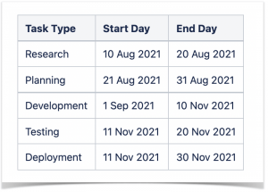
You can create a simple Gantt chart using a three-column table containing tasks and start and end days.
Add the Chart from Table macro, choose the chart type, and specify the settings.
Labels Column:
- Task Type
Values Column:
- Start Day
- End Day
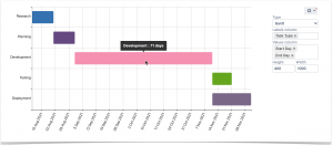
The chart is simplistic and bright. The diagram shows you all the main stages of the project. The system counts the number of days within each stage. When you hover over the bar, you can see the duration of the selected project stage.
Add task descriptions and completion bar
The previous chart looks good, however, it can present the information even more effectively. The chart displays the required project scopes, but the time frames remain unspecified and too long.
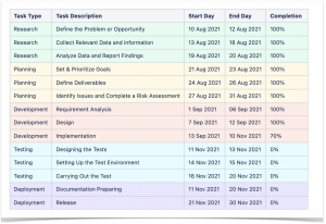
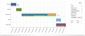
You can break down each project stage into your current tasks to make your chart more informative. You add a task description column to the table and specify the duration of task realization.
Add the completion column to the table to show the progress bars on the chart:
Labels Column:
- Task Type
- Task Description
Values Column:
- Start Day
- End Day
- Completion
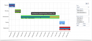
The bars allow you to get more information about the progress of each task.
Pro tip:
Learn more about using Spreadsheets in Confluence
Outline milestones
The chart looks much better now. However, there is always space for improvement. The app also helps you add milestones to Gantt charts.
Milestones are key events of a project. The team is only able to proceed if the milestone is complete. You can insert the additional small table into one macro body to display the milestones on your chart. Do this in the edit mode.
After that, choose the settings.
Labels Column:
- Task Type
- Task Description
- Milestone
Values Column:
- Start Day
- End Day
- Completion
- Date
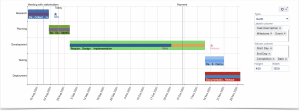
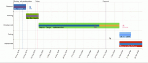
The milestones are marked with an asterisk. You can see the detailed milestone descriptions when you hover over the asterisks.
Don’t forget about planned activities
You can also mark the project’s key activities on the chart to prioritize them and collaborate more effectively.
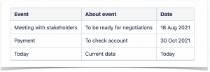
All you need to do is insert the events table into one macro body and set additional labels and values columns in the chart settings. The app allows you to add the “today” event.
Add the correct columns into the settings.
Labels Column:
- Task Type
- Task Description
- Milestone
- Events
Values Column:
- Start Day
- End Day
- Completion
- Date
It means that when you open a page with a chart, you will see the line that shows where you are at the moment. This way, you get a bird’s-eye view of all project stages, enabling you to see the project time frame and progress.
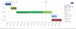
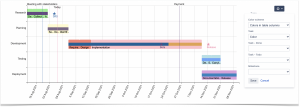
Last but not least, you can set dependencies between tasks. This helps you understand what you need to prioritize and complete before moving on to the next stage.
If you want to focus on a more specific period without losing the rest of the data, you can zoom in on the Gantt chart. Hold down the Ctrl button and rotate the wheel on your mouse to zoom the chart in or out. Afterward, you can move around the chart by pressing Ctrl (for Windows) or Alt (for MacOS) and dragging the chart in the necessary direction.
Customize your chart and share the results
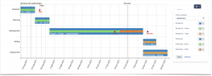
Now, you need to change the bars’ colors and set the titles to match your brand book guidelines.
You can select more appropriate colors for each type of task or each task in particular.
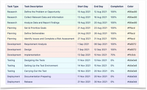
If standard app colors don’t match your company style or satisfy you, specify the colors for each task in a table.
Pick colors from this list or set your HEX codes.
Now that you’re ready with all the information on the project, it’s time to present your boss with the Gantt chart you created.
Here’s how you can share your Gantt chart with your boss and your colleagues:
- export the Gantt chart or the Confluence page to Word or PDF
- share the link to the page
Since your boss asked you to show the project schedule in Confluence, the second option would suit you best.
Bonus tip: make your Confluence tables and graphs look more professional
We created a Gantt chart from scratch with the help of the Table Filter and Charts app, but you can do a lot more. Try this handy solution for free to discover all of its features:
You can manage your tables in Confluence on the fly using a bundle of this app’s easy-to-use and fully customizable macros. Check out how user-friendly features Table Filter and Charts are and elevate your tables in Confluence to the next level.


