


How Project Managers and Scrum Masters Use Confluence for Project Monitoring

In the Project Management Dashboards in Confluence webinar, we talked about the tools that project managers and scrum masters use, and that help them make data-driven decisions based on the data from Jira and Bitbucket. We showed how you could enhance Confluence’s default functionality to create easy-to-understand reports for management and stakeholders with all the technical and business metrics visualized on Confluence pages.
Here we bring this information back together and provide you with the guides on how to build a dashboard where you can ensure that projects remain on track and see the actual progress compared to the project objectives stated in the plans.
Visualize the backlog: open vs resolved issues graph
As new tasks, features, and bugs are added continuously during the project implementation, the visualization of the dynamics in the project backlog helps spot the bottlenecks in the processes timely. Using it, you’ll be able to find inefficiencies and support the teams, whose backlogs contain more work to do than they could possibly perform.
The Created vs Resolved Issues report shows the difference between the number of created and resolved issues over a given period and whether the overall backlog is moving towards resolution.

This chart is built using the Jira Issues macro, which pulls the data from Jira according to a JQL or a link to a filter.
Check out a full guide on how to build the graph.
See the advancement in the project: Gantt chart
Gantt chart is a tool that visualizes the development process, helps to schedule your work and track the progress. In a nutshell, it is a timeline that’s used to illustrate how the project will run. You can see:
- what tasks are included in a project or a sprint
- start and end dates of a project or a sprint
- tasks duration — project schedule, i.e., start and end dates
- who works on a particular task.

Using this chart, you can visualize all the tasks and phases of the project to optimize task planning and distribution, so you can predict when you will deliver the product. By visualizing the dependencies and parallel processes, you’ll also be able to find critical points, such as when the tasks depending on each other are planned at the same time slot.
We have prepared detailed instructions on how to build this kind of chart.
Track the sprint progress: burndown chart
A burndown chart is often used in Agile project management to visualize the amount of work completed during the sprint compared to the total work, so a team can keep track of the time remaining to complete that work.

Based on the data exported from Jira, this chart displays the total amount of work in story points that a team should complete during the sprint. An orange line is the amount of work left. A purple line displays how the sprint should run in the ideal world where the efforts are distributed equally.
The tasks burn down as they are marked as completed and on the last day of a sprint, no significant tasks should remain. If you see that your teams tend to fail to complete the tasks in time, you need to investigate the reasons for this issue and reduce the workload.
Learn how to build this chart.
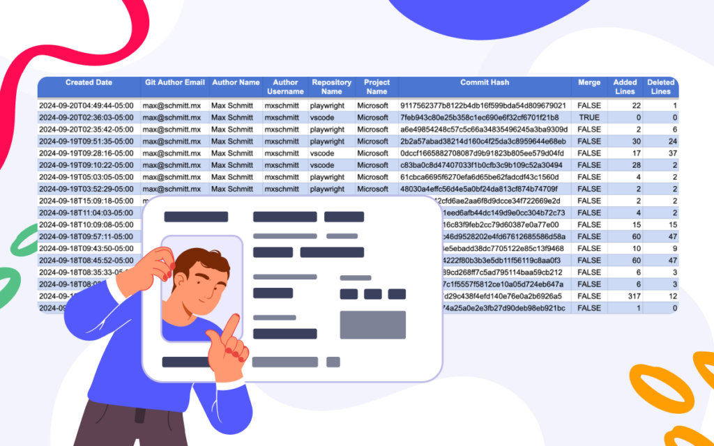
Make the development process transparent: engineering metrics
While monitoring the progress of the project, it’s necessary to see the actual change over time. Here we offer you the chart that will show the dynamics of contributions in terms of commits made by users over the chosen period. You can build a similar chart showing the pull request dynamics by feeding in the corresponding CSV file, which you can get via the Awesome Graphs for Bitbucket’s Export to CSV feature.
Using these, you’ll be able to see the trends in pull requests and commits and find out if your team is committing more code now than before.

During the daily meetings, teams try to spot the difficulties that appear in the processes, and these charts can bring more transparency to them. For example, if you keep your tasks between a day or two and see that one of the developers hasn’t committed in a few days, maybe it’s time to talk and find out what difficulties they might have.
Follow the guide to build these charts.
There’s more coming
The graphs and charts described in this article will help you gain more visibility into the current state of the processes and make project monitoring easier. Using the Awesome Graphs for Bitbucket app as a data provider, and the Table Filter and Charts for Confluence app to aggregate and visualize the data from Bitbucket and Jira, you will get the functionality comparable to BI platforms in Confluence.
In the next article in the series, we’ll tell you how to build the dashboard, which can be used by any agile team for a sprint retrospective.
Watch the webinar’s recording on our YouTube channel while waiting for our next post and tell us what you think in the comment section.
Suggested further reading:
–How to Build PR Review Time Report from Bitbucket Data in Confluence