


How to Integrate TeamCity and Bitbucket Server
Bitbucket is a centralized development management solution for controlling your repositories behind the firewall. It allows you to simplify the procedures of hosting an internal source code control server and provide easy access to your repositories for all your team members.
In the IT world, it is not a secret that Bitbucket can be integrated with other software products and platforms into a single ecosystem that makes the entire development process comprehensive and convenient. Most times, people integrate Bitbucket with Jira. But localization and resolution of the issue is not the only problem, which a generic development encounters every day, several times a day. But it is more important to preserve the project integrity while adding modifications or corrections into the program code. For these purposes, you can use the continuous integration server that can also create project builds and run a series of tests for automatic verification of functionality.
With the introduction of the Integrated CI/CD, Atlassian extended the list of platforms supported out-of-the-box, so you can now link Bitbucket Data Center and Server with Bamboo or Jenkins. But it doesn’t mean that TeamCity users have to miss out on the integration benefits, and in this blog post, we will show how to link your Bitbucket and TeamCity and get the most of it.
View build statuses with Commit Status Publisher
First of all, we would like to present the native add-on from the developers of TeamCity because native integration tools are usually convenient, well-thought, and rich in features.
Commit Status Publisher is an open-source plugin that comes bundled with TeamCity (since version 10.0) and allows it to automatically send build statuses of the commits to an external system.
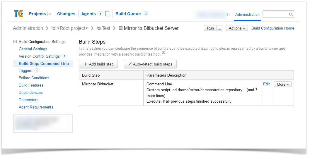
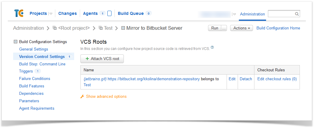
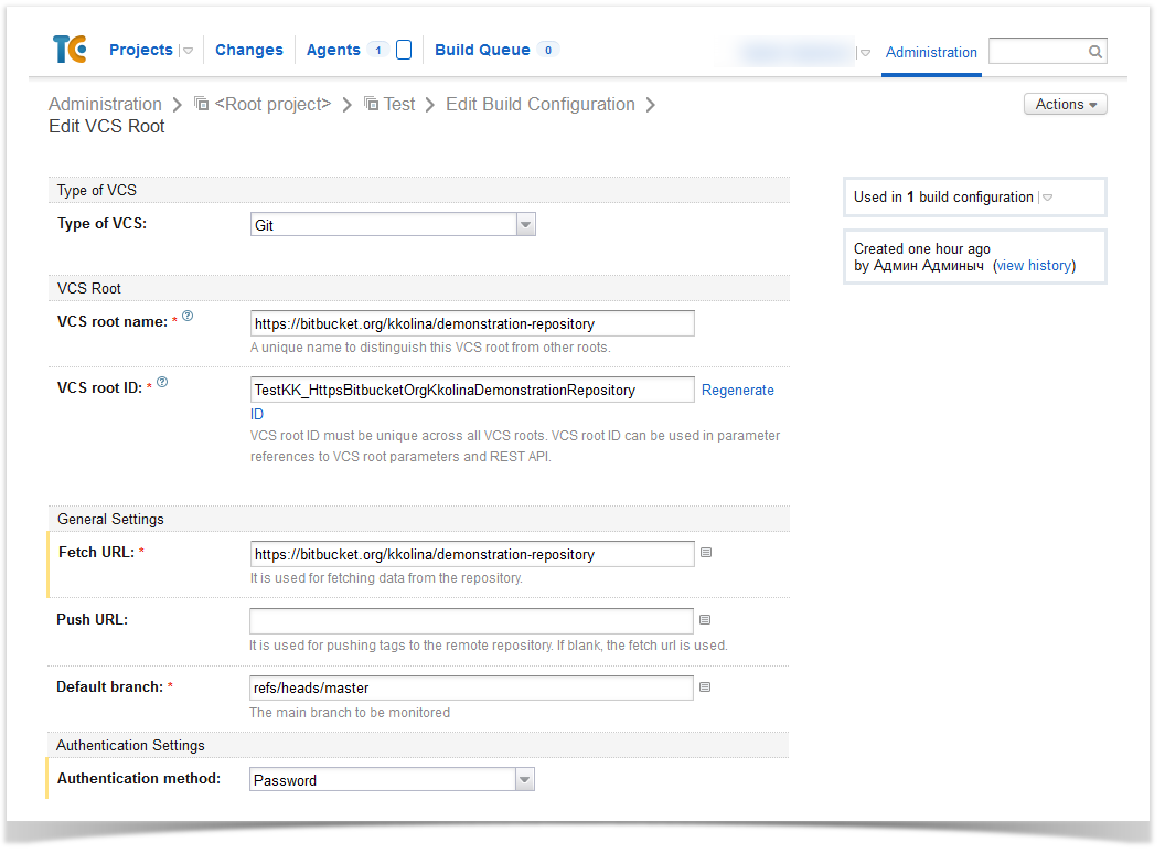
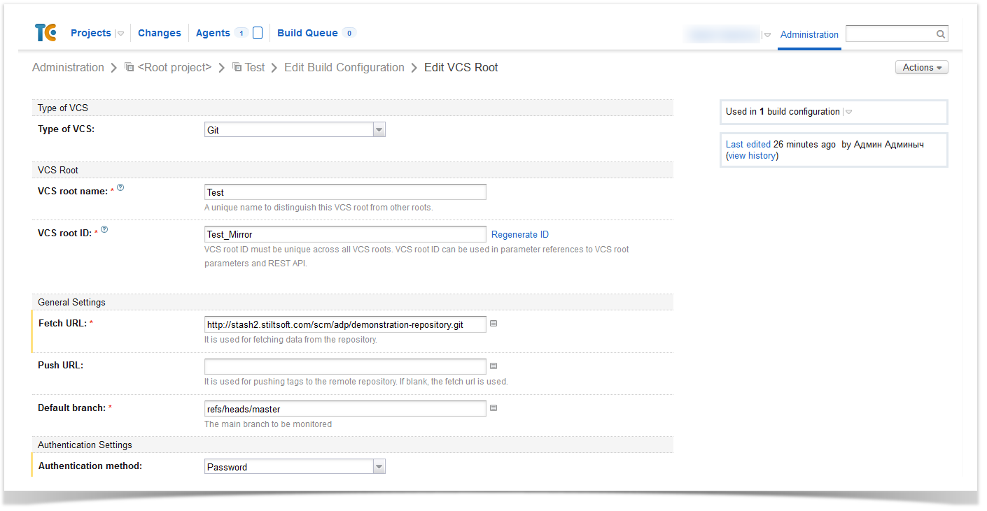
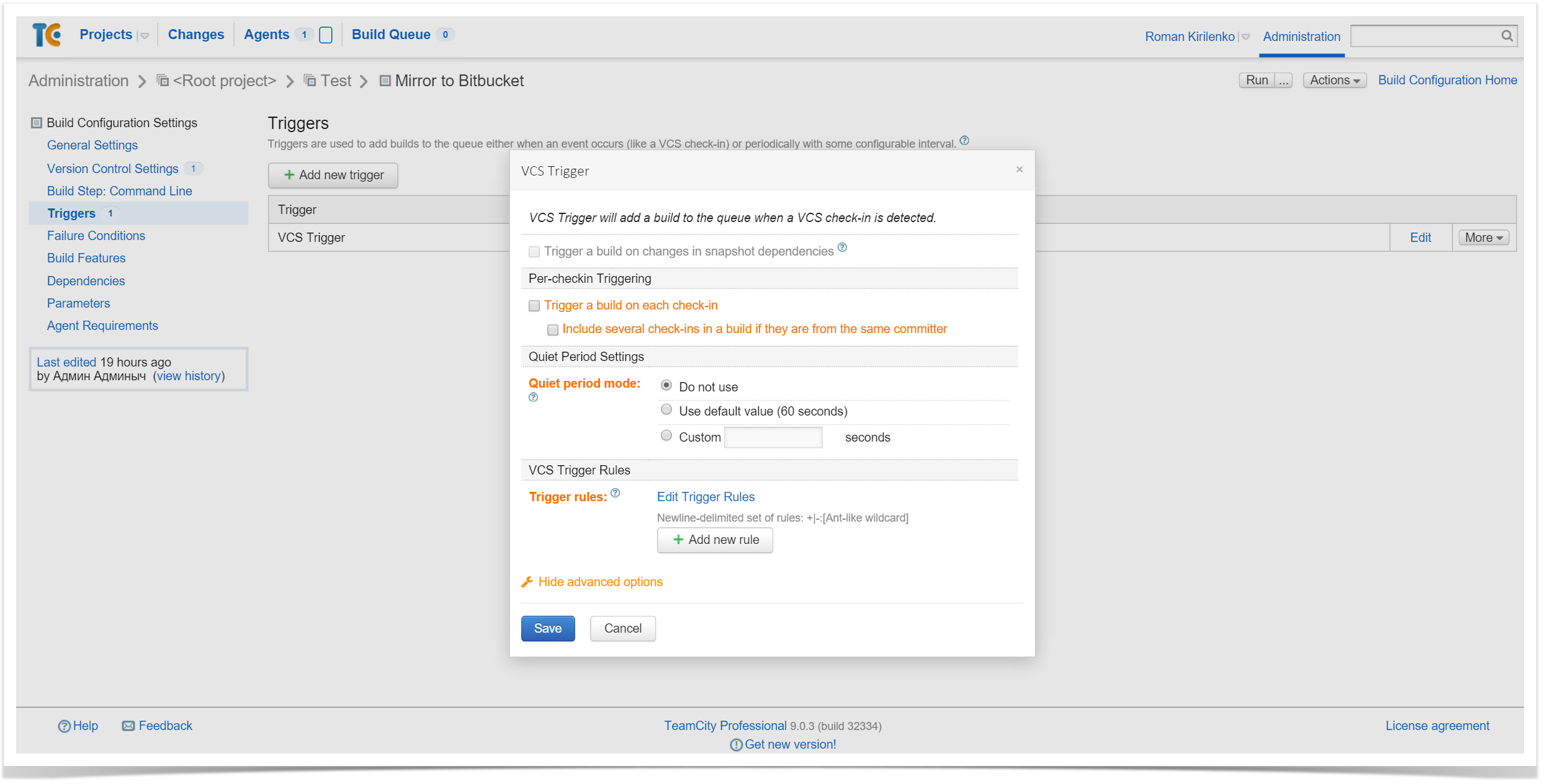
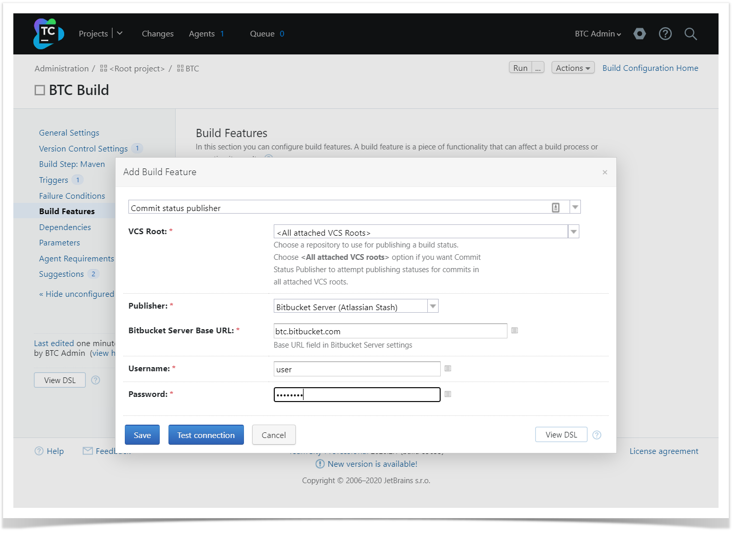
To enable the transfer of the statuses to Bitbucket, you need to add a Build Feature with Commit Status Publisher type in the Build Configuration Settings
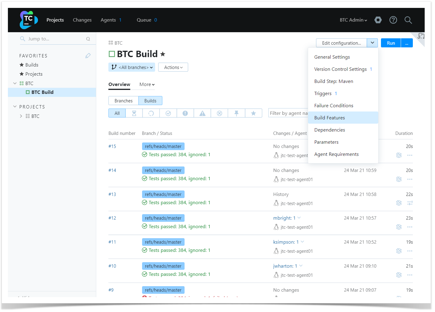
And then set it up for Bitbucket.
Once the configuration is complete, run the application build and ensure that Bitbucket received data from TeamCity. If everything worked correctly, from now you’ll be able to see the build statuses on the Builds page.
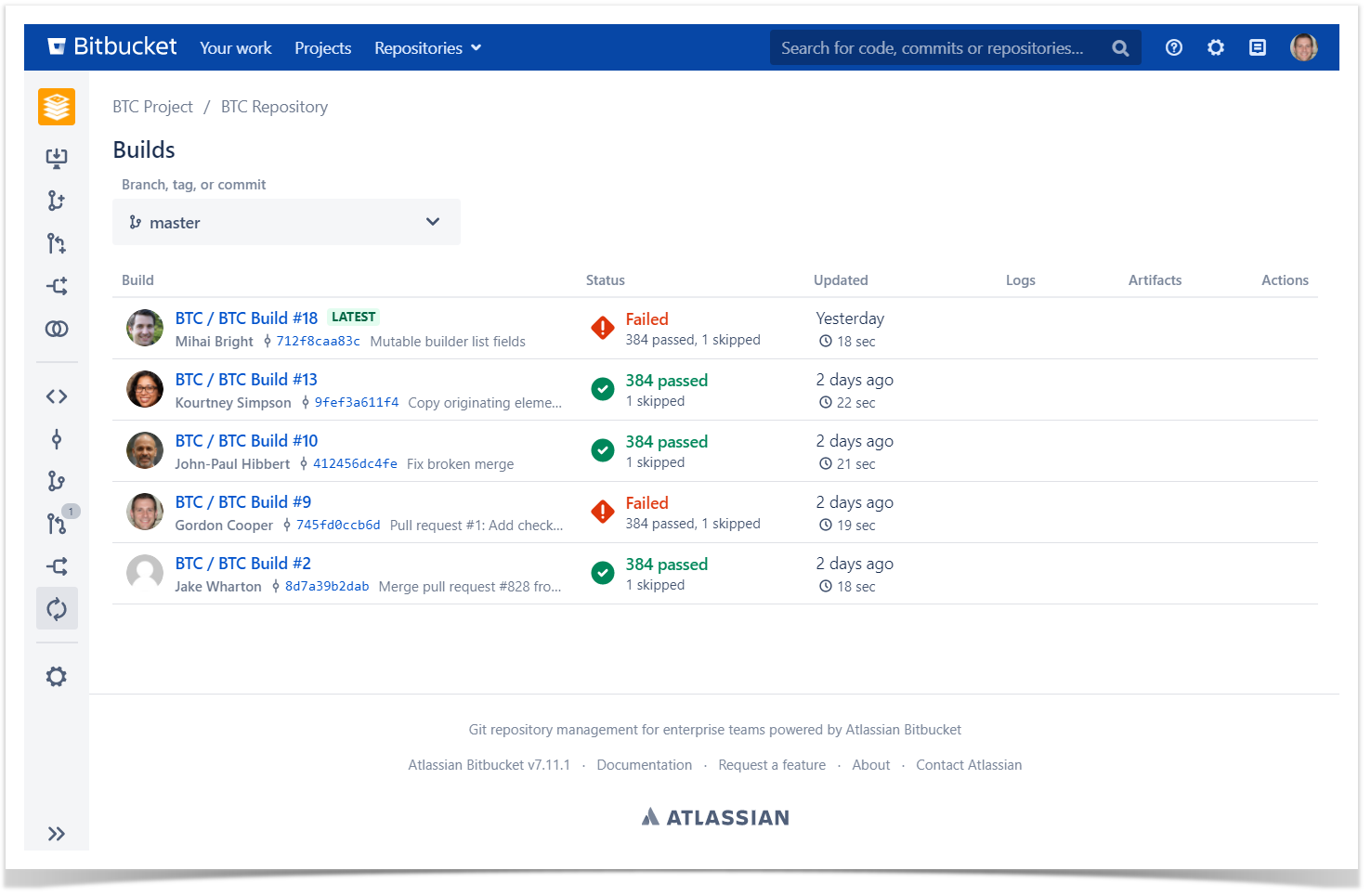
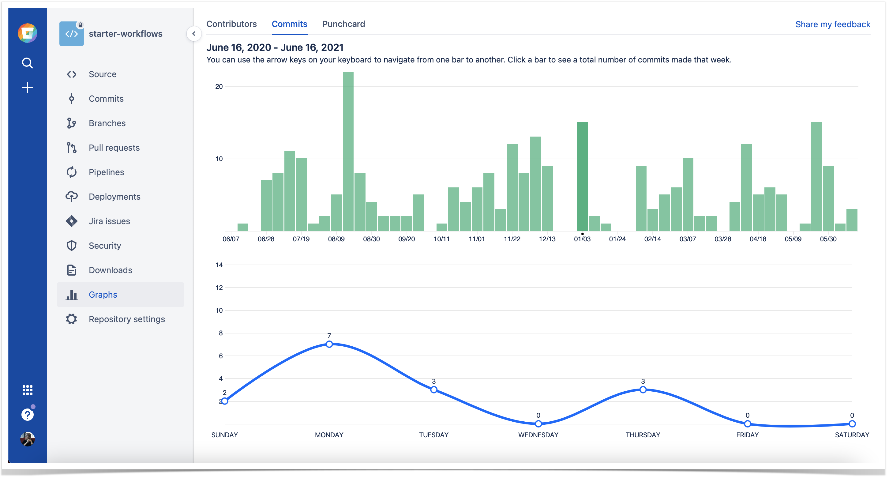
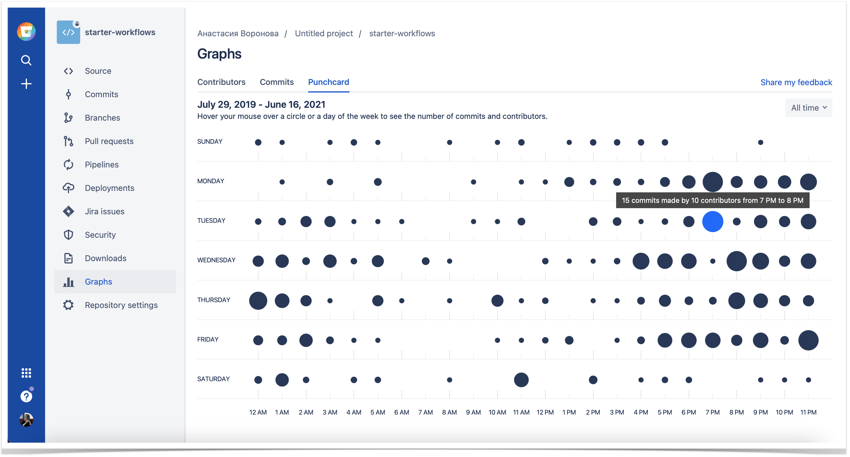
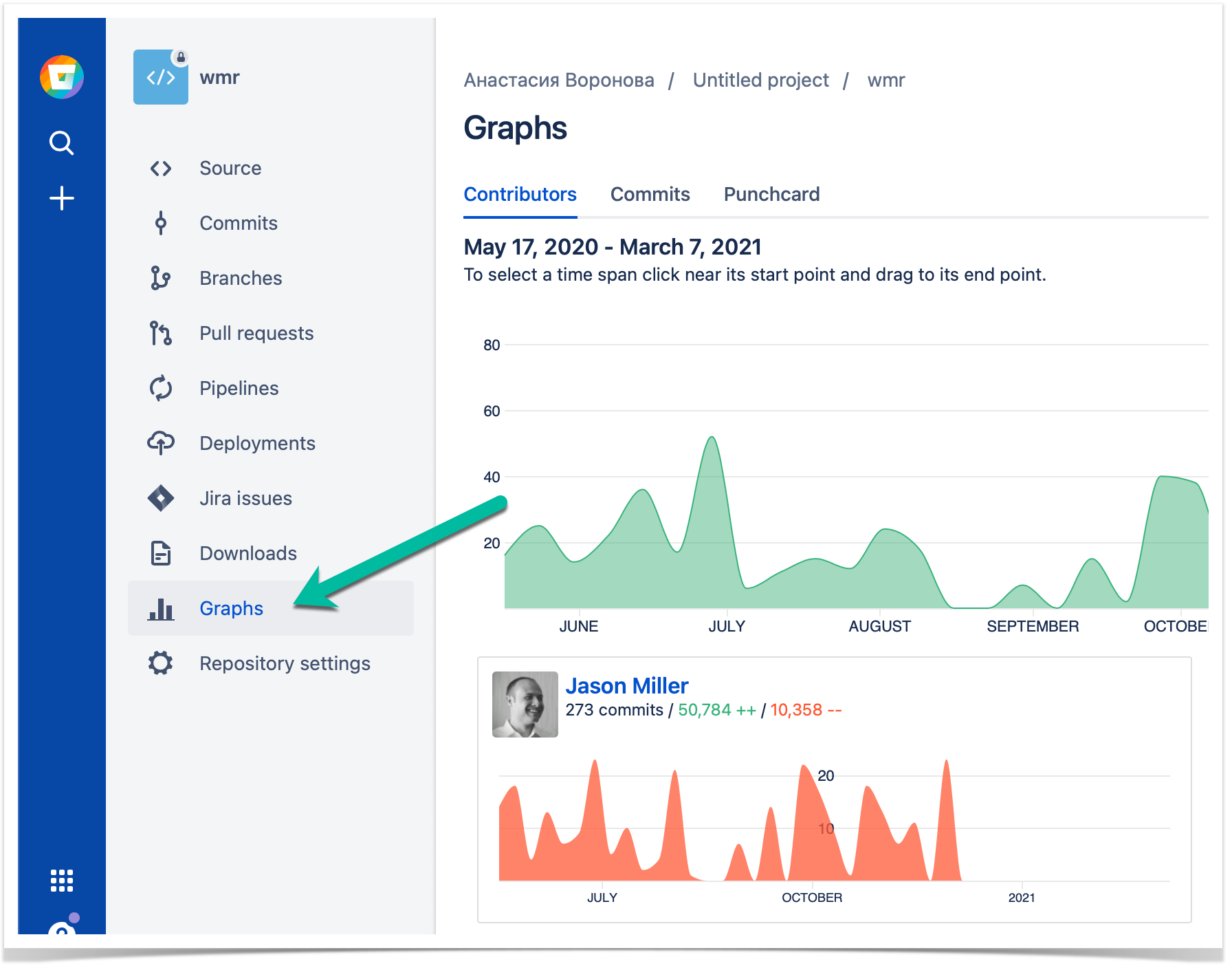
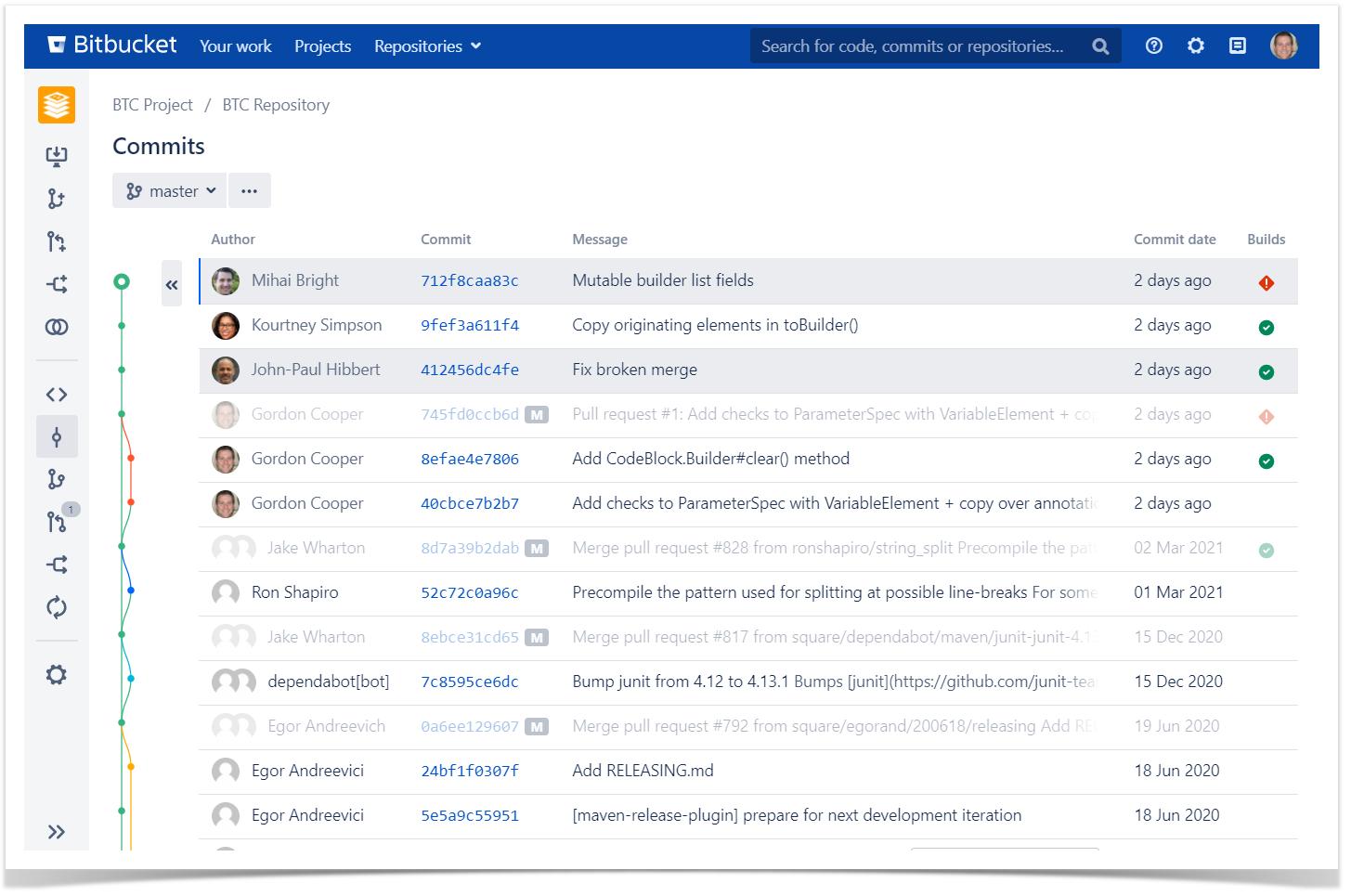
Apart from the Builds page, builds statuses are indicated on the Commits and Branches pages. If you select any build status icon, it will take you to the Builds page with the filter set to that commit or branch.
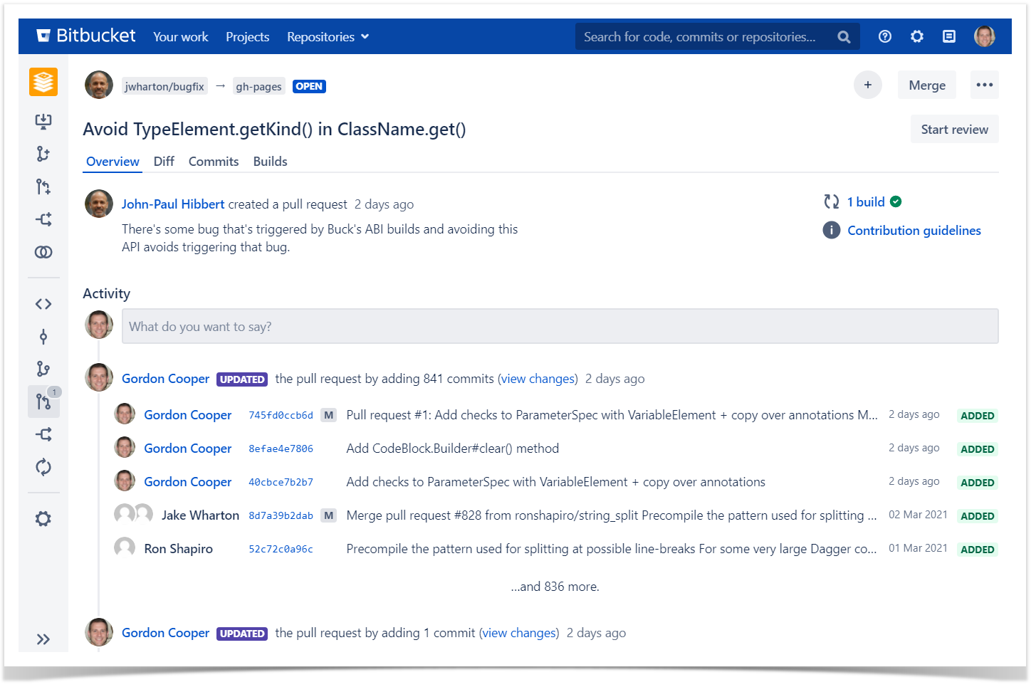
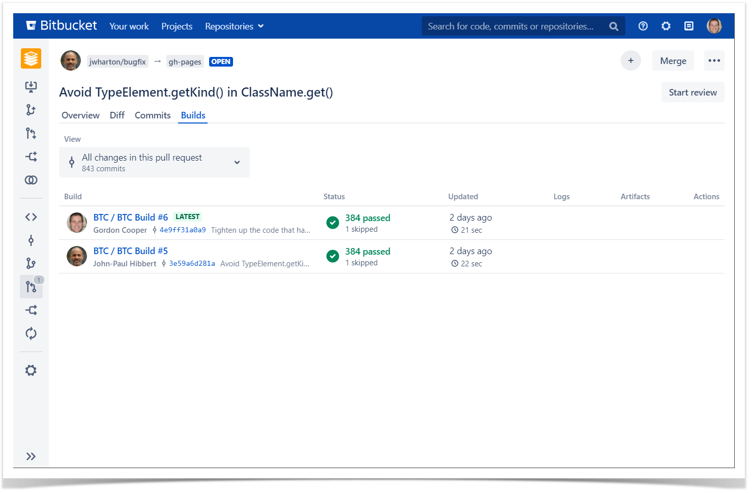
While viewing the pull request details, you’ll see build status on the Overview tab or go straight to the Builds page to see builds information for each commit.
Run builds, access artifacts and logs without leaving Bitbucket
If you don’t want to spend time switching tools and would like to operate on your builds without losing the context, you can get a more advanced integration with TeamCity using the TeamCity Integration for Bitbucket app. It provides a seamless way to connect your Bitbucket to the TeamCity server, so you can monitor and configure the pipeline without leaving Bitbucket. Using it, you can:
- Run builds
- View build results
- Access logs and artifacts via direct links.
After you installed the app to your instance, you need to authorize TeamCity in Bitbucket using access tokens.
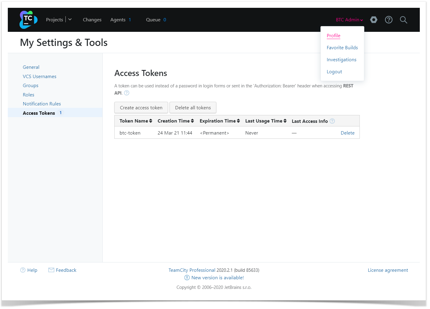
You can create an access token in your TeamCity profile.
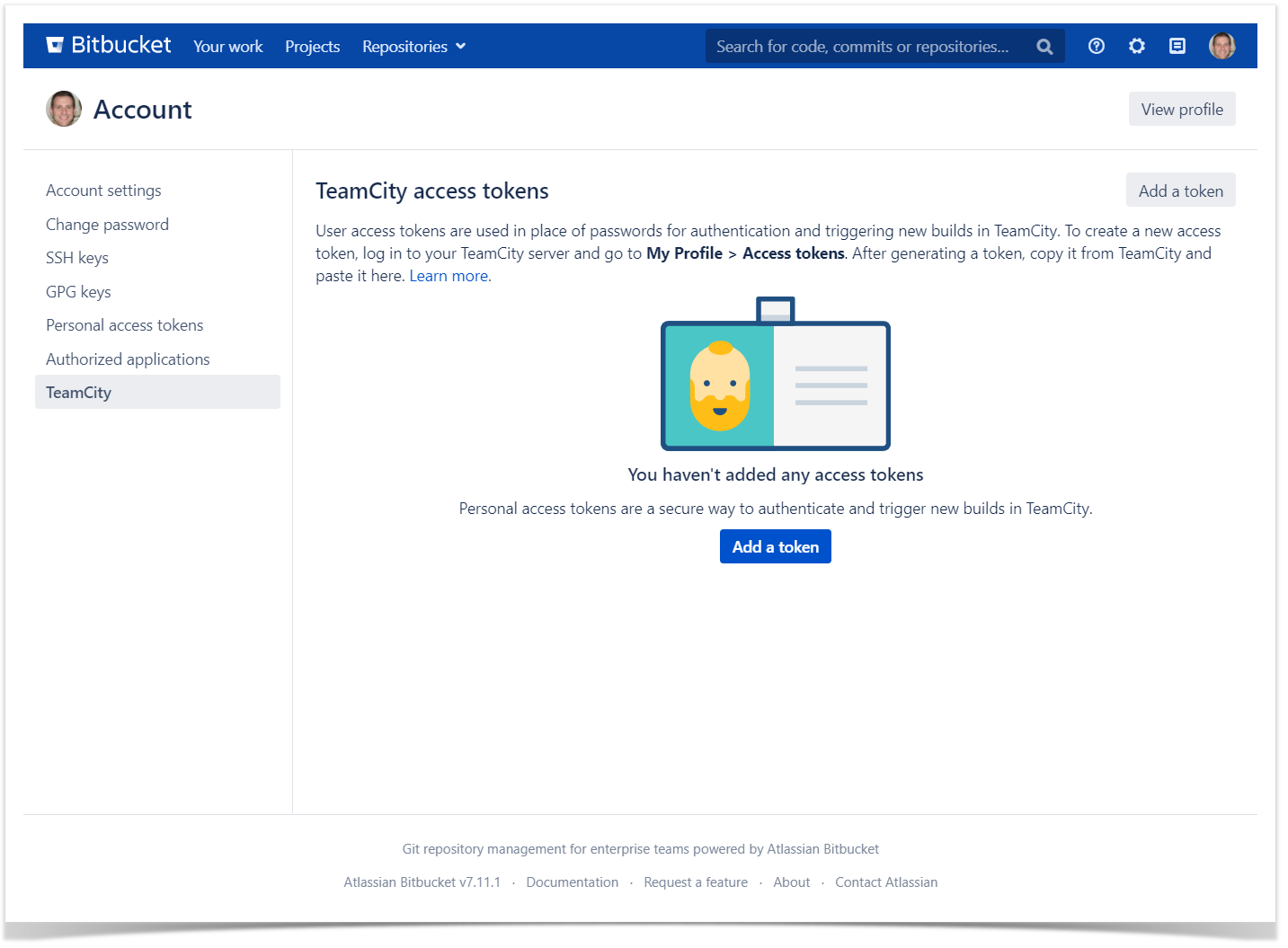
Now add the token to your profile in Bitbucket. Click on your avatar in the header and then on Manage account, choose TeamCity tab in the navigation bar and add the token.
You can enhance the integration by adding the Commit Status Publisher to your build configuration.
Go to the Configuration Settings on a build page in TeamCity, click on the Build Features, Add Commit Status Publisher and set it up for Bitbucket as described a few paragraphs above.
Now you’re all set and can get to work with the app. On the Builds page, you can view build statuses, links to logs and artifacts, and perform build actions. At the moment, the list of actions include:
- Build the latest commit — running a build for the latest commit in the current branch.
- Re-build this commit — re-running a build for a particular commit.
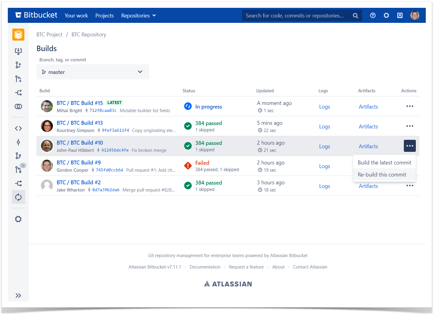
You can also find build information on the Pull Requests page. The latest build statuses are shown in the Overview tab, while the Builds tab allows to act on builds and view builds’ logs and artifacts, similarly to the main Builds page.
TeamCity Integration for Bitbucket is available for a free 30-day trial on the Marketplace both for Bitbucket Server and Bitbucket Data Center. We have step-by-step guides to get you started faster, but if you have any questions about the app or feedback you’d like to share, create a ticket in our Help Center.
Integrate to improve
You can enhance your DevOps toolchain with the help of integrations described in the article to improve developers’ velocity as well as time to production. Which one to choose depends on your requirements and personal preferences. Write in the comments, which one you use or would use, and share your opinion about these integrations.