


Two-Minute How-To: Getting Current and Historical Status Distribution in monday.com

Tracking current and historical status distribution in monday.com is one of the quickest ways to identify bottlenecks, forecast delivery timelines, and keep stakeholders aligned. This blog post shows how to create a status distribution report that reveals how many items are in each status – both now and over time – with minimal setup.
View Current Status Distribution
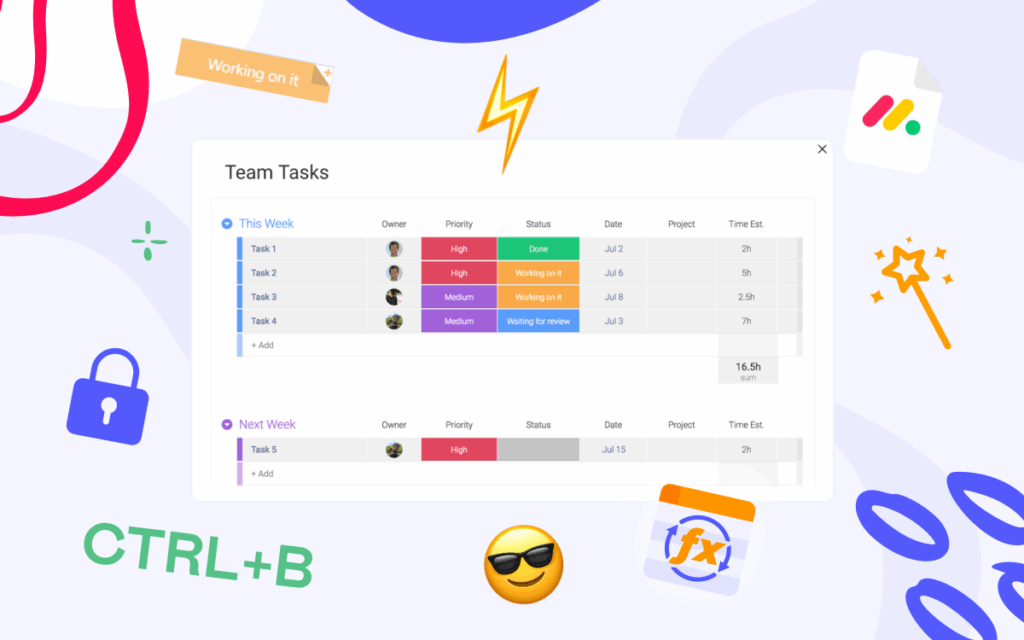
A current status distribution report shows exactly where work is piling up right now – for example, whether items are getting stuck in the “In Progress” status.
To see how many items you have in each status, you can use a native Chart in monday, either as a Board View or a Dashboard Widget. Dashboards are especially useful if you want to compare status distribution across multiple boards.
Set it up in just a few steps:
-
Insert a Chart widget
-
Choose a Pie chart
-
Set Labels to the Status column
-
Set Values to Count of items

That’s it – you’ll have a live, always-up-to-date view of your current status distribution.
Tracking Historical Status Distribution
A historical status distribution report helps you understand trends and overall process health over time. When using native tools in monday, creating this type of report usually requires manual aggregation – either by reviewing activity logs item by item or by exporting board data and processing it externally.
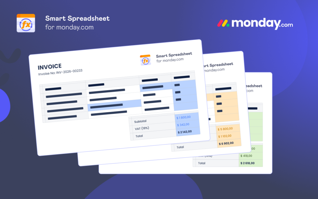
A practical workaround is to extend your standard setup with a third-party app – Smart Spreadsheet works especially well for this use case.
Start by adding Smart Spreadsheet as a Board View or a Dashboard / Docs Widget, then import your board or multiple boards. From there, you can create a Pivot Table and visualize the data in a familiar, Excel-like format. Because the spreadsheet stays synchronized with your boards, the Pivot Table is always up to date.
This setup already gives you a clean and reliable current status distribution report.

To add historical tracking, head to the Automation Center, find the Smart Spreadsheet Report automation, and configure it to send an XLS report based on your spreadsheet – weekly or monthly, for example.


Each exported report acts as an automatic snapshot of your board’s state and summary at that point in time.

Over time, these snapshots let you analyze status distribution trends and workflow evolution with minimal effort.
![]() Pro tip: For more advanced status tracking, try our Board Email Reports | Item Updates Reports app. Its custom Status Report automatically sends Time in Status and Status Change reports to the emails you specify, giving you clear insights into your workflow performance.
Pro tip: For more advanced status tracking, try our Board Email Reports | Item Updates Reports app. Its custom Status Report automatically sends Time in Status and Status Change reports to the emails you specify, giving you clear insights into your workflow performance.
FAQ
How to create reports in monday?
You can create reports in monday.com using Dashboards and Board Views. Add widgets such as Charts, Batteries, or Numbers, connect them to one or more boards, and configure how data is grouped and counted. For more advanced reporting – such as historical analysis – you can extend native reporting with third-party apps that export or snapshot board data automatically, for example, our Smart Spreadsheet.
How to track project status in monday?
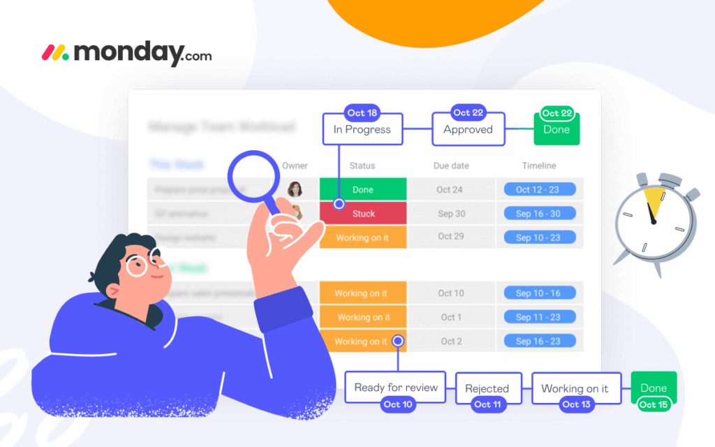
Project status in monday.com is typically tracked using a Status column, where each item represents a task, deal, or work unit. By grouping items by status and counting them in a chart or table, you can see how work is distributed across states like “Done”, “In Progress”, or “Stuck”. Dashboards allow you to monitor project status in real time across multiple boards.
How to visualize status in monday?
The most common way to visualize status is with Chart widgets, using Pie or Bar charts. For deeper analysis or historical trends, spreadsheet-style reports and pivot tables can provide a more detailed, time-based view – try our Smart Spreadsheet to get more from your monday account.