Why to Use DORA Metrics in Jira and Bitbucket

December 13, 2022
#Bitbucket#Analytics
7 min

It’s good when business decisions are based on facts, but it’s even better when these facts are expressed in numbers and can be compared with each other. The same applies to software delivery performance. This area is undergoing a great deal of interest in order to identify universal metrics to measure engineering processes. DORA metrics are considered to be among them. In this article, we’ll explain what DORA metrics are, how they contribute to a company’s success and how to measure them in Bitbucket.

What are DORA Metrics?

DORA metrics are a set of indicators that help companies measure the quality of software development and speed of delivery processes. They were identified by the DevOps Research and Assessment (DORA) group based on several years of studies into the DevOps practices of 30k+ engineering professionals.


DevOps Research and Assessment is an American research firm focused on digital transformation founded in 2015 and acquired by Google in 2019, known for its annual State of DevOps reports on business technology transformation.


DORA metrics are primarily used to gauge:

  • Throughput
    • Deployment frequency – How often code is deployed
    • Lead time for changes – How long it takes for a commit to get into production
  • Stability
    • Change failure rate – Percentage of changes that led to problems in production
    • Time to restore service – How long it takes to recover service after an incident

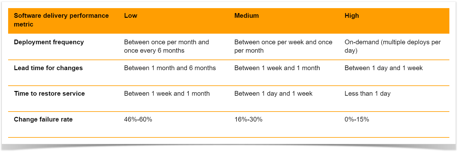
Based on how teams rank in each category, they are added to elite*, high, medium, or low clusters.

four key DORA metricsSource: 2022 Accelerate State of DevOps Report.
*This year an elite cluster was omitted as the highest-performing cluster doesn’t demonstrate enough of the characteristics of last year’s elite cluster.

In addition to software delivery performance indicators, the group recently added the fifth key metric – reliability. It is used to measure operational performance and illustrates how well services meet users’ needs, such as availability and performance.

Let’s have a closer look at the four software delivery performance metrics.

Deployment frequency

This metric indicates how often code is delivered to production or released to end users. According to DORA, the higher the deployment frequency, the better, as it involves more minor changes and minimizes release risks. In addition, it allows you to deliver value to customers faster and get feedback quicker.

But the deployment frequency depends on the type of system. While web apps are typically delivered multiple times a day, this frequency isn’t appropriate for game developers with multi-gigabyte releases. In this case, the frequency of deployment to pre-production environments can be measured.

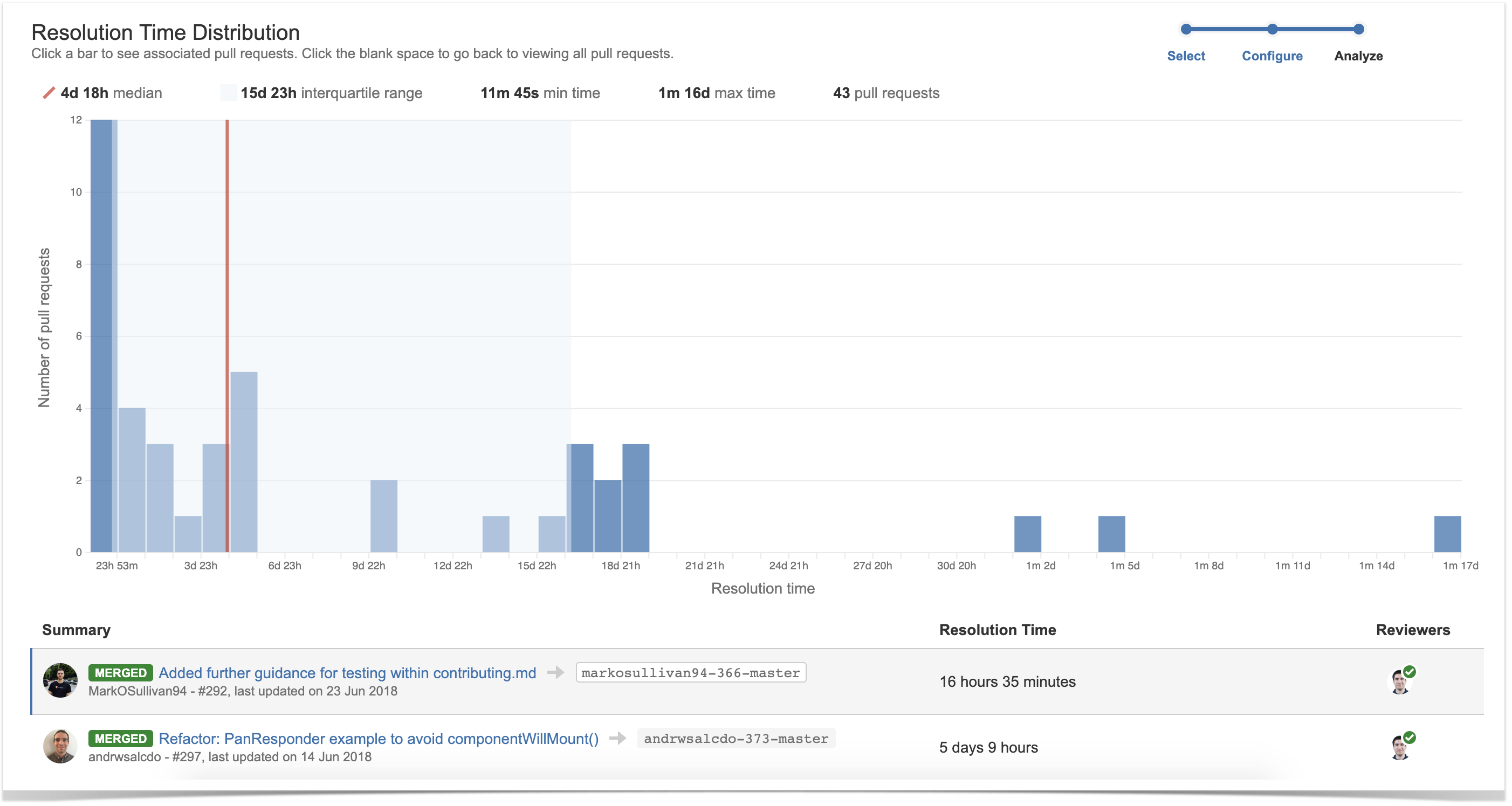
Lead Time for Changes

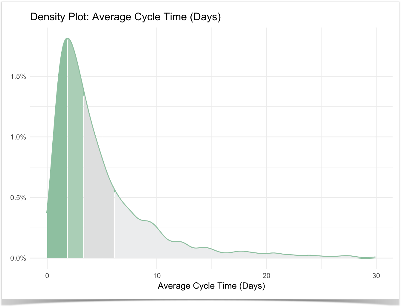
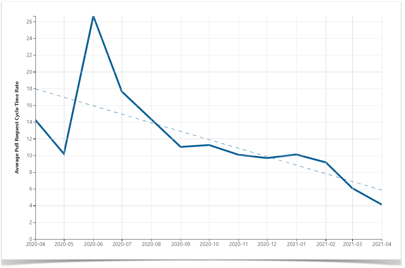
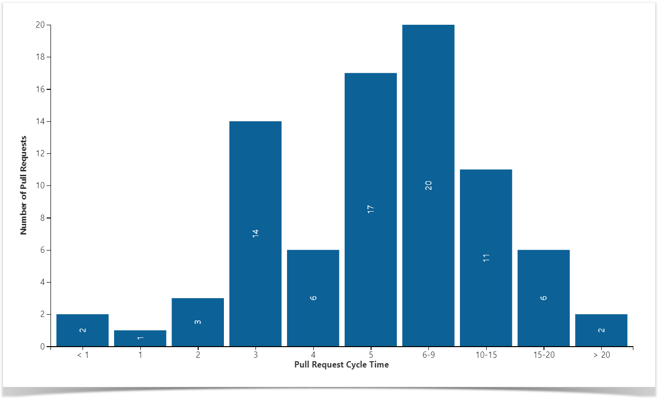
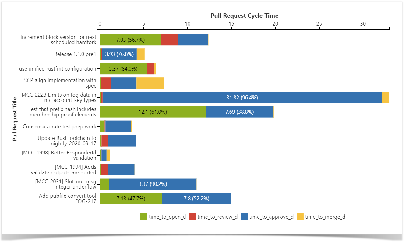
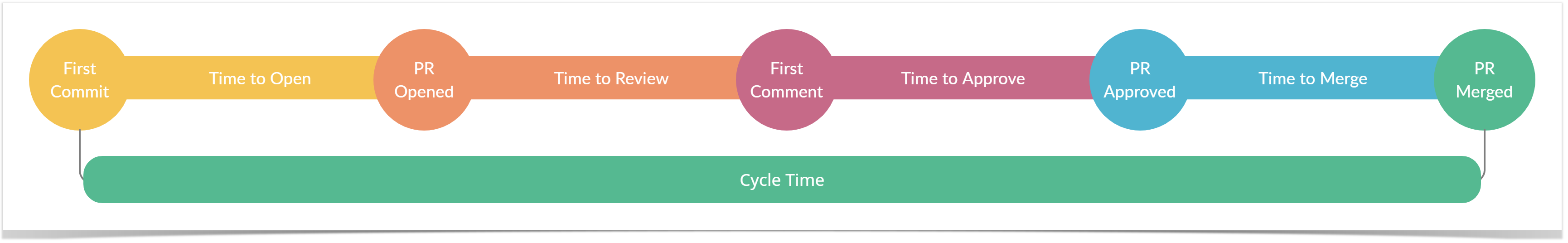
Lead time for changes also refers to the speed of development and indicates the time taken to deliver a commit into production. Using it, engineering managers can understand how efficient their teams’ cycle time is, how quickly changes are implemented and how well peaks in demand can be handled. Moreover, a long lead time for changes means that product updates are not delivered to users regularly enough. Therefore the advantage of quick feedback for further improvements cannot be taken.

Change Failure Rate

The change failure rate refers to code quality and measures the percentage of deployments that led to failures in production requiring remediation (e.g., a hotfix, rollback, fix forward, patch). Here is compared the number of post-deployment failures to the number of changes made.

A low change failure rate confirms the quality of the pipeline and indicates that the previous stages have successfully identified the majority of defects before deployments.

Time to Restore Service

This metric also shows the quality of software development and refers to the time taken to restore service after such incidents as an unplanned outage or service impairment. No matter how hard your team tries, the chance of an outage is high. So it’s crucial to organize processes to respond to emerging issues as quickly as possible.

A low time to recovery means that you efficiently identify emerging issues and can either quickly roll back to a previous version or promptly deploy a bug fix.

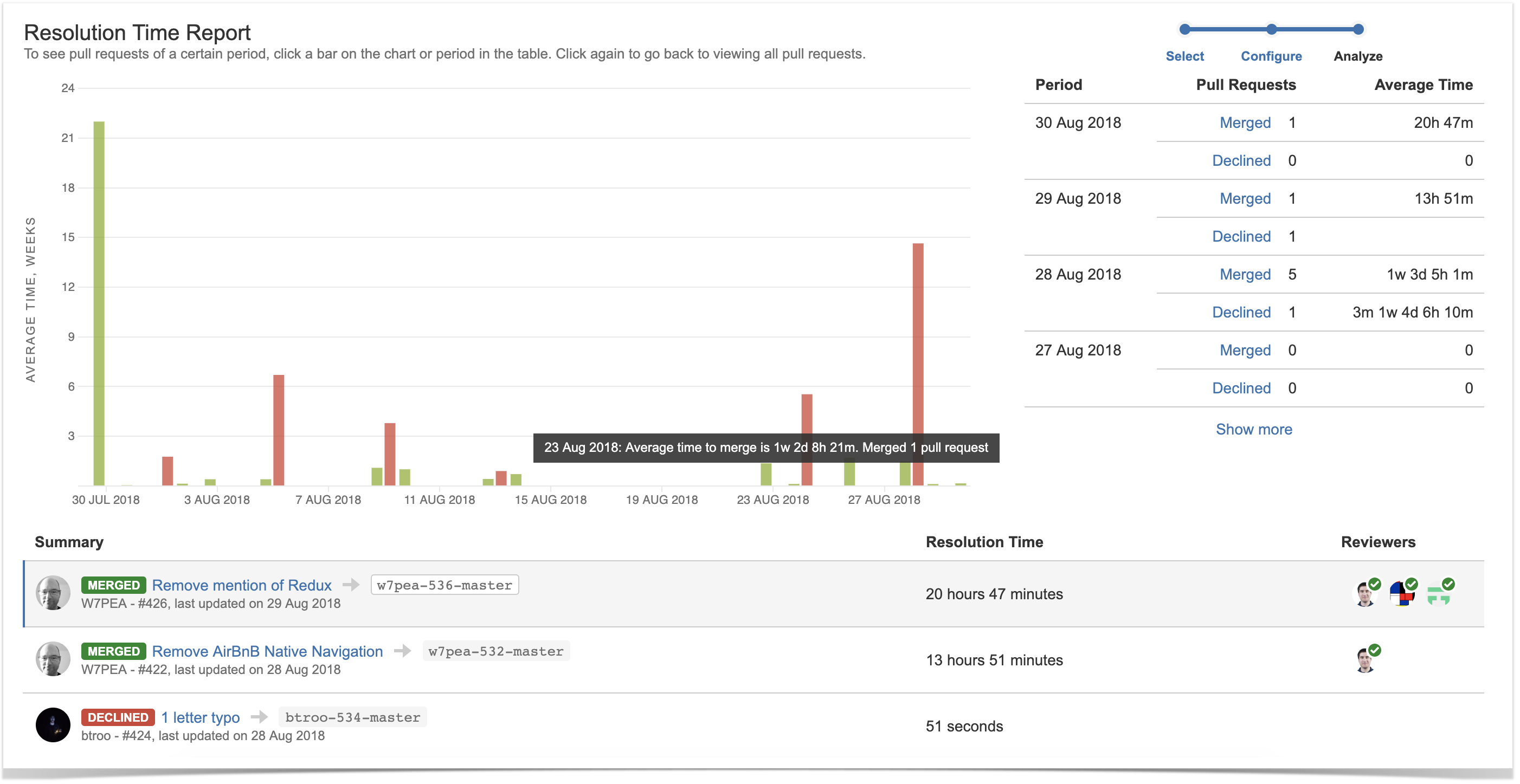
How to measure DORA metrics in Bitbucket?

As can be seen, DORA metrics are an effective way to understand your teams’ throughput and quality of code and make informed decisions about improving processes.

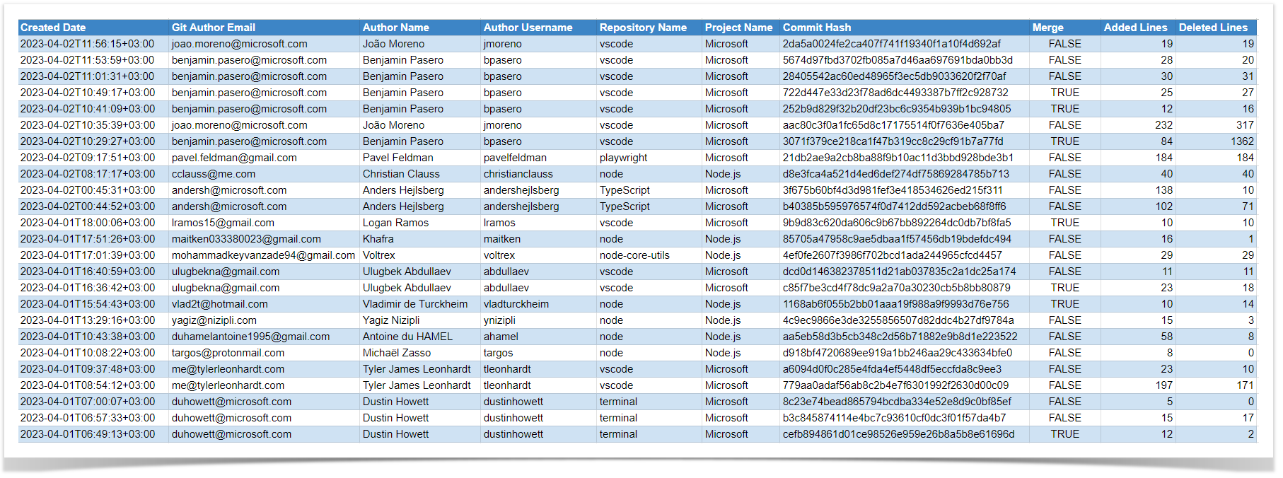
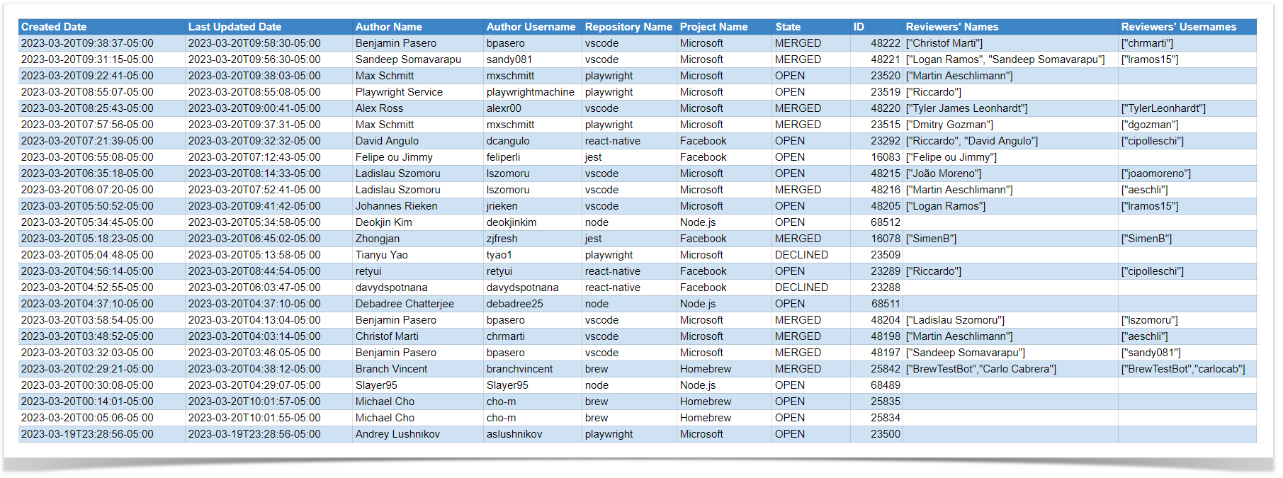
Using information from your project management systems like Jira and Bitbucket, you can calculate them manually:

  • Deployment frequency – the average number of days per week or month with at least one deployment
  • Lead time for changes – the average time between the first commit of a release and the deployment to production
  • Change failure rate – the ratio of deployment failures to the overall number of deployments
  • Time to restore service – the average time between a bug report and fix deployment

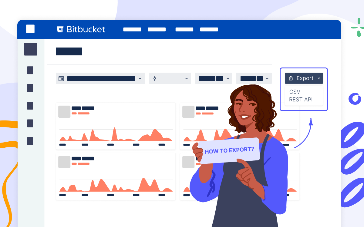
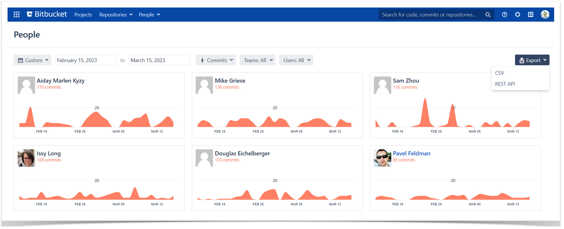
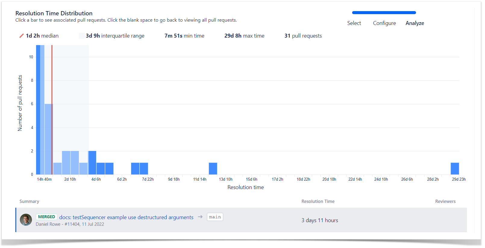
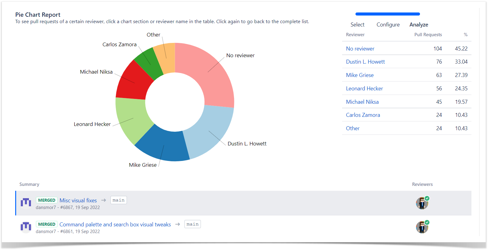
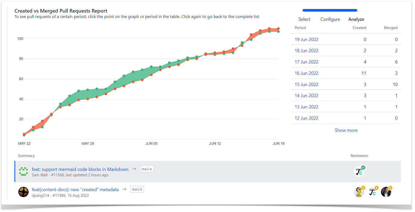
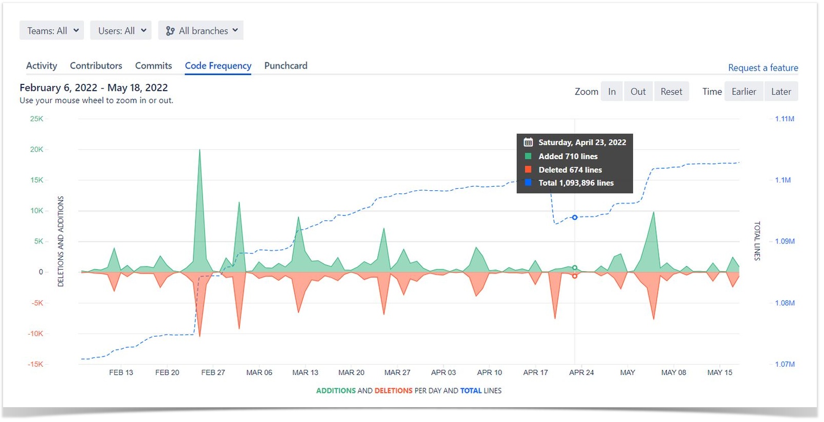
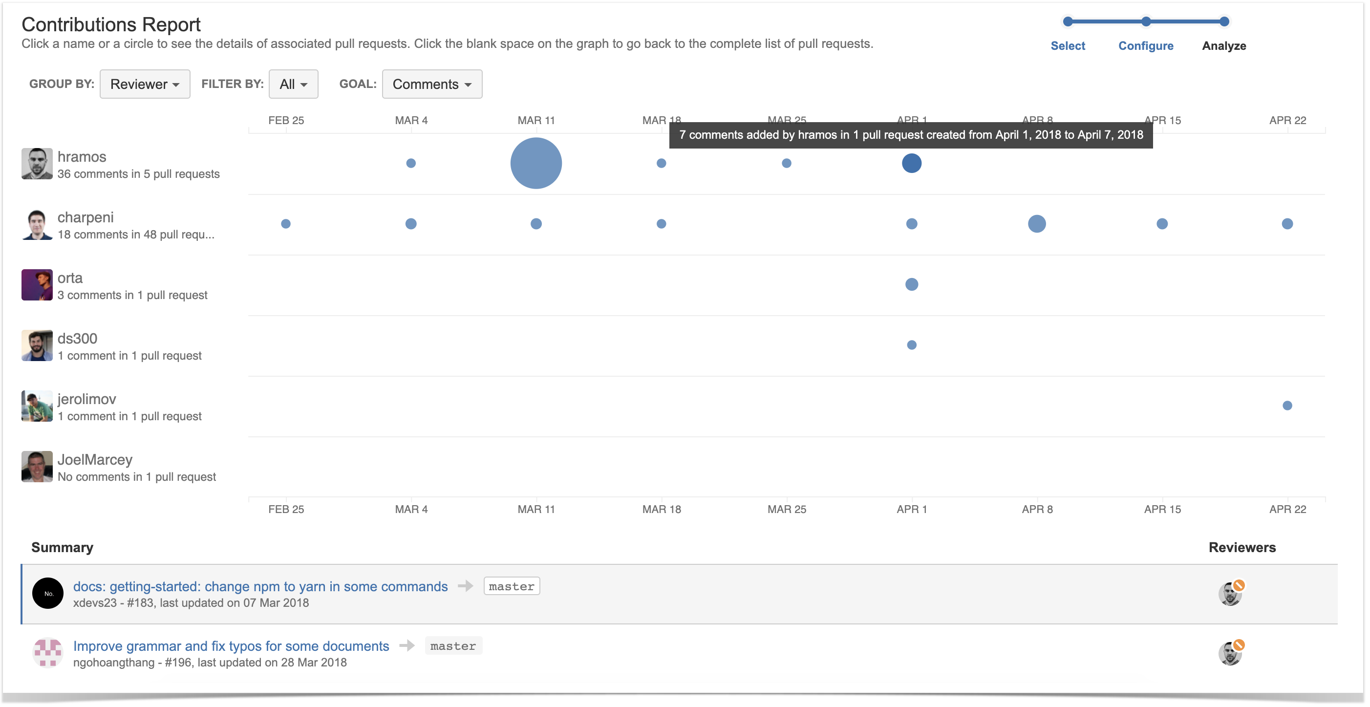
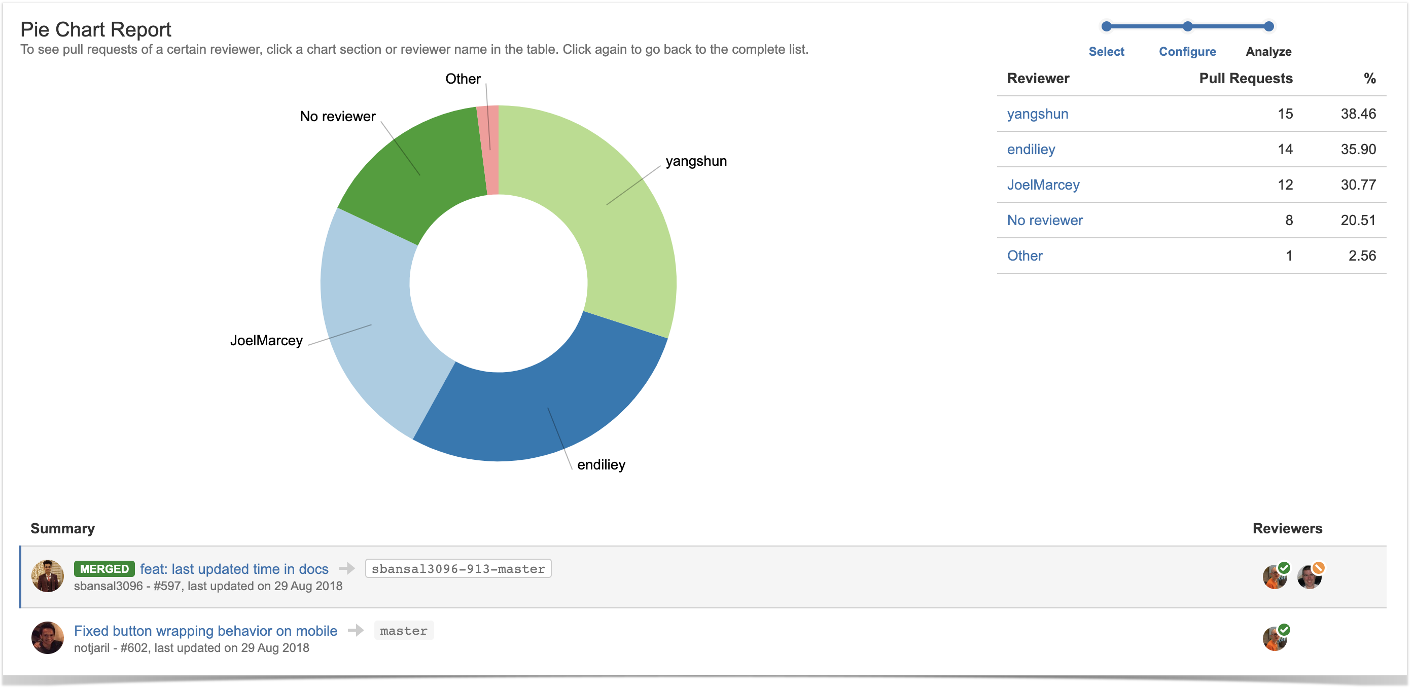
However, it’s much easier to measure metrics using Awesome Graphs for Bitbucket, which helps track and visualize your Git repositories as well as export commit and pull request data from Bitbucket to build custom reports.

Feel free to leave your email below if you would like to stay updated and be among the first to know about our new features and updates.


Contact Us
Related posts

    How to Export Commit and Pull Request Data from Bitbucket to CSV

    November 26, 2022
    #How To#Bitbucket#Reporting
    11 min

    Being a universal file type, CSV serves as a go-to format for integrations between the applications. It allows for transferring a large amount of data across the systems, blending it, and building custom reports. To export commit and pull request data from Bitbucket, you can use the Awesome Graphs for Bitbucket app, which gives you the capability to export to CSV in different ways.

    In this article, we’ll show you how to use the app to export engineering data to CSV for further integration, organization, and processing in analytics tools and custom solutions.

    What you will get

    The described ways of exporting will give you two kinds of generated CSV files, depending on the type of data exported. 

    In the case of commit data, you’ll get a list of commits with their details:

    commits export

    And the resulting CSV with a list of pull requests will look like this:

    pr export

    Exporting from the People page

    You can export raw commit and pull request data to CSV directly from Bitbucket. When you click All users in the People dropdown menu at the header, you’ll get to the People page with a global overview of developers’ activity in terms of commits or pull requests.

    At the top-right corner, you’ll notice the Export menu, where you can choose CSV.

    Export Commit and Pull Request Data from Bitbucket

    By default, the page shows contributions made within a month, but you can choose a longer period up to a quarter. The filtering applies not only to the GUI but also to the data exported, so if you don’t change the timespan, you’ll get a list of commits or pull requests for the last 30 days.

    Exporting via the REST API resources

    Beginning with version 5.5.0, Awesome Graphs REST API allows you to retrieve and export commit and pull request data to CSV on global, project, repository, and user levels, using the dedicated resources. This functionality is aimed to automate the processes you used to handle manually and streamline the existing workflows.

    You can access the in-app documentation (accessible to Awesome Graphs’ users) by choosing Export → REST API on the People page or go to our documentation website.

    We’ll show you two examples of the resources and how they work: one for exporting commits and another for pull requests. You’ll be able to use the rest of the resources as they follow the model.

    Export commits to CSV

    This resource exports a list of commits with their details from all Bitbucket projects and repositories to a CSV file.

    Here is the curl request example:

    curl -X GET -u username:password "https://bitbucket.your-company-name.com/rest/awesome-graphs-api/latest/commits/export/csv" --output commits.csv

    Alternatively, you can use any REST API client like Postman or put the URL directly into your browser’s address bar (you need to be authenticated in Bitbucket in this browser), and you’ll get a generated CSV file.

    By default, it exports the data for the last 30 days. You can set a timeframe for exported data up to one year (366 days) with sinceDate / untilDate parameters:

    curl -X GET -u username:password "https://bitbucket.your-company-name.com/rest/awesome-graphs-api/latest/commits/export/csv?sinceDate=2020-10-01&untilDate=2020-10-13" --output commits.csv

    For commit resources, you can also use the query parameters such as merges to filter merge/non-merge commits or order to specify the order to return commits in.

    Read more about the resource and its parameters.

    Export pull requests to CSV

    The pull request resources work similarly, so to export a list of pull requests with their details from all Bitbucket projects and repositories to a CSV file, make the following curl request:

    curl -X GET -u username:password "https://bitbucket.your-company-name.com/rest/awesome-graphs-api/latest/pull-requests/export/csv" --output pullrequests.csv

    The sinceDate / untilDate parameters can also be applied to state the timespan up to a year, but here you have an additional parameter dateType, allowing you to choose either the creation date or the date of the last update as a filtering criterion. So, if you set dateType to created, only the pull requests created during the stated period will be returned, while dateType set to updated will include the pull requests that were updated within the time frame.

    Another pull request specific parameter is state, which allows you to filter the response to only include openmerged, or declined pull requests.

    For example, the following request will return a list of open pull requests, which were updated between October 1st and October 13th:

    curl -X GET -u username:password "https://bitbucket.your-company-name.com/rest/awesome-graphs-api/latest/commits/export/csv?dateType=updated&state=open&sinceDate=2020-10-01&untilDate=2020-10-13" --output pullrequests.csv

    Learn more about this resource.

    Integrate intelligently

    While CSV is supported by many systems and is quite comfortable to manage, it is not the only way for software integrations the Awesome Graphs for Bitbucket app offers. Using the REST API, you can make the data flow between the applications and automate the workflow, eliminating manual work. And we want to make it easier for you and save your time.
    Let us know what integrations you are interested in, and we’ll try to bring them to you, so you don’t have to spend time and energy creating workarounds.

    Related posts

    Bitbucket Analytics: Why, What and How to Use

    October 4, 2022
    #Analytics#Bitbucket#Reporting
    7 min

    It’s no secret that the business world has adapted to making decisions based on data. We analyze conversion and churn rates, track the number of active users and average revenue. We know how much we spend on advertising and how it correlates with web traffic growth.

    But what about software development? In contrast to sales and marketing, the world of software engineering is less familiar with the same approaches, and all project development data remains hidden within repository management tools like Github, Gitlab, Bitbucket. It is widespread for software development decisions to be based on theory, instincts, experiments, or gut feelings. Sometimes they are backed up by a few numbers on commits or pull requests, but it is always tedious and time-consuming. Besides, it sometimes causes data errors due to manual work.

    A combination of all of these factors can negatively impact the development of any product, leading to:

    • Hidden inefficiencies and costs as invisible bottlenecks hamper team performance and productivity
    • Inability to determine if everyone is on the right track due to lack of transparency and visibility in projects and teams
    • Investing time in manual work instead of new ideas, core tasks, or favorite activities
    • Slow development velocity, missed deadlines, and disappointed stakeholders

    And it is up to everyone to decide how long this list should continue.

    To simplify work and make processes of software development more transparent many organizations rely on a data-driven approach and comprehensive analytics of commits and pull requests.


    64% of companies mark that improved efficiency and productivity as the top benefit of data analytics, while 56% say about faster, more effective decision-making

    Source: Finance Online


    What is a data-driven approach in software engineering?

    Data-driven development means using and analyzing commits and pull request data as a primary source of information for decision-making. In this approach, engineering processes are viewed from a transparent, accurate, and unbiased perspective by defining and using metrics such as KPIs or OKRs. It lets everyone know where the business is moving and how personal work contributes to its success.

    However, despite focusing on raw numbers and statistics, data-driven development also relies on people. It is not enough to count lines of code, the number of commits and pull requests, or to determine how long it takes to resolve pull requests. To be successful, metrics-based approaches need individuals and teams to understand the data, analyze it, and use it for continuous learning and improvement.

    What are the pros of using data in software development management?

    1) Processes transparency and optimization

    Collecting and analyzing commits and pull request data on an ongoing basis gives engineering managers a clear view of what is going on in projects and within their teams. It helps to explore similar patterns and find ways to improve them.

    2) Predictability of development and time-to-market

    Graphs and reports empower teams to find hidden inefficiencies, resolve everyday challenges, and speed up the development process without affecting code quality. It helps reduce time-to-market and deliver on promises.

    3) Informed decision-making based on well-rounded insights

    Analyzing real-time data with past patterns and getting deeper insights across project development can confirm a new strategy’s success or force you to revisit your choices.

    4) Keeping everyone on the same page

    Providing greater visibility into in-progress work and enabling developers to see the impact of their efforts on overall project success ensures the commitment of team members as well as keeps them motivated and moving in the right direction.

    How to implement a data-driven approach in Bitbucket?

    Bitbucket is a real storehouse of information on everything happening inside engineering processes. Unlocking it is all that is required to identify bottlenecks, understand why things go wrong, and find solutions. Unfortunately, Bitbucket does not provide any functionality that allows getting a quick overview of what is happening on projects and within teams.

    Here come data-driven apps like Awesome Graphs for Bitbucket that automatically pull data from Git repositories and empower data-driven software management.

    Awesome Graphs for Bitbucket helps engineering managers to monitor and measure the activity of the projects and developers from the whole Bitbucket by transforming invisible development activities into easy-to-understand insights and reports. Apart from this, the app:

    • seamlessly integrates into Bitbucket and displays data on the client’s side. No need to expose your source code outside Bitbucket or worry about security issues
    • gives a lot of out-of-the-box reports without requiring complex configuration and additional analytics knowledge
    • exports data to a CSV file or via REST API to create custom graphs or dashboards and merge them with the data from other apps

    When using Awesome Graphs for Bitbucket, project planning becomes more accurate since it provides an overview of the project’s dynamics and helps to identify bottlenecks that hold teams back. Apart from this, it is possible to track how your team’s productivity increases compared to the previous period, view the engineering contribution for each repository and project, or recognize hidden talents.

    Start a 30-day free trial to discover analytics’s benefits to your projects and teams.


    Related posts

      Get Even Awesomer Graphs for Your Bitbucket Cloud

      September 6, 2022
      #News#Bitbucket
      4 min

      In Bitbucket Cloud, behavior of apps is defined by the app context. There are two app contexts: personal and workspace.

      • With the personal context, you can use the app in all repositories to which you have access, but other users can’t use the app installed by you.
      • With the workspace context, you can use the app only in repositories in a specific workspace the app was installed in, so all users who have access to the workspace can use the app without installing it.

      It’s time to move to something new

      At the moment, the Awesome Graphs for Bitbucket Cloud has separate versions of the app for each of the contexts.

      We’ve been working hard on the development of both versions, but have decided to focus solely on the workspace context version, as it provides us with more opportunities to make an overall better app for the users.

      It’s a bit different, but much better

      The new version is installed to a particular workspace and available to everyone who’s got access to it.

      The transition of the app context allowed us to extend the app’s capabilities and add new features, improve security and an overall experience.

      Just to name a few, here’s what’s already in the new version:

      • Graphs and Reports are available for whole workspaces as well as individual repos
      • Lines of code statistics in addition to commits stats
      • New approach to the rate limits resulting in better app stability
      • Bug fixes and minor improvements here and there

      Should you do anything at all?

      If you’re not sure, which version of the app you’ve been using and if you need to do anything at all, you can check it the Workspace settings → Manage Installed apps:

      • The old one has the old three-color logo and the installation context is personal. If that’s what you have, then read further, and we’ll show you what to do.
      • If you have an orange and white logo app with workspace context, then you are using “the right” version already — good for you!

      manage installed apps in Bitbucket

      How to get the “right one”?

      Rather than going through a complex migration scheme, you just need to install the new app to your workspace — one click, and you’re all set.

      P.S. Don’t forget to uninstall the old one. (smile)

      What’ll happen to the old version?

      The personal context version of the app will be deprecated and no longer maintained after November 1, 2022, so hurry up and install the new app to your workspace now!

      In case you need assistance or have any questions, please feel free to contact us.

      Related posts

        Analyze How Code Review is Going in Bitbucket Data Center

        September 27, 2021
        #Analytics#How To#Bitbucket
        9 min

        Awesome Graphs is one of our most popular apps. It’s a solution that extends Bitbucket, a platform that teams use to host Git repositories and collaborate on code.

        Awesome Graphs helps engineering leaders and software teams improve their own processes and deliver products faster by transforming invisible development activities into easy-to-understand insights and reports.

        One of the keys focuses of the app is the code review processes analytics. We would like to tell you which features support this use case and how you can benefit from the app. Keep reading if you are interested in:

        • Seeing how actively your team members review code
        • Analyzing what developers may need to improve their work patterns and who’s doing a great job
        • Learning what reviewers are most active and diligent
        • Knowing the average time taken to resolve pull requests.

        Code review analysis

        code review analysis in bitbucket

        The Contributions Report analyzes activity in pull requests (tasks, comments, needs work/approved/declined statuses). It helps you understand:

        • What developers create high-quality code and who might need to improve their approach to work. E.g. when an engineer has fewer taskscomments, and needs work flags in their pull requests, it suggests his work is approved as it is or with minor changes and he creates code of high quality.
        • What reviewers are thorough when they review the work of developers. E.g. diligent reviewers come up with suggestions and improvements, so they have more tasks and comments than others.
        • How the dynamics of code review changes over time. E.g. you can see if the number of pull requests with Needs work flags is getting bigger or smaller if the number of tasks in pull requests is increasing or decreasing over time.

        Learn more

        The average time taken to resolve pull requests

        pull requests resolution time report in bitbucket

        Another report, Resolution Time Report, shows the average time taken to resolve pull requests. This is helpful to capture trends in resolution time. It displays resolution times of merged and declined pull requests separately. With this report you can:

        • Notice spikes in resolution time and then dive in to see what went wrong
        • See if an average resolution time is high for a long period of time – it can be a signal to look into your code review process and determine what causes delays
        • Monitor how changes in your processes affect the speed of code review.

        Learn more

        Knowledge sharing indicators

        reviewers of pull requests report in bitbucket

        The Pie Chart Report is a handy way to check if all developers in your team are involved in the code review. This report shows the breakdown of pull requests by different statistics types.

        Grouped by reviewer, the Pie Chart Report shows the following:

        • How many pull requests each person reviewed. These metrics help understand how much everyone contributes to the project.
        • Whether all people review code or there are one or two who are doing all job. This is an indicator of poor knowledge sharing.
        • Who is too busy reviewing all pull requests of their team. These people can become a bottleneck that slows the delivery time, because they’re not available for immediate review.

        Learn more

        Pull requests with a too long or too short resolution time

        pull requests resolution time report in bitbucket

        The Resolution Time Distribution Report visualizes pull requests grouped by the time taken to merge or decline them and gives an idea of the most frequent resolution times on your project. Using this report. you can easily:

        • find pull requests with the longest resolution time to check the reasons for the delay
        • see pull requests with the shortest time to resolve them to investigate whether they were checked as appropriate
        • predict the resolution time for the future pull requests.

        Learn more

        Exporting pull requests for the future processing

        With Awesome Graphs, the historical data can be exported to a CSV file right on the People page.

        exporting pull requests from bitbucket

        As a result of the exporting, you receive the CSV file with the list of pull requests (alternatively, the list of commits) with their details about the author, reviewers, state, the date they were created and last updated. The files can be processed in Excel or integrated with analytics tools like Tableau, Power BI, etc. to create custom graphs and dashboards and merge with the data from other apps.

        Learn more

        What other reports do you need?

        Awesome Graphs already has a wide range of graphs and reports that help you answer various questions about project development and the work of your team in Bitbucket. We are open to your feedback and appreciate hearing about what you need. So if you have a problem that you think Awesome Graphs can help you with, contact us – we actually listen.

        Try Awesome Graphs for free


        Related posts

          Pull Request Analytics: How to Visualize Cycle Time / Lead Time and Get Insights for Improvement

          March 30, 2021
          #Reporting#How To#Bitbucket
          12 min

          Cycle Time / Lead Time is one of the most important metrics for software development. It can tell a lot about the efficiency of the development process and the teams’ speed and capacity. In the previous article, we showed you how to get a detailed report with the pull request statistics and Cycle Time / Lead Time calculated on the repository level. 

          Today we’ll tell you how to use this report:

          • How to visualize the pull request data.
          • What things to pay attention to.
          • What insights you can get to improve performance.

          Please note that we define Cycle Time / Lead Time as the time between the developer’s first commit and the time it’s merged and will refer to it as Cycle Time throughout the article.

          Analyzing your codebase

          First, you need to understand the current state of affairs and how it compares to the industry standards. According to the Code Climate’s research, the industry-wide median for Cycle Time is 3.4 days, with only the top 25% managing to keep it as low as 1.8 days and the bottom 25% having a Cycle Time of 6.2 days.

          © Code Climate

          To get a better understanding of the development process, it might be helpful to look at the teams’ dynamics and monitor the changes over time. The following chart shows how the average Cycle Time changes month after month with a trend line, so you can see objectively whether the development process is getting faster or slower and check how your rates compare to the industry average. Follow the instructions to build this chart.

          For a more precise analysis and evaluation of the current code base, you can also use the Cycle Time distribution chart that provides pull request statistics aggregated by their Cycle time value, making it easy to spot the outliers for further investigation. Learn how to build this chart.

          In addition to the Cycle Time, Awesome Graphs for Bitbucket lets you analyze the pull request resolution time out-of-the-box. Using the Resolution Time Distribution report, you can see how long it takes pull requests to merge or decline, find the shortest and longest pull requests, and predict the resolution time of future pull requests with the historical data.

          While Cycle Time serves as a great indicator of success and, keeping it low, you can increase the output and efficiency of your teams, it’s not diagnostic by itself and can’t really tell what you are doing right or wrong. To understand why it is high or low, you’ll need to dig deeper into the metrics it consists of. The chart below gives you a general overview of the pull requests on the repository level and shows the Cycle Time with the percentage of the stages it’s comprised of (which we’ll discuss in detail in the following paragraphs). You can build a chart like this using the Chart from Table macro, available in the Table Filter and Charts app.

          Breaking down the Cycle Time

          We break down Cycle Time into four stages:

          • Time to open (from the first commit to open)
          • Time waiting for review (from open to the first comment)
          • Time to approve (from the first comment to approved)
          • Time to merge (from approved to merge)

          Now we’ll go through each of these stages, discussing the things to pay attention to.

          Time to Open

          This metric is arguably the most important of all, as it influences all the later stages and, according to the research, pull requests that open faster tend to merge faster.

          Long Time to Open might indicate that the developer had to switch tasks and/or that code was rewritten, which might also result in large batch sizes. In one of the previous articles, we described how you can check the size of your pull requests in Bitbucket, so you can also use it for a deeper analysis.

          One of the things you can do to improve your Time to Open is to decrease the pull request size to be no more than 200 to 400 lines of code. Thus you’ll influence each stage of the cycle, as the smaller pull requests are more likely to be reviewed more thoroughly and be approved sooner.

          Time to Review

          Time to Review is a great metric to understand if your teams adopted Code Review as part of the daily routine. If it’s high, then it might not be part of their habit, and you’ll need to foster this culture. Another reason might be that the pull requests are not review-friendly and the reviewers procrastinate dealing with them. You can change this, once again, by keeping the pull request size small and by writing a reasonable description so it’s easier to get started with them. If the long Time to Review rate is caused by organizational issues, then it might require reprioritization.

          Time to Approve

          This is the stage you don’t really want to minimize but rather make it consistent by reducing inefficiencies in the code review process. While there are many strategies for Code Review, there is hardly any industry standard for Code Review metrics, so you’ll need to focus on the organization of the process and try to find a way to get constructive feedback.

          Time to Merge

          Long Time to Merge might be an indicator that there are obstacles in the delivery workflow. To improve it, you need to find out if there are any blockers in the process, including manual deployment, and check if your tooling satisfies your current needs.

          Wrapping up

          Cycle Time’s importance is difficult to overestimate, as this metric can tell a lot about the way you work, and controlling it, you can optimize the development process and deliver faster.

          Once again, we built the initial pull request report with the help of the Awesome Graphs for Bitbucket app as a data provider and used the Table Filter and Charts for Confluence app to aggregate and visualize the data.

          These are just a few examples, but you can get much more even from this one report. Check out the other guides for charts based on data from Bitbucket. Share your feedback and ideas in the comments, and we’ll try to cover them in future posts.

          Related posts