Get your free copy of Anatomy of Confluence Cloud macros!
December 14, 2020
#How To#Confluence
1 min
Hey All!
We are excited to share our expertise and many years’ experience with Confluence Cloud macros. We collected our knowledge and useful hints on which macro and under what circumstances to use in Confluence Cloud featuring:
Children Display
Content by Label
Page Properties
Page Properties Report
Trello board
Task Report
Table of Contents
Decision Report
and many more!
What are you waiting for? Grab your copy of our guide by clicking the button below and let us know what other macros to include.
Two-Minute How-To: Filtering Tables in Confluence Cloud
December 8, 2020
#How To#Confluence
3 min
What is the major advantage of storing data in structured tables? We believe that the answer is the ability to find the relevant information in seconds, be comfortable with your data, and gain insights exactly when you need it. No matter what kind of tables you have and what size they are, you can filter them in Confluence Cloud in the blink of an eye.
In this post, you’ll learn how to filter table data, search for values within the whole table, and hide unnecessary columns.
To get started, you need to enable filtration for tables on a Confluence page by adding the Table Filter macro in the page view mode.
1. How to filter table data
To filter table data, hover over table columns, click the funnel icon in a table header, type or select values, and voila, you filtered the table. Two figures in the upper right corner of the table indicate the number of filtered rows in relation to the total number of entries.
If you’d like to stick to the results of your filtration, you can save these changes.
In case you don’t know exactly in what column to look for values, you can try the global filter that allows filtering the whole table at once. Use the regular expressions for the advanced search, for instance, when you need the partial word search or search for multiple items.
3. How to hide columns
If your table is large and has a lot of columns, you can hide unnecessary ones to make it readable and easier to navigate.
Learn more about Confluence Cloud
Read our guide to get started with Confluence Cloud macros and learn how you can use them to create engaging content.
This is our second post in the series of Two-Minute How-to blog posts. You can also check how to create polls in Confluence Cloud.
If you have any questions or would like to suggest a topic for the next post, feel free to contact us. Check out the latest news in the How-to category in our blog! 😉
There are plenty of solutions for managing tasks and to-dos for teams to be more organized and efficient while sharing work and collaborating on the same projects. If you are looking to start using such a tool at your workplace or are already using one, but would like to try something new, this post will give you an overview of five options to consider.
A perfect task management tool has the right set of features, a nice and user-friendly interface, it is fast and easy to use. It should be flexible, but not overwhelming or confusing with loads of advanced functionality that your team doesn’t need.
Let’s take a look at a brief overview, major features, and pricing of:
Use the highlights below to compare these utilities and see if one of them matches your needs.
Trello
Trello is a free tool that helps teams stay on the same page synchronizing multiple tasks. You can create personal and team boards to track your tasks. If you are not sure what to start with, you can customize templates and use them to boost your productivity at home and at work.
You can easily organize and plan your activities, be it a new team project or your family vacation. Create a board and populate it with lists to visualize your work adding cards to each list. Trello cards are easy to use: you can add checklists, tags, comments, files, due dates. You can rapidly drag and drop items between lists to show progress to your teammates.
Pricing: Trello is free to use. If you are planning to use it for free with your team, you can create only 10 boards. The unlimited amount of boards and more capabilities are available in the Business Class version for $9.99 per user per month. You can be billed monthly or annually. Learn more.
Confluence Cloud
Confluence is a collaboration software that helps teams keep all their work in one place organizing it with the help of pages and spaces. Teams can swiftly share content and discuss their projects. The great thing is that either you need to manage product requirements or you want to collaborate on marketing plans, you can use different templates that can save you a lot of time.
In Confluence, you can create task lists mentioning your colleagues who can also edit the tasks adding statuses and due dates.
Moreover, you can edit tasks in real time together with your coworkers avoiding mess in your documentation.
Pricing: Confluence is always free for teams with less than 10 users. You can get the Standard plan for $5 per user per month choosing annual or monthly billing. Learn more
Asana
Asana is a web and mobile application that allows you to manage tasks online without using email. You can create an organization or a workspace that will include members (your company employees) and guests (customers, partners, etc.). Employees are grouped in teams and you can organize their work in projects with tasks displayed as a to-do list that can be sorted and filtered based on user’s goals. A task list can have sections to arrange tasks based on their priority, different work stages, categories, etc. What’s nice is that the list of tasks is not overloaded with details. But they are one click away – select a list item and view its details on the sidebar that can be collapsed to get a better view of a task list.
Working with tasks is easy and intuitive, while powerful. You can assign a task to delegate it to someone, set a due date and time, create sub-tasks, post a comment, attach files, follow the task, mark the task complete or incomplete, and more.
Besides seeing a list of tasks from the project perspective, you can view the list of all tasks assigned to you or some other person across all projects. Another cool feature is personal and team calendars, which show tasks assigned to you (personal calendar) and tasks of your team across all projects in a single view.
You also get:
Inbox page, where the updates on all projects you’re a member of and tasks that you follow or are assigned to are shown
Dashboard with your projects’ progress charts
Basic and advanced tasks search capabilities
Reminders about tasks
Private projects, tasks, and teams
Creating tasks and conversations by sending emails to Asana
Team conversations, where team members post announcements and discuss work
Email notification as an alternative to using Asana Inbox.
Pricing: Accounts in Asana are free and tied to individual users. For teams up to 15 people, there is a free plan with basic features. For larger teams or to use premium benefits, you need to upgrade either the entire organization or one team. The cost of the premium option depends on the size of your plan. You can get Asana Premium for $10.99 or less per user per month. You can be billed monthly or annually. Learn more
Hubstaff Tasks
Hubstaff Tasks is a web-based project management tool that simplifies team collaboration. Its intuitive interface makes it easy to jump into for teams of different sizes.
Hubstaff Tasks keeps all of your tasks organized in a Kanban board using cards and columns. The app will show you a quick overview of all the tasks that are currently being worked on, which project phases they are in, as well as who’s working on them. You can create a card for each task or to-do and move it to different stages of the project by dragging and dropping. Here’s what you can do with your task cards:
Assign team members and include followers
Add task descriptions, attach files, and create task labels
Set due dates and hourly estimates
Communicate with and notify teammates using comments
The app has an Agile Sprints feature that shows you all the tasks assigned to you. You can organize them by current or future sprint, allowing you to prioritize the right tasks and keep the workflow moving forward.
Hubstaff Tasks’s custom workflows feature lets you advance tasks to the next stage and assign them to the right team members with just one click. It also has automated Stand-ups that team members can use to report accomplishments and roadblocks. With these features, you can ensure that everyone is on the same page and that things are getting done.
Pricing: Hubstaff Tasks has a free plan for up to 5 users. Its Premium plan offers unlimited projects and 5 GB of storage for $5/user/month. Learn more
Remember the Milk
Remember the Milk (RTM) is a cross-platform web-based application that you can use to manage tasks from a computer or smartphone online or offline. This tool is a popular task manager for personal use, but you can perfectly customize and use it for business purposes.
If your team’s work is organized into projects, you can create separate lists for each project. You can create subtasks (this feature is available for Pro accounts).
You can assign tasks and share/send to-dos to other RTM users. Tasks can be prioritized, postponed, moved to another list. You can perform actions on several tasks at once and set reminders. It also supports recurrent tasks, comes with flexible search, several sorting options, and the ability to add tasks via email. It is even possible to add a location to a task.
You can track tasks that are due today and tomorrow or are overdue. It is easy to get a printable weekly planner.
Remember the Milk has the Pro Tester Program, which you can join to get access to pre-release versions of new cool features. So if you are missing something in the released version, check out this program and see if what you are looking for is available there.
Pricing: Standard Remember the Milk accounts are free. Pro accounts are $39.99 per year and give you access to additional features. Learn more
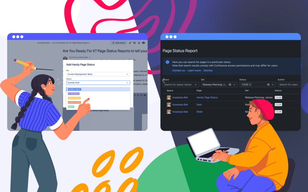
You can easily filter and aggregate information on Confluence pages. Moreover, you can create your set of statuses and change them in the page view mode on the fly.
Discover our comprehensive list of apps to boost your project planning capabilities here!
If you have any questions, feel free to comment on this blog post below. Don’t forget to subscribe to email notifications about new articles in our blog.
Atlassian Remote Summit 2020: New experience for all of us
April 10, 2020
#News
4 min
At times like these, when our well-being is essential and should come above everything else, companies all over the world had no chance but to cancel or postpone their conferences. Atlassian decided to organize the first Atlassian Remote Summit to help users from different countries meet Atlassian experts online and learn about important Atlassian news and achievements.
Just imagine that almost 29k people registered to stay connected with Atlassian!
In this blog post, you will find information about the most exciting announcements made during April 1-2.
Day 1 – Atlassian keynote: Unleashing the potential of all teams
Atlassian co-founder and co-CEO Scott Farquhar, Kelly Drozd, Agile Delivery Manager at St. Jude Children’s Research Hospital, and other Atlassian leaders showed us new ways to bring remote working on a new level.
We will describe the main news from this keynote briefly.
General updates:
Every Atlassian product is now available for free for all teams with up to 10 users because so many organizations worldwide deal with remote working for the first time and need support in this challenging task.
Atlassian will support educators with a free subscription to Trello Business Class for a year.
Bitbucket:
To avoid switching between Jira and Bitbucket, Atlassian introduced Your work dashboard in Bitbucket, where you can get the essential information about your projects.
Jira Service Desk and Jira:
Jira Service Desk integration with CI/CD tools. Now Bitbucket pipelines, Jenkins, CircleCI, Octopus Deploy can automatically create a change request within JSD.
New incident bulk linking for OpsGenie and JSD.
New capabilities for roadmaps in Jira: hierarchy, progress bars, drag-and-drop dependency mapping, Confluence macros for sharing roadmaps.
Introduction of Jira Service Desk Templates (for such teams as HR, Legal and Facilities).
Trello’s Butler automation tool comes to Jira and Slack.
Confluence Cloud
A new fresh look of the home page.
Page analytics is now available at the standard tier.
Inline comments are now available in the edit mode.
Day 2 – Atlassian keynote: Business transformation
Atlassian co-Founder and co-CEO Mike-Cannon Brookes, Intuit CEO Sasan Goodarzi, told the viewers all over the world about the role of Cloud in an organization’s transformation journey.
General updates:
Mike announced the dates of Atlassian Summit 2021 in Vegas: April 20-22.
Users can get smart notifications for Jira with email digest instead of multiple emails.
You can join the waitlist for Atlassian Forge that offers the new standard in app development for Cloud.
Atlassian introduced the Premium tier for Jira Service Desk.
Integration of Jira Align and Trello.
Atlassian Cloud Enterprise is coming soon. This enterprise plan supports unlimited users, sandbox, centralized user billing, release tracks, and more.
Atlassian Summit was always an excellent opportunity for all Atlassian vendors to meet our customers and tell Atlassian users more about our products. This year, we did our best to stay connected. So we opened a virtual booth where everyone could book a demo to learn more about our apps.
We knew that Atlassian users were missing swag from us. For that reason, all attendees of the booth got a chance to win the $200 Amazon gift card.
How to Track Progress Over Training Courses in Confluence
April 7, 2020
#How To#Confluence#Learning Management
3 min
Here, in izi LMS team, we’re doing our best to create features our customers need the most when it comes to training courses in Confluence. Today we are pleased to present a new report in izi – LMS for Confluence that will be extremely valuable in the analysis of your organization’s learning process.
With Course Results Report, you’re able to generate reports based on courses you have in Confluence. It’s a macro that you can insert into any page and get a report for all or several courses, participants, and their progress. Course Results Report saves you time you could spend collecting data from each course individually.
View all courses’ results in one place
Earlier, an administrator could get a report for each separate course only. Now you can keep reports about all the courses on one page. To get a global report about all courses, all you have to do is to insert the Course Result Report macro to the page. As a result, you have a table that includes information about all courses and employees that were enrolled in them.
This report can save you time in several cases. For instance, when your Learning & Development team wants to track all courses and their participants in one place. Or when your management needs a global report on all courses taken by employees this year.
Enjoy a flexible report configuration
With the help of the macro, you can include only those courses and participants you need for your report. A report can be based on a user group and their courses. Also, you can create a report for one single participant and include all or several courses passed by this person. It is convenient, especially if your supervisor wants to know how learning goes for each of the employees in their team.
Share course results with your colleagues
A ready-made report can be shared just like any other Confluence content. Imagine how handy it can be when you need to share particular course results with a supervisor or team lead.
Refine your training courses in Confluence
Moreover, you can power up your reports with the help of the Table Filter and Charts for Confluence app. In a bundle with izi – LMS for Confluence this app takes your course analytics to a new level.
You can easily filter report results when you need to find all the participants who only started the course. It comes in handy when you have a lot of course participants. You can also use reports to build insightful graphs to rapidly get an overview of your colleagues’ progress.
Try the new version of izi LMS to have a better understanding of the learning process in your organization. Course reports can help you enhance your education program and check course results on the fly.
Nelson Mandela once said, ‘Education is the most powerful weapon you can use to change the world.’ We can do nothing then agree because well-educated employees are a key to a prosperous and successful company. Create more educational material for your employees – izi – LMS for Confluence is there to help you.