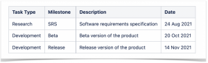
Table Filter, Charts & Spreadsheets achieves SOC 2 Type II compliance
May 22, 2025
#News
4 min
We are thrilled to announce that our Table Filter, Charts & Spreadsheets for Confluencehas achieved SOC 2 Type II compliance. This milestone reflects our commitment to delivering secure and reliable solutions that extend the capabilities of Atlassian products.
Why SOC 2 matters for you as a customer
SOC 2 is a widely recognized standard for organizations that manage customer data. It shows that a company has the necessary controls in place for security, availability, processing integrity, confidentiality, and privacy.
Over the past years, we’ve put a lot of time and effort into strengthening our security processes, completing detailed audits, and improving our systems.
SOC 2 certification means that an independent auditor has checked our systems and processes and confirmed they meet the five Trust Services Criteria: security, availability, processing integrity, confidentiality, and privacy. Previously, we achieved SOC 2 Type I certification, which reviews controls at a single moment in time. Now, SOC 2 Type II shows that our controls work effectively over time, proving we consistently meet top security standards.
While you may not notice changes in day-to-day operations, this certification gives you extra peace of mind that our commitment to protecting your data has been independently verified. You can use Table Filter, Charts & Spreadsheets for Confluence with greater confidence, knowing your data is safe. For more information visit our Trust Center.
Subscribe for monthly updates on how to get the most out of Atlassian products.
Thank you for signing up
for our newsletter!
You will be the first to know about fresh content, releases,
and special projects.
Stay tuned.
Revolutionize Employee Performance Evaluation in Jira and Confluence
March 11, 2025
#How To#Confluence#Jira
12 min
Measuring employee performance demands more than traditional quarterly reviews and subjective feedback in today’s rapidly digitalizing work environment. Companies are turning to integrated, data-driven solutions to objectively track performance, boost productivity, and drive continuous improvement. By harnessing the power of Jira and Confluence, along with specialized apps like Smart Attachments for Jira, Table Filter, Charts & Spreadsheets for Confluence, and izi – LMS for Confluence, you can create a seamless performance management ecosystem that supports both real-time analytics and ongoing employee development.
The Digital Shift in Employee Performance Evaluation
The transformation to remote work and digital collaboration has reshaped how companies monitor team performance. With in-person interactions limited, managers face challenges in capturing real-time, objective insights into employee contributions. Traditional review methods—often dependent on sporadic meetings and anecdotal evidence—can miss the nuances of day-to-day work. Now, a robust digital strategy is essential:
Continuous Feedback: Real-time data capture at key workflow stages helps eliminate the bias of retrospective evaluations.
Data-Driven Insights: Automated metrics provide clear trends, helping managers pinpoint strengths and areas for improvement.
Integrated Systems: Leveraging the power of Jira and Confluence ensures that performance metrics are not siloed but become part of everyday operations.
Optimizing Employee Performance Analytics in Jira
Jira has long been the go-to platform for task tracking and project management. Its flexibility makes it an ideal hub for gathering employee performance data. As tasks are completed and closed, performance metrics—such as delivery speed, work quality, and process adherence—can be automatically captured within your existing workflows.
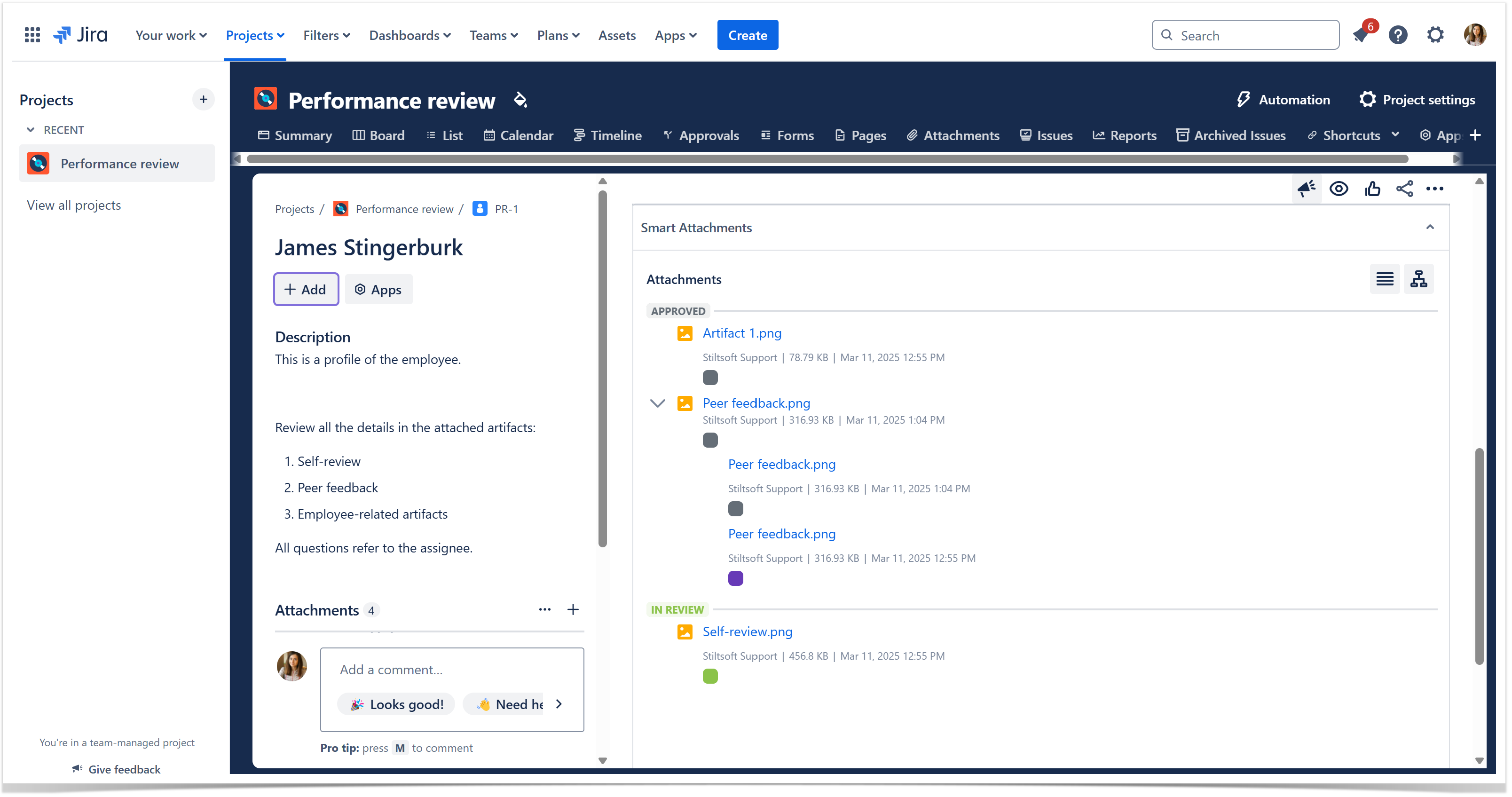
The Smart Attachments for Jira app elevates employee performance tracking by streamlining attachment management. It helps you link relevant documents, work samples, feedback forms, and project artifacts to corresponding Jira issues. This ensures that every performance record is enriched with contextual evidence, making it easier for managers to review contributions and make informed decisions.
Key benefits include:
Automated Documentation: No more manual uploads—relevant files are linked to each task.
Seamless Integration: The Smart Attachments app works directly within Jira, complementing existing workflows without added complexity.
Visualizing Employee Performance Data in Confluence
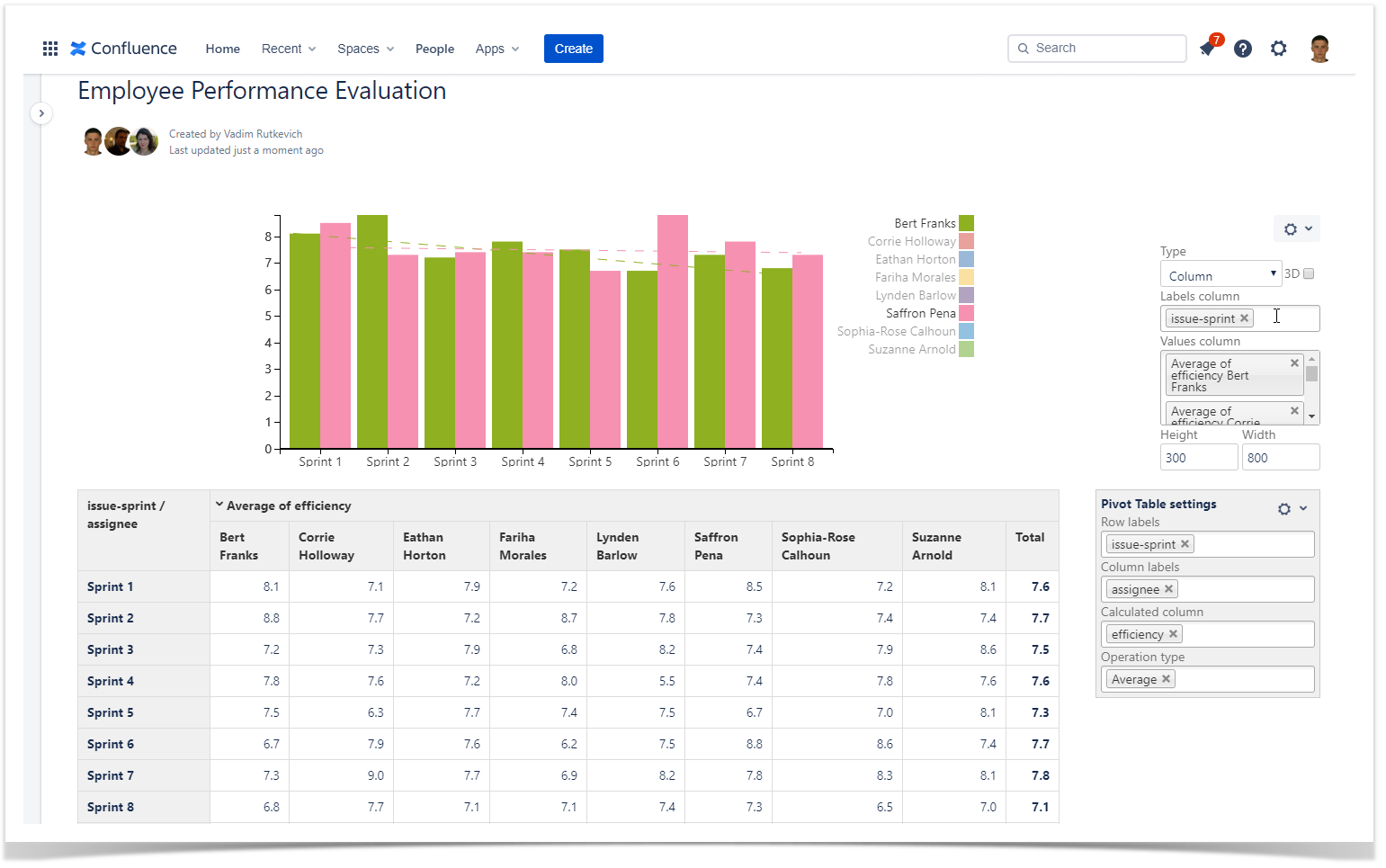
Raw data is only as valuable as your ability to interpret it. Once your employee performance data is captured in any form, exporting it to Confluence allows for dynamic visualization and deeper analysis. The Table Filter, Charts & Spreadsheets for Confluence app is designed to transform CSV data into interactive dashboards, pivot tables, and charts that track performance over time.
How It Works:
Data Export: Save your performance metrics as a CSV file.
Confluence Integration: Attach the CSV file to a Confluence page and use the CSV macro to display the data in a table.
Dynamic Visualization: Enclose the table within the Table Filter and Charts macro to:
Create pivot tables that group data by sprint, assignee, or issue type.
Generate charts that illustrate trends in delivery speed, code quality, and efficiency.
Enable trendlines to visually track performance improvements or identify setbacks.
Benefits:
Immediate Insights: Instantly identify trends across multiple sprints or projects.
Custom Reports: Tailor visualizations to highlight specific employee performance metrics.
Actionable Data: Use insights to inform targeted training and process improvements.
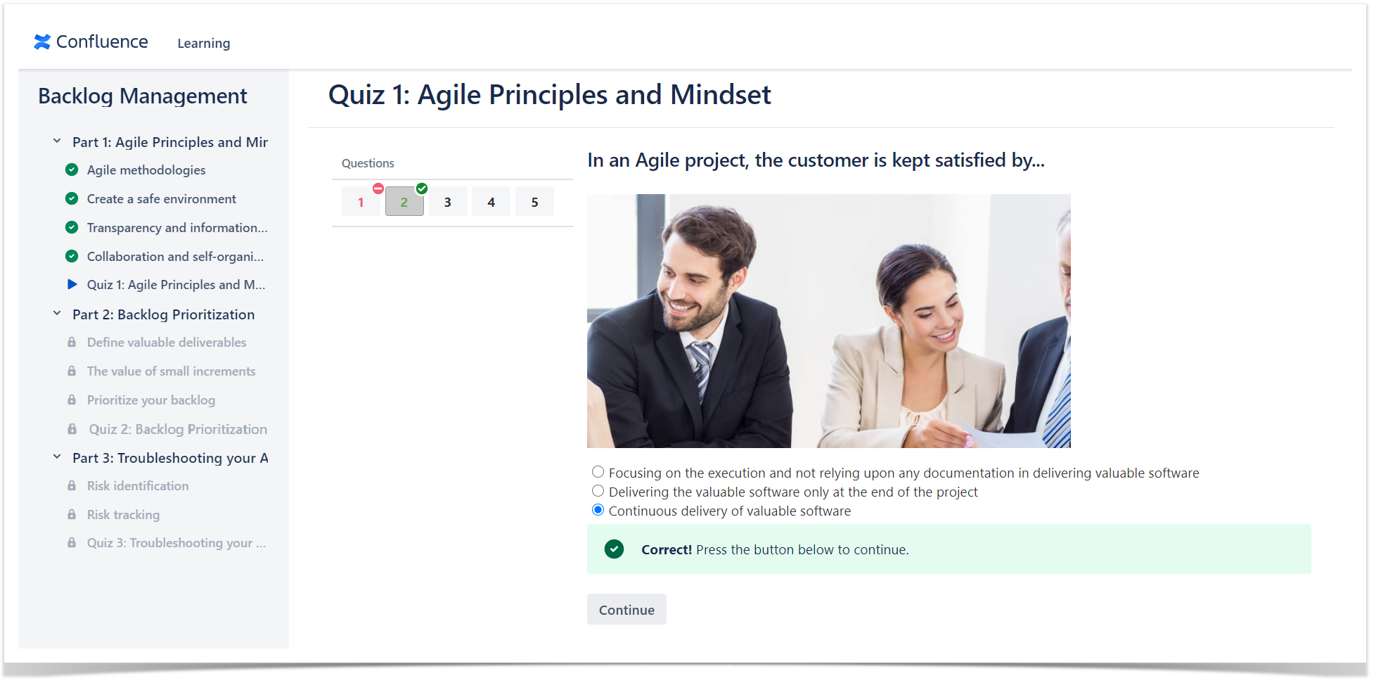
Upskilling Teams with izi – LMS for Confluence
Objective performance analytics are only one side of the coin. To ensure continuous improvement, companies must invest in employee performance and development. The izi – LMS for Confluence app transforms your familiar Confluence workspace into a full-featured learning management system.
What izi – LMS Offers:
Course Creation: Build interactive courses, quizzes, and tests directly within Confluence.
Seamless Integration: Utilize existing Confluence pages and content to create engaging training materials.
Progress Tracking: Monitor employee progress with detailed reports, ensuring that training efforts are aligned with performance gaps.
By merging training with performance data, managers can tailor educational programs to address specific skill deficiencies and promote career development, ensuring that every team member has the resources needed to excel.
Integrating Tools for Employee Performance Management System
A comprehensive performance management system is built on the synergy between data capture, visualization, and continuous learning. By integrating Jira and Confluence with the right apps, companies can:
Streamline Performance Reviews: Capture real-time data in Jira and enrich it with contextual documents using Smart Attachments for Jira.
Enhance Employee Development: Utilize izi – LMS for Confluence to provide targeted training based on data-driven insights.
This holistic approach improves the objectivity and efficiency of performance evaluations and fosters an environment of continuous learning and growth—vital for staying competitive in today’s fast-paced business landscape.
Conclusion
Incorporating digital tools into your employee performance evaluation process is no longer optional—it’s a strategic imperative. By harnessing the power of Jira and Confluence along with apps like Smart Attachments for Jira, Table Filter, Charts & Spreadsheets for Confluence, and izi – LMS for Confluence, your organization can achieve a more objective, transparent, and effective performance management system.
Empower your managers with real-time insights, streamline the feedback process, and invest in your team’s growth to drive overall success. Start transforming your employee performance evaluations today and unlock the full potential of your digital workplace.
Discover how these innovative tools can revolutionize your performance review process and propel your organization to new heights.
Subscribe for monthly updates on how to get the most out of Atlassian products.
Thank you for signing up
for our newsletter!
You will be the first to know about fresh content, releases,
and special projects.
Stay tuned.
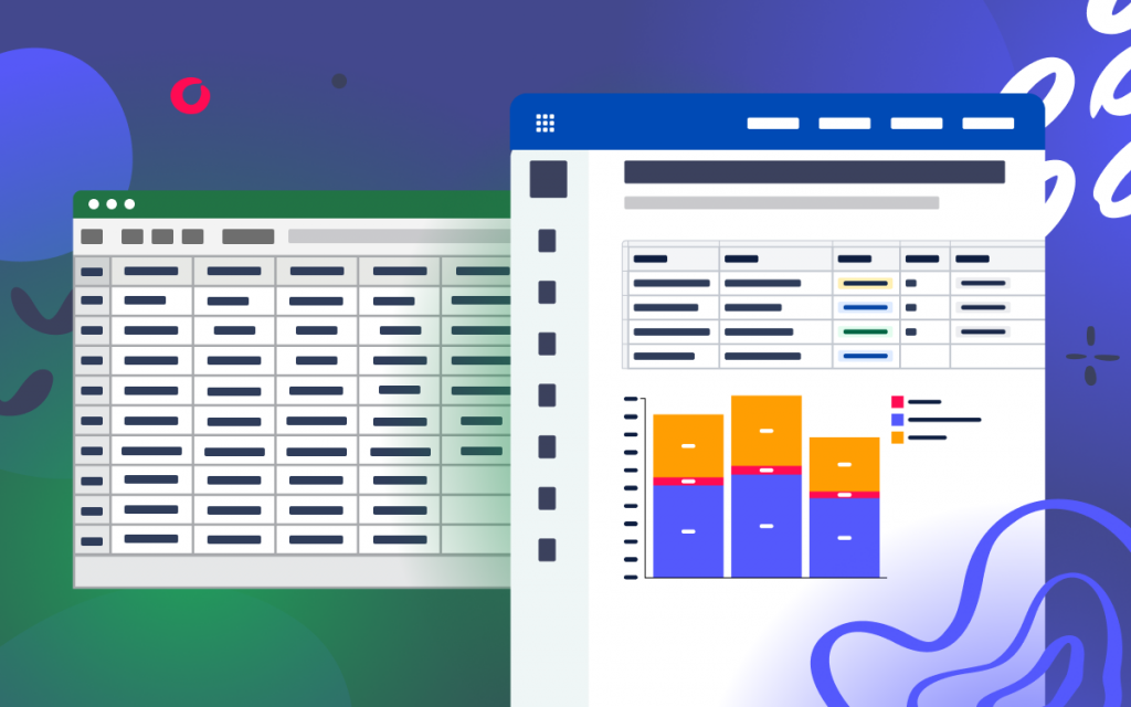
Visualizing data can drastically improve the cognition of your information by the target audience. If you use Confluence for data storage and processing, graphs and diagrams will become real helpers in this.Whether you’re managing a project timeline, analyzing sales figures, or monitoring team performance, integrating charts and graphs into your Confluence pages can transform static reports into dynamic, interactive dashboards.
Many in-built and third-party tools allow you to build diagrams, charts, and graphs in Confluence. In this article, you’ll find more information on different apps for building charts and graphs. You’ll learn how to use the native Confluence Chart macro and see one of the apps in action.
Top five apps for charts and diagrams
The Atlassian Marketplace suggests a wide range of apps in the Charts & Diagramming category. You can find a suitable tool depending on your needs and budget. See top five charts and diagrams apps in this category and their specifications in the table below:
Generates images from various sources, including your GitHub integration
As you can see, these solutions differ to suit various needs. In this blog post, we will tell you more about apps and features for transformation of table data into charts. In this blog post, we’ll tell you more about the Table Filter, Charts & Spreadsheets for Confluence app and the free inbuilt Confluence Chart macro.
Confluence’s native Chart Macro
It is the native macro bundled within Confluence. It offers you the following capabilities:
supports Pie Chart, Bar Chart, 3D Bar Chart, Time Series Chart, XY Line Chart, XY Area Chart, Area Charts, Gantt Chart
requires edit mode to configure the macro settings
covers all simple cases when you need to draw a graph
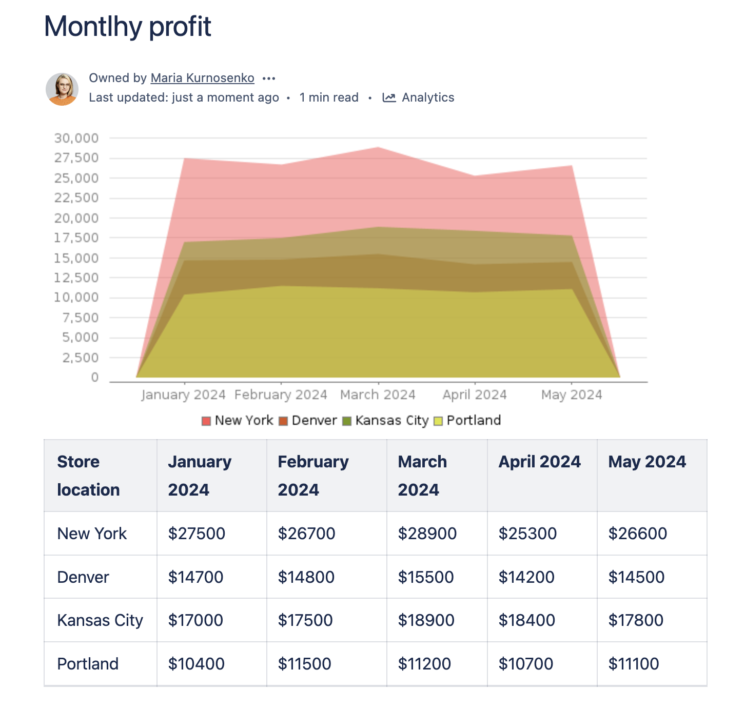
For example, you can create an Area chart as follows:
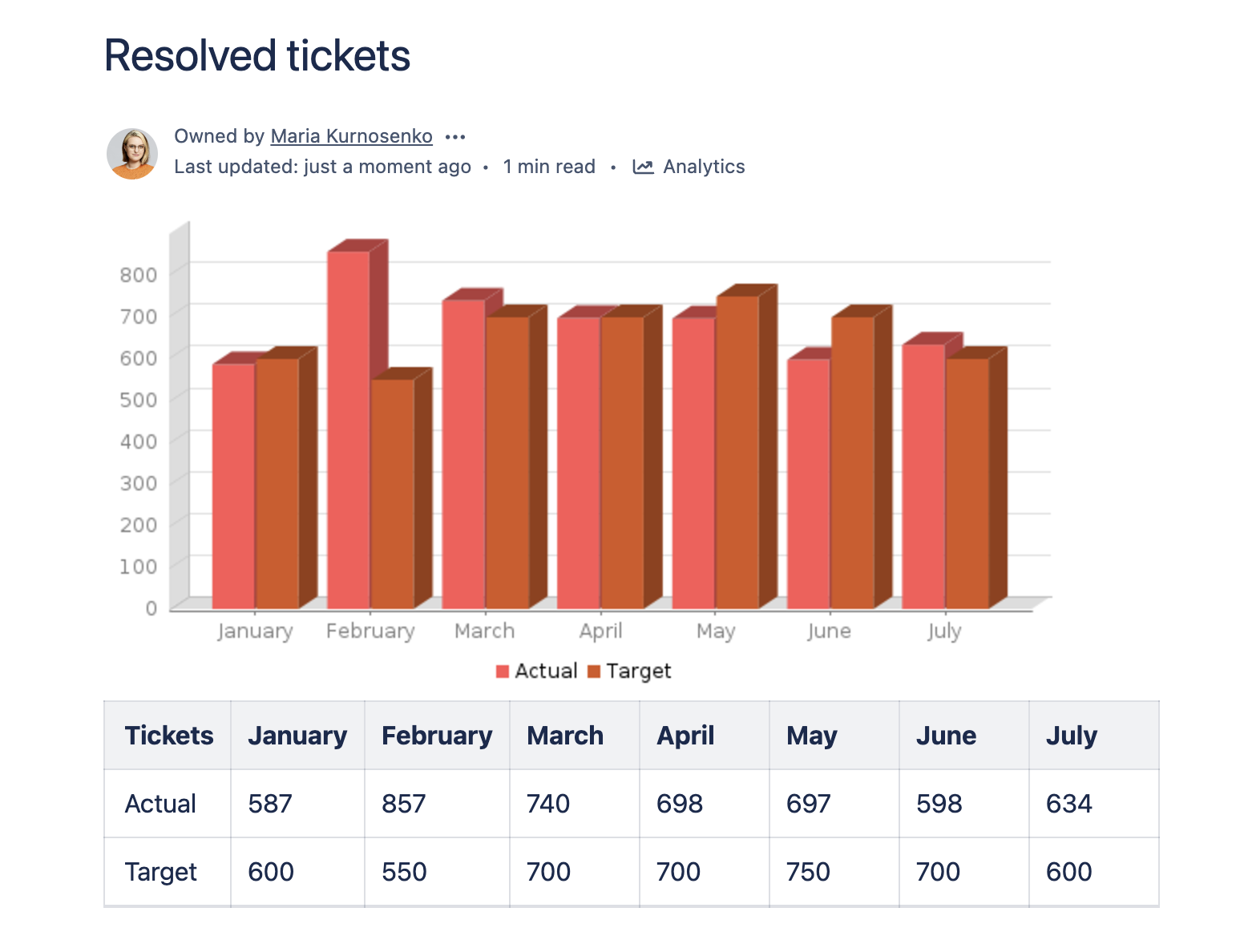
Or render a 3D Bar chart:
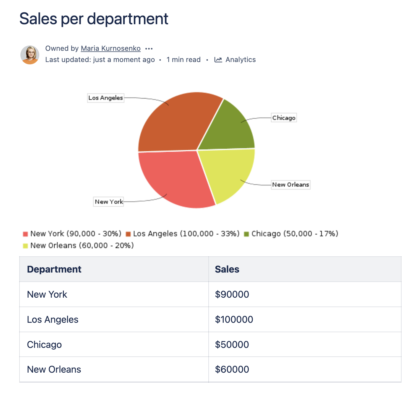
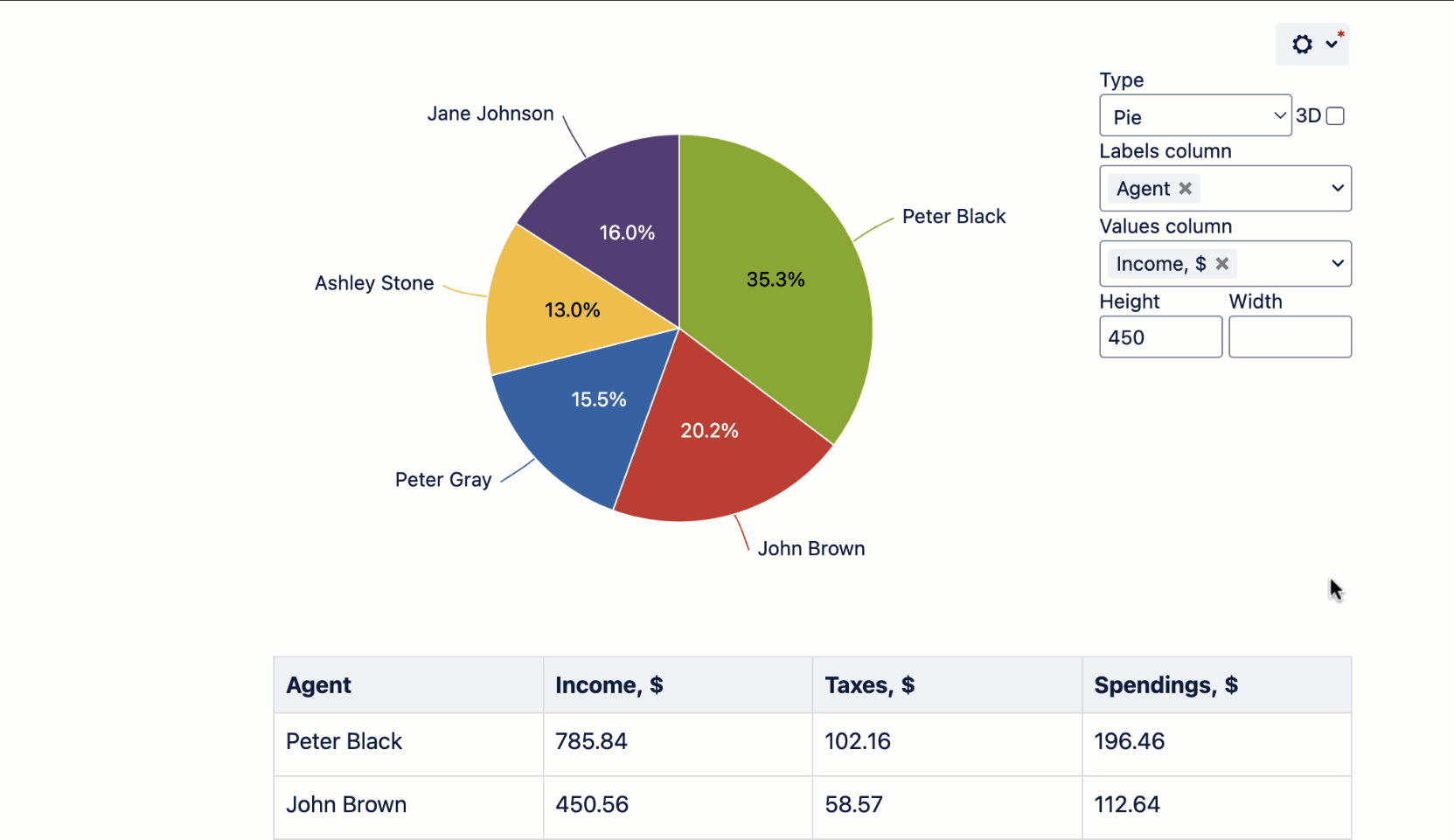
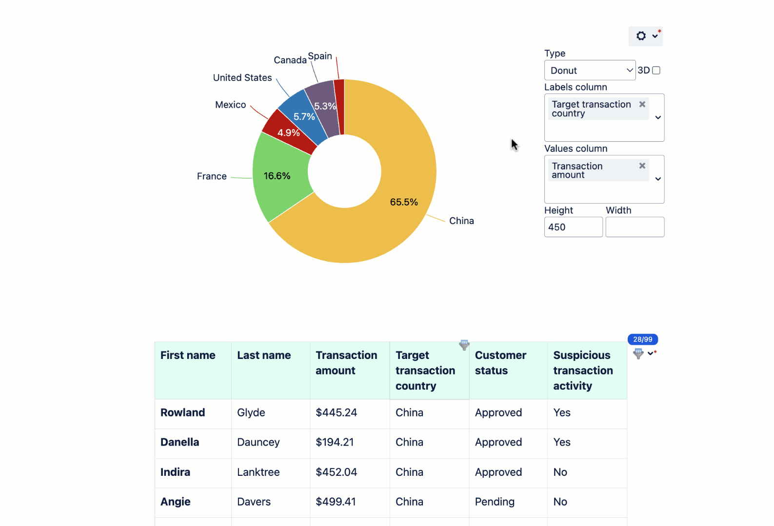
Or see the ratio between different entities with a Pie chart, like the following one:
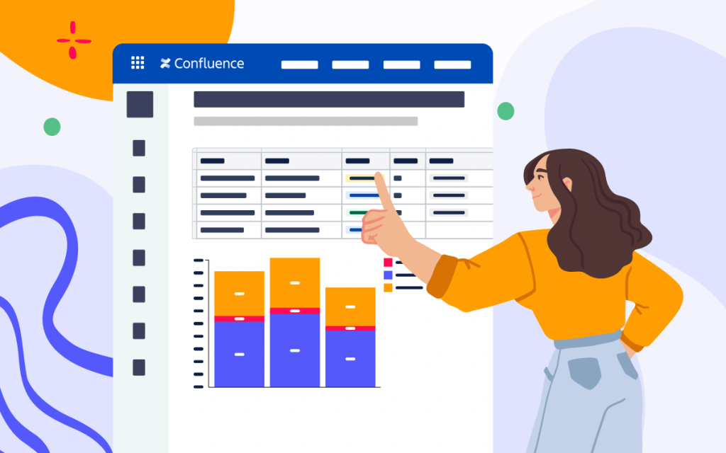
Table Filter, Charts & Spreadsheets
Graphs are a part of the functionality that the Table Filter, Charts & Spreadsheets app offers. The app is a pretty useful and flexible solution that includes several macros for various purposes. These are three of its most popular features:
Table Filter helps you filter complex and large tables on the fly right when viewing or editing a Confluence page.
Pivot Table allows you to create a pivot table with aggregated and summarized values from big and complex tables.
Chart from Table can draw graphs using data from the tables (macro-generated tables also supported).
Table Spreadsheet allows you to utilize the benefits of Excel-like spreadsheets right on your Confluence pages.
Table Filter, Charts & Spreadsheets is available for Cloud and Data Center Confluence versions, so you can use all of the macros regardless of your hosting type.
As for the Chart from table Macro, you can use it to create the following chart types:
Gantt chart
Pie and Donut chart
Bubble Pie chart
Column, Stacked Column, Bar, Stacked Bar chart
Line, Area, Stacked Area chart
Time Line, Time Area, Stacked Time – Area chart
Radar (Spider) chart
Contiguity / Barcode chart
Scatter plot
Punchcard
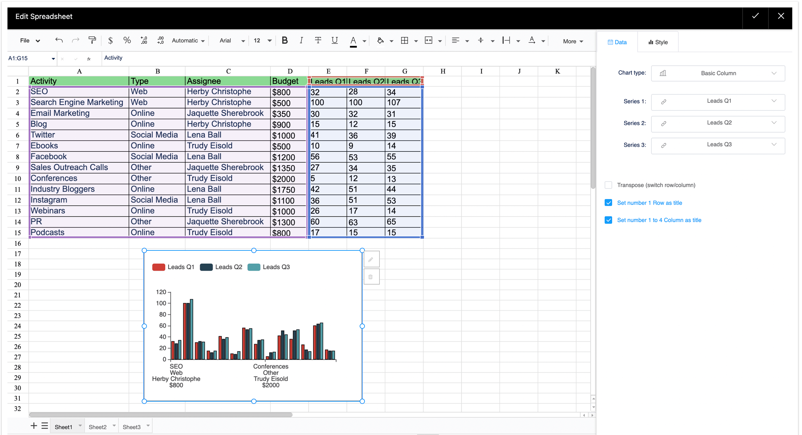
Graph samples with Chart from Table
You can build charts instantly in the view mode from a regular or macro generated table.
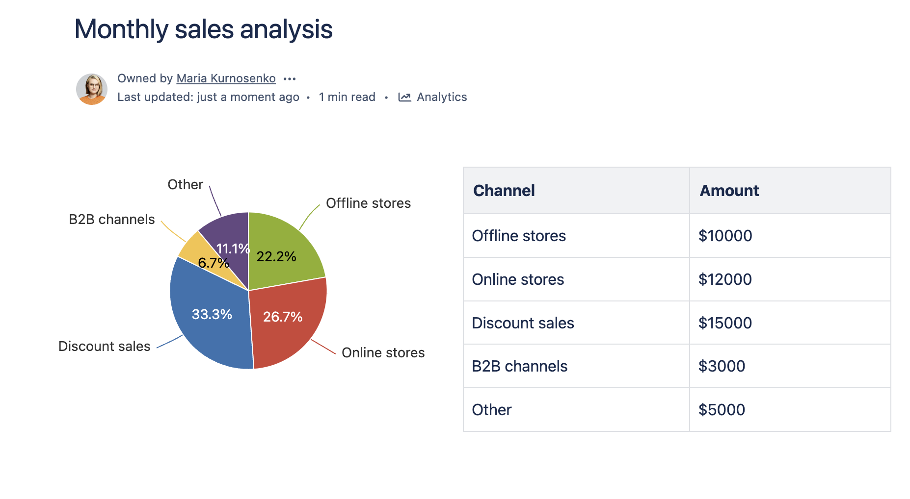
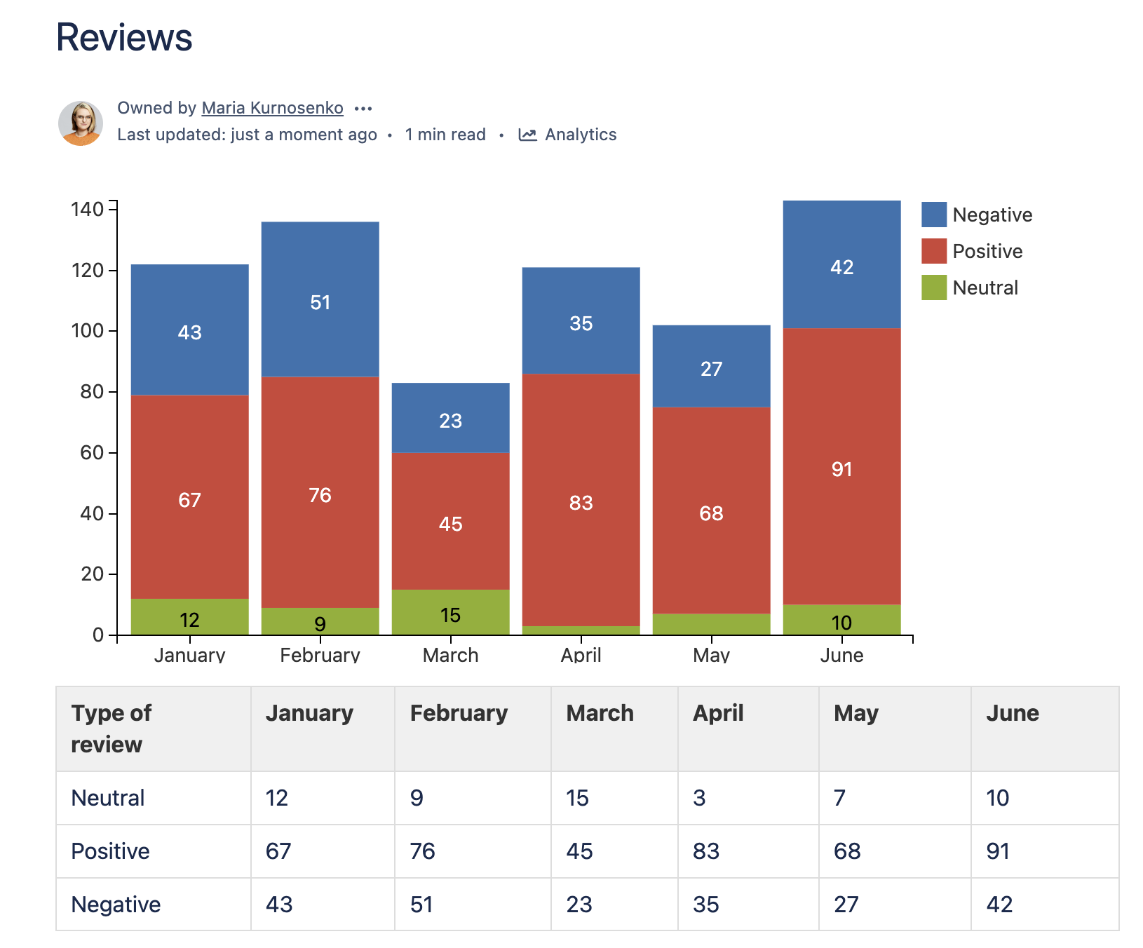
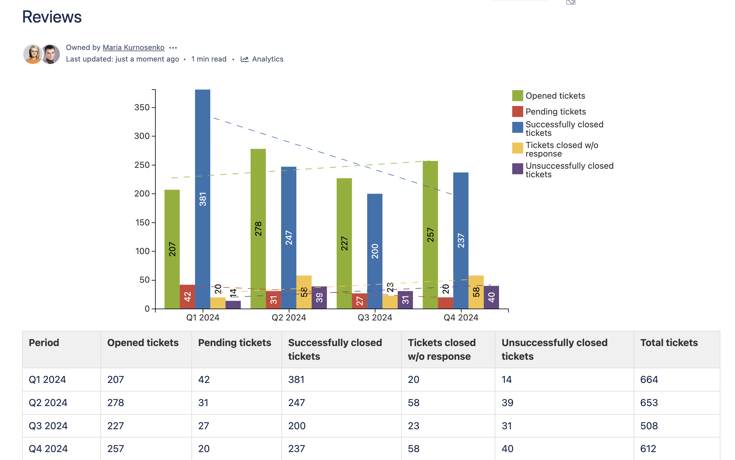
For example, let’s create pie charts with the monthly sales analysis, as follows:
Or create a stacked column chart to see the overall picture against multiple indicators, like this:
You can also use a multi-column chart to see the progress and trend over some time period, as follows:
You can instantly modify the chart settings while viewing the page by using the settings panel on the side. If you need to change the source table, the chart will update automatically. After you finish setting up the chart, you can download it as a picture, or export it into a PDF or a Word file.
Combining the macros
Let’s see how you can use the other macros from the Table Filter, Charts & Spreadsheets bundle to up your charting game.
The Table Filter macro allows you to filter any table right in the page view or edit modes. The table will be immediately redrawn depending on the specified filter values. The rich set of filters helps you easily handle multi-format data turning large and complex tables into smaller, simpler ones.
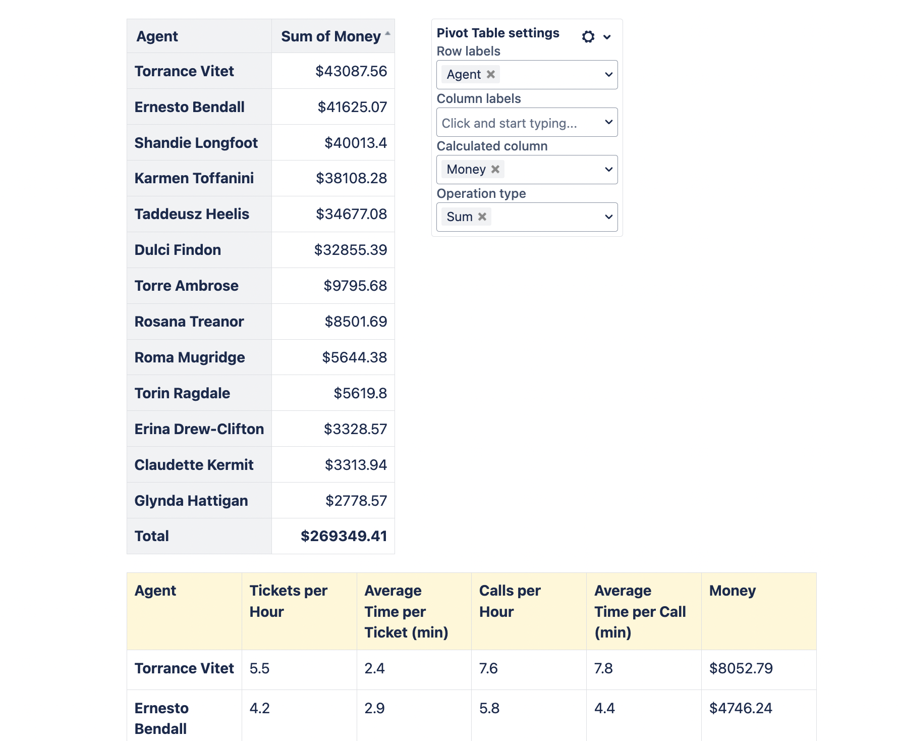
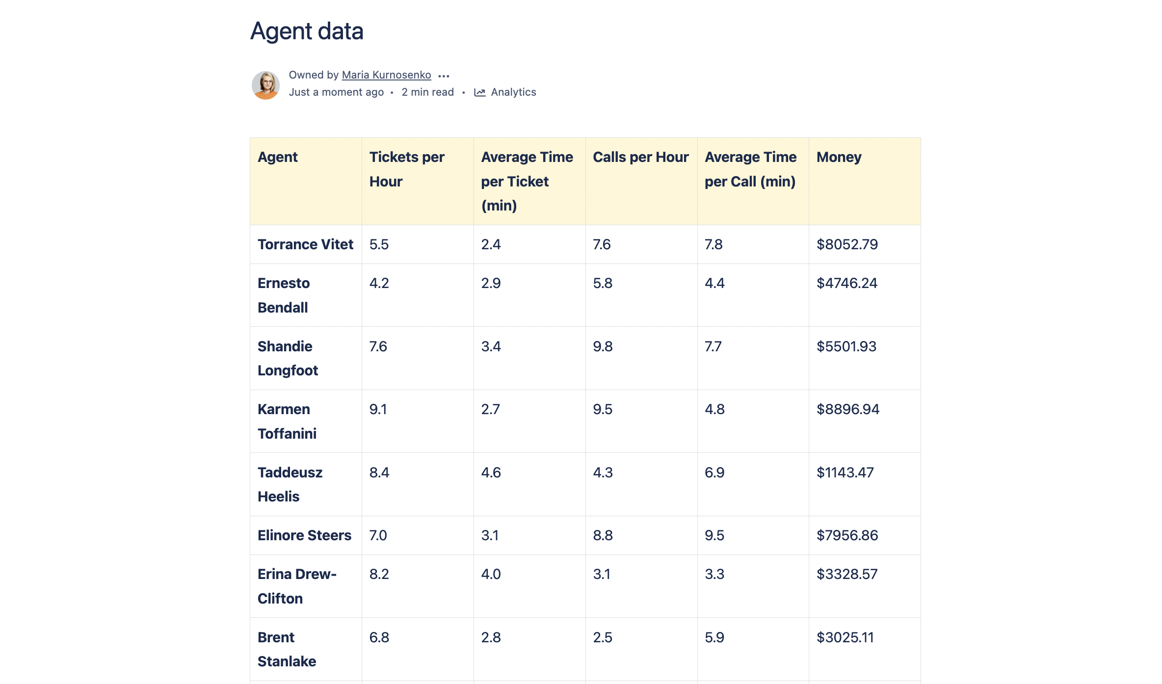
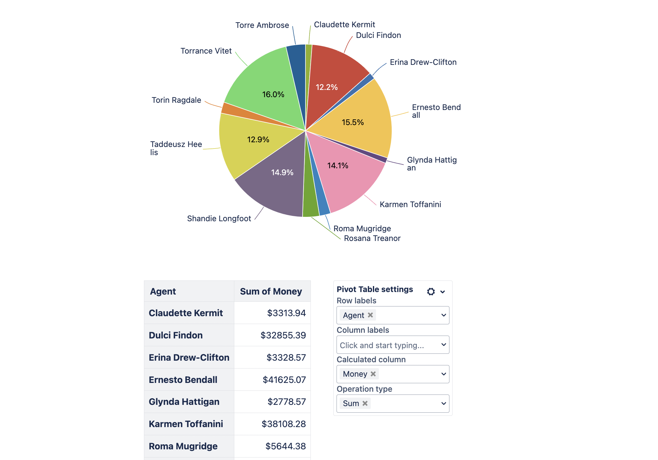
With the Pivot Table macro, you can aggregate data from bigger tables with repeated values. Pivot tables help you simplify the information in a table before turning it into a chart.
Pivot table
Table for the pivot
You may combine all these three macros from the Table Filter, Charts & Spreadsheets app into a single data processing mechanism using the Table Toolbox macro (in Cloud). In such a way, you can even draw graphs from the filtered pivot table. And, of course, if you make some changes in filtration or graphs settings, the dashboard will be automatically updated according to your changes.
Alternatively, you can process your table data as a spreadsheet by wrapping a table into into the Spreadsheet from Table macro. It will transform the table into a spreadsheet which you can process similarly to Excel or Google Sheets further on. It also has various visualization capabilities, so if you prefer working with spreadsheets while analyzing data through charts and graphs, it can be done too.
How to get and visualize data from Jira in Confluence
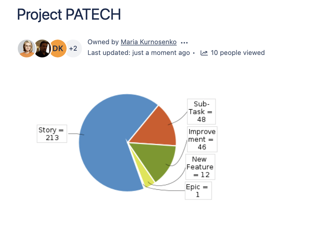
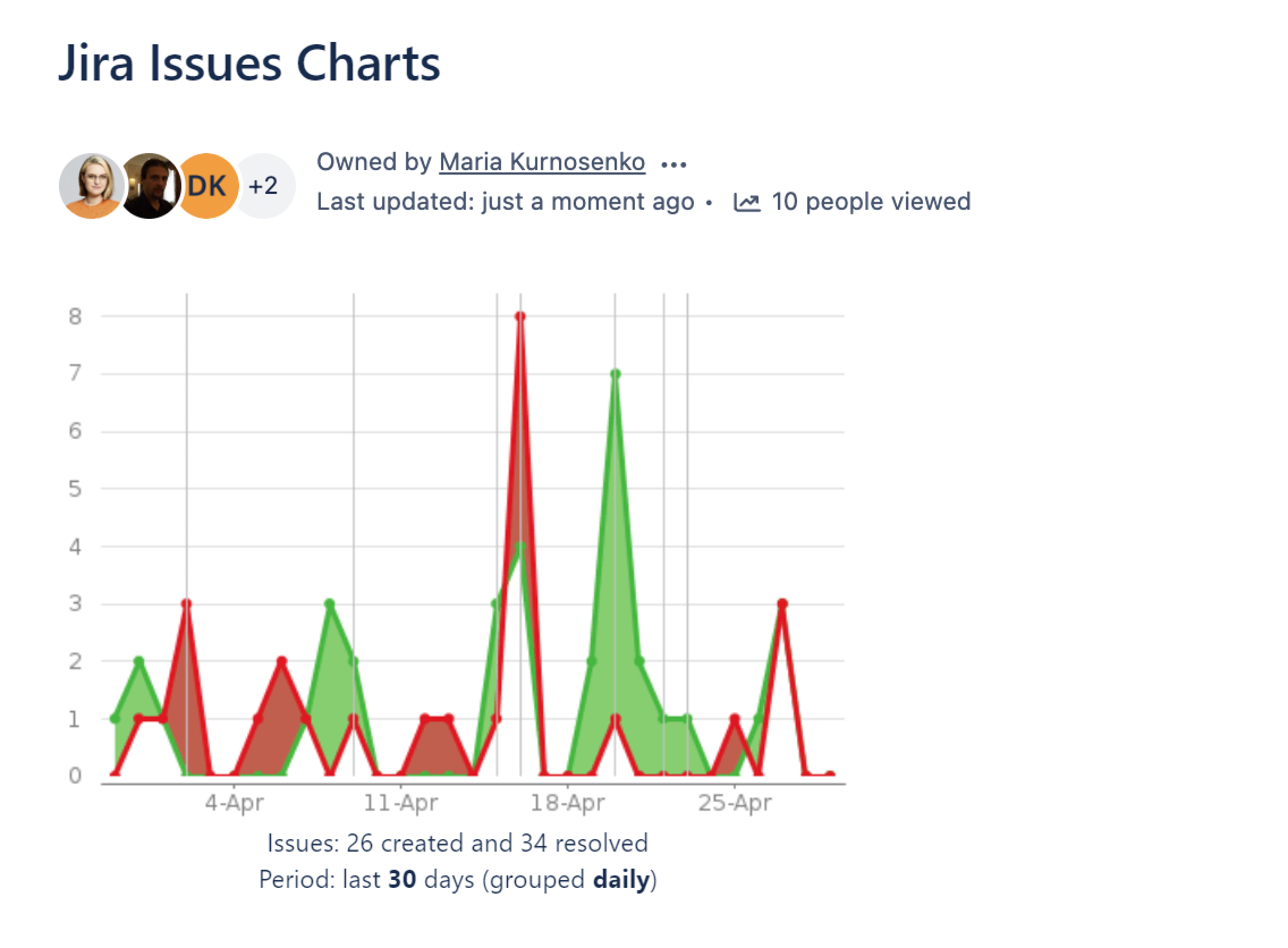
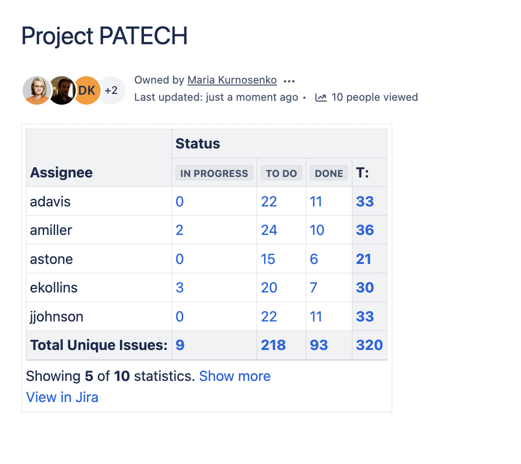
Of course, Atlassian supplies you with the out-of-the-box Jira integration in Confluence. If you use Confluence Server or Data Center, you need to set up an application link to your Jira instance. In Confluence Cloud, you can simply paste a URL to Jira into the page, and it will convert into the Jira Issues macro. Then you’ll be able to receive and handle your Jira data. You can visualize it with the Jira Chart macro (Jira filters and JQL queries are supported). Three types of charts are available:
Pie Chart from Jira
Created vs. Resolved Chart from Jira
Jira Two Dimensional Chart
An example of a pie chart with the number of issues per assignee will look like this:
The comparison of created against resolved issues looks like this:
The sample two-dimensional chart looks like this:
Alternatively, you can process the incoming Jira data with the Table Filter, Charts & Spreadsheets for Confluence app. With its help, you can build a chart from the table containing Jira issues or apply the Pivot Table macro and then create a chart from the calculated pivot table. You can also filter the issues if the list is too big. Of course, you can use the Jira macro filtration, but it is much more flexible and convenient to use the Table Filter macro. In this case, you can make changes on the fly, and graphs will be redrawn automatically. Combo!
Interested in trying our app?
You can see it in action on our demo server. And, of course, find out details in the documentation or watch the tutorials on YouTube to reveal all the capabilities of the Table Filter and Charts app. Also, check out a comparison table for the Chart and Chart from Table macros which can help you select a suitable macro for your needs.
Subscribe for monthly updates on how to get the most out of Atlassian products.
Thank you for signing up
for our newsletter!
You will be the first to know about fresh content, releases,
and special projects.
Stay tuned.
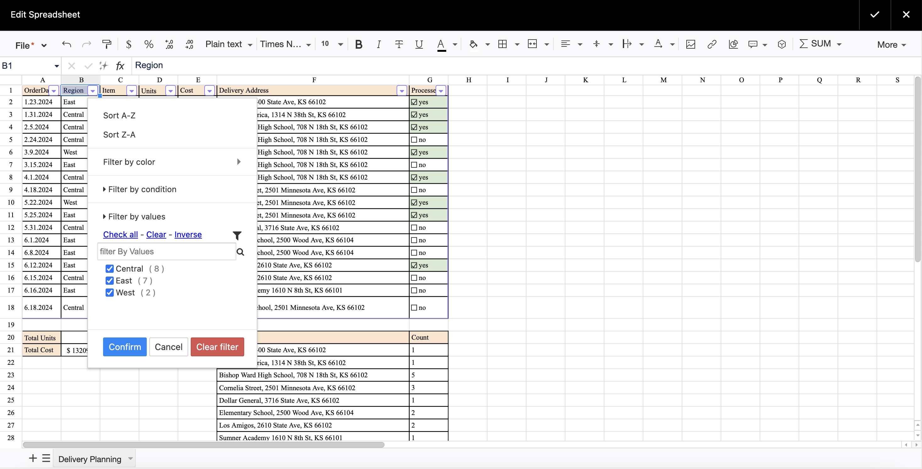
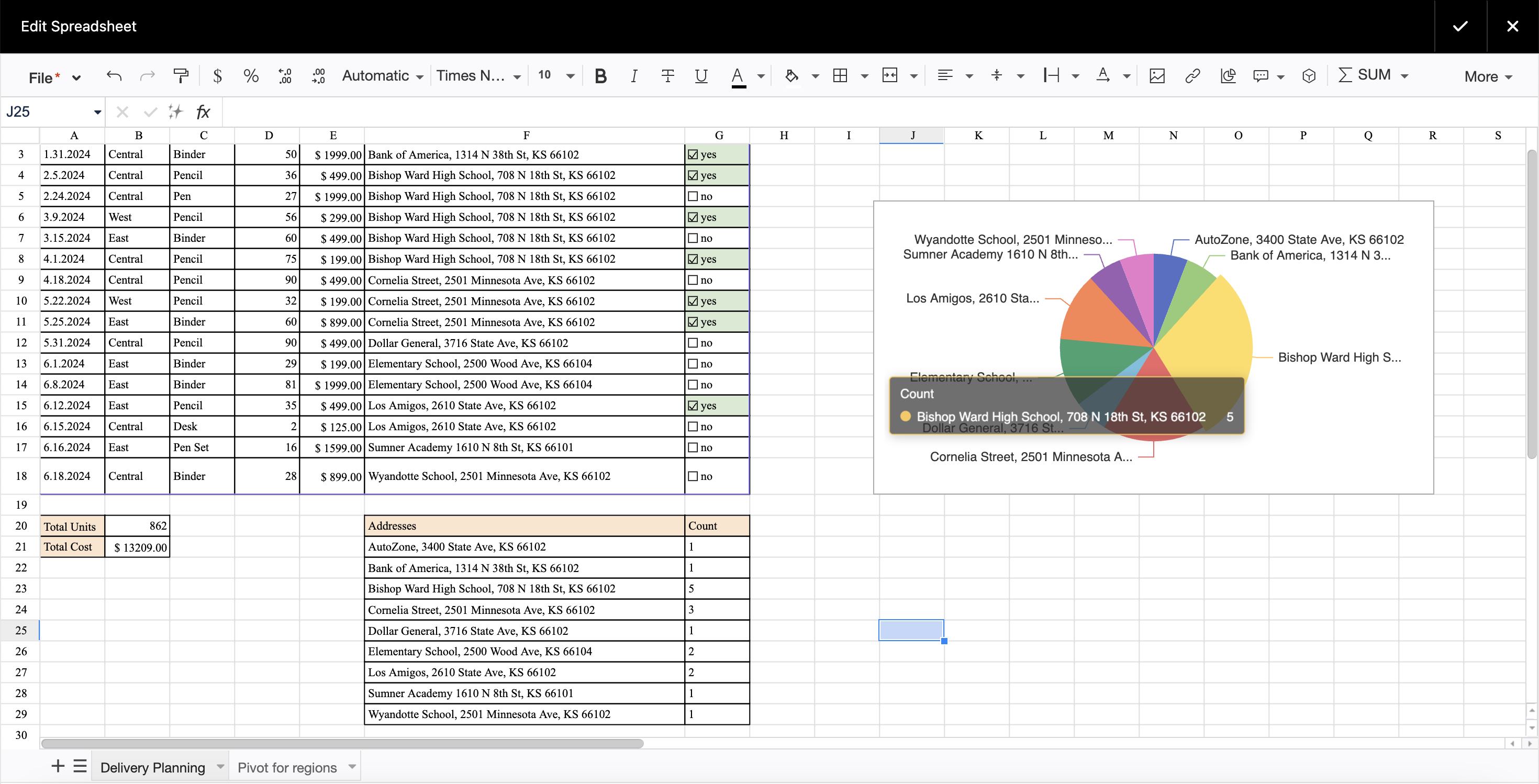
Meet Aimee, a savvy data analyst who loves using spreadsheets daily. Recently, Aimee’s company switched to Confluence Cloud, and she wants to complete her latest project directly in the Atlassian Ecosystem. Aimee agreed to organize and analyze data regarding the newest bunch of orders. She will further share this information with the project manager, who will use the data to proceed with the delivery planning. Aimee is a loyal spreadsheet fan and loves to work both hard and smart. After spending some time in Confluence, Aimee found herself longing for the spreadsheet functionalities and familiar Excel-like environment.
If you, like Aimee, lack the potential of Excel or Google Sheets while working in Confluence, the Table Spreadsheet macro will soon become your go-to. With its help, you can:
Embed the spreadsheet into your Confluence page and edit it in view mode.
Customize table cells, borders, and text.
Filter the table, aggregate data into a pivot, and create a chart.
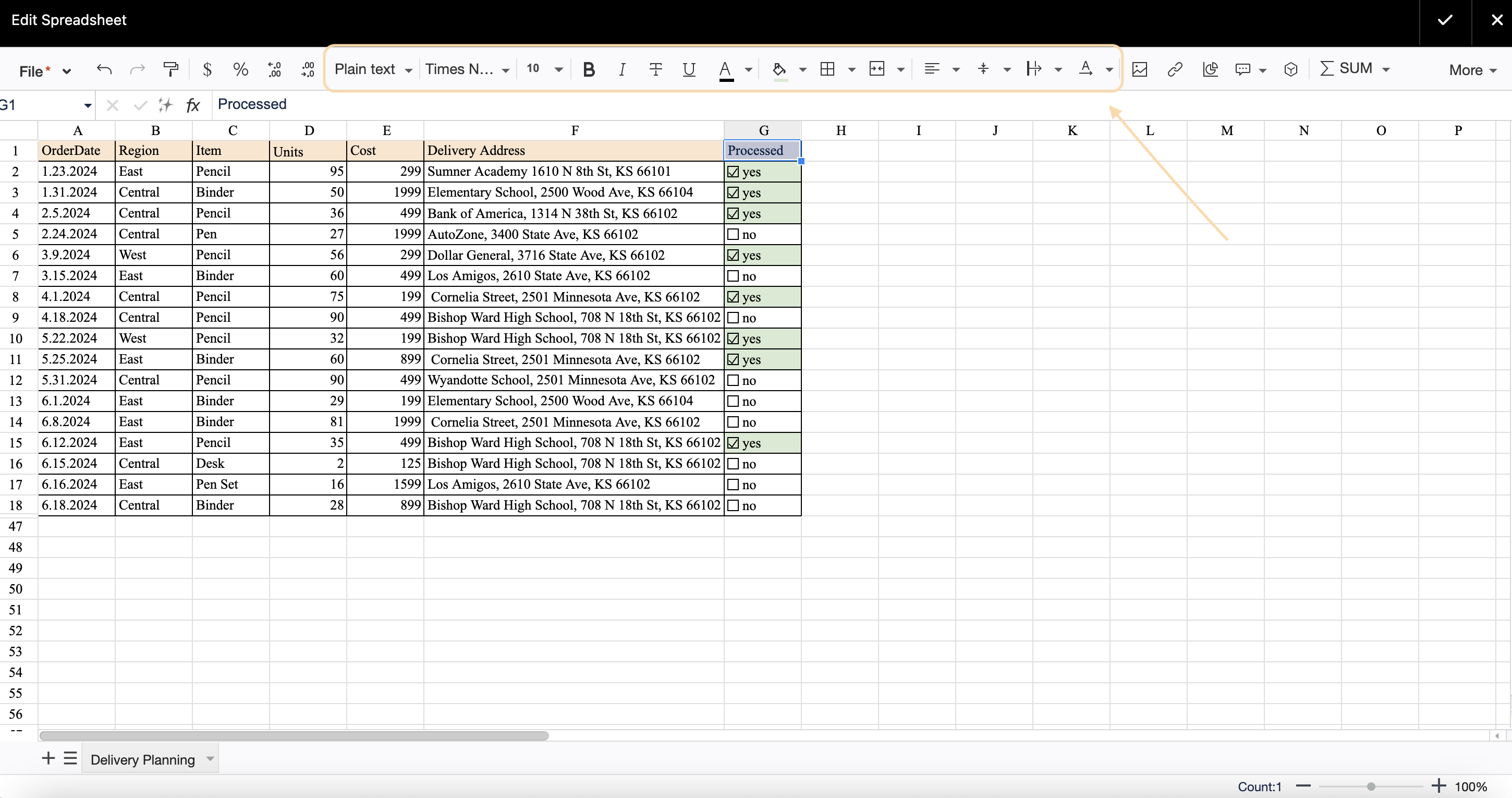
So, Aimee’s task is to analyze spreadsheet data so that project managers can swiftly decide the most efficient way to deliver the orders and allocate the necessary resources.
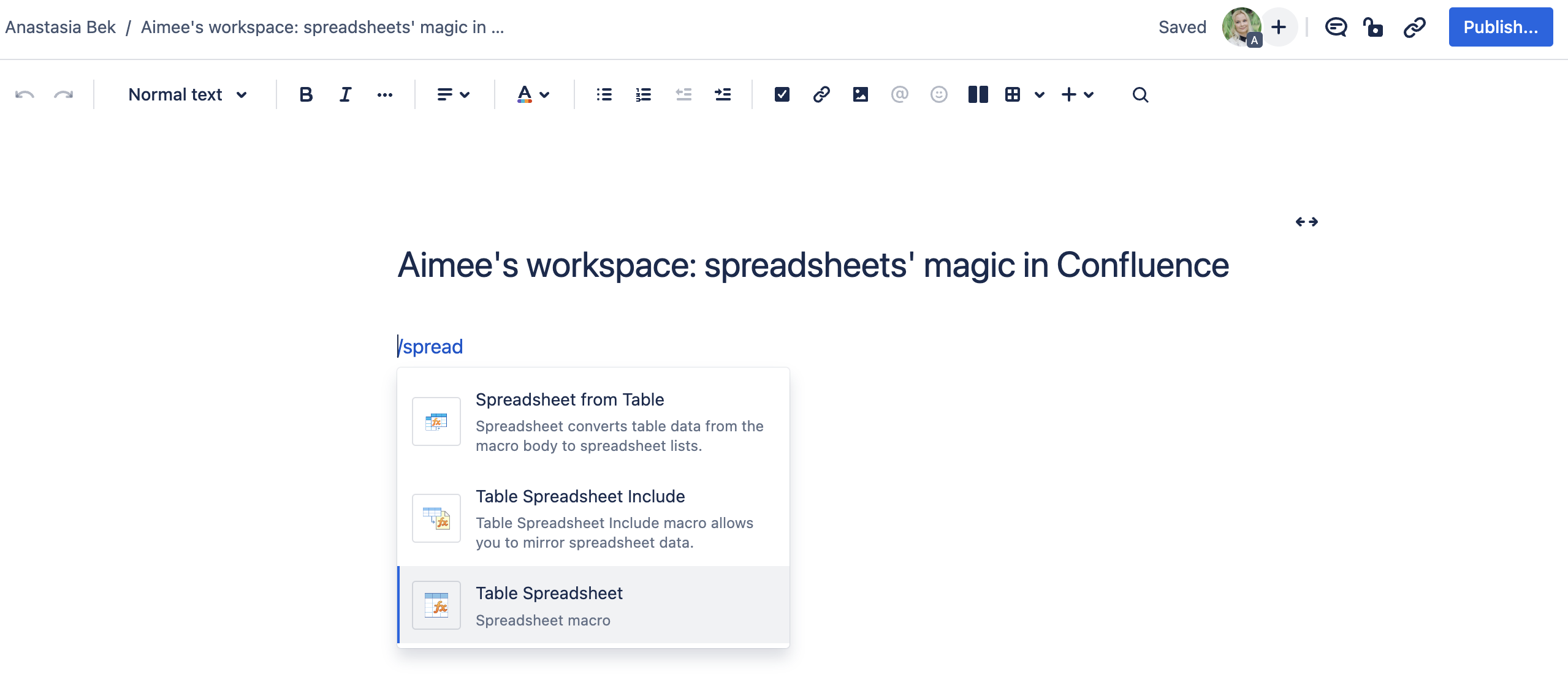
To add the macro, go to the edit mode. Type /Table Spreadsheet or click the Plus button on the top control panel, and select the macro.
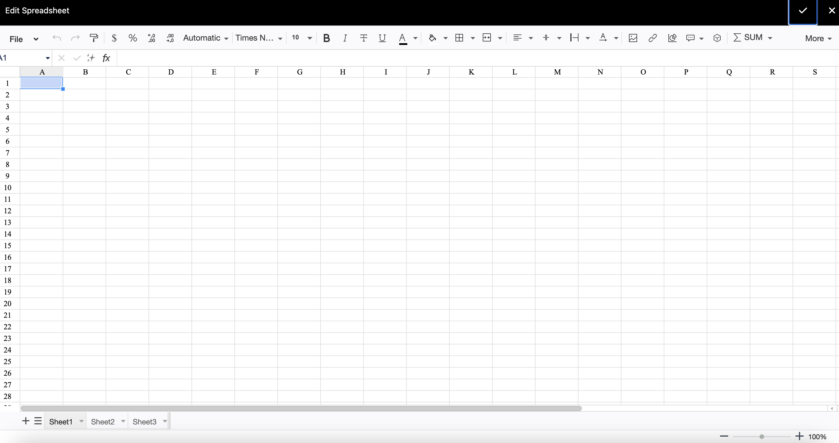
When the macro opens, you’ll see a new spreadsheet.
Now you can create your table:
set table borders
choose cell color
freeze header row or column
align the text
choose the font and text style
merge cells, if needed.
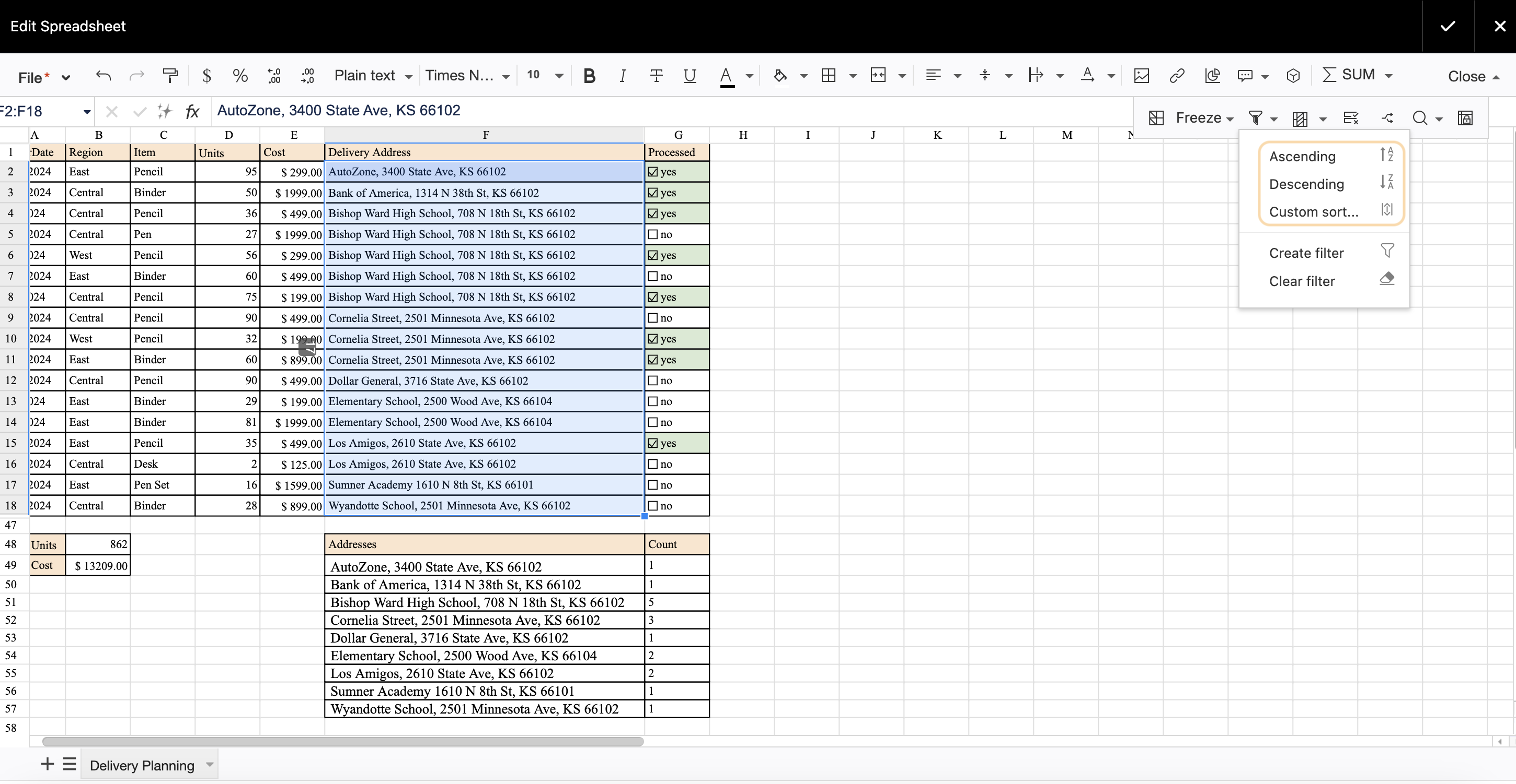
To sort the table, click the funnel icon in the editor pane. You can select ascending or descending sorting or customize your own.
You can also enable table filtration here. You can filter by values and conditions and remove the filter when it is no longer needed.
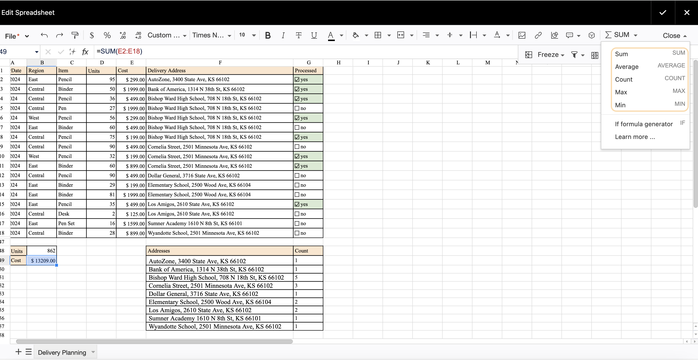
Add formulas to count table data automatically.
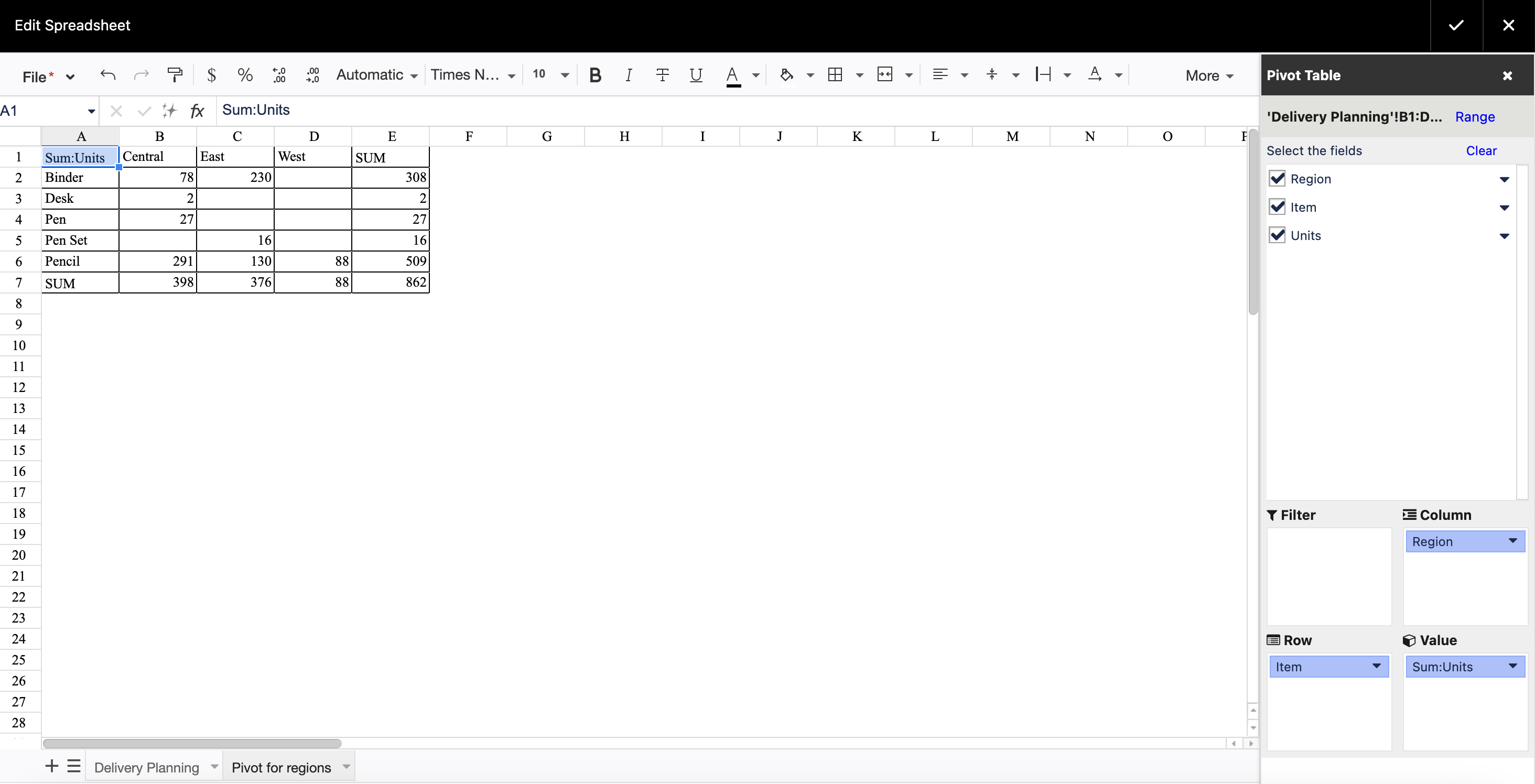
To add a pivot table, select the data range you want to aggregate. Click the button on the editor pane. It creates a new sheet with the pivot table settings. Place the chosen columns into corresponding spaces and select the type of aggregation.
To add a chart, select the data range you need to turn into a chart. Next, click the Button on the editor pane. Select the chart type and choose the settings.
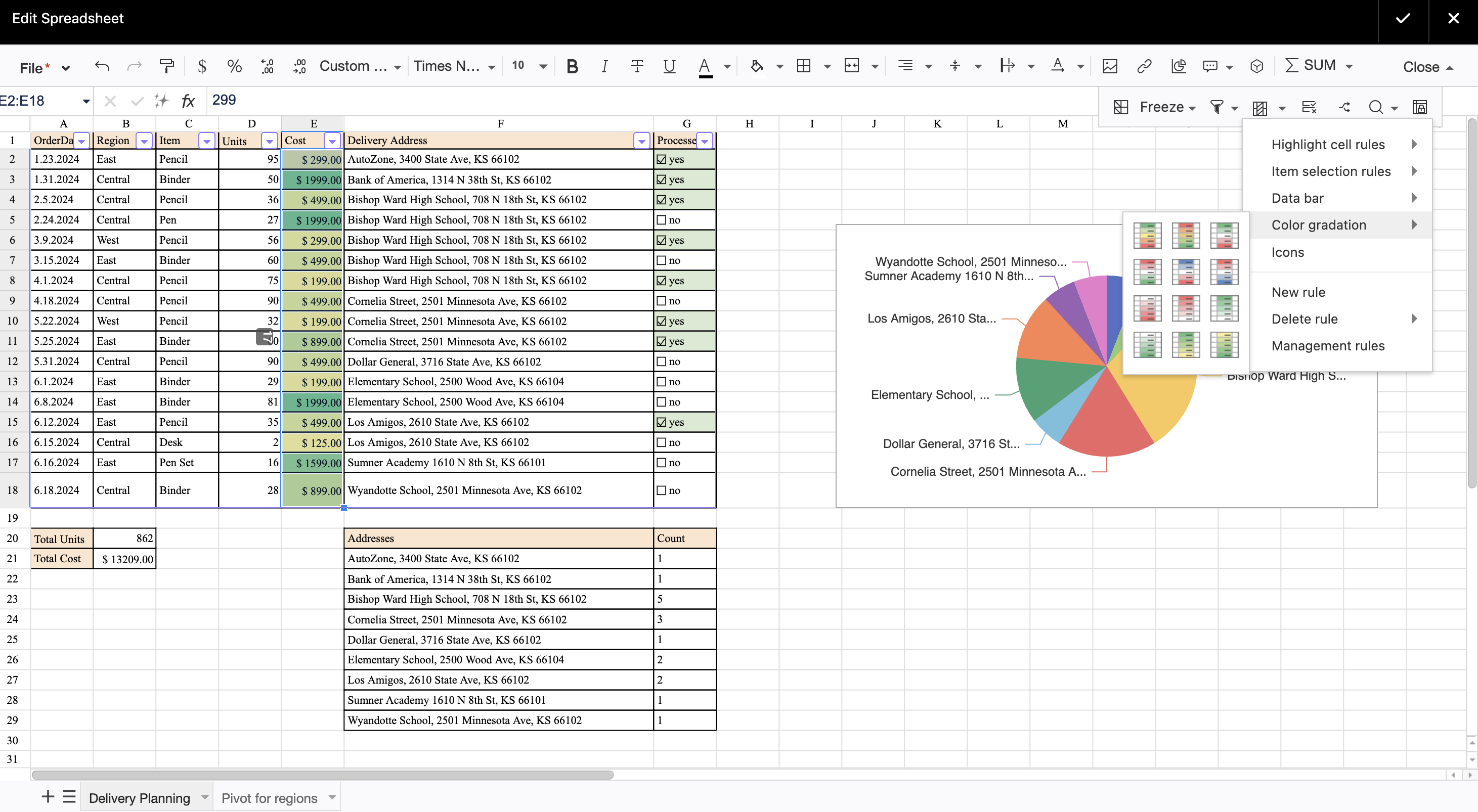
You can set up conditional formatting if you want to highlight the cells depending on their values. Click the Button on the editor pane and choose a suitable formatting preset. You can set your own formatting rules if you want.
After you finish editing the spreadsheet, save the macro and the page. You can then edit the spreadsheet in view mode.
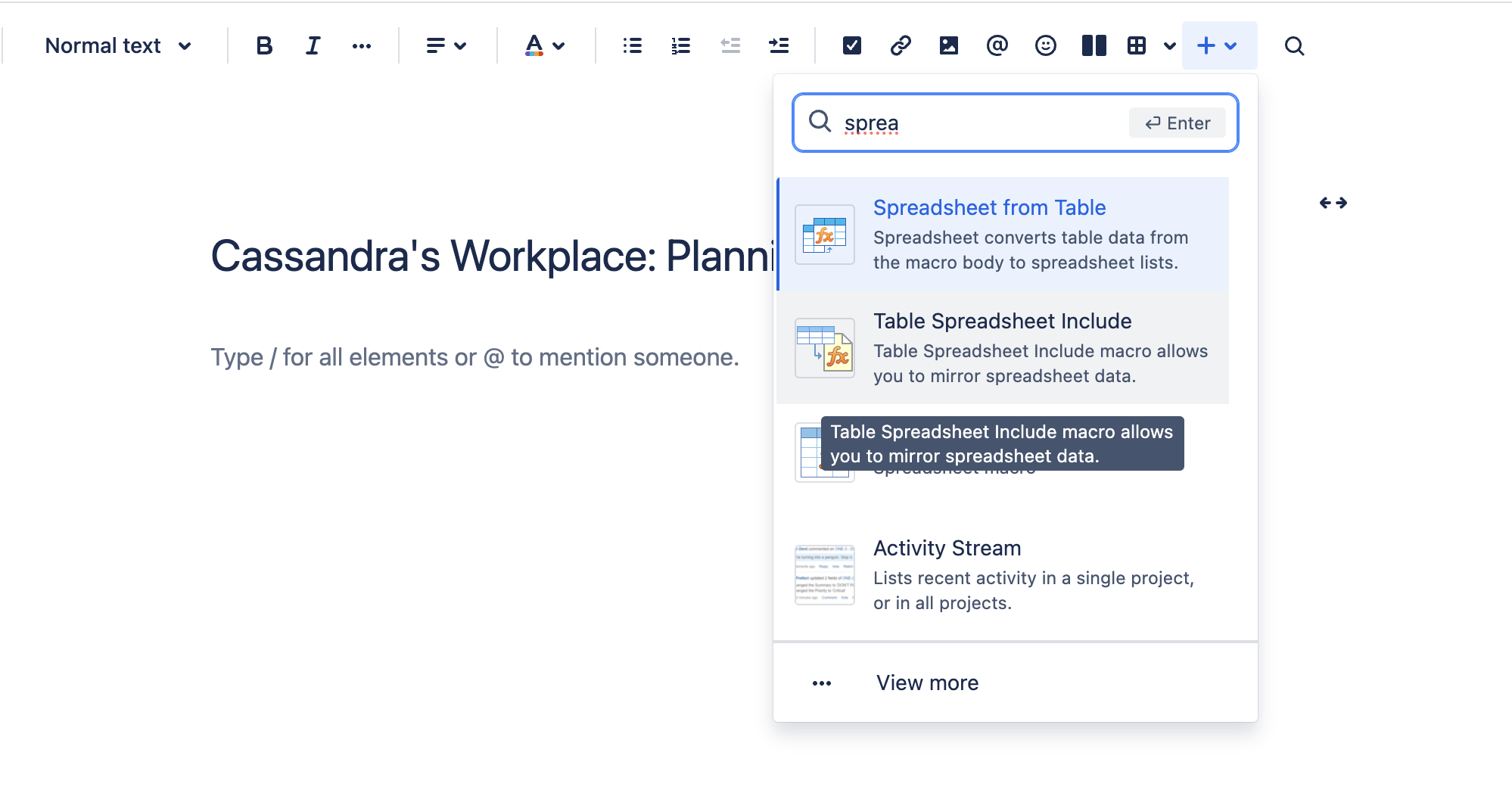
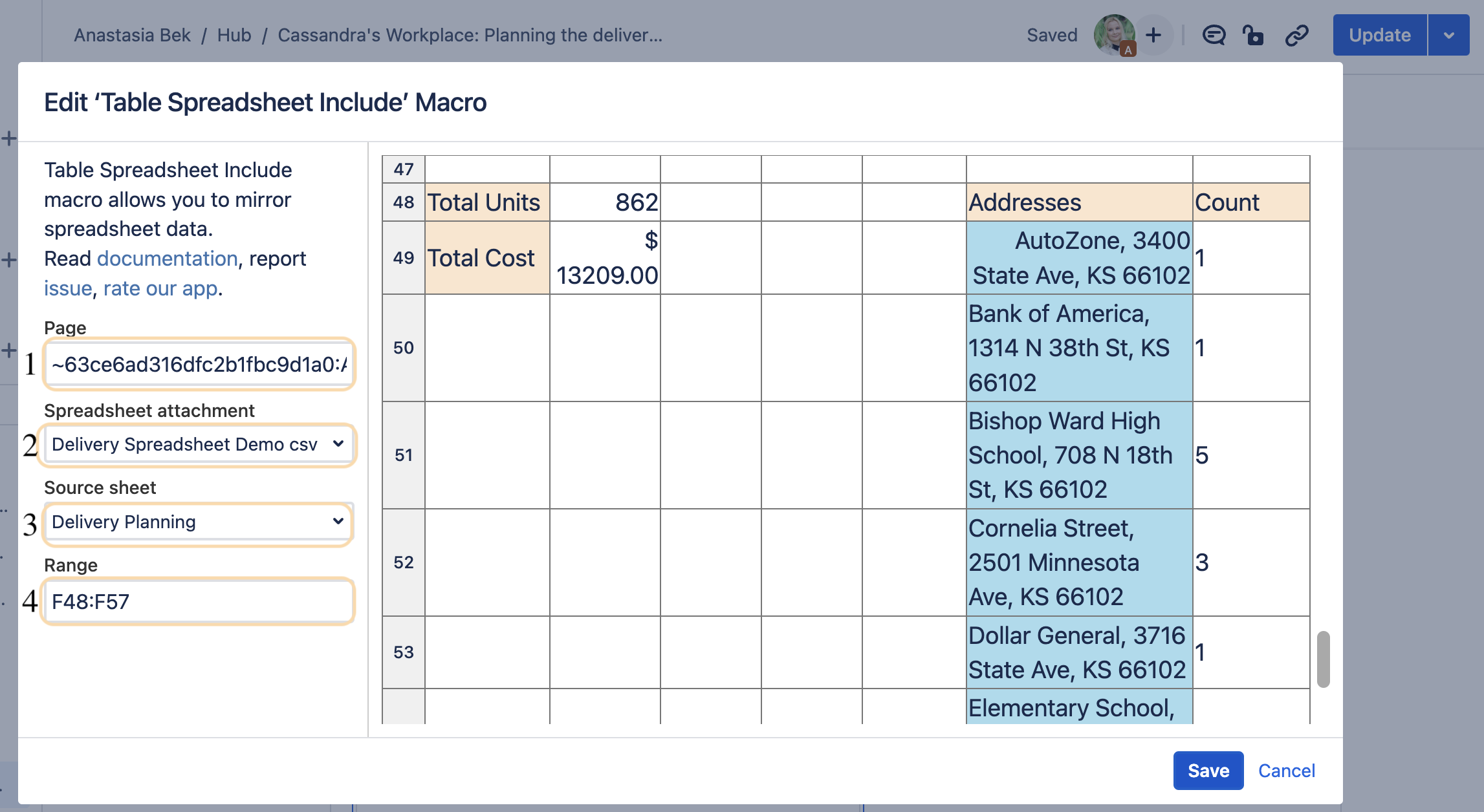
How to Use the Table Spreadsheet Include Macro
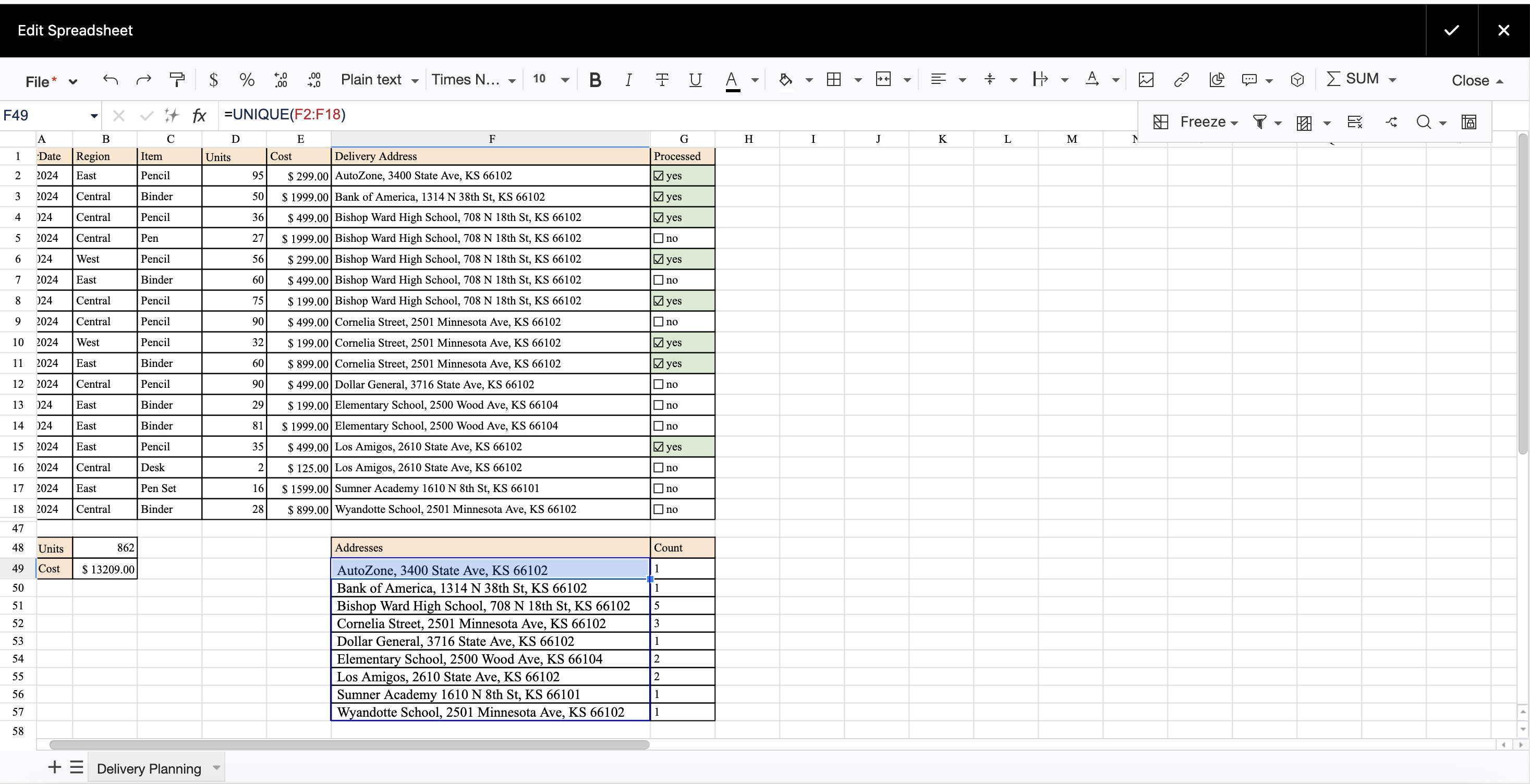
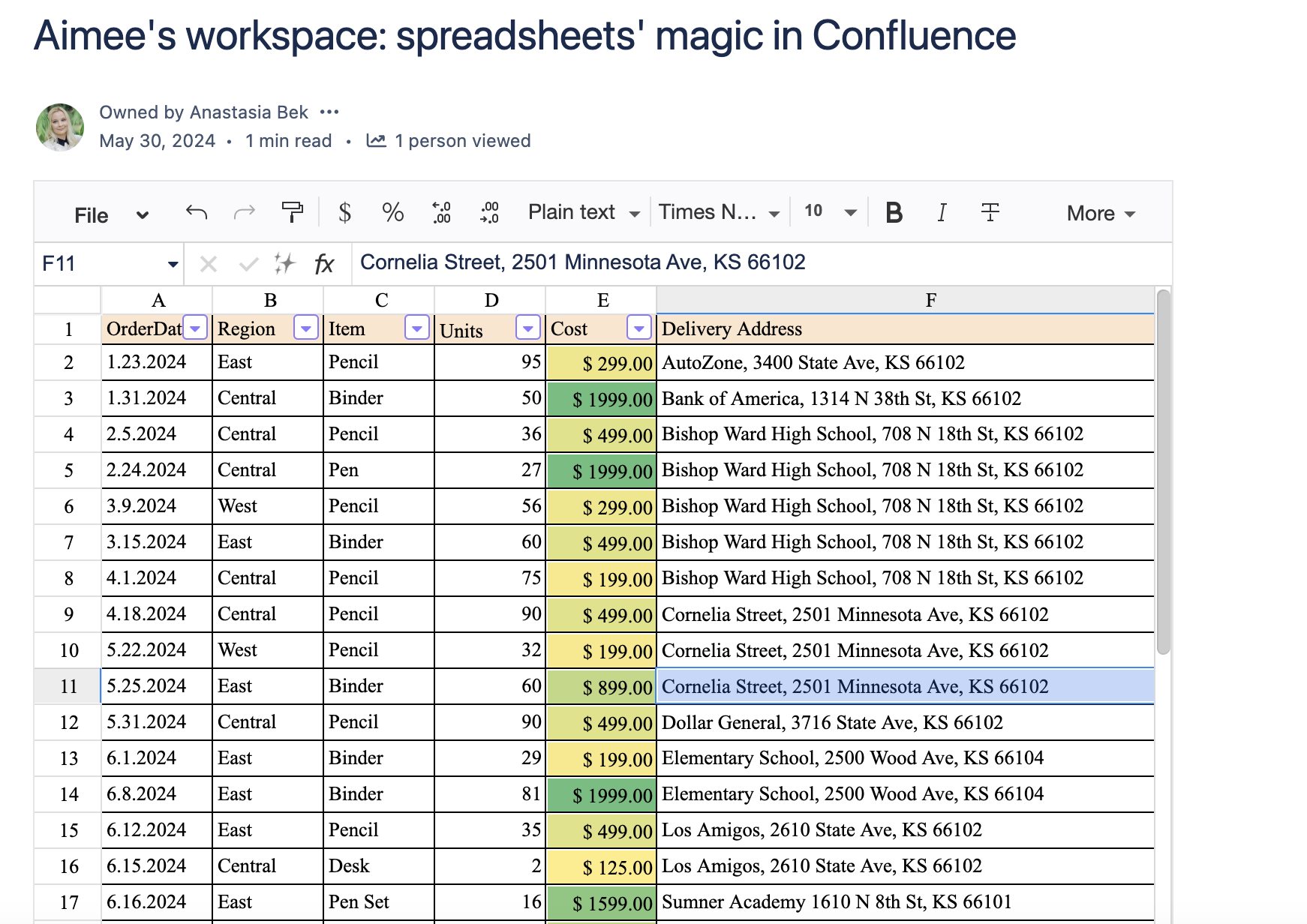
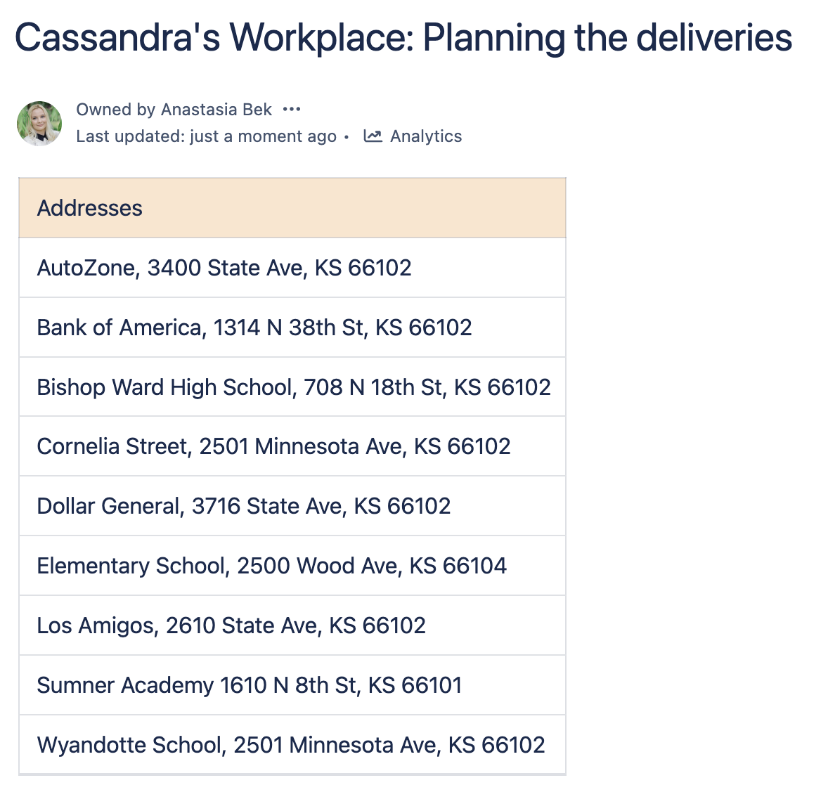
Aimee’s insights are now ready to be shared with the world. Project Manager Cassandra can benefit both from the data and the Table Filter, Charts & Spreadsheets for Confluence app . The app has additional macros that allow you to reuse spreadsheet data and repurpose necessary content. In Cassandra’s case, this is a clean list of unique addresses awaiting deliveries.
To add the macro, go to the edit mode. Type /Table Spreadsheet or click the Plus button on the top control panel, and select the macro.
Then utilize and reuse necessary spreadsheet content (if there’s only one spreadsheet on the page or only one sheet in the spreadsheet, content is selected automatically):
Specify the name of the page where the Table Spreadsheet is located.
Select the specific spreadsheet attachment.
Select the specific sheet in your spreadsheet to reuse content from.
Specify the range in the sheet to repurpose it (you can also select the range in the spreadsheet displayed in the right section of the Table Spreadsheet macro browser).
After you insert the macro on the page, the cell range is reused on a new page from another Confluence page.
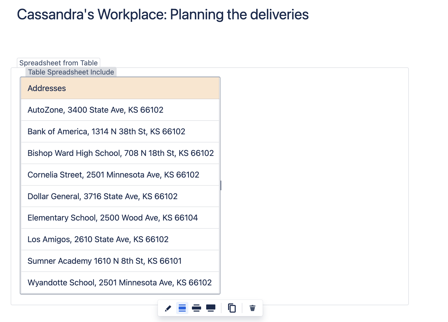
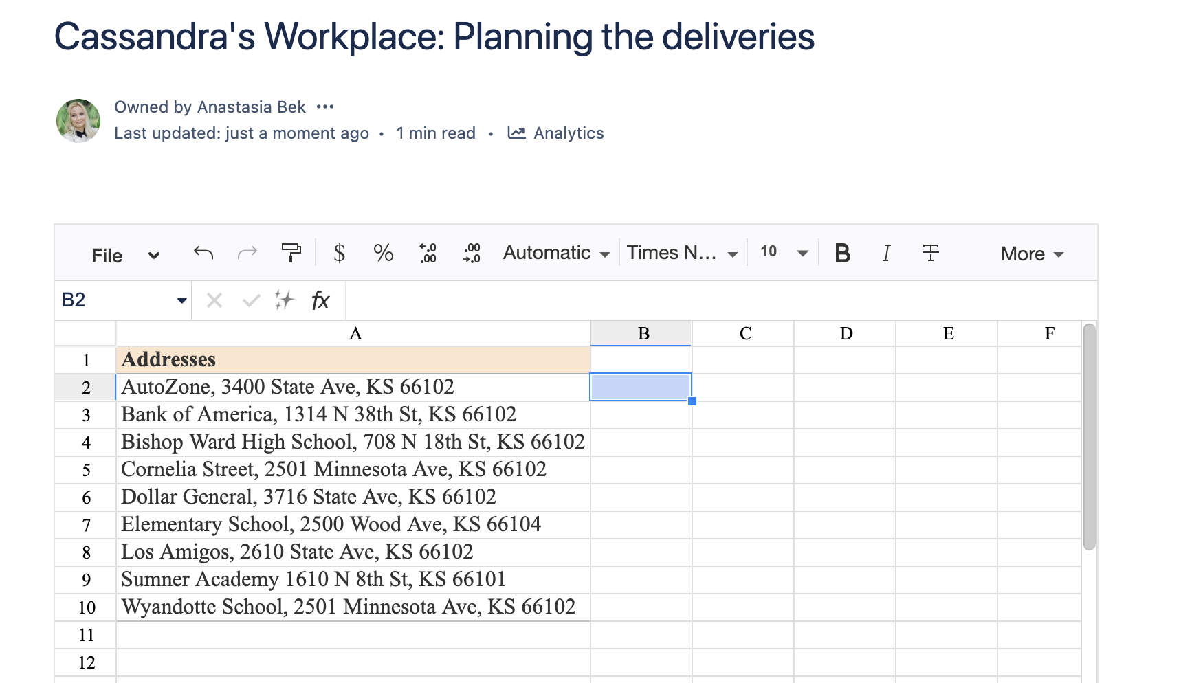
How to use Spreadsheet from Table macro
Spreadsheet from Table is available starting with version 1.3.4-AC and OFF by default.
The app should be updated to enable themacro by the instance Admin via the Confluence Administration
To add the macro, go to the edit mode. Type /Table Spreadsheet or click the Plus button on the top control panel, and select the macro. Then, add your content inside the macro and save the page.
This macro retains the entire toolset of the macro Aimee previously used for the analysis. The content is dynamic, so it will update every time you change the source table.
After you finish editing the spreadsheet, save the macro and the page. You can edit the spreadsheet in the view mode, just like the Table Spreadsheet macro.
From data analysis to project management, spreadsheets offer many opportunities that apply to many needs and projects. With Table Filter, Charts & Spreadsheets for Confluence app you’re able to enjoy spreadsheet functionalities directly in Confluence.
Our world today develops like a flash and is highly data-driven. That’s why you must rise to the modern world’s challenges by adapting to the opportunities at hand. Speaking of data, one of the challenges is working with infinite rows of raw data in large tables and spreadsheets. In today’s article, we’ve gathered three ways to incorporate AI into your daily routine to get the most out of data.
Table Filter, Charts & Spreadsheets for Confluence now allow you to leverage AI usage and advance your data analysis in Confluence. New AI functionalities and macros can assist you with your data-related routines and processes. In this article, you’ll explore three game-changing ways to utilize AI in your Confluence experience, which empowers you to unlock valuable insights. Stay tuned till the end to learn all the tips and tricks on unlocking AI’s power to the fullest.
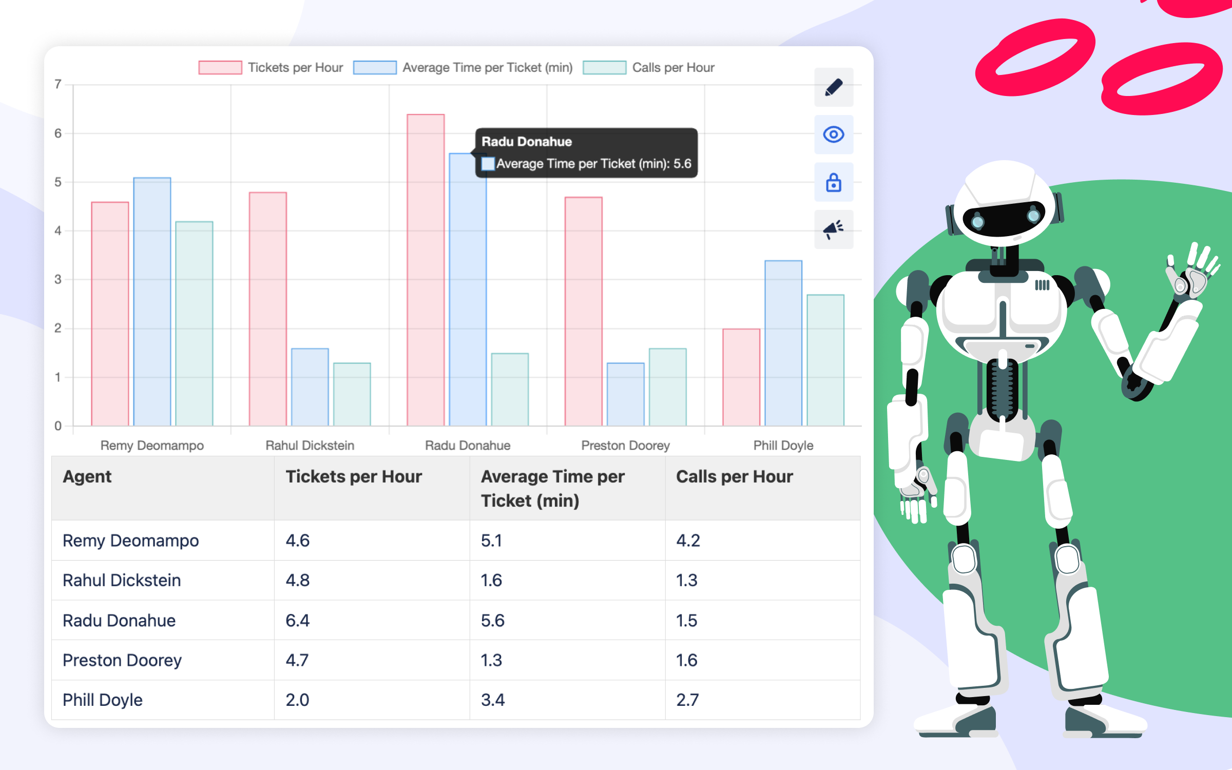
1. AI Table Macro: Transforming Data Management and Visualization
Challenge: Telling compelling stories with table data. Going from raw data rows to neat and visually attractive AI tables and diagrams.
Tip: Precise prompt wording helps you craft stunning visualizations of table data, improve communication and comprehension of data.
Sorting, filtering, and visualizing data are fundamental to effective decision-making. With the introduction of the AI Table macro, you can now effortlessly perform these and other operations with the help of AI. This powerful macro has various output types, enabling swift extraction of information:
Tables – AI-powered table sorting, filtering & more
Charts and Diagrams – AI-generated visualizations
Plain Text – tabular data transformed into text
When writing your prompts and selecting output types, you can check the box for locking auto-update to ensure your edits will be saved automatically. Moreover, you can always hide the source table to highlight the AI-generated result.
AI Table can assist in visualizing data by generating compelling charts and diagrams. It acts as a way to simplify creating visuals and data narratives directly in Confluence.
Multiple types of charts and diagrams are here for you; prompt wording is the key here:
create a bar chart
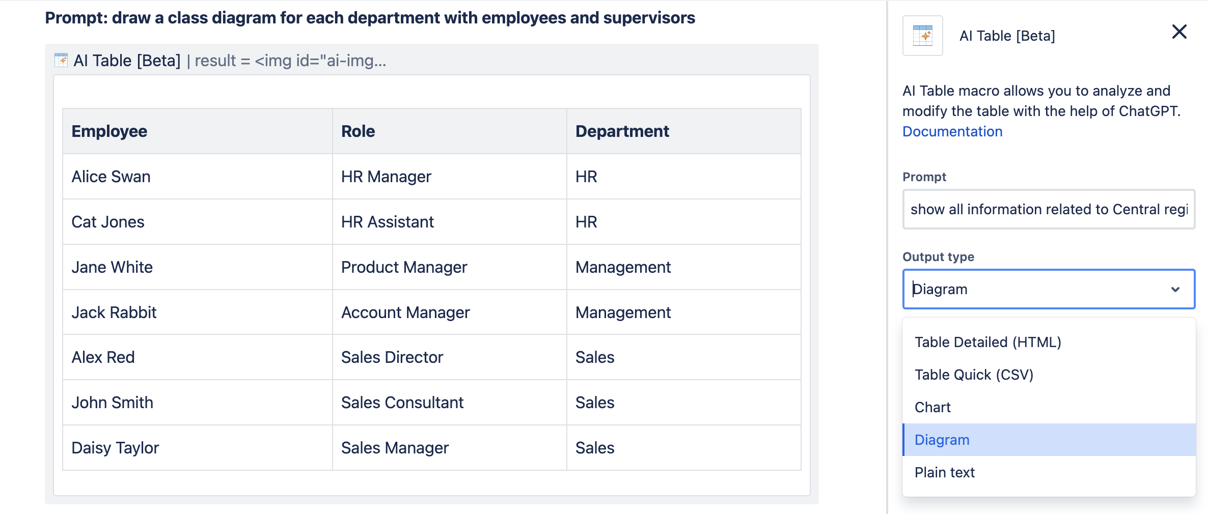
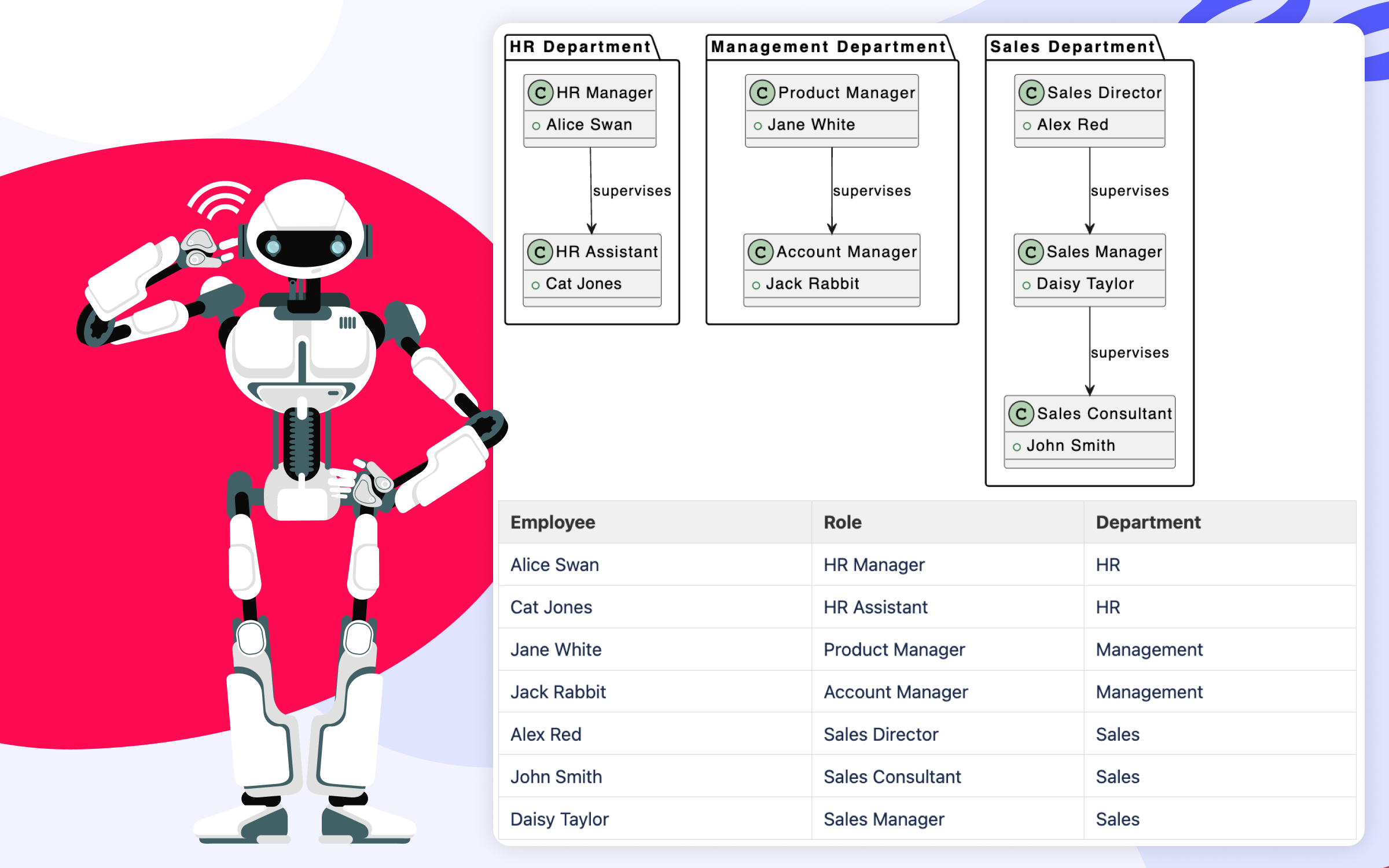
draw a class diagram for each department with employees and supervisors
AI processed Confluence table
AI processed Confluence table
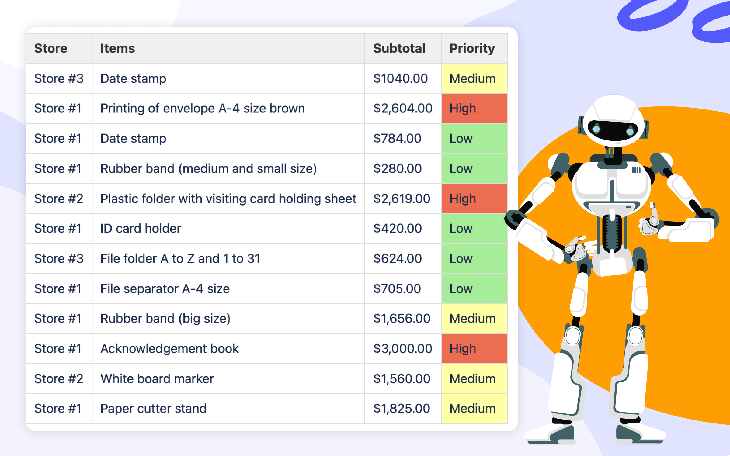
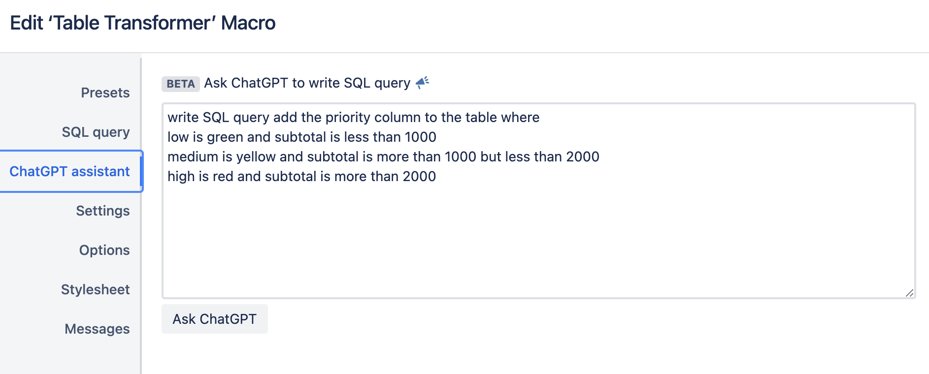
2. AI-Powered SQL Query Writing: Unleashing the Power of Data Manipulation
Challenge: Solving complex, outside-the-box cases. Table data manipulation using SQL.
Tip: Use AI to accelerate data analysis with SQL.
For SQL lovers and advanced data manipulation enthusiasts, the Table Transformer macro now offers an AI-powered advantage. To complement a variety of examples of SQL queries from the app documentation, you can now leverage AI to generate custom queries effortlessly. The wording for prompts here plays a greater role than your previous experience with SQL query writing.
Whether it’s color coding specific data subsets or performing complex analyses, the AI assistant in the Table Transformer macro levels up data processing and enhances table data manipulation. You can now craft SQL queries tailored to your unique requirements. This accelerates data analysis and helps you derive actionable insights for smoother and faster decision-making.
So, there are three ways now how to approach advanced data manipulation via SQL:
harder one: write SQL query manually
smarter one: excel in prompt wording while working with an AI assistant
smart & hard: leverage AI capabilities and SQL skills based on your use case
And if you’re wondering which result AI might return – here is an example for you with AI-generated SQL query.
AI processed Confluence table
AI written query for SQL
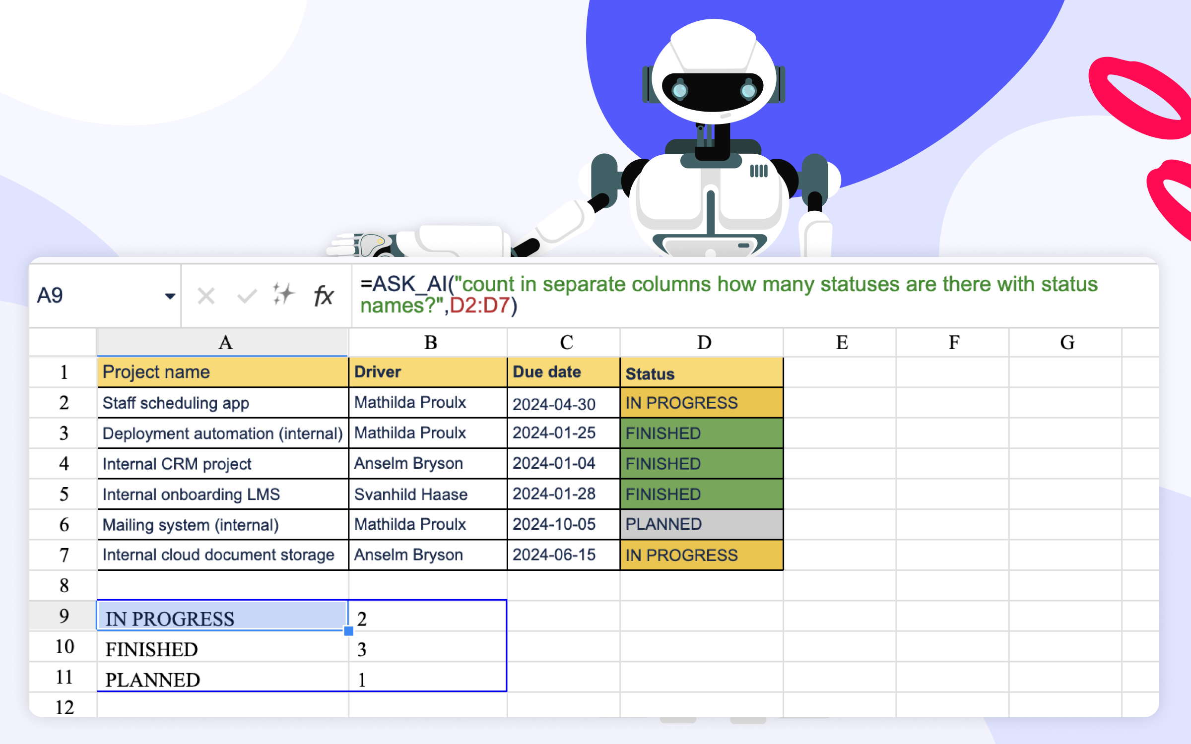
3. AI Formula Writing and Calculations in Spreadsheets: Simplifying Data Workflows
Challenge: Writing formulas in Excel and Excel-like environments to calculate and derive information.
Tip: Make use of AI-crafted formulas and calculations and bid farewell to formula nightmares.
Spreadsheets serve as vital instruments for data analysis, but combating complex formulas can be a daunting task. With the AI-powered Table Spreadsheet macro, you can upgrade your in-spreadsheet data analysis dramatically – and do all that directly on the Confluence pages.
With AI assistance, you can effortlessly write formulas and calculate data while using the Table Spreadsheet macro. AI-powered formula writing and calculation capabilities will rely mostly on your prompt wording and column(s) specifications to deliver the result. This helps you escape nightmares associated with formula writing and level up your spreadsheet-related data workflows.
Weaving our AI tips together in one place
The integration of AI functionalities within Confluence can advance data manipulation and analysis. Vast AI capabilities can empower you to get the most out of your table and spreadsheet data. A few examples can be streamlining data management tasks, enhancing visualization capabilities, and many more.
And here comes the integral tip for you to get maximum value from the AI: invest time and effort to write a clear, specific prompt that avoid ambiguity and communicate the context of your needs clearly.
We’re thrilled to see how AI can assist you in daily tasks related to table data in Confluence. From prompt-based filtration to SQL queries and spreadsheet formula writing, we hope you warmly greet AI Table in Confluence. Check out the AI Table macro from the Table Filter, Charts & Spreadsheets for Confluence app, which is available on the Atlassian Marketplace.
Subscribe for monthly updates on how to get the most out of Atlassian products.
Thank you for signing up
for our newsletter!
You will be the first to know about fresh content, releases,
and special projects.
Stay tuned.
5 Tips to Become a Gantt Chart Expert Using Atlassian Confluence
February 5, 2024
#How To#Confluence Tutorial#Confluence#Reporting
12 min
Imagine you have to visualize a long-term project in the simplest way possible. What is the first solution that comes to your mind? Most project managers would say that a Gantt chart can be a lifesaver. This powerful tool for project planning helps you display the sequence of the main project stages and tasks and their duration within one chart. For this purpose, this is the most illustrative method so far.
Consider the following situation: you are in charge of a new project. Unexpectedly, the vice president of your company has requested a detailed one-page project timeline to look through as soon as possible.
Let’s look at what you have now:
all deadlines written in separate sticky notes
the project tasks placed on several Confluence pages
the key events marked in the team calendar
You’ve been given an hour to assemble all this information on one Confluence page.
In this situation, Table Filter and Charts for Confluence will help you complete this challenging task. In this blog post, we will show you how the Chart from Table macro, one of this app’s three most popular macros, allows you to visualize your data easily using a Gantt chart.
Build the simplest Gantt chart in a few clicks
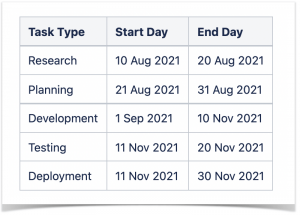
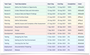
You can create a simple Gantt chart using a three-column table containing tasks and start and end days.
Add the Chart from Table macro, choose the chart type, and specify the settings.
Labels Column:
Task Type
Values Column:
Start Day
End Day
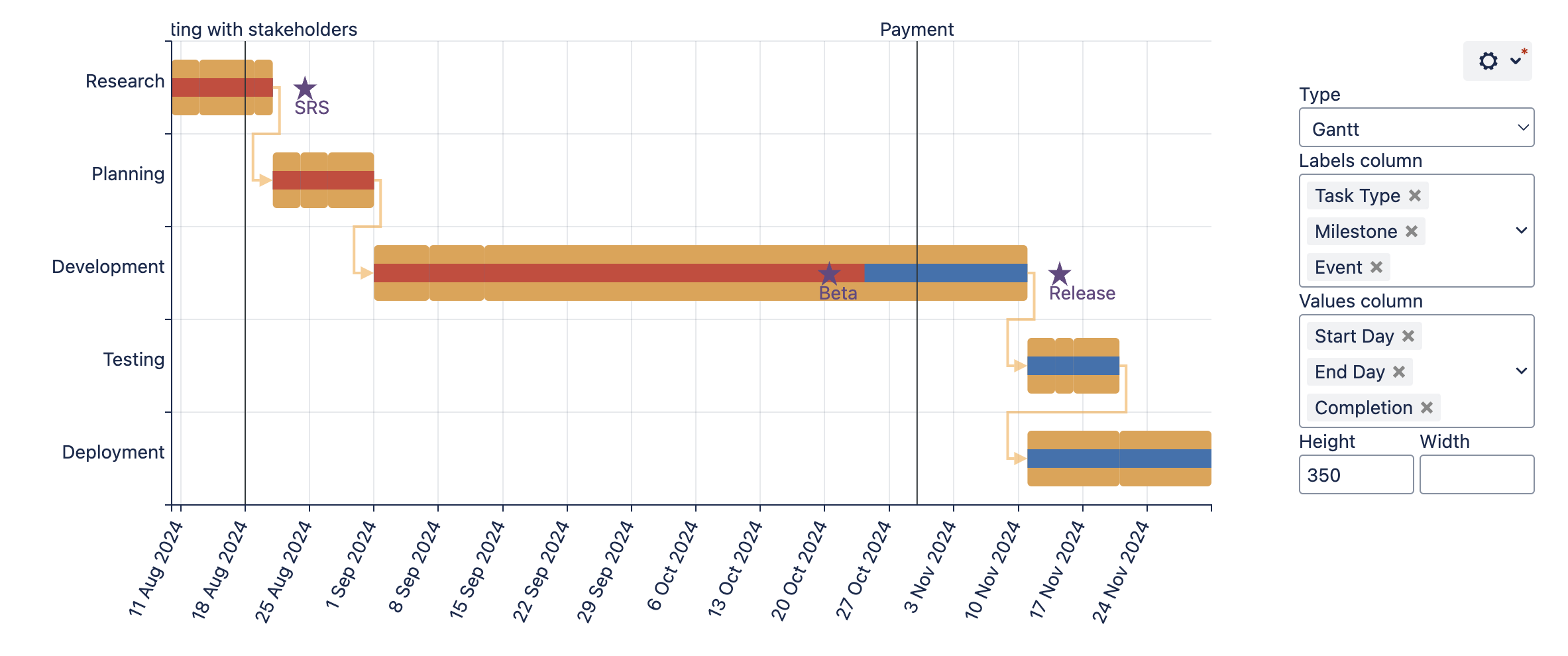
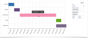
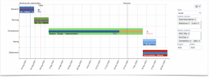
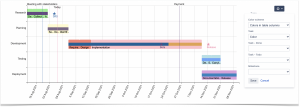
The chart is simplistic and bright. The diagram shows you all the main stages of the project. The system counts the number of days within each stage. When you hover over the bar, you can see the duration of the selected project stage.
Add task descriptions and completion bar
The previous chart looks good, however, it can present the information even more effectively. The chart displays the required project scopes, but the time frames remain unspecified and too long.
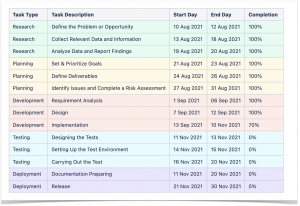
You can break down each project stage into your current tasks to make your chart more informative. You add a task description column to the table and specify the duration of task realization.
Add the completion column to the table to show the progress bars on the chart:
Labels Column:
Task Type
Task Description
Values Column:
Start Day
End Day
Completion
The bars allow you to get more information about the progress of each task.
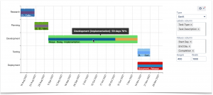
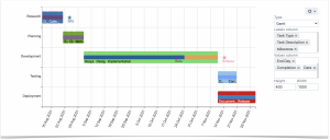
The chart looks much better now. However, there is always space for improvement. The app also helps you add milestones to Gantt charts.
Milestones are key events of a project. The team is only able to proceed if the milestone is complete. You can insert the additional small table into one macro body to display the milestones on your chart. Do this in the edit mode.
After that, choose the settings.
Labels Column:
Task Type
Task Description
Milestone
Values Column:
Start Day
End Day
Completion
Date
The milestones are marked with an asterisk. You can see the detailed milestone descriptions when you hover over the asterisks.
Don’t forget about planned activities
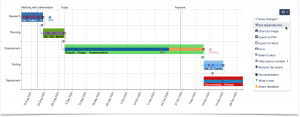
You can also mark the project’s key activities on the chart to prioritize them and collaborate more effectively.
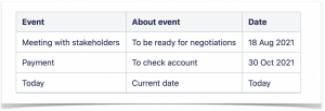
All you need to do is insert the events table into one macro body and set additional labels and values columns in the chart settings. The app allows you to add the “today” event.
Add the correct columns into the settings.
Labels Column:
Task Type
Task Description
Milestone
Events
Values Column:
Start Day
End Day
Completion
Date
It means that when you open a page with a chart, you will see the line that shows where you are at the moment. This way, you get a bird’s-eye view of all project stages, enabling you to see the project time frame and progress.
Last but not least, you can set dependencies between tasks. This helps you understand what you need to prioritize and complete before moving on to the next stage.
If you want to focus on a more specific period without losing the rest of the data, you can zoom in on the Gantt chart. Hold down the Ctrl button and rotate the wheel on your mouse to zoom the chart in or out. Afterward, you can move around the chart by pressing Ctrl (for Windows) or Alt (for MacOS) and dragging the chart in the necessary direction.
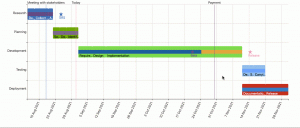
Customize your chart and share the results
Now, you need to change the bars’ colors and set the titles to match your brand book guidelines.
You can select more appropriate colors for each type of task or each task in particular.
If standard app colors don’t match your company style or satisfy you, specify the colors for each task in a table.
Now that you’re ready with all the information on the project, it’s time to present your boss with the Gantt chart you created.
Here’s how you can share your Gantt chart with your boss and your colleagues:
export the Gantt chart or the Confluence page to Word or PDF
share the link to the page
Since your boss asked you to show the project schedule in Confluence, the second option would suit you best.
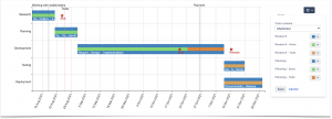
Bonus tip: make your Confluence tables and graphs look more professional
We created a Gantt chart from scratch with the help of the Table Filter and Charts app, but you can do a lot more. Try this handy solution for free to discover all of its features:
You can manage your tables in Confluence on the fly using a bundle of this app’s easy-to-use and fully customizable macros. Check out how user-friendly features Table Filter and Charts are and elevate your tables in Confluence to the next level.
Subscribe for monthly updates on how to get the most out of Atlassian products.
Thank you for signing up
for our newsletter!
You will be the first to know about fresh content, releases,
and special projects.
Stay tuned.
We use cookies on our website to give you the most relevant experience by remembering your preferences and repeat visits. By clicking “Accept”, you consent to the use of ALL the cookies.
We use necessary cookies to optimize our site. We’d also like to set performance cookies that help us make improvements by measuring how you use the site.
By clicking “Accept all”, you voluntarily agree to the data processing mentioned.
The cookies collect information in a way that does not directly identify anyone. For more information on how these cookies work please see our ‘Cookies policy’.
Necessary cookies are used for activities that are strictly necessary to operate or deliver the service you requested from us and, therefore, do not require you to consent. They enable core functionality such as security, network management, and accessibility.
Performance cookies enable improved functionality and personalization and help us measure traffic and analyze your behavior with the goal of improving our service. This means that our services may not work properly if they are disabled.